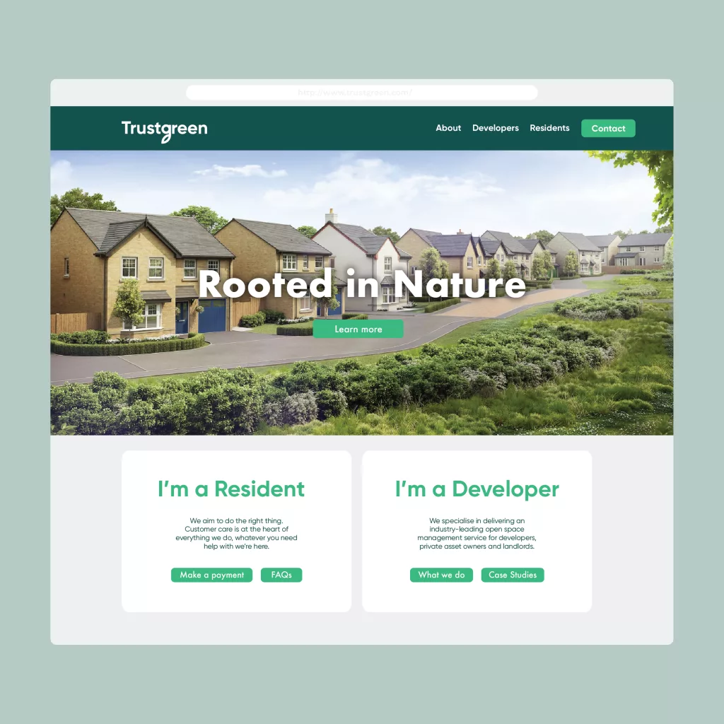

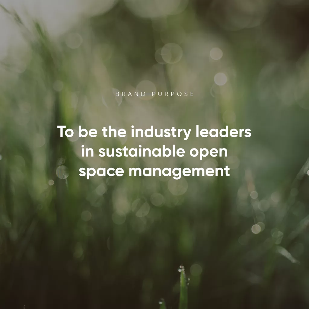
Managing sustainable outdoor spaces for thousands of households across the UK.
As happens when companies grow quickly, numerous sub-brands and assets had been hastily added over the years with little cohesion. Trustgreen’s brand experience needed a single, cohesive name and strategic streamlining, and the visual and verbal identities warranted a fresh face for a bold and best-in-class company.
In a series of brand discovery sessions with key stakeholders, we crafted a brand positioning document that served as a foundation for all future brand decisions, including renaming, values, and visual branding. Through these sessions, we recognised the limitations of the existing names and gained insights into the company’s dynamics.
While exploring various name options, we realised the best choice might already be within reach. We proposed replacing “Trustmgt” with “Trustgreen.” This choice aligns perfectly with the brand’s values and fostering a shared mission among the team. For customers, it immediately conveys trust and clarity from day one.
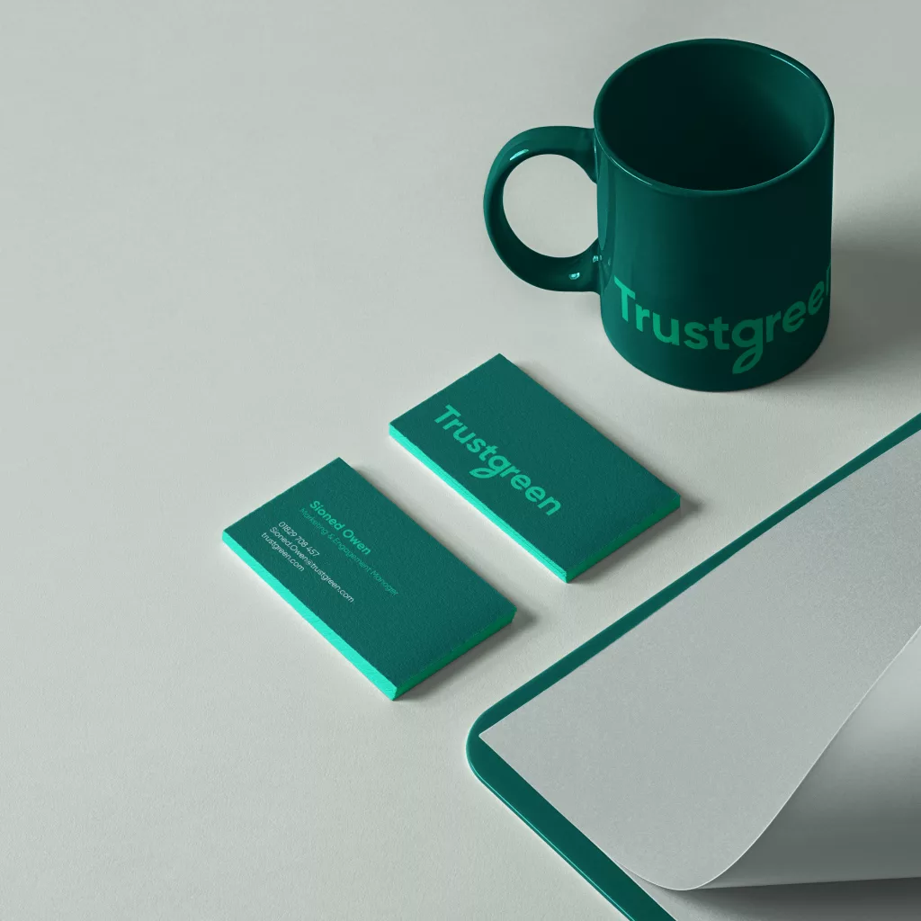
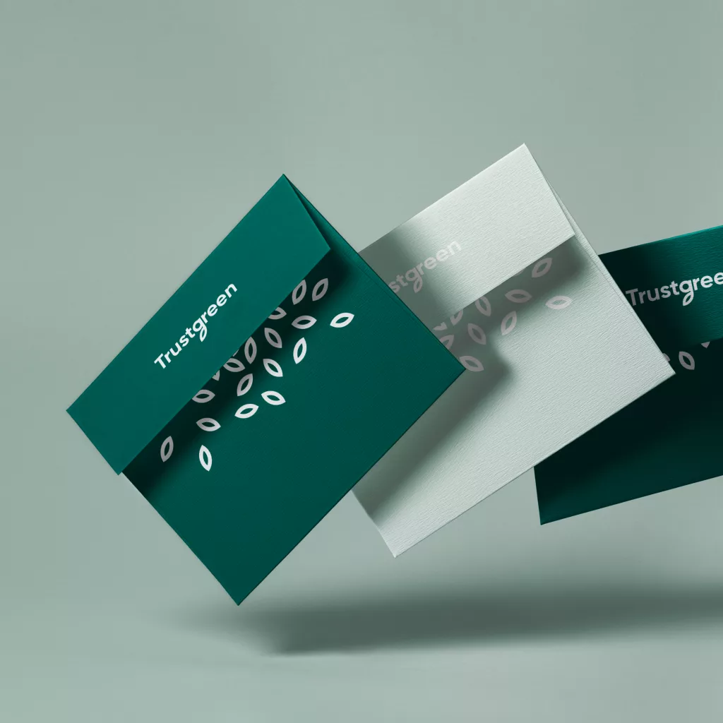
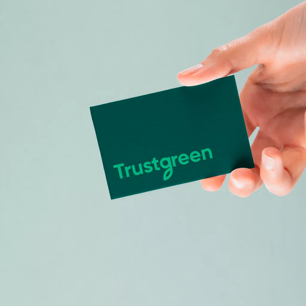
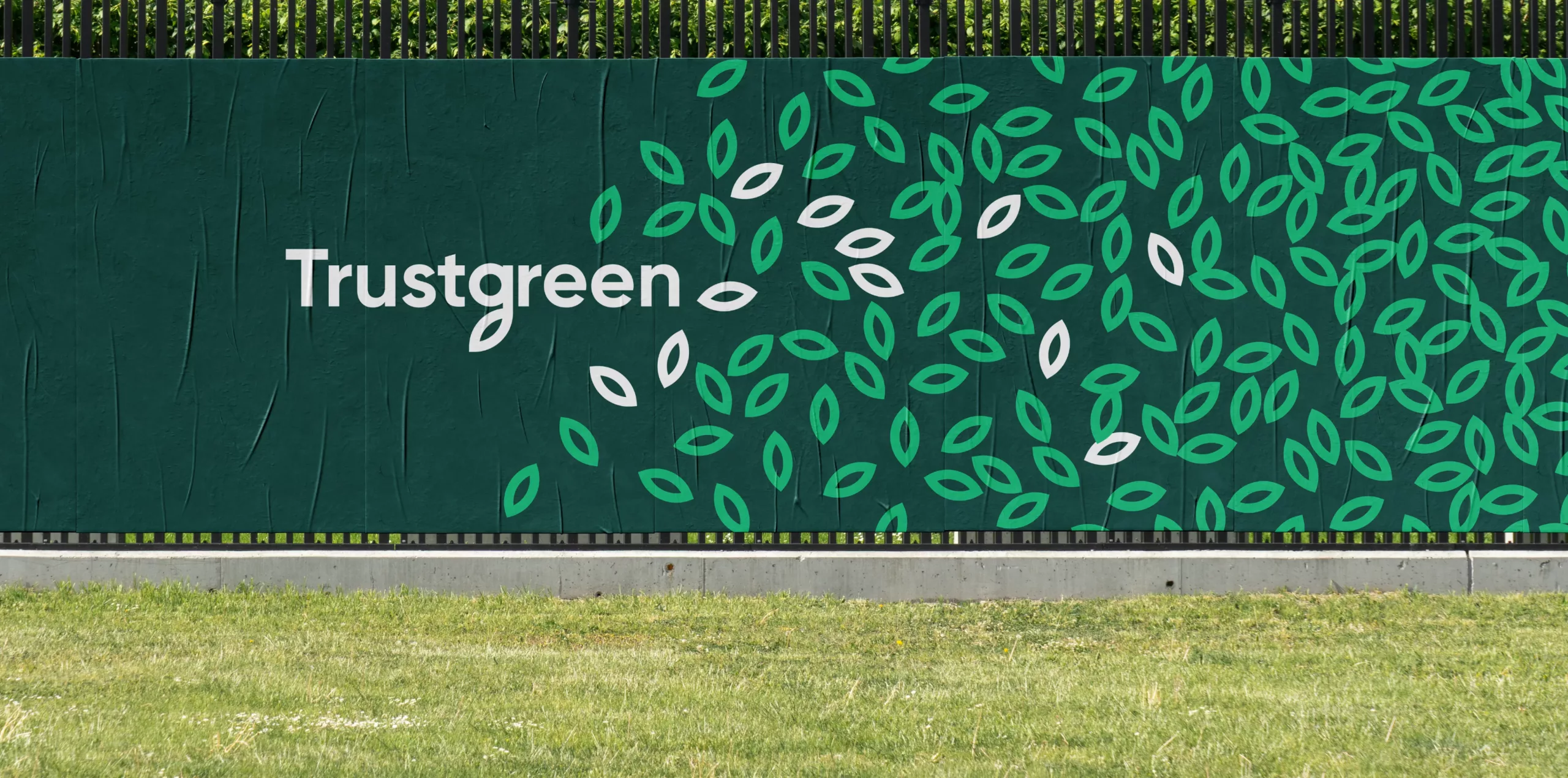
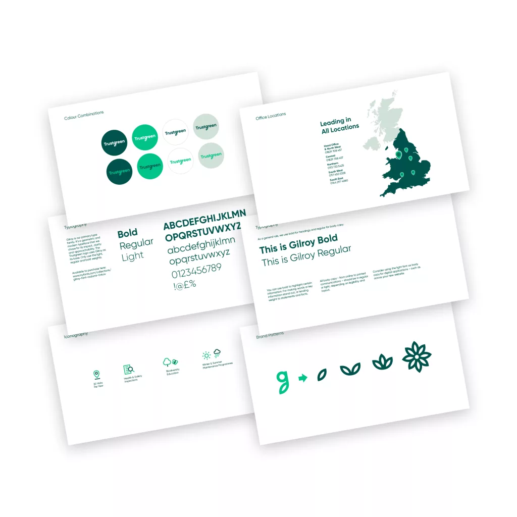
The new Trustgreen logomark makes a direct connection to its name and its purpose. In addition, the new logotype is a customised geometric sans which is bold and forward-looking, while also maintaining approachability. Its ownability is highlighted by the unique ’g’ leaf that reflects its ‘rooted in nature’ ethos. This ‘g’ is also a key brand element from which brand patterns and applications can stem from.
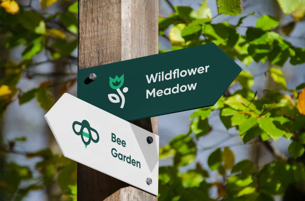
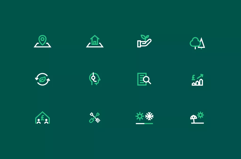
Bespoke Icons
We developed a collection of icons to creatively represent certain themes and benefits. These icons incorporate the two brand colours to enhance depth and visual appeal. Additionally, we animated a selection of these icons to enhance the user experience, convey the intended message and express the brand’s personality.
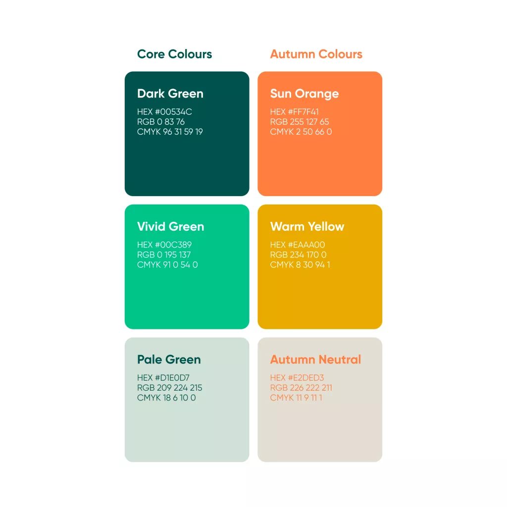
The colours were selected as a vibrant reflection of the environment and seasons. The two primary brand colours, situated at opposite ends of the green spectrum, offer flexibility in their use, enabling a subtler or more vibrant message depending on the intended purpose.
Our brand support involved developing brand guidelines, designing marketing collateral, and ensuring a successful rollout of the new brand.