
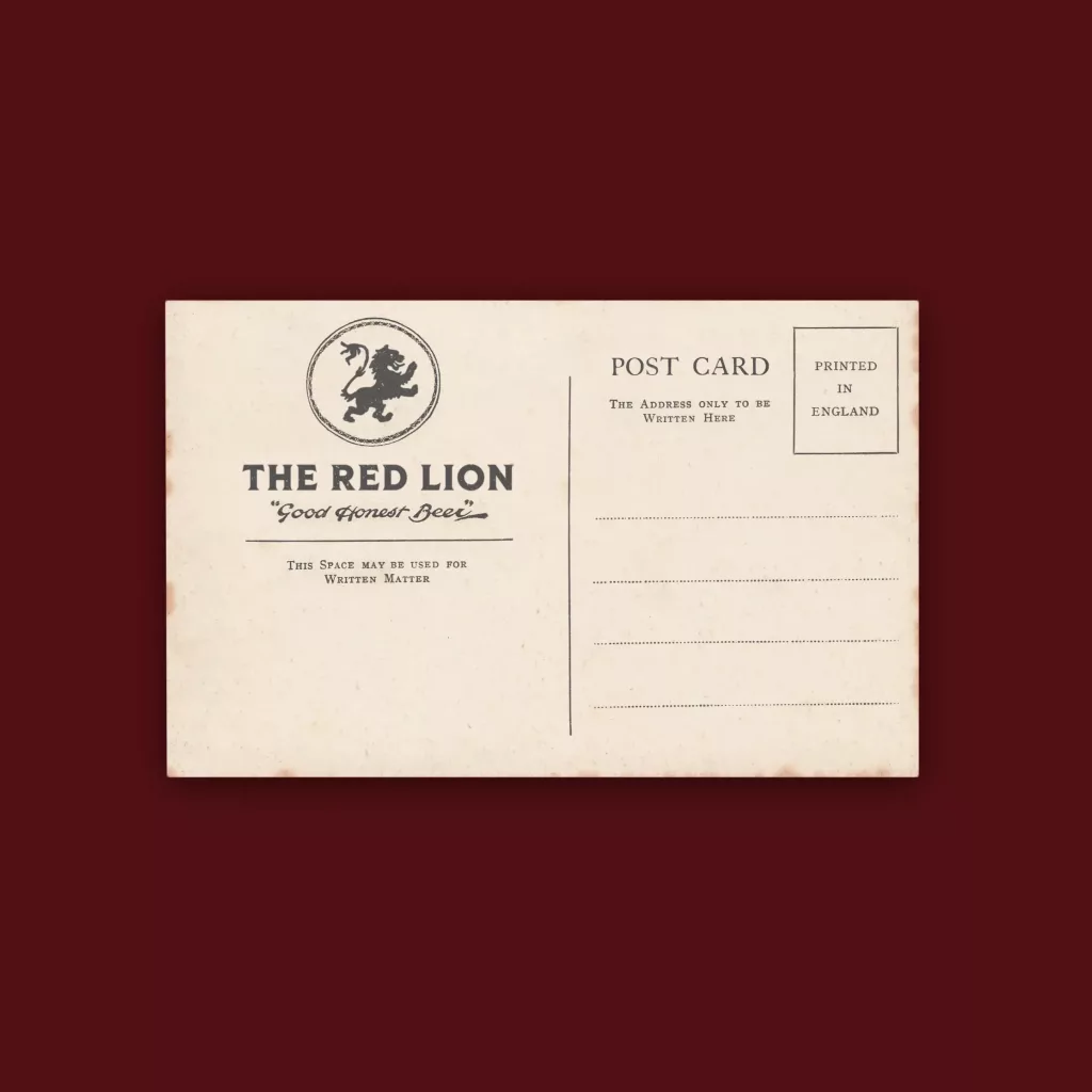
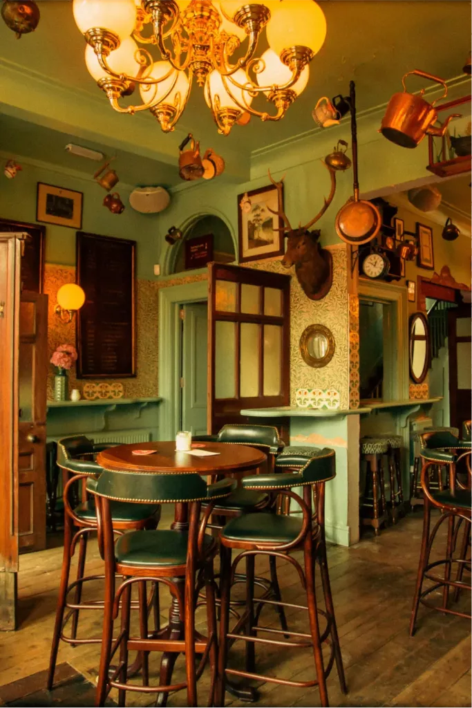
Establishing a brand that evokes nostalgia for the British pub
Essentially we were not tasked with creating a brand in the modern sense because pre 20th century pubs were never overtly branded, instead we curated a set of graphic interventions that marked out The Red Lion as a place to visit and raise a glass to the traditional public house.
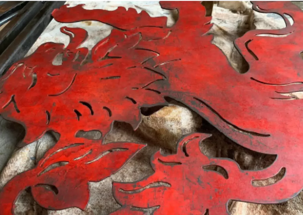
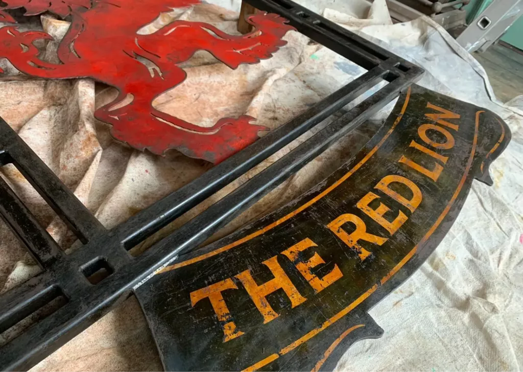
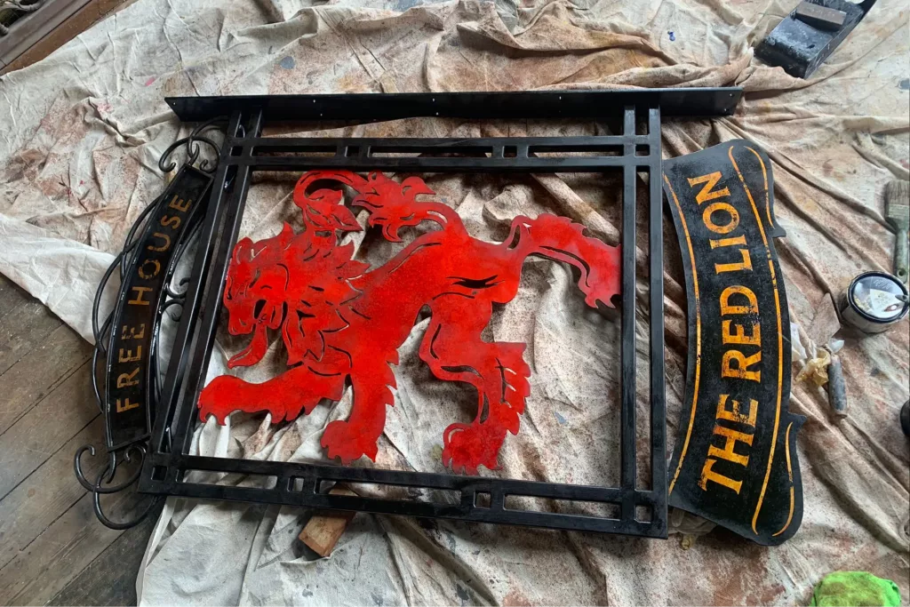
Distressed hanging pub sign
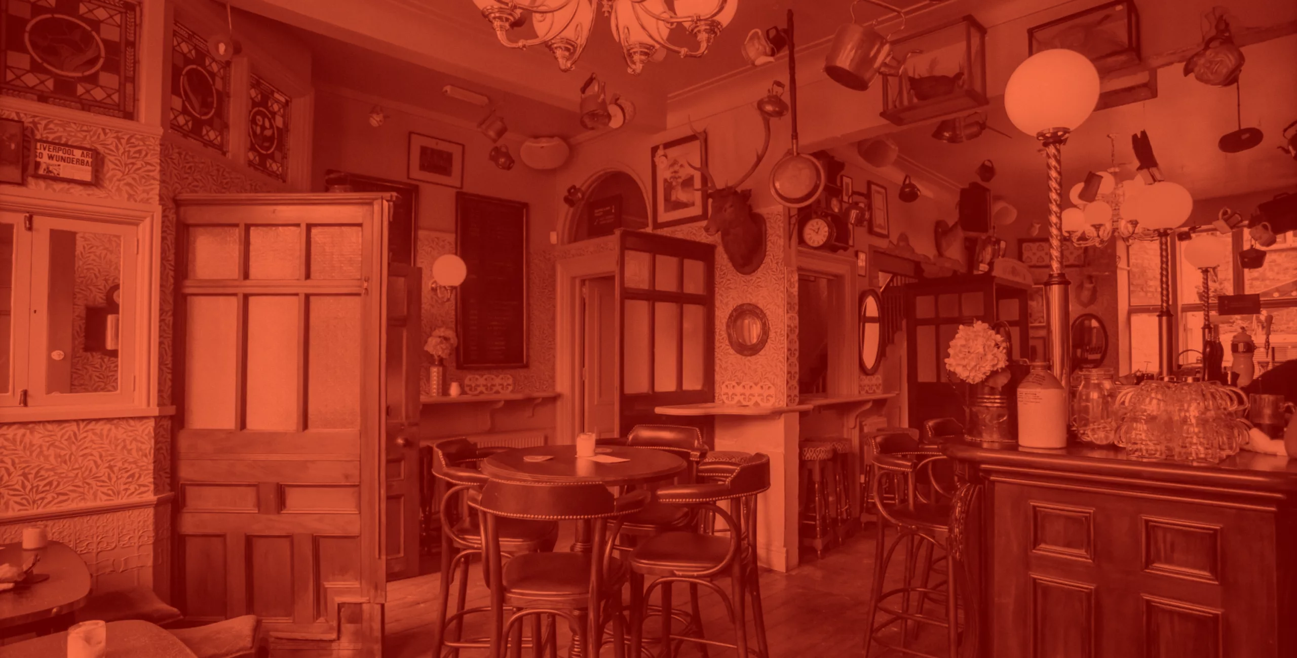
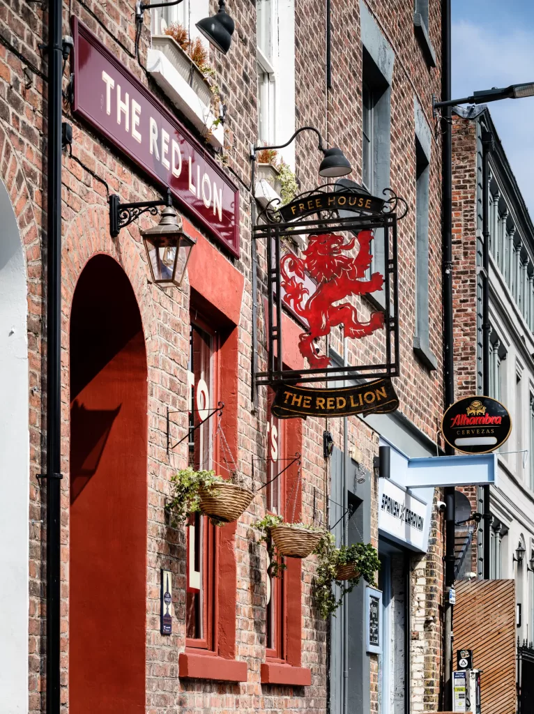
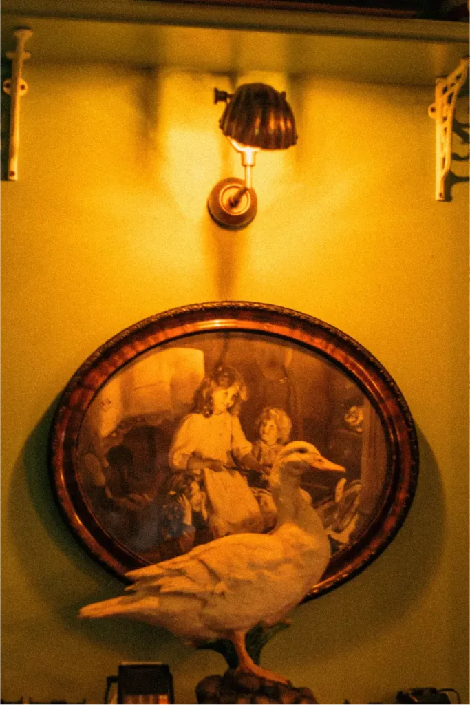
As this project essentially involved taking a tired office building and turning it into an authentic looking pub – albeit in a period georgian building – the challenge was to never install anything that looked too ‘new’.
We commissioned a traditional sign for the new pub that obviously arrived looking brand spanking new and much too awkward against the antique interior. Enter stage left, the theatre artist to beautifully degrade and age the sign. Proudly hung, as if it has been there for many decades.
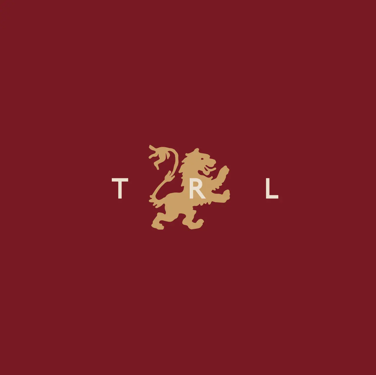
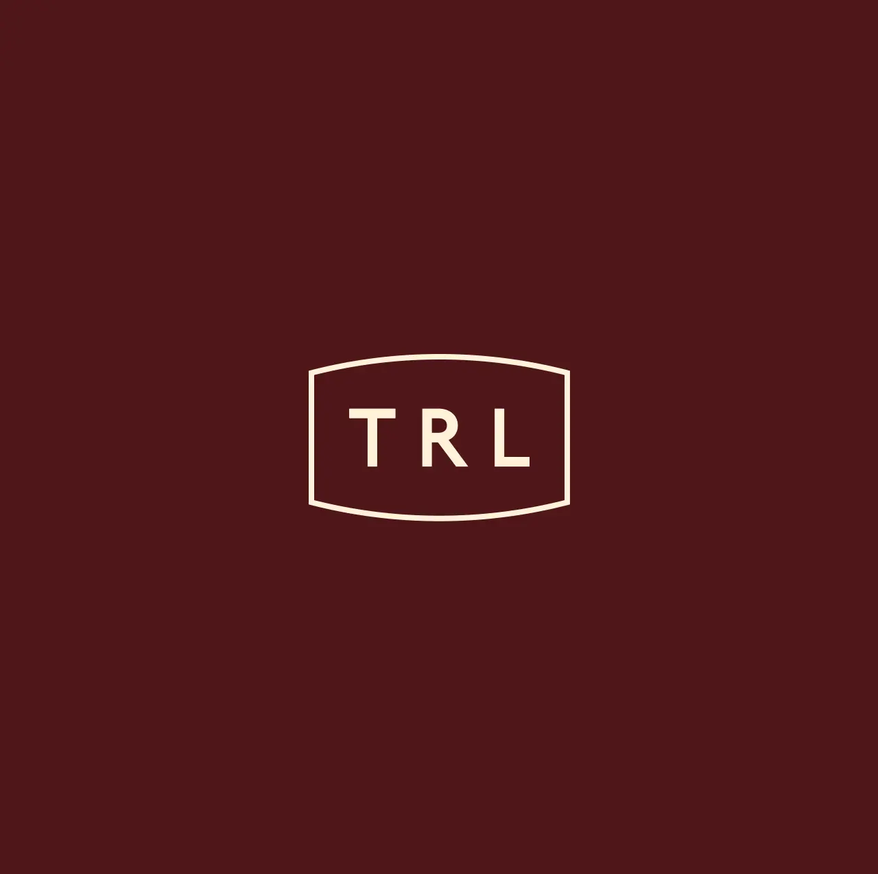
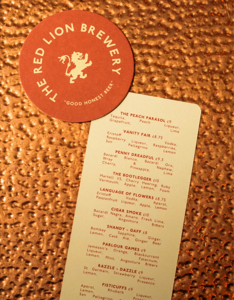
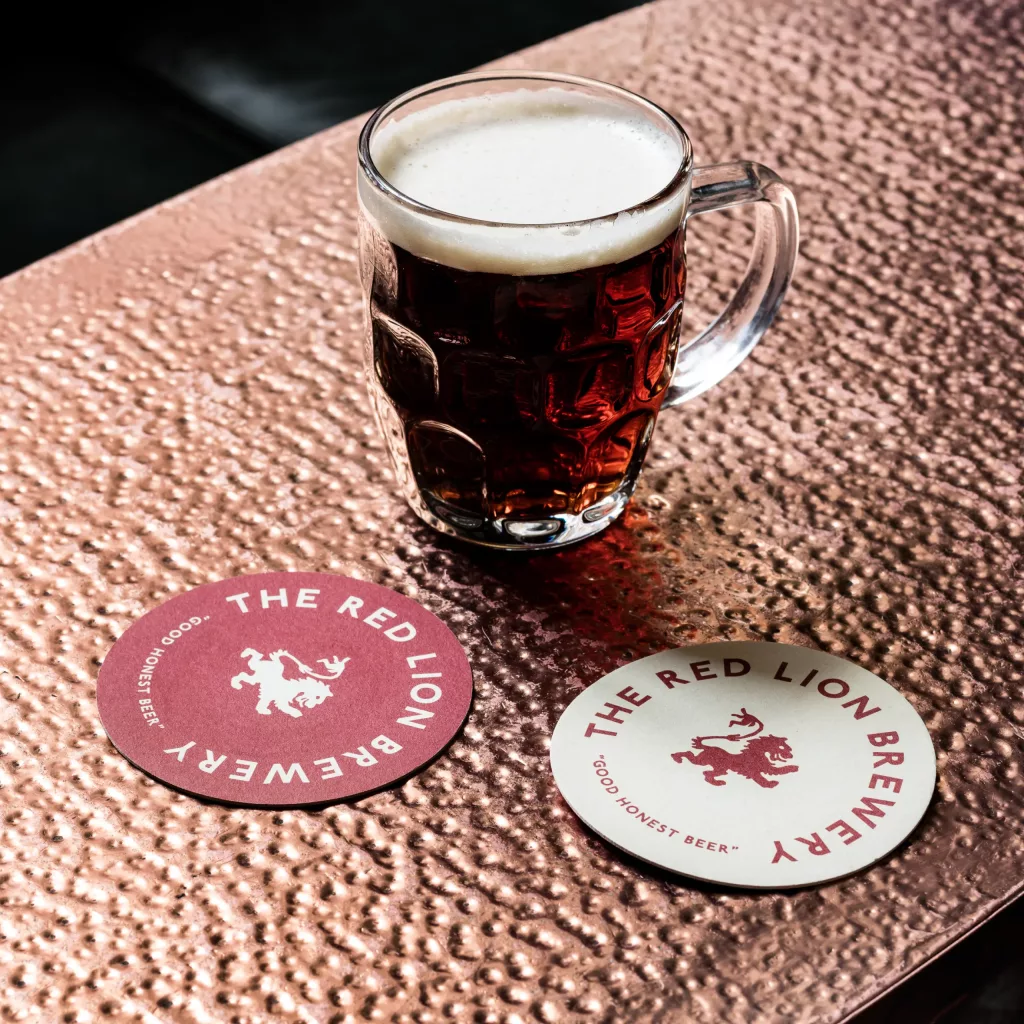
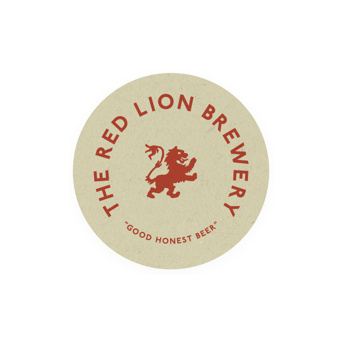
Brandmarks
We decided our graphic interventions should reference the 1940’s era. As this era lent itself to a modernist approach that formed an interesting counterpoint to the elaborate Victorian interior.
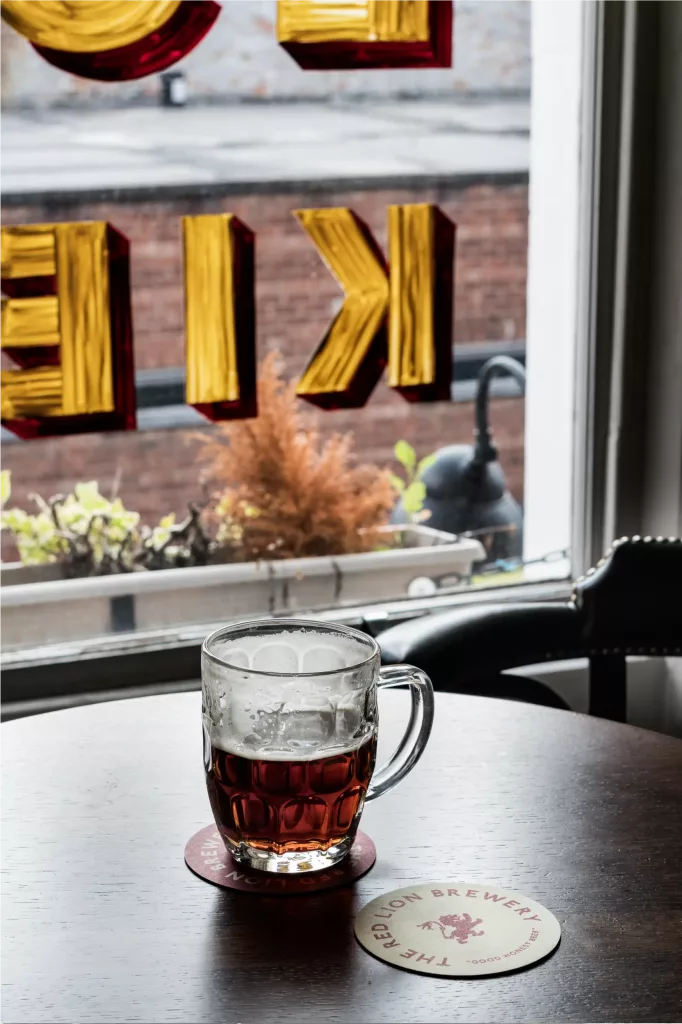
The aim was to stir nostalgia and evoke emotions from patrons with the brand marks and graphic language that appear at different times and across different applications such as beer mats, pavement signs, beer clips.
WordPress multisite approach
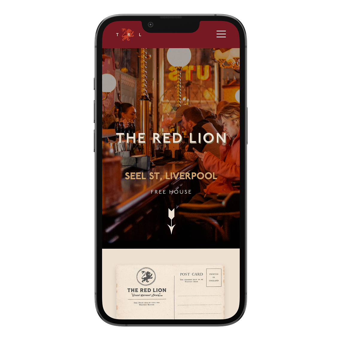
A simple objective, to create a website that mirrors The Red Lion’s pub’s character and entices visitors to step through its doors whilst quickly providing essential information such as location, opening hours, and contact details.
As our client holds multiple hospitality venues, we needed a digital approach that allows us to efficiently create multiple websites for them. We opted for a WordPress multi-site approach, which utilises a shared, bespoke template. This enables us to easily and quickly create a new branded website and manage all the company’s sites through a single WordPress dashboard, reducing admin and saving time and money.
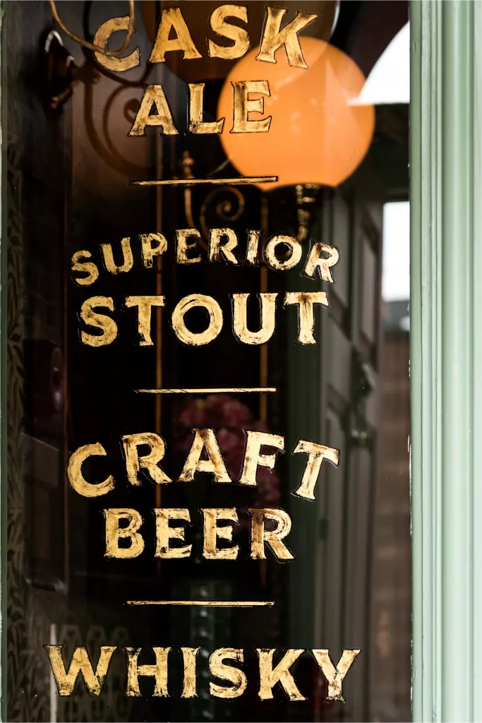
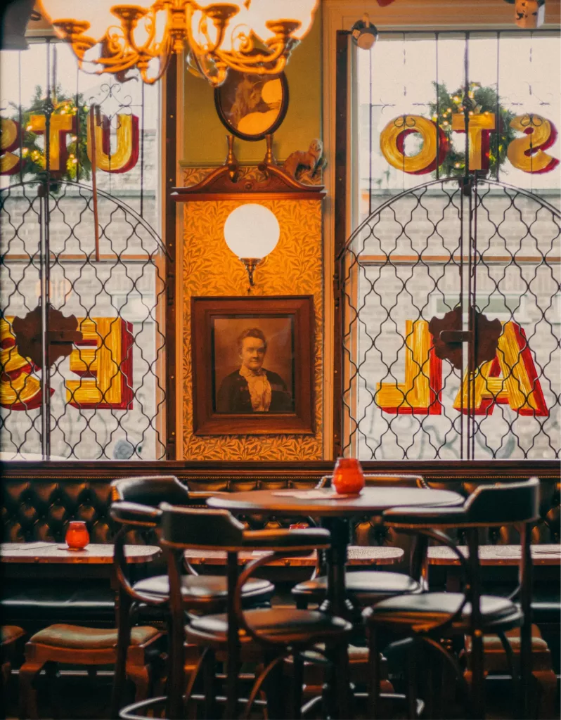
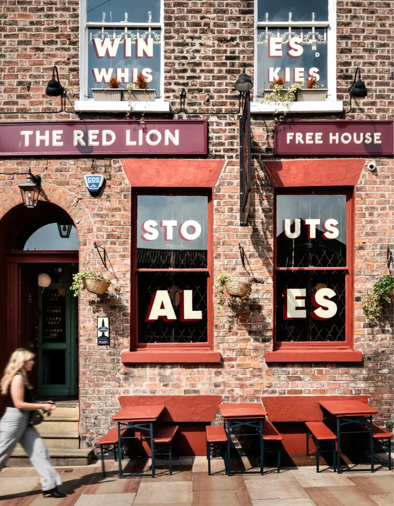
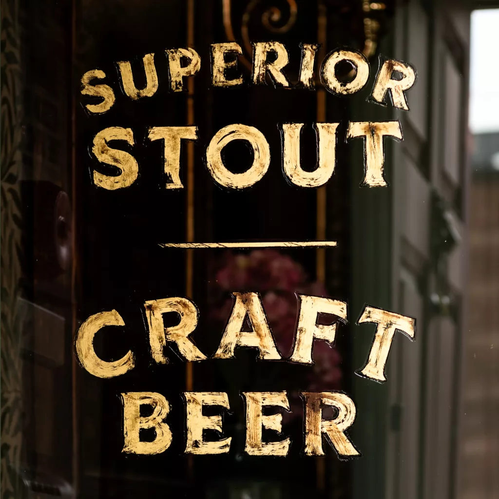
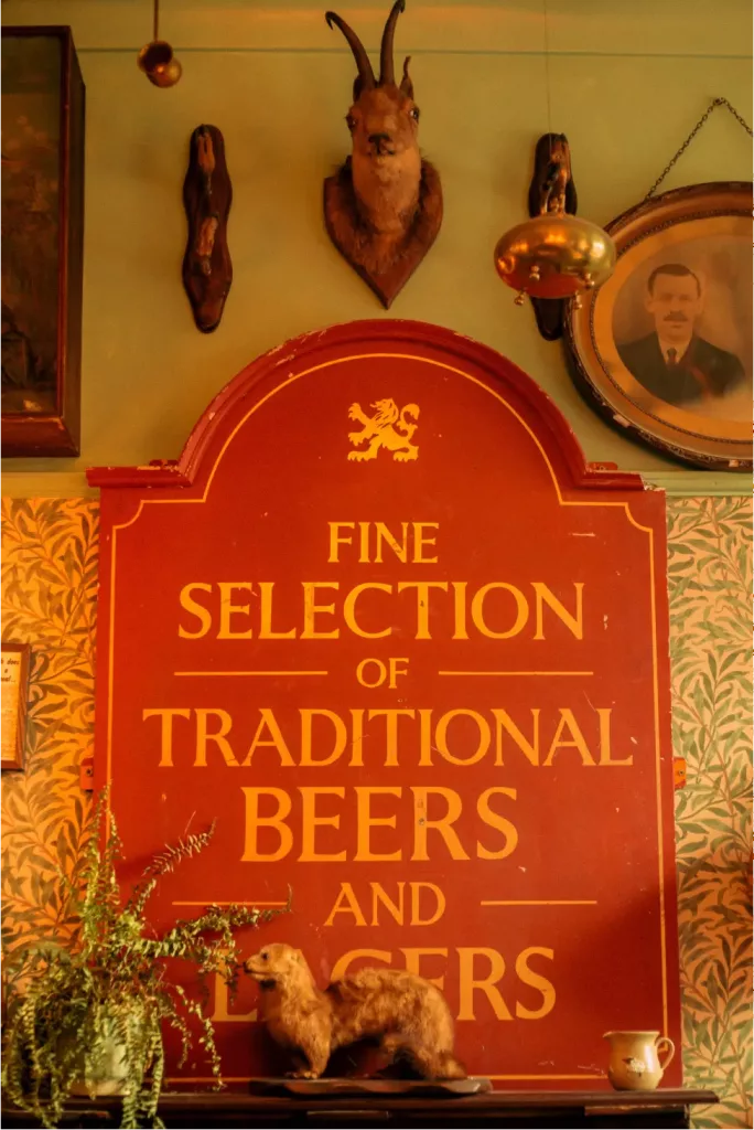
Sign Writing
We like to team up with artisans and craftspeople; often with pubs we prefer to utilise traditional skills wherever possible. A modern plastic sign cannot compete with the craft and heritage of hand painted lettering or graphics added to a building. Not forgetting the many sustainable benefits as well.
Signwriting flows seamlessly from the interior to exterior, emanating both skill and authenticity. From the bold signage boards through to the hand painted lettering onto the windows. When the sunlight catches the lettering, you notice the brush strokes of each letter, creating instant beauty.
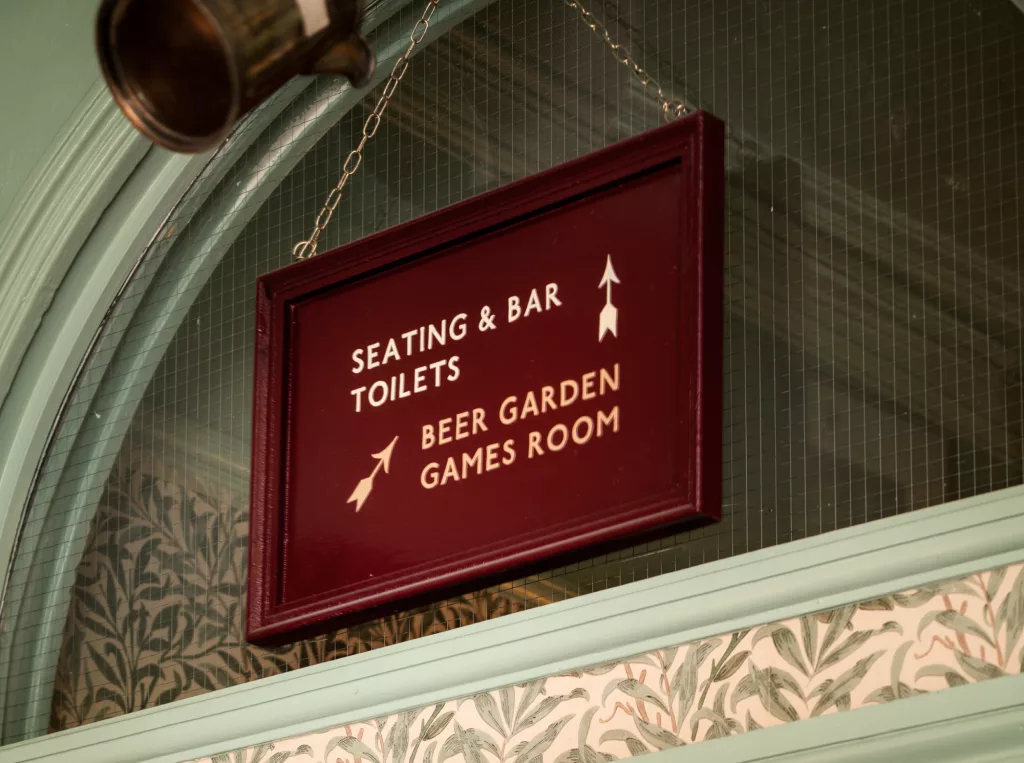
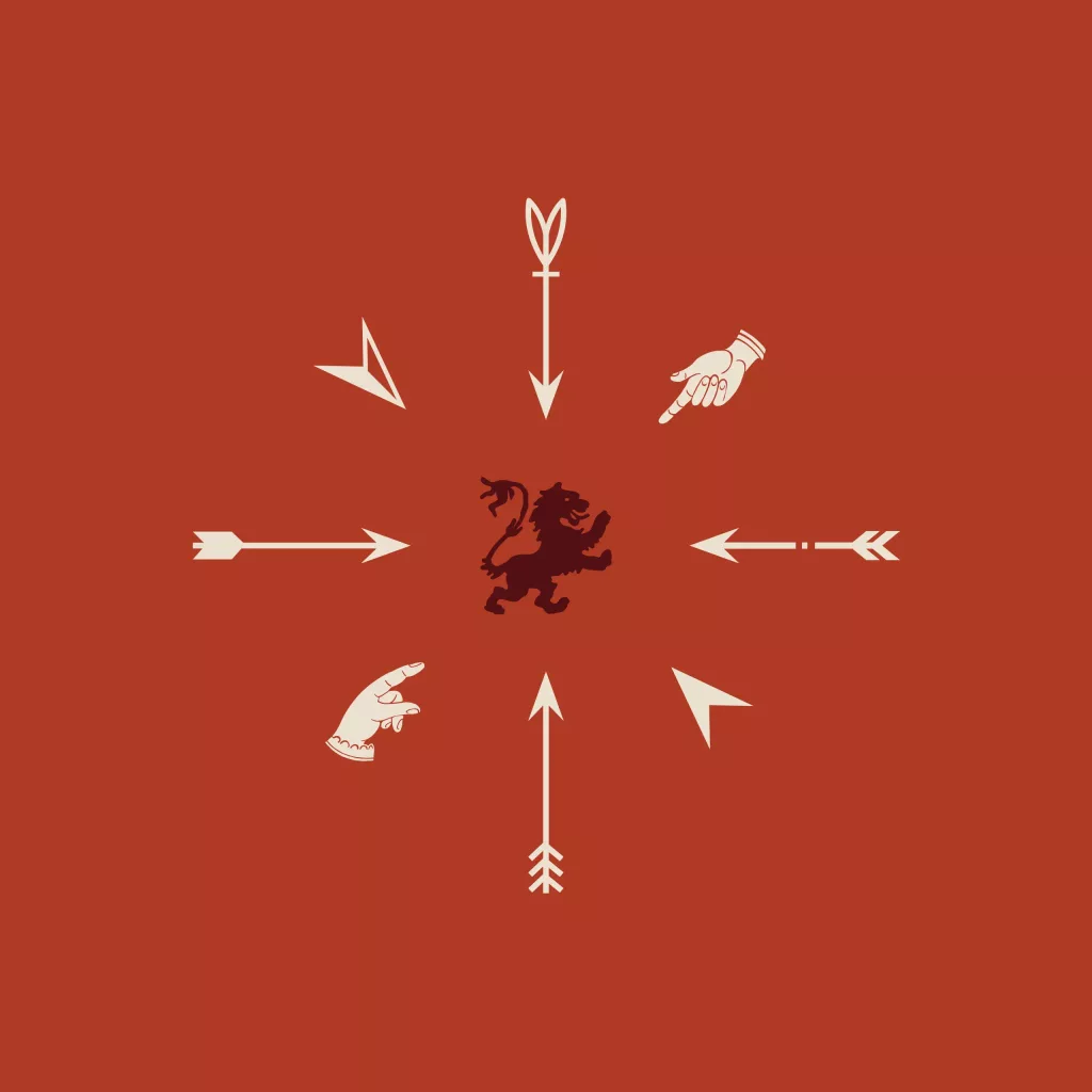
Wayfinding
Originally a residential townhouse, the Georgian building houses multiple rooms spread across four levels, including outdoor spaces. We carefully guided patrons through the various areas, from the bar to smoking areas and the beer garden.
To honour the building’s heritage, we created around 20 elegant instruction signs with hand-painted arrows set against a red background. Each sign features period moulding and a brass chain for added authenticity.