
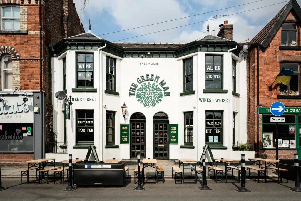
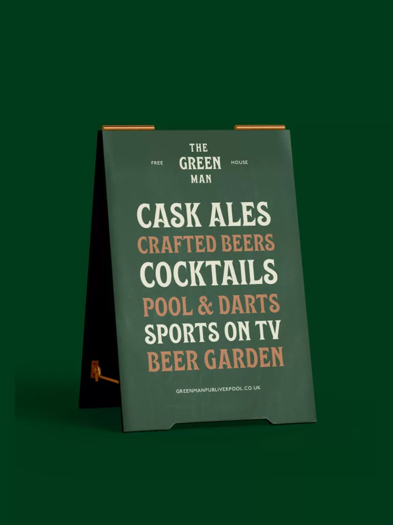
Delivering a characterful identity with traditional pub charm
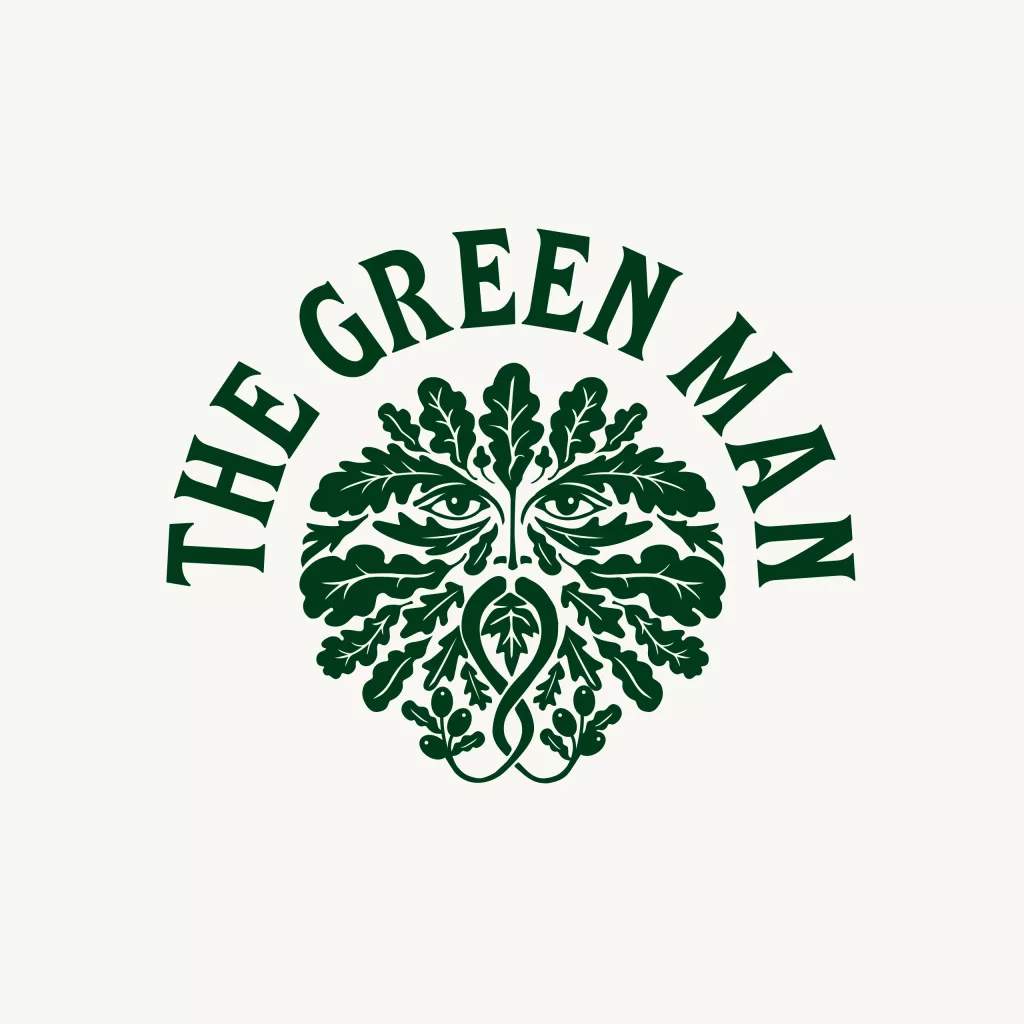
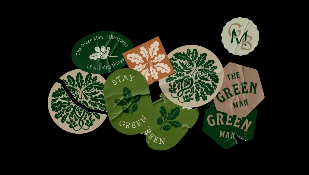
To create the brand we immersed ourselves in the history of the Green Man, a character steeped in English folk-lore. Our research informed many aspects of the project, such as the illustration, typography and colours that all came together to create the visual identity. We worked closely with our client to roll-out the brand across print, signage, interior and online.
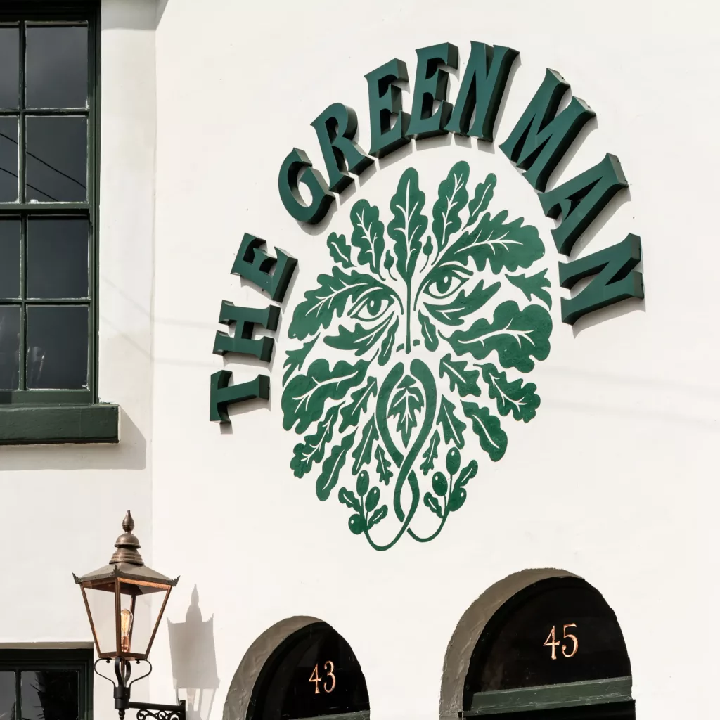
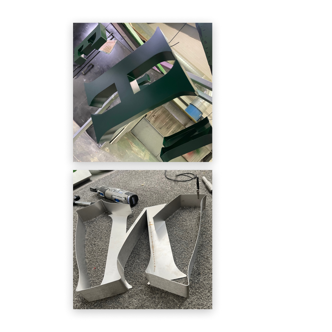
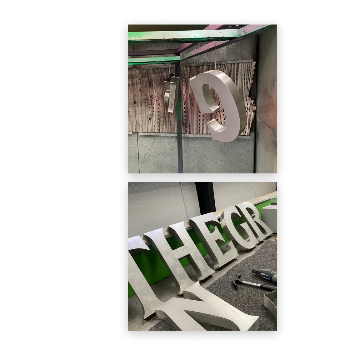
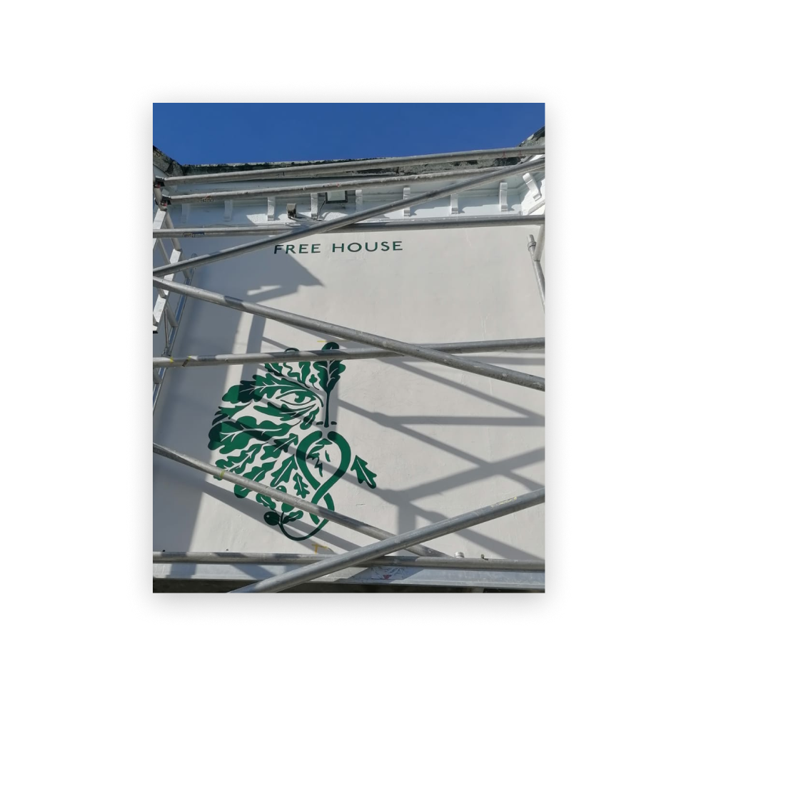
Creating 3D built-up signage letters
The font used in the logo warranted a deep form to help command attention and to contrast against the flat hand-painted elements we added to the building. To achieve this, we commissioned built up aluminium letters. Aluminium can flex to follow ornate, curved letterforms, it can be soldered by hand to achieve the 3D look required and it can be powder coated in any RAL colour.
We take time to carefully consider the intricate decisions and details involved in creating a signage scheme, to ensure that the final outcome is a thing of beauty, radiates the brand to passers-by, while maintaining the building’s unique character.
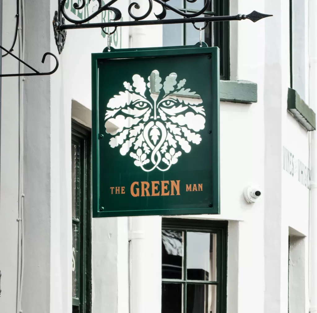
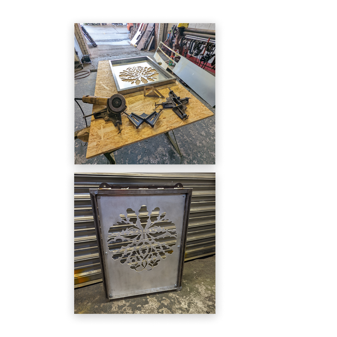
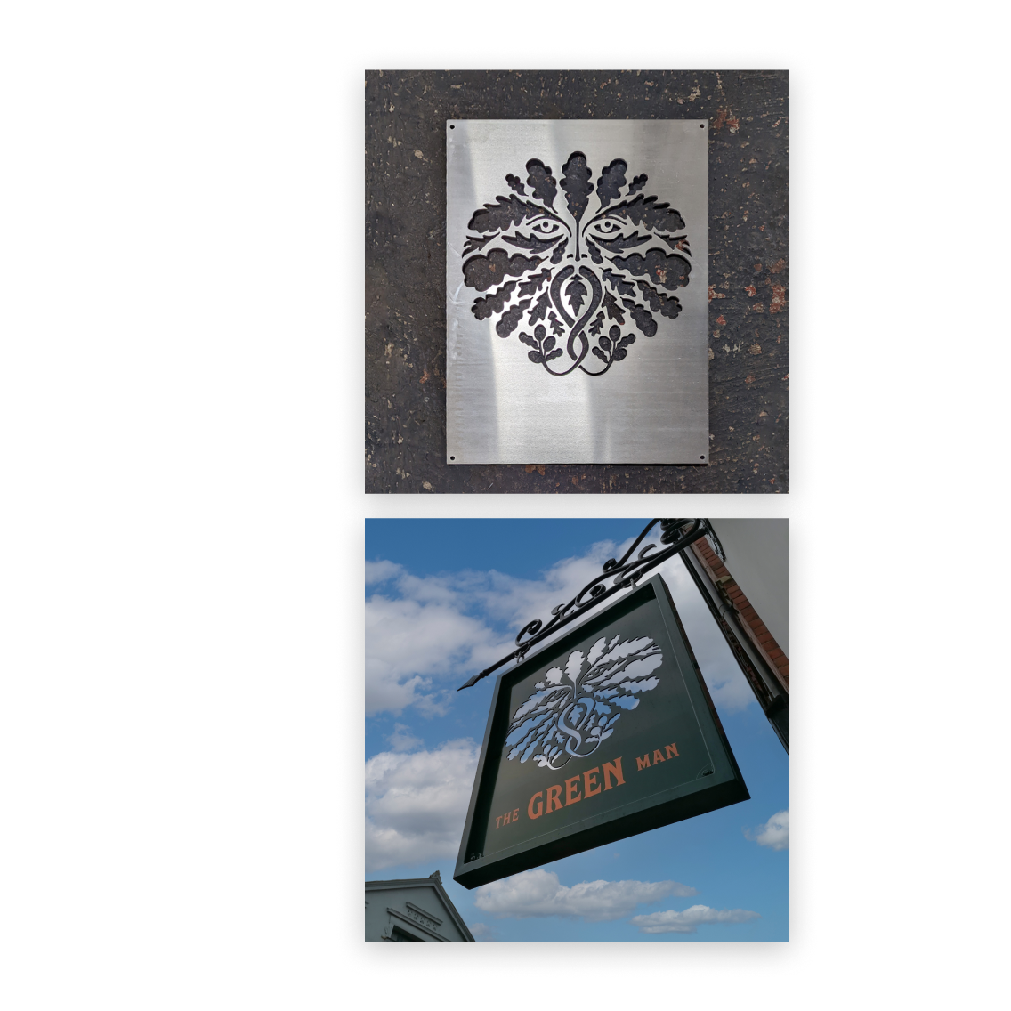
See-through, swinging pub sign
No pub is truly complete without a traditional swinging sign. For this particular project, we CNC routed the Green Man’s foliage-laden face out of metal to create a unique see-through sign that looks great from both sides.
It’s just one element amongst many that contribute to a successful exterior pub aesthetic, and combine to give passersby a reason to pop in for a pint, to Instagram it, or to simply stop and admire it.
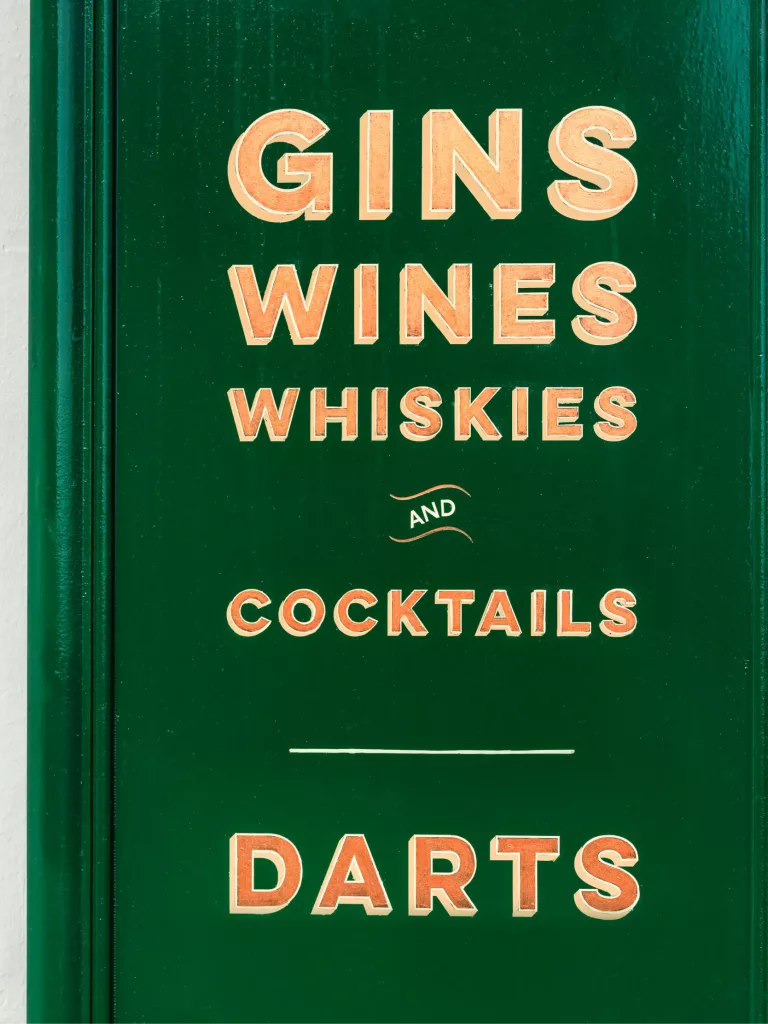
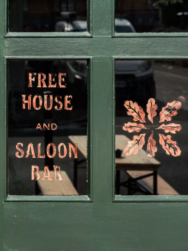
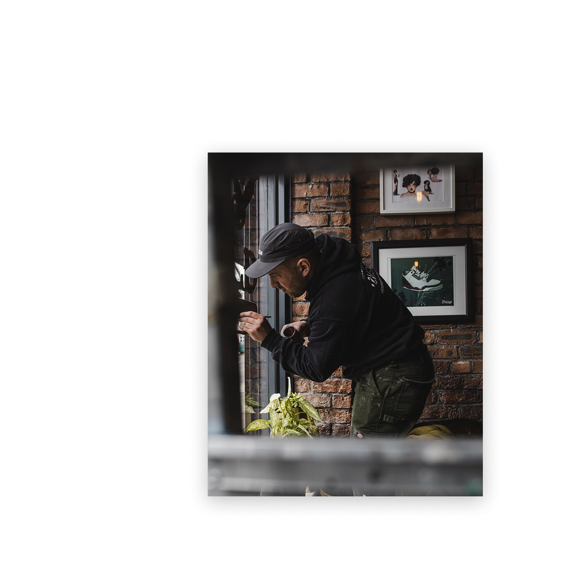
Signwriting a pub
We like to team up with artisans and craftspeople; often with pubs we prefer to utilise traditional skills wherever possible. A modern plastic sign cannot even begin to compete with the craft and heritage of hand painted lettering or graphics added to a building. Not forgetting the many sustainable benefits as well.
Harry Mytton is a traditional sign painter based in Merseyside. We’ve worked with Harry on numerous occasions, including The Red Lion and The Vines.
Signwriting flows seamlessly from the interior to exterior, emanating both skill and authenticity. From the metallic copper painted leaves through to the hand painted lettering onto the windows. When the sunlight catches the lettering, you notice the brush strokes of each letter, creating instant beauty.
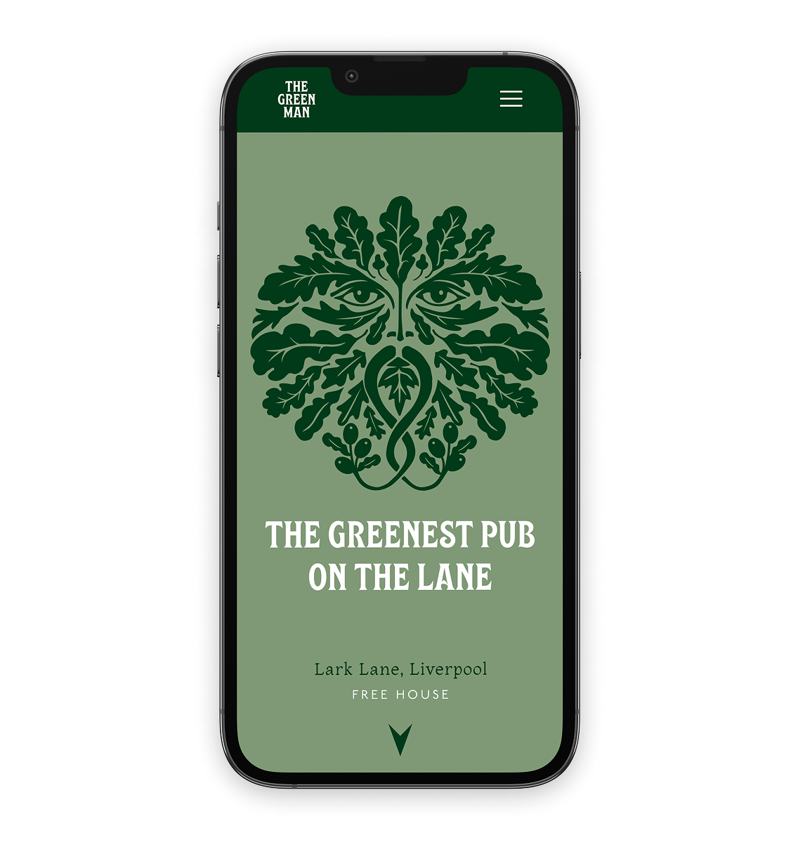
WordPress multi-site approach
A simple objective, to create a website that mirrors The Green Man pub’s character and entices visitors to step through its doors whilst quickly providing essential information such as location, opening hours, and contact details.
As our client holds multiple hospitality venues, we needed a digital approach that allows us to efficiently create multiple websites for them. We opted for a WordPress multi-site approach, which utilises a shared, bespoke template. This enables us to easily and quickly create a new branded website and manage the websites through a single WordPress dashboard, reducing admin and saving time and money.