

.svg)
Wayfinding signage that gets you there with flair
We design clear, characterful wayfinding that helps people find their way and brings your brand into the space around them. Every sign works together, from first arrival to final destination.




Wayfinding design for every turn

Entrance signs and directories help people get their bearings, understand what’s there and decide where to go first.

Maps, arrows and floor signs make the next step clear, especially where routes split or change level.

Room and facility signs let people know they’ve found the right place. No awkward peering through a door to check.
A little less “Where am I?”
We walk the routes your visitors will take. Where do they arrive? What are they looking for? Where do they have to choose a direction? The answers tell us what information belongs where, from the first welcome to the final room sign.
We also think about how different people will read and use the signs, so directions are clear at a glance.

Iconic by design
Sometimes a good symbol does the job faster than a sentence. Clear, consistent icon sets quickly help people recognise where they’re going, whether that’s a lift, entrance, café, toilet or something much more specific to the space.
They can be simple and universal where they need to be, or drawn with enough character to feel unmistakably part of the brand. Either way, every icon follows the same visual logic, so the whole system feels joined up.
Take a left at the lovely typography
We use type, colour, icons, illustration and materials to make signage feel part of your brand and building. It might be bold enough to catch someone’s eye across a busy room or subtle enough to sit beautifully within a historic interior.
We consider how each sign looks and where someone will see it, then work with specialist makers to bring the designs into the space.
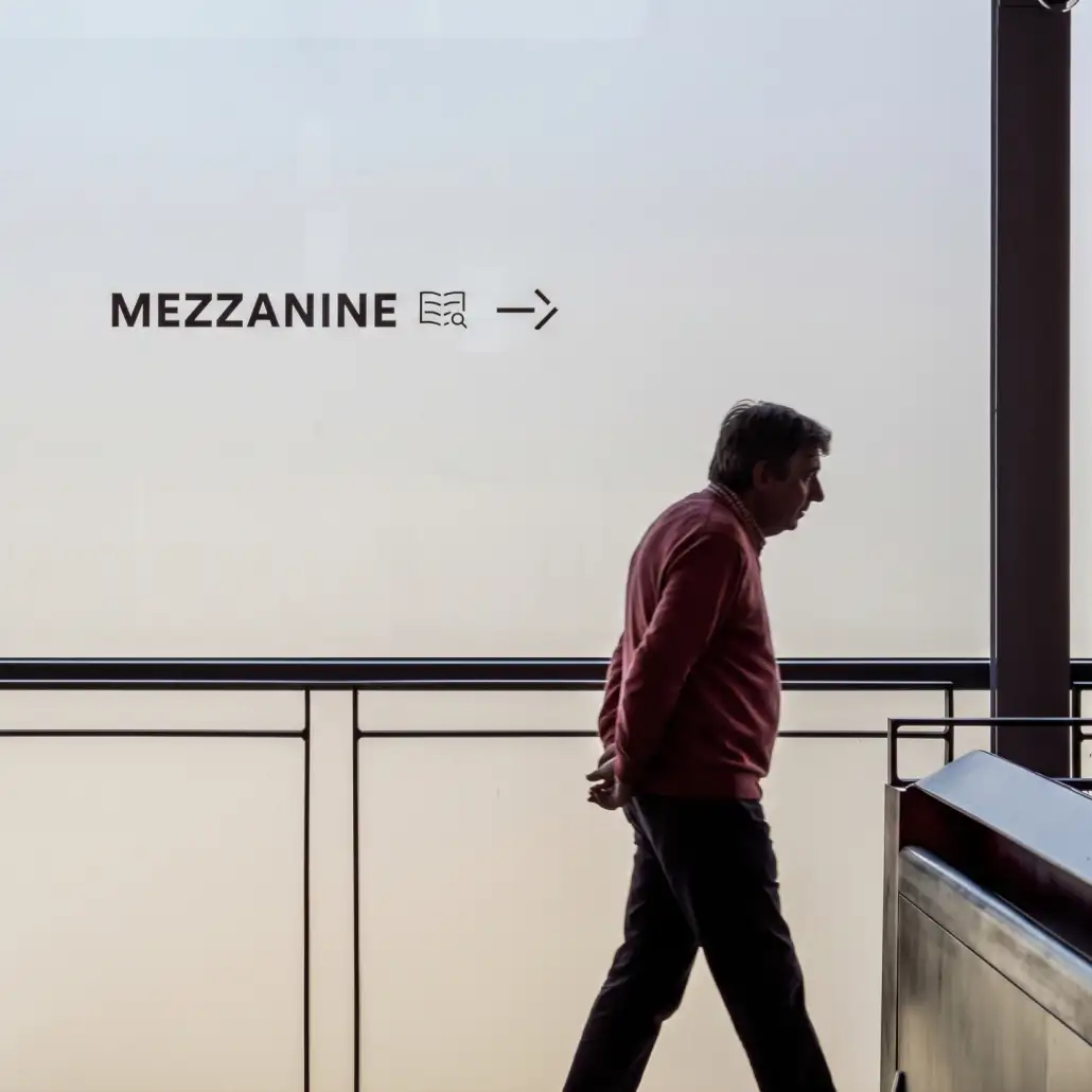
Finding your feet at Storyhouse
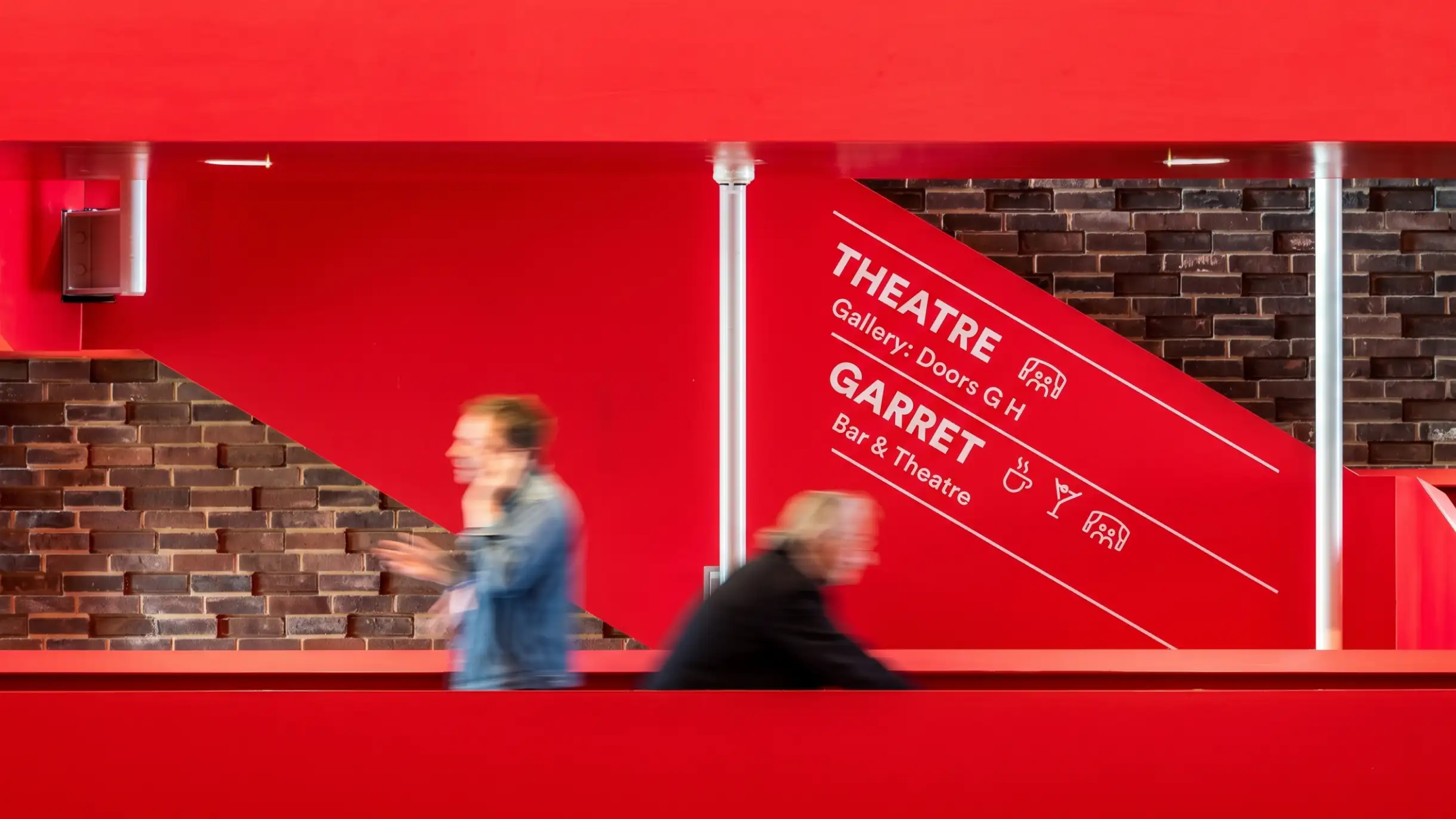
Storyhouse brings a theatre, cinema, library and bars together across several floors. We created a wayfinding system with clear destination names and bespoke icons inspired by its identity. The signs help visitors move around while letting the Art Deco interiors speak for themselves.
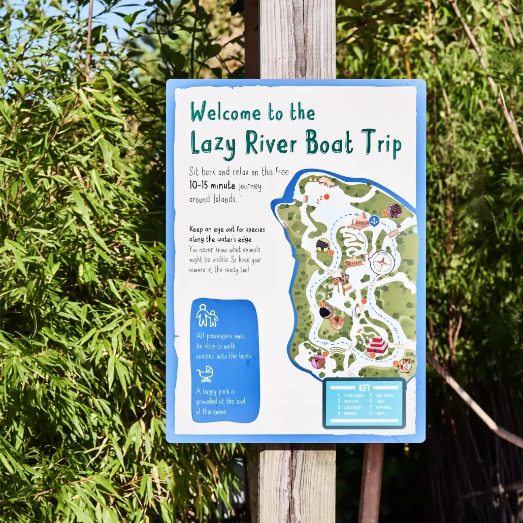
A wilder way around Chester Zoo
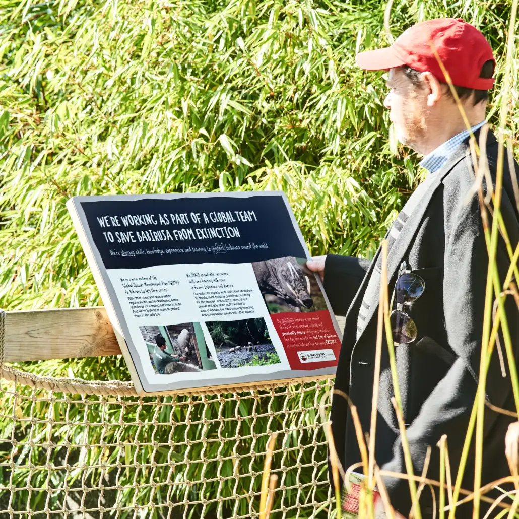
Chester Zoo has a lot to explore, so the signage needs to help without getting in the way of the experience. For the Islands project, we designed maps and signage as part of a wider interpretation scheme, using clear visual cues and bespoke illustration to help visitors get their bearings.
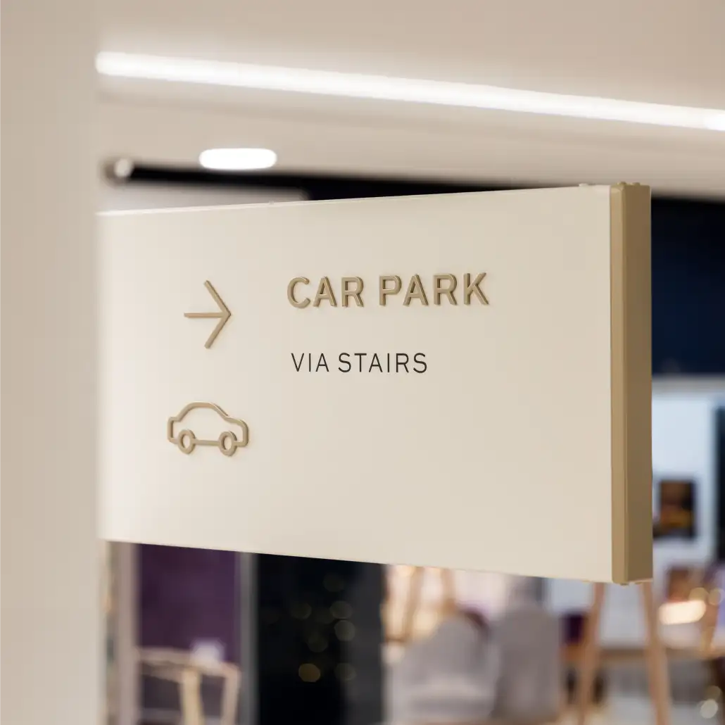
Clear routes through Eastgate Square
Years of signage had built up across Eastgate Square, making the shopping centre harder to navigate than it needed to be. We stripped things back and created a clear and elegant wayfinding system that reduces visual clutter and carries the new identity through the visitor journey.
Got people heading the wrong way?
Tell us about your space and what people need to find.
FAQs


Ideally while you’re planning the space, so signage can be considered alongside the layout and interiors. We can also help once a building is open.
Yes. We can review what’s working, find the gaps and bring separate signs into one clear system.
No! We work on spaces of different sizes, from workplaces and hospitality venues to visitor attractions. The number of signs depends on what people need to find.
We work with trusted specialist makers and installers, and stay involved as the designs are brought to life.

Book in a chat to see if we're a good fit.
