


From shopping centre to city-centre destination
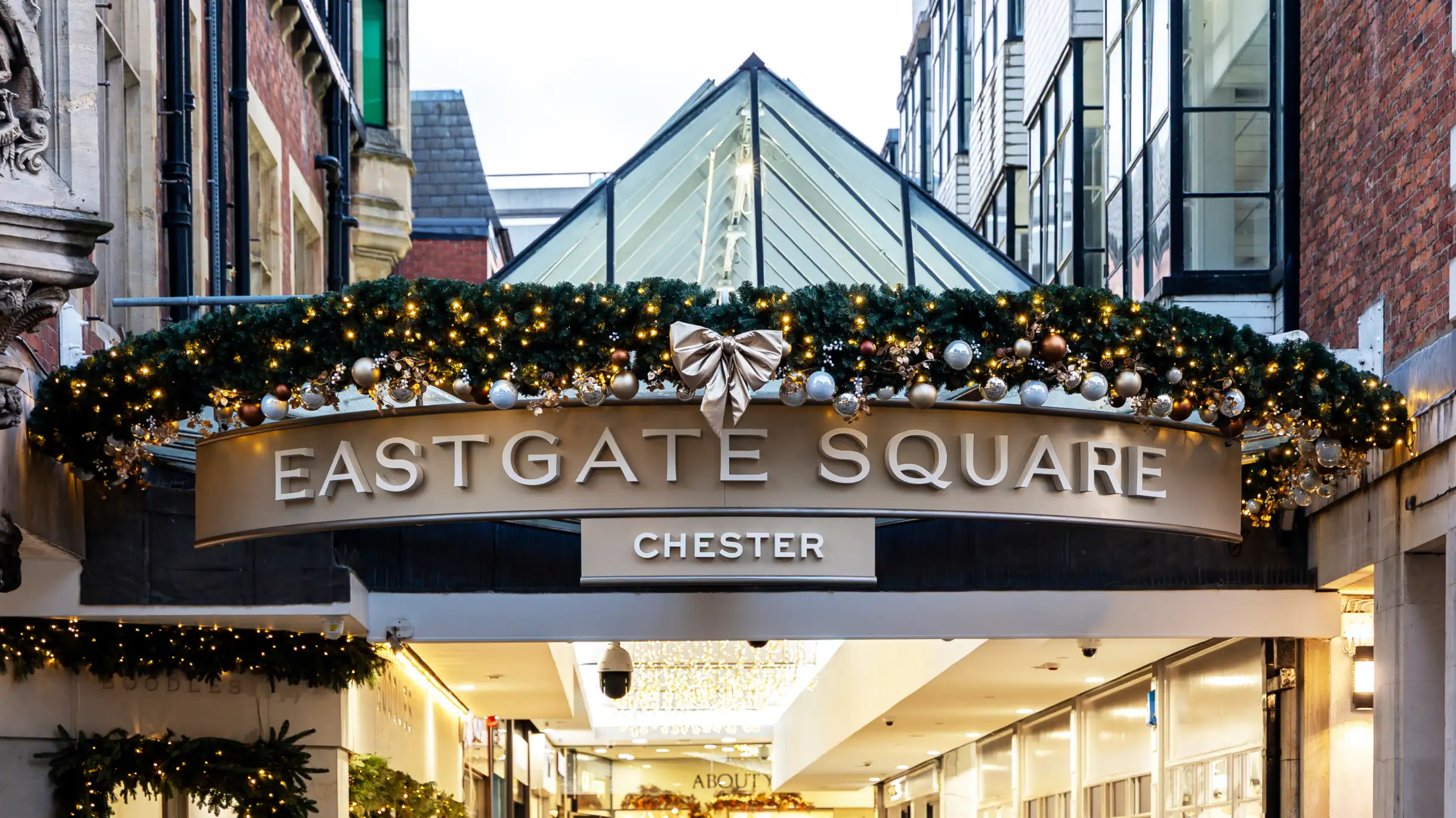
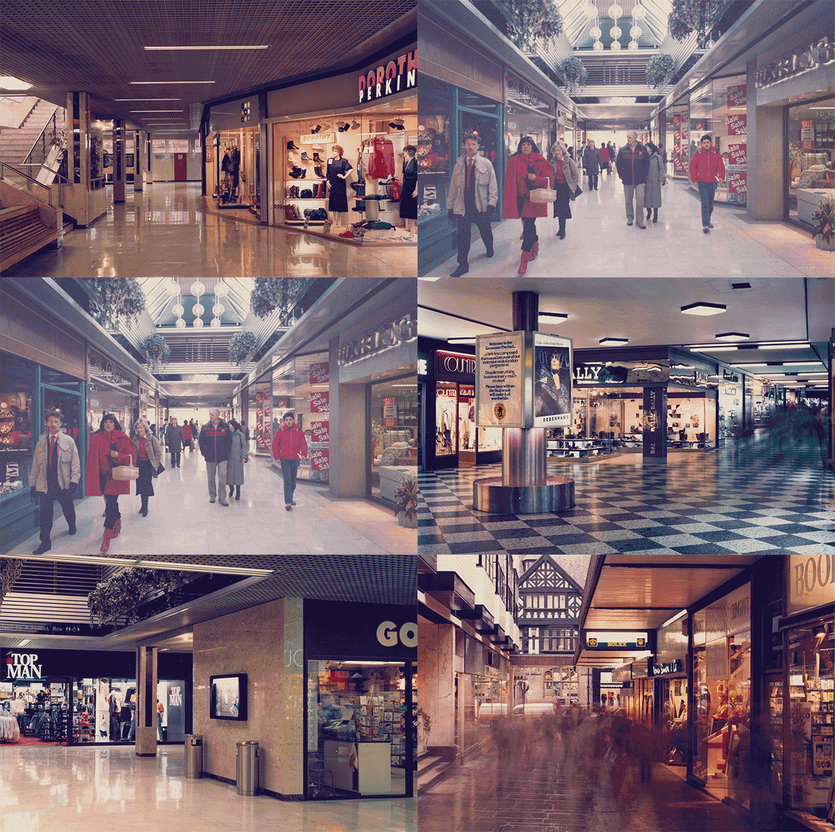
Eastgate Square sits right in the middle of Chester, but the former Grosvenor Shopping Centre wasn’t making the most of its position. Following a change in ownership, the brief was to reposition the centre to attract a higher calibre of brands and give people more reason to spend time there.
We worked across naming, brand identity and wayfinding to change how the centre looked, felt and functioned. That meant stripping away years of visual clutter and creating an identity that could sit confidently alongside high-end brand names.
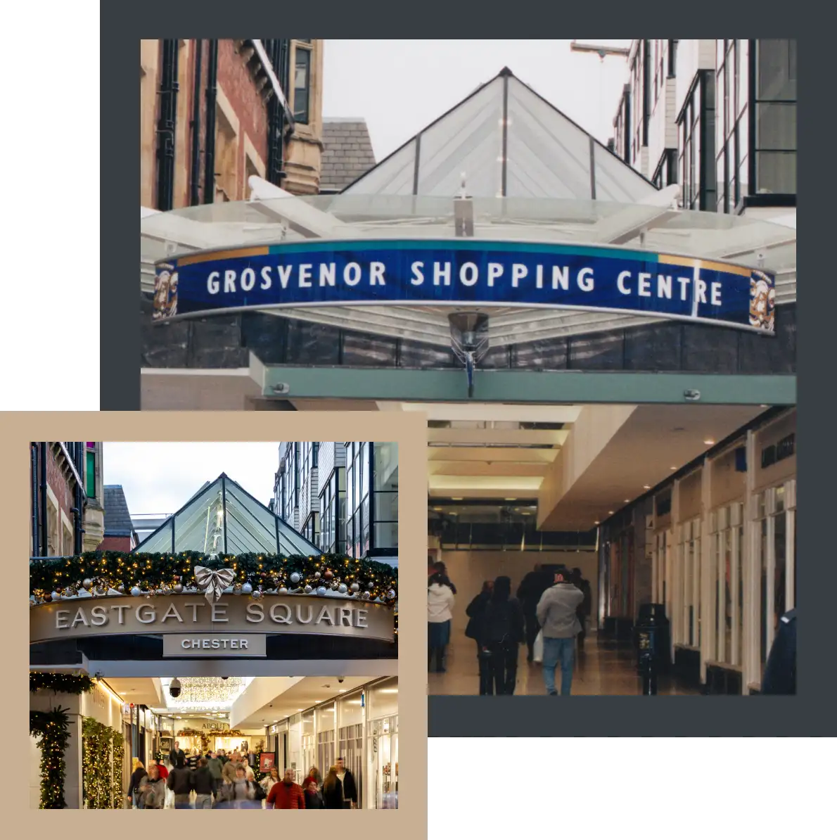
A new name for a new chapter
The Grosvenor name was tied to the centre’s previous ownership, meaning it couldn’t be carried forward. We started by looking at what could come next.
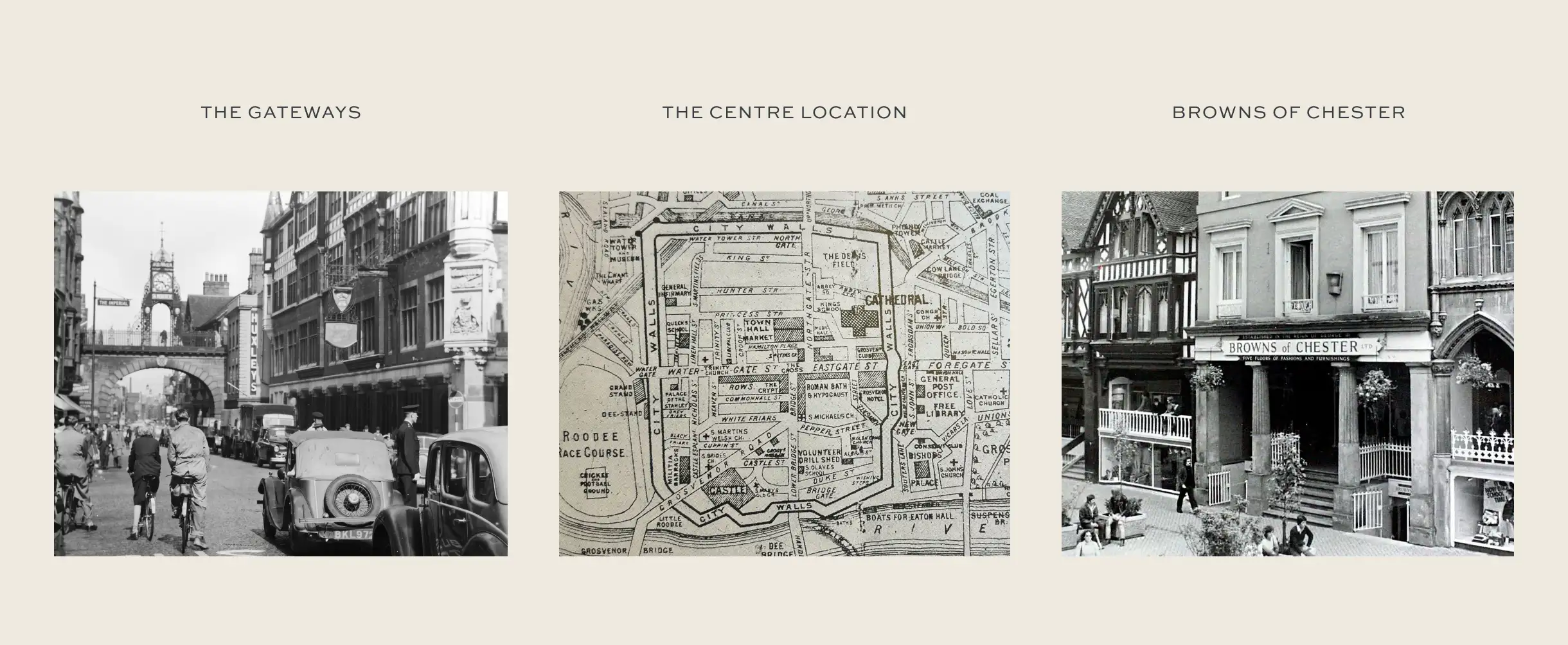
Chester gave us plenty to work with. We dug through the history of the site, its streets and the buildings around it, exploring routes connected to everything from its Roman past to Browns of Chester and the old Exchange.
The final name, Eastgate Square, puts the focus on its place in the city. A square has always been somewhere people meet, but there’s another nice bit of geography in there too: the centre sits in the middle of a square created by four prominent Chester landmarks – The Cross, Eastgate Clock, St Michael’s Church and the Roman amphitheatre.
A typeface of its own
The identity needed to feel right for the calibre of brands Eastgate Square wanted to attract.
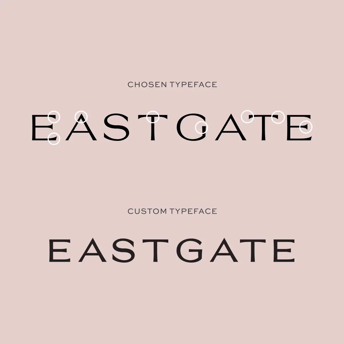
We took an existing typeface and made it theirs, with details influenced by the lettering on the iconic Browns of Chester sign. The finished typeface is completely unique to Eastgate Square.
Working with what was already there
The building itself gave us the beginnings of the colour palette.
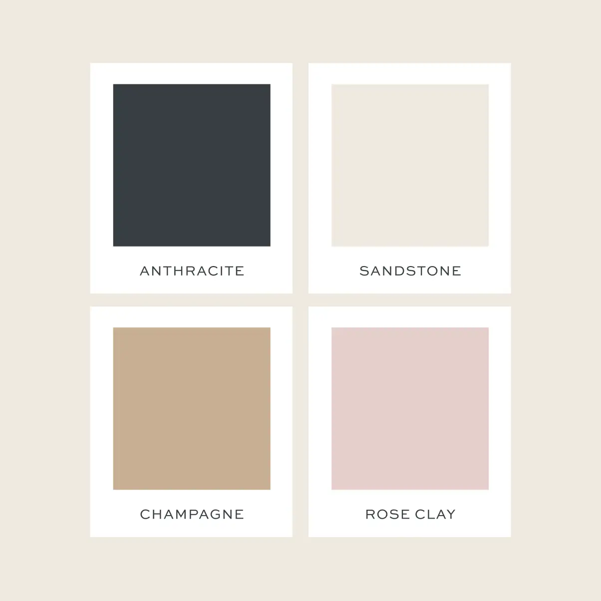
Cream tiles and warm stone tones already run through the centre, so rather than fighting the architecture, we worked with it. Sandstone, anthracite, champagne and rose clay create something warmer and more considered, while still feeling fresh against the existing space.
The custom typography and restrained palette give it enough confidence to hold its own, without competing with the shopfronts it sits beside.


Less signage. Better directions.
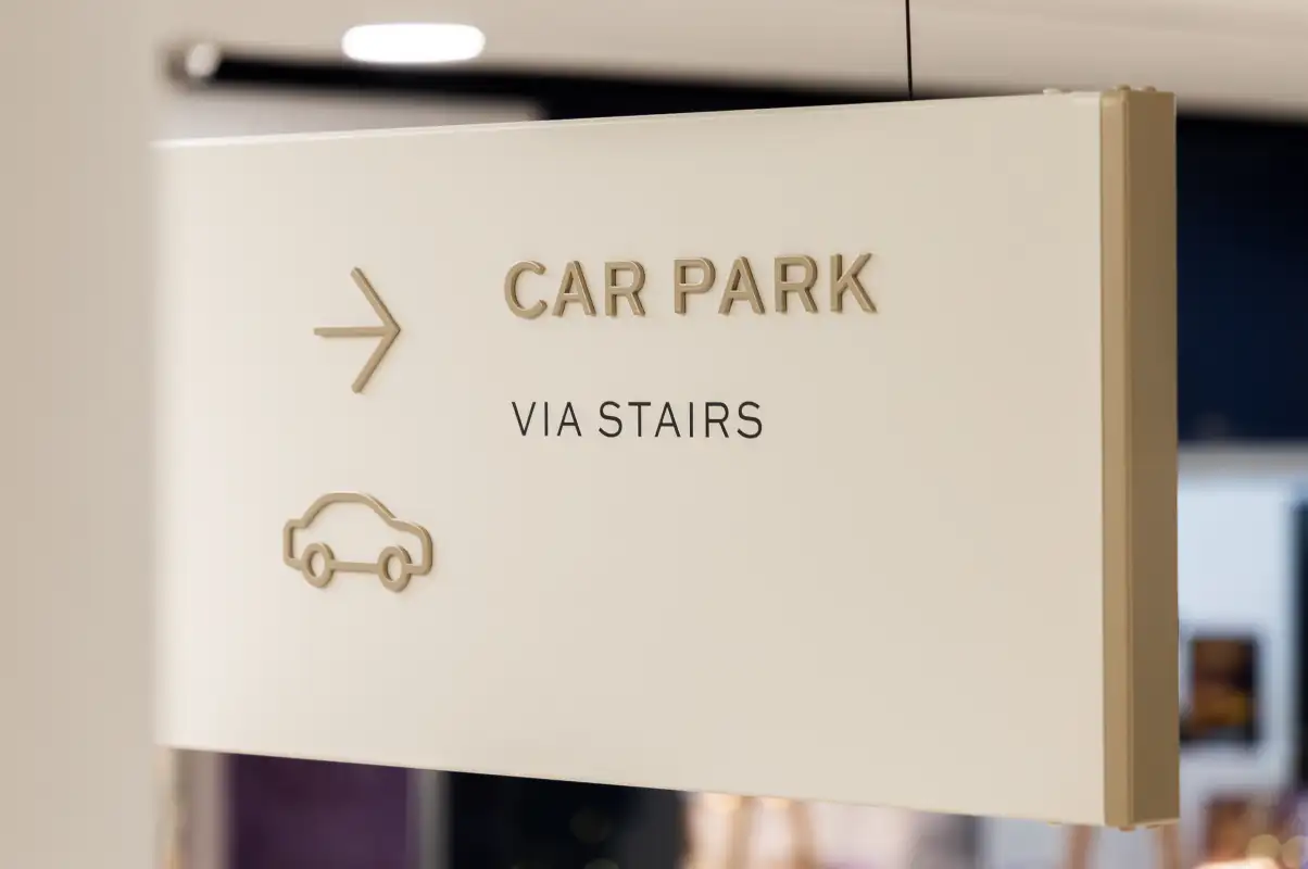
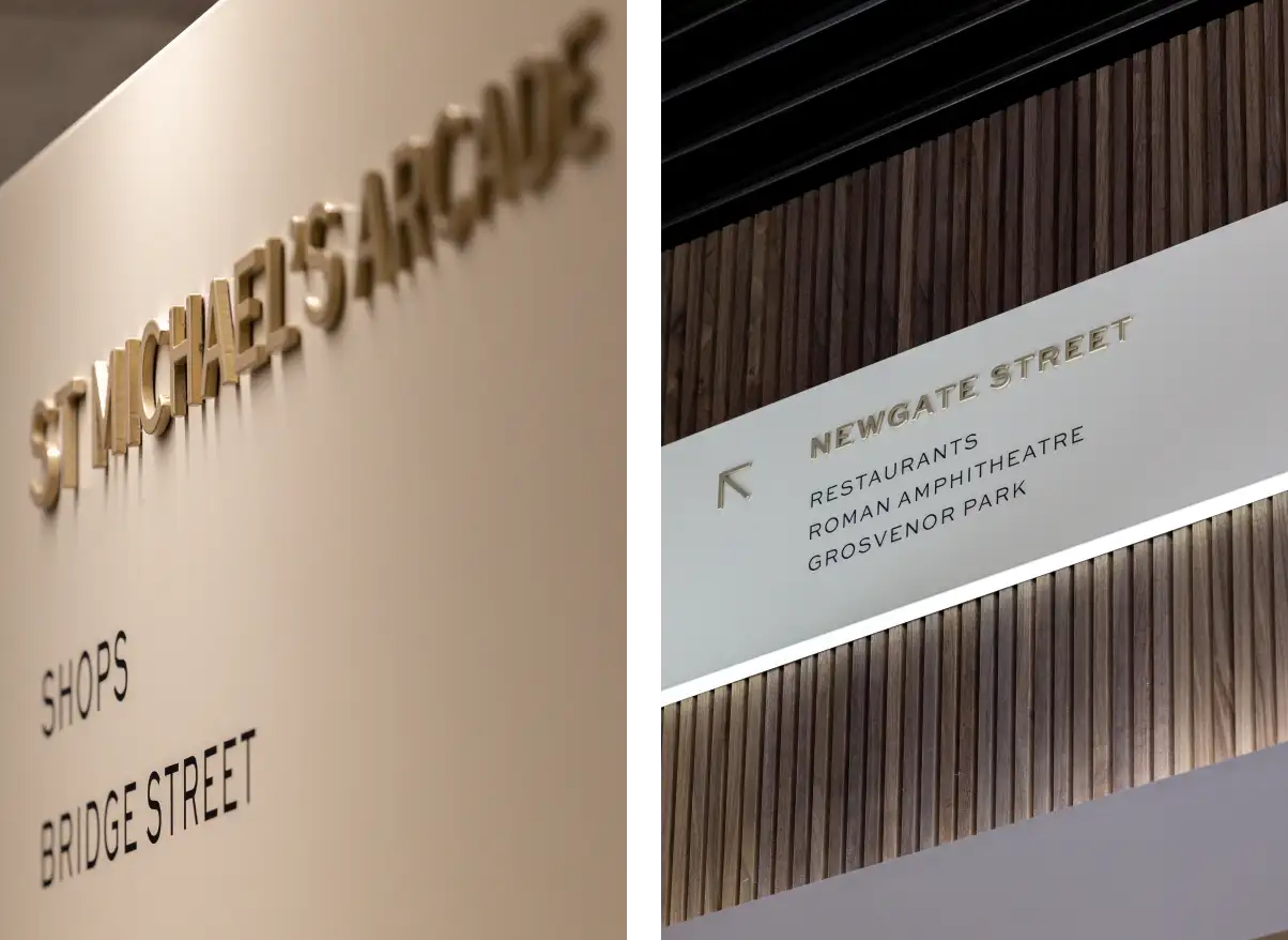
Over the years, the signs had piled up. We completed a full signage audit, walking every route and entrance to work out what could go, what needed updating and where information would be useful. Then we built one clear wayfinding system around the new identity.
Removing things was just as important as adding them. With less visual noise and clearer directions, the branding became part of the visitor journey rather than something you only saw above the entrance.
Make the entrances count
Eastgate Square has several ways in, each with a different amount of space to play with.
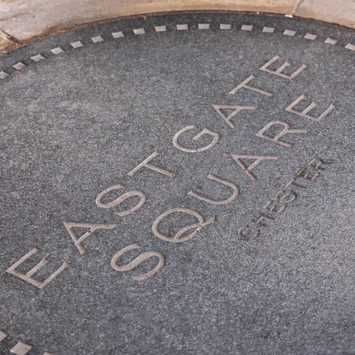
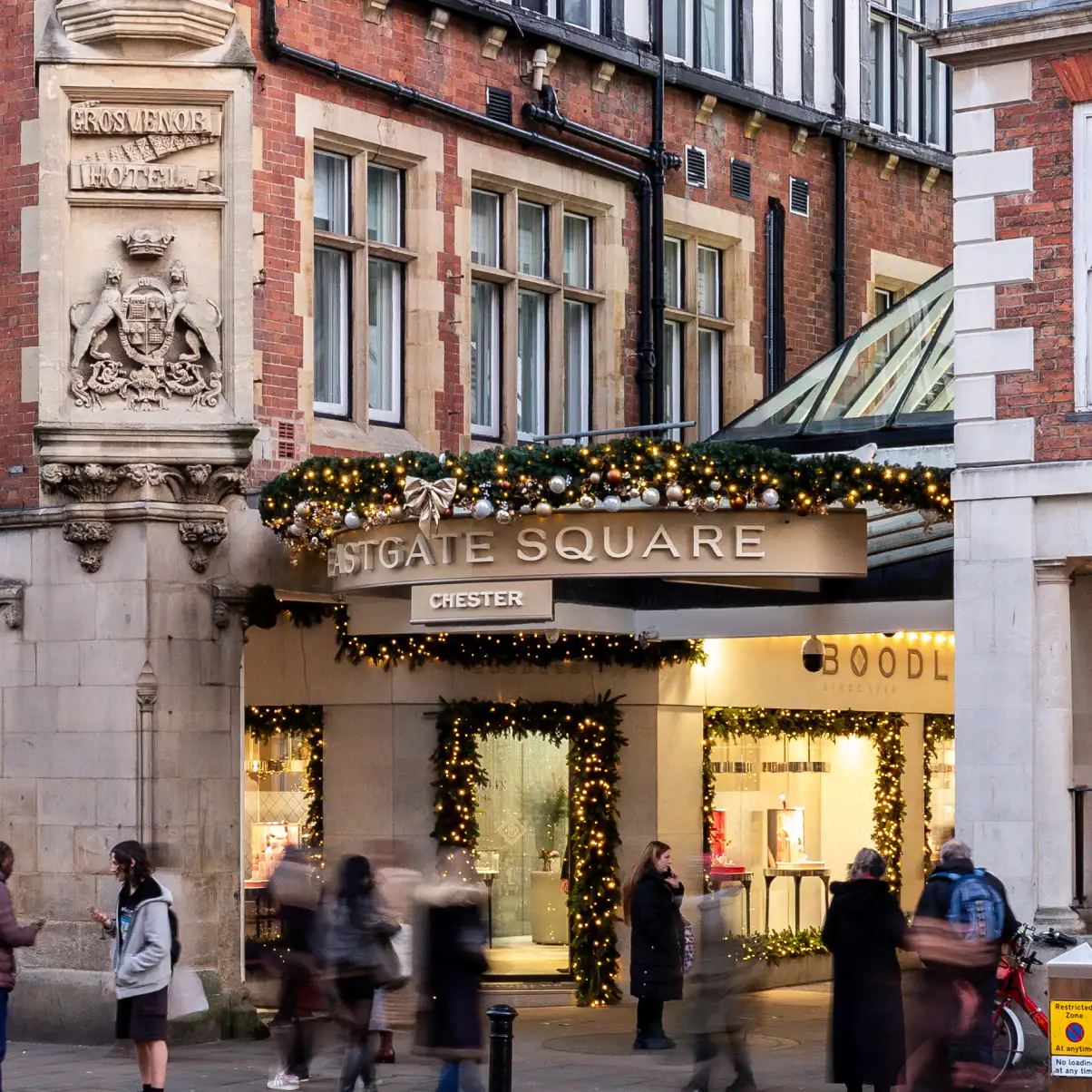
Rather than forcing the same sign into every location, we created a family of entrance signage that could adapt. Larger lettering improves visibility where the old signs were getting lost, while powder-coated finishes, raised details and stone floor plaques give the identity a more permanent presence.
Finding the shops. And your car.
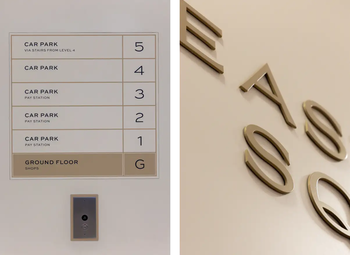
The wayfinding didn’t stop at the shops. We extended the system throughout the car park, introducing clearer floor identification and directions to shops, lifts, stairs, pay stations and exits. The aim was simple: wherever somebody entered the centre, the next move should be obvious.

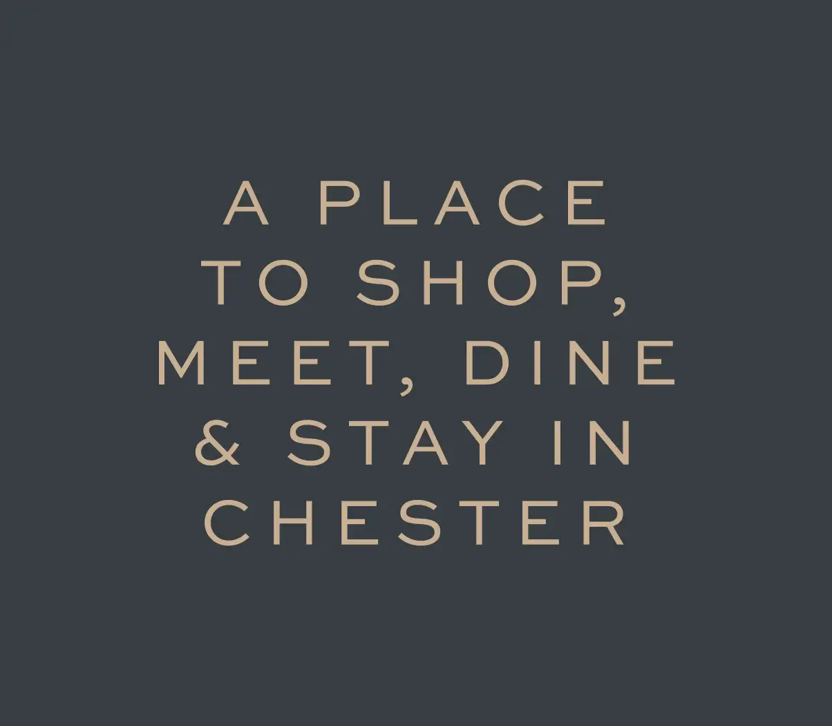
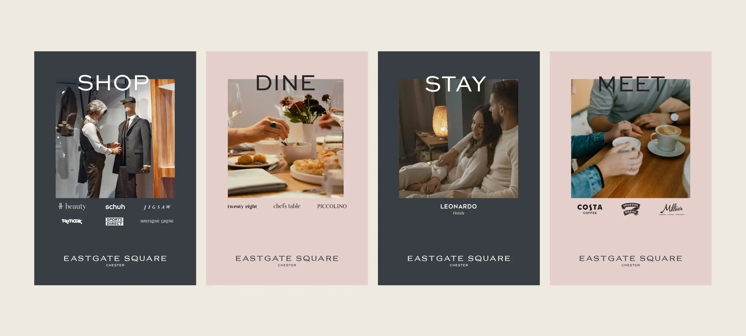
Shop. Dine. Stay. Meet.
The rebrand also gave us a chance to rethink how Eastgate Square talks about the reasons to spend time there.
Four words covered quite a lot: shopping, food, the hotel, coffee, catching up and generally having a reason not to head straight home.
Used with the new typeface and colour palette, the idea showed how the identity could move beyond signs and into campaigns – presenting Eastgate Square as somewhere to spend time in Chester, not just somewhere to pass through.

We worked with Stride on the renaming of Eastgate Shopping Centre as we wanted to work with a team that were creative with vision, but also really understood the importance of local community and heritage. They were incredibly passionate yet commercial, and we're delighted with the end result.

Lucy Elliott Martin Group, Owners of Eastgate Square

Book in a chat to see if we're a good fit.
