


Wayfinding for more than one million customers a year
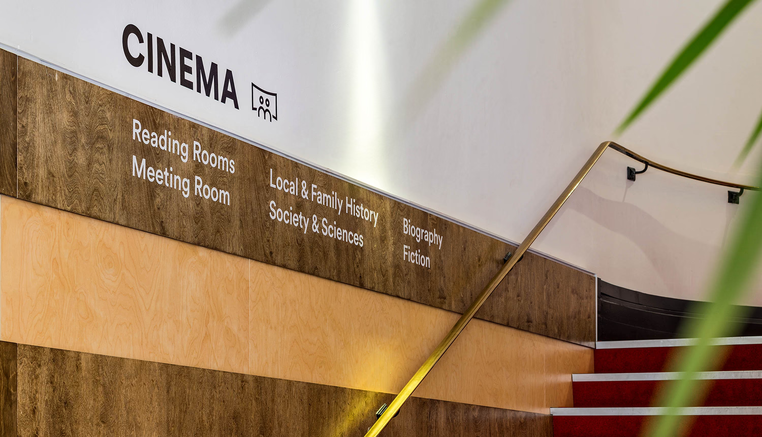
Making a complex building easy to navigate
Storyhouse is a big, layered building with a lot happening under one roof. Our job was to make it easy to navigate without filling its beautiful Art Deco interiors with intrusive signage.
Before the venue opened, we worked alongside the architectural and interior design teams to develop a wayfinding system that helped visitors find theatres, bars, toilets, library, meeting rooms and other spaces across multiple floors, while feeling like a natural part of the building.

Working with the building
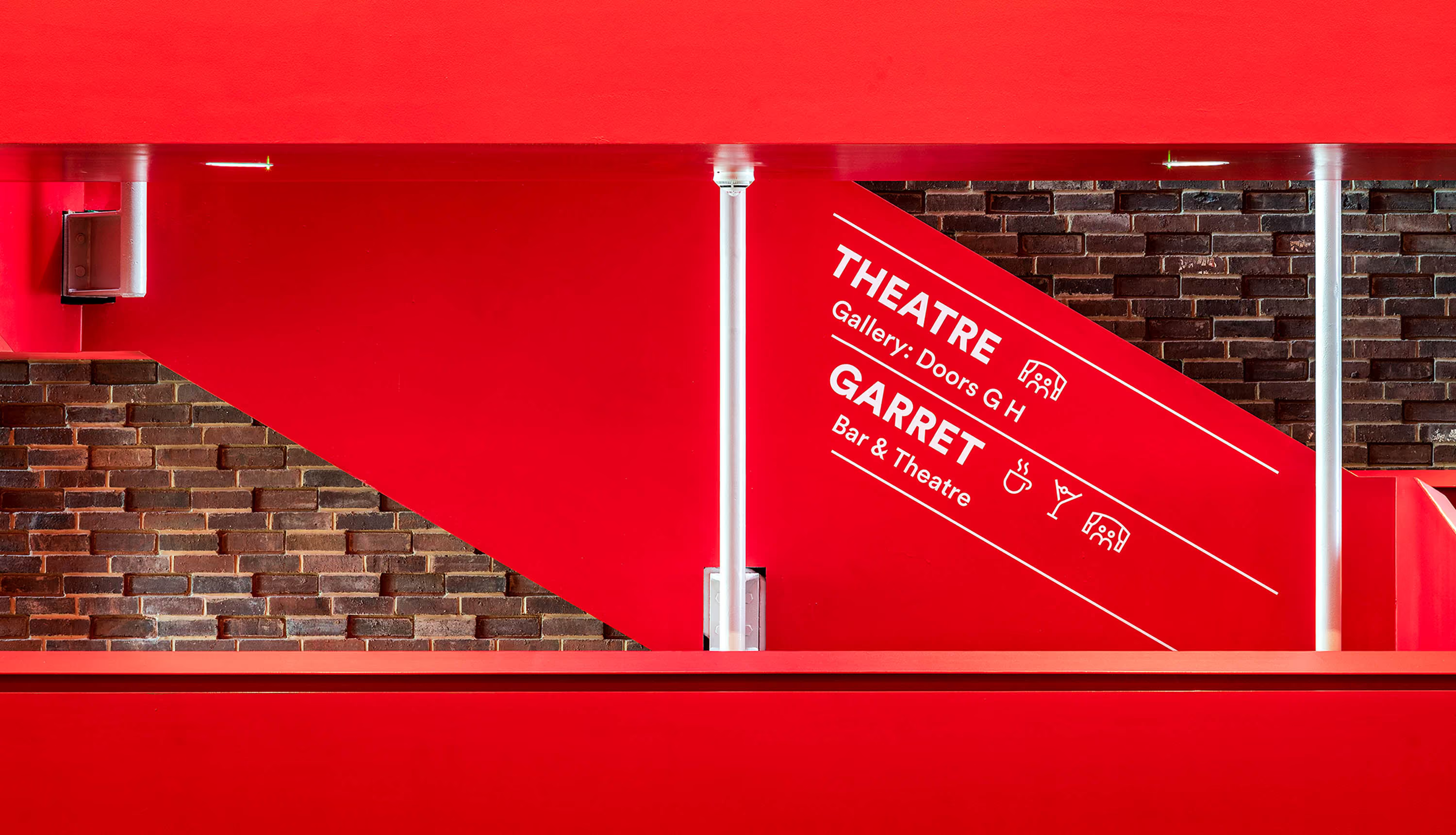
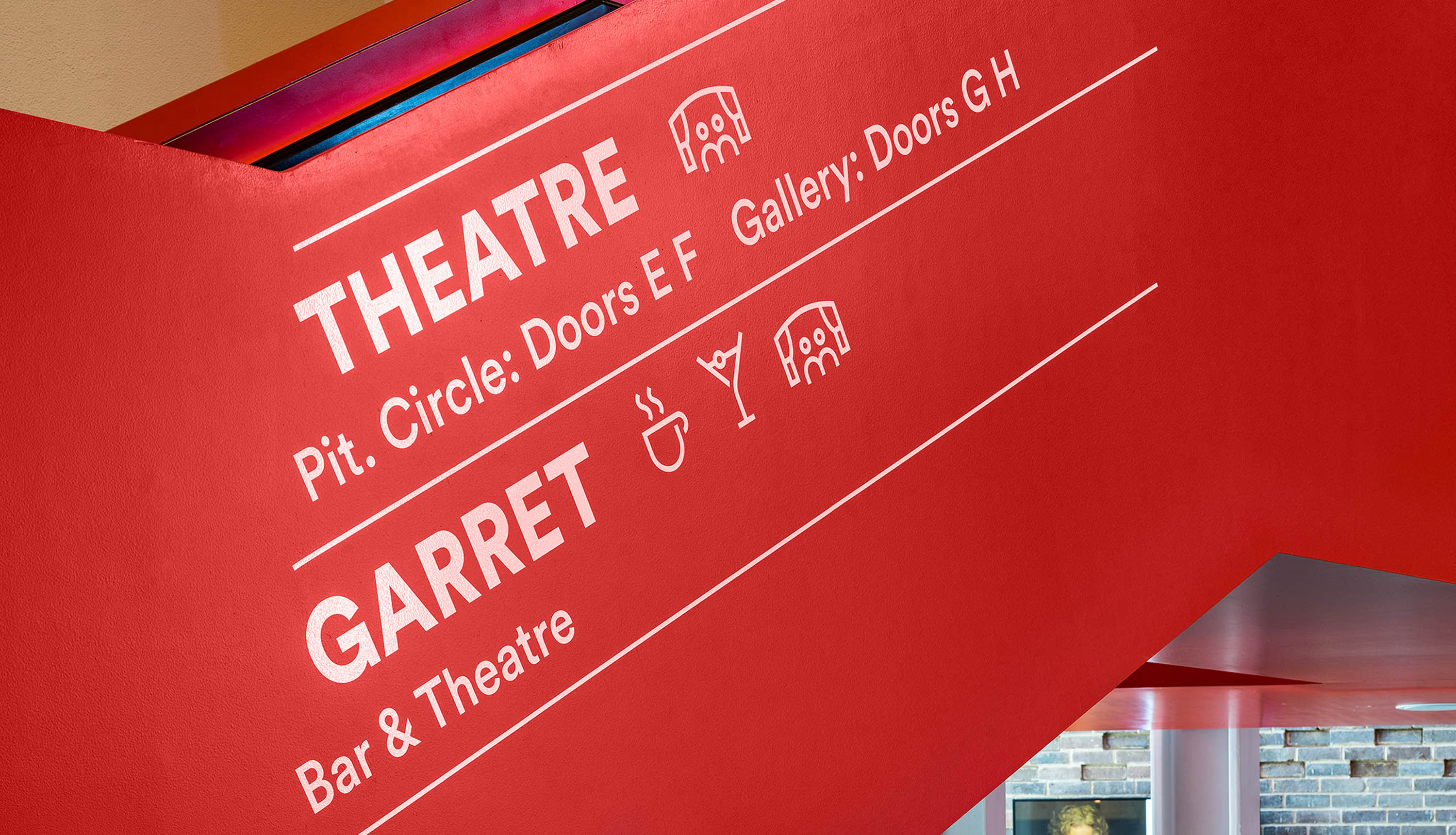
Storyhouse is a big, layered building with a lot happening under one roof. Our job was to make it easy to navigate without filling its beautiful Art Deco interiors with intrusive signage.
Before the venue opened, we worked alongside the architectural and interior design teams to develop a wayfinding system that helped visitors find theatres, bars, toilets, library, meeting rooms and other spaces across multiple floors, while feeling like a natural part of the building.
Creating a system people could follow
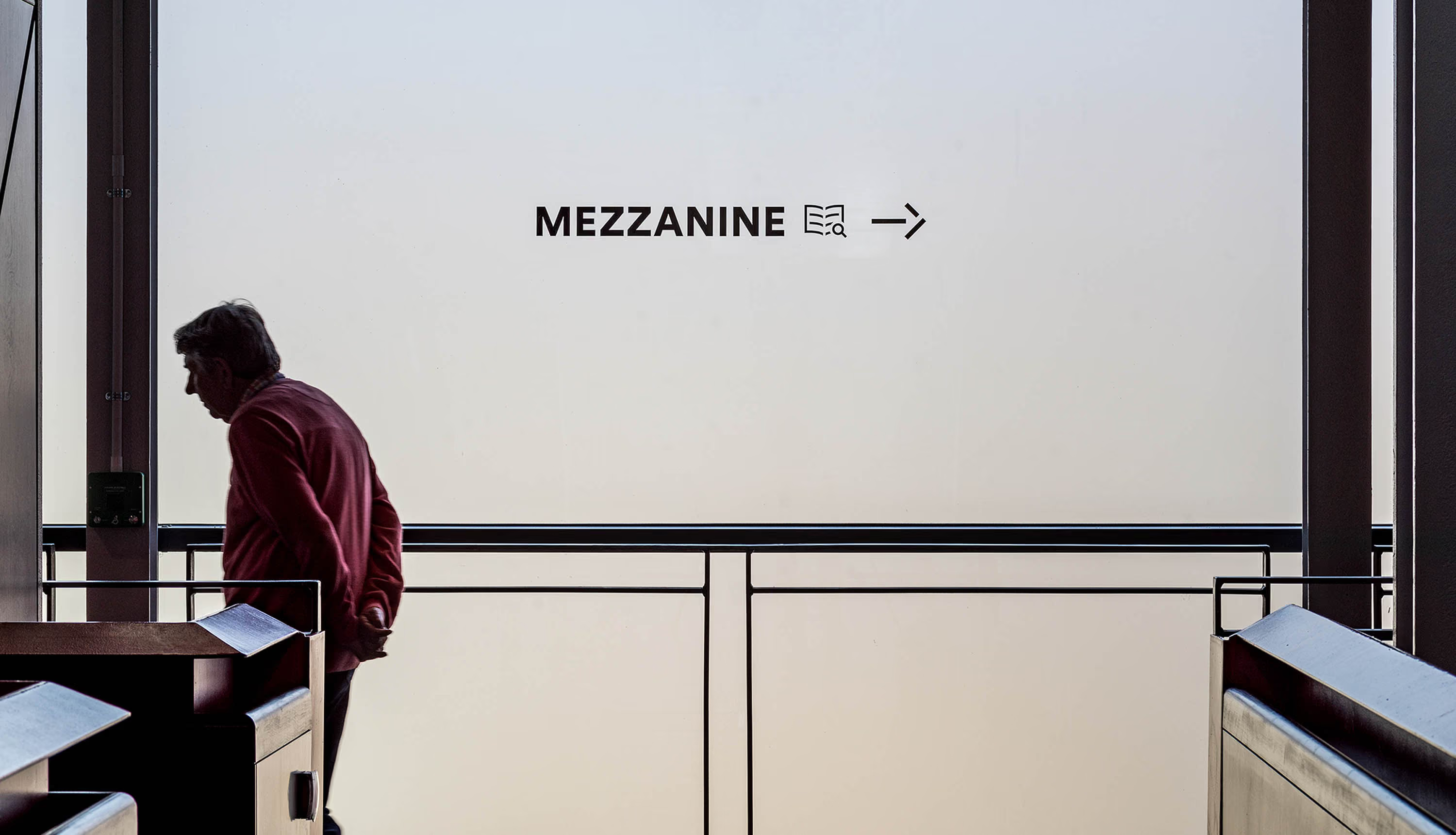
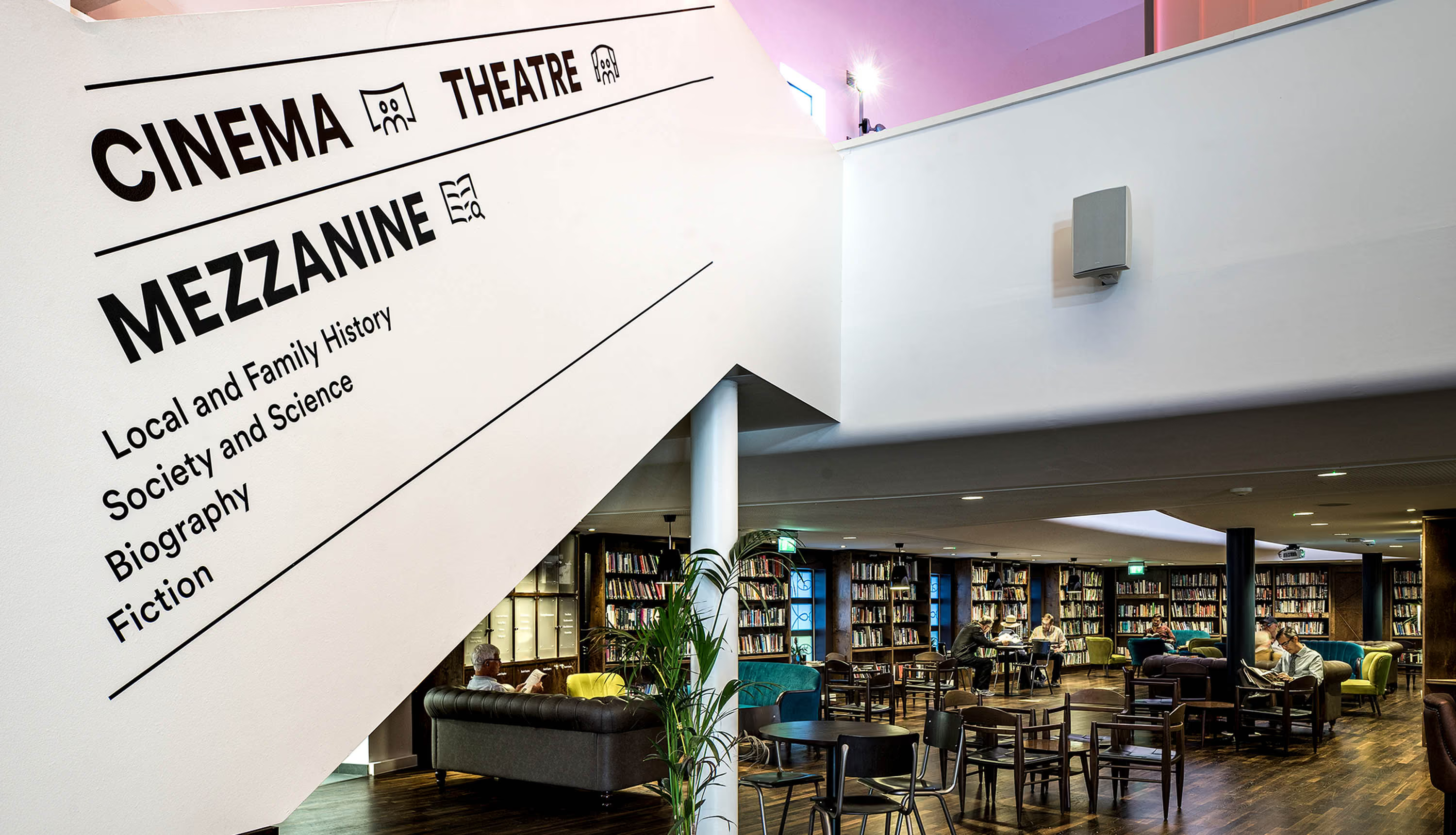
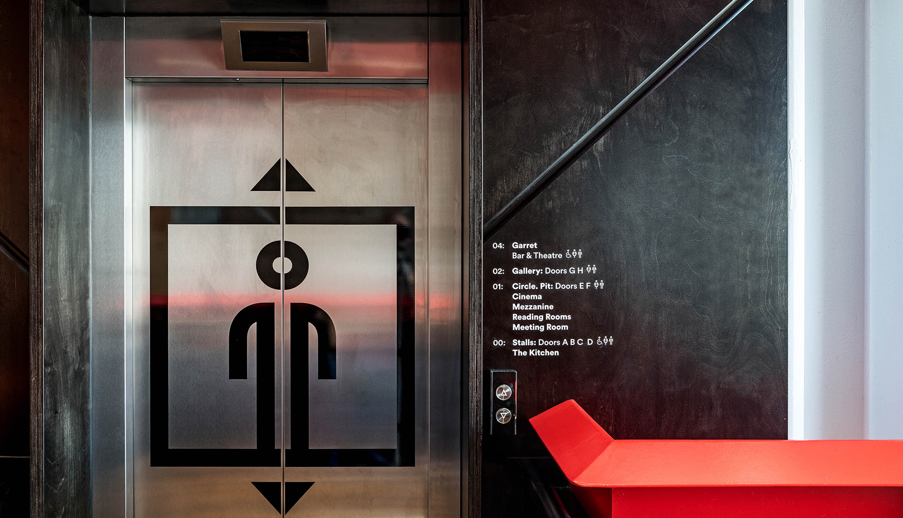
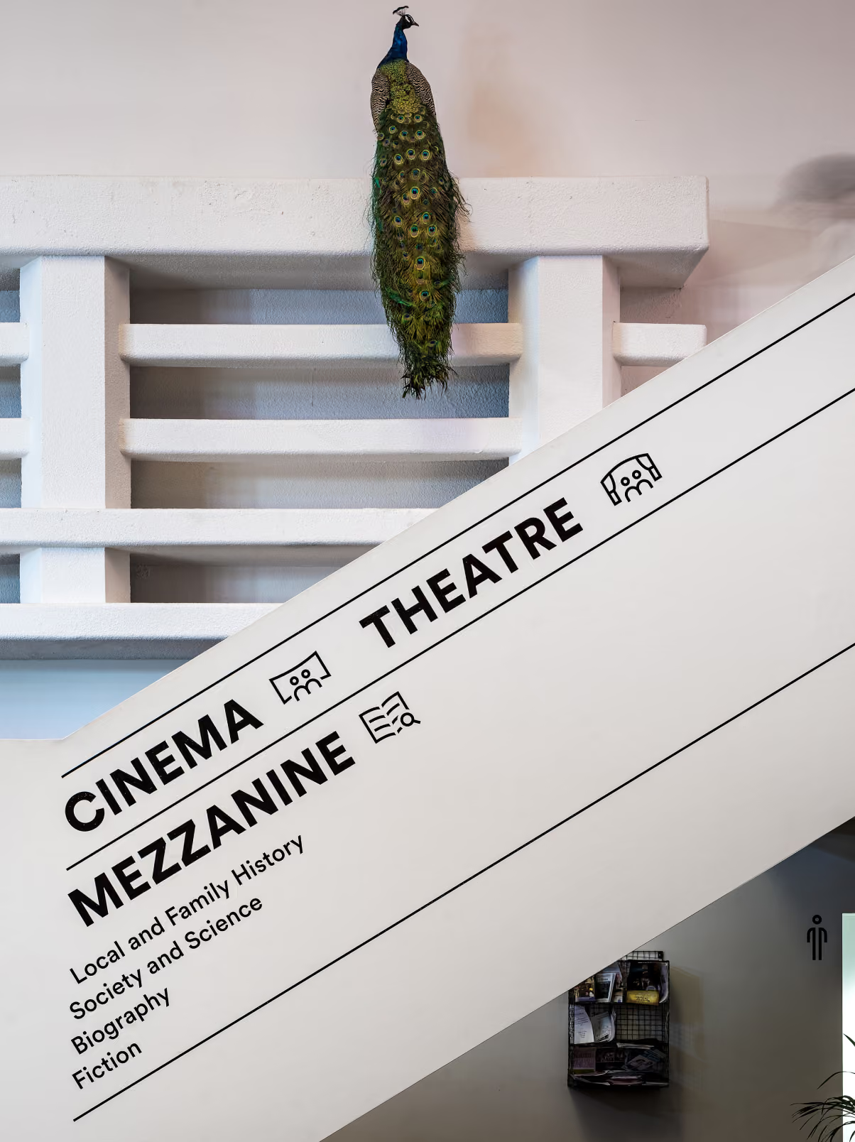
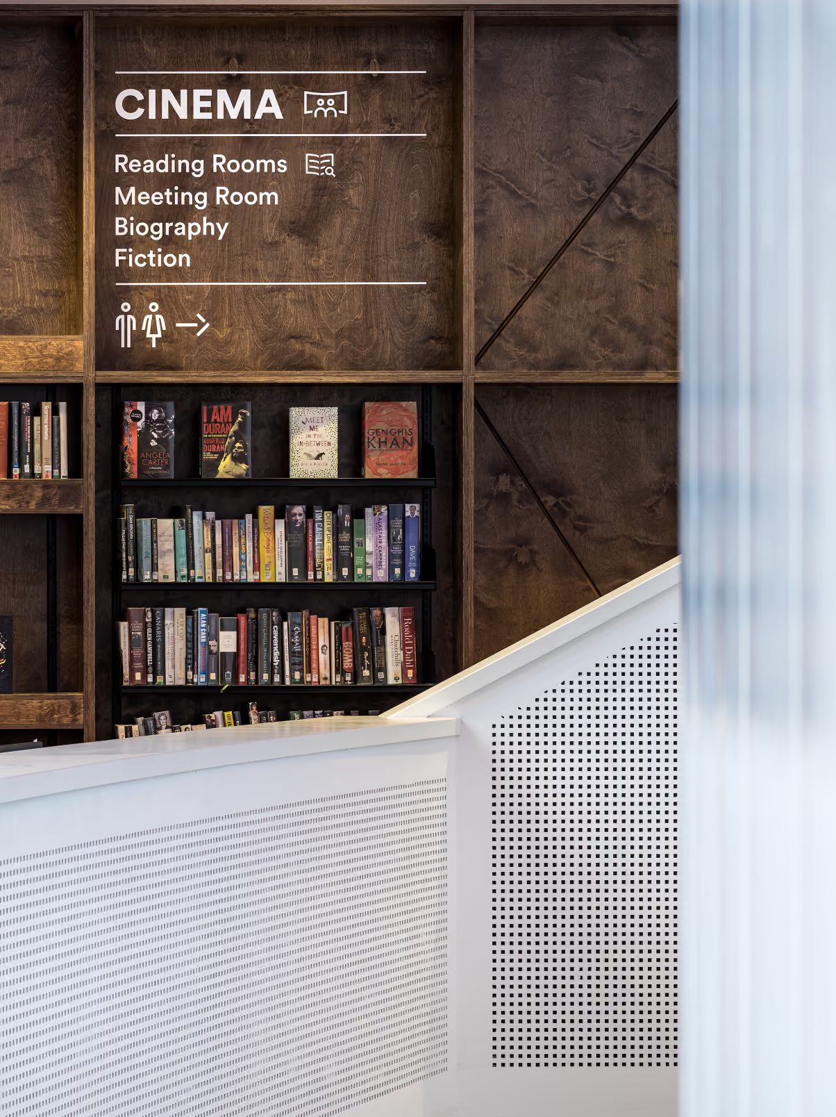
We developed a clear hierarchy for the wayfinding, distinguishing between primary destinations, secondary spaces and supporting information.
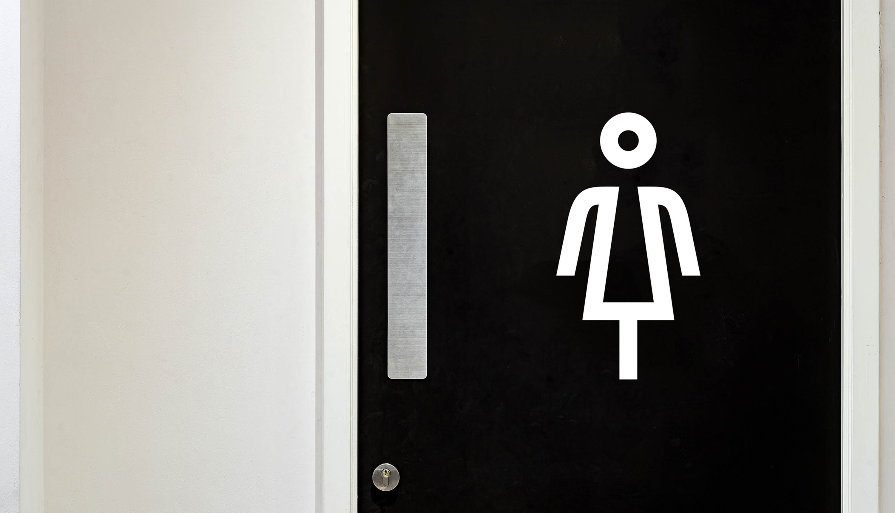
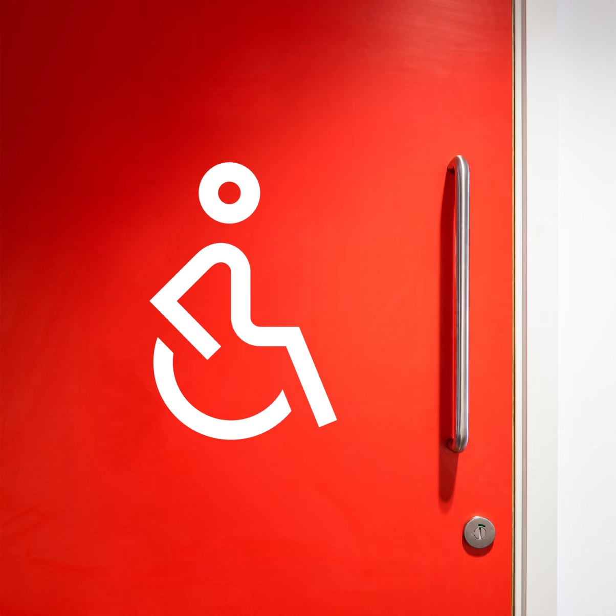
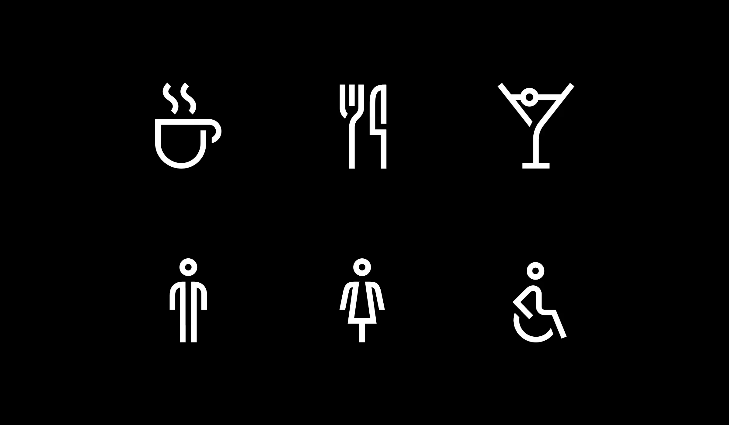
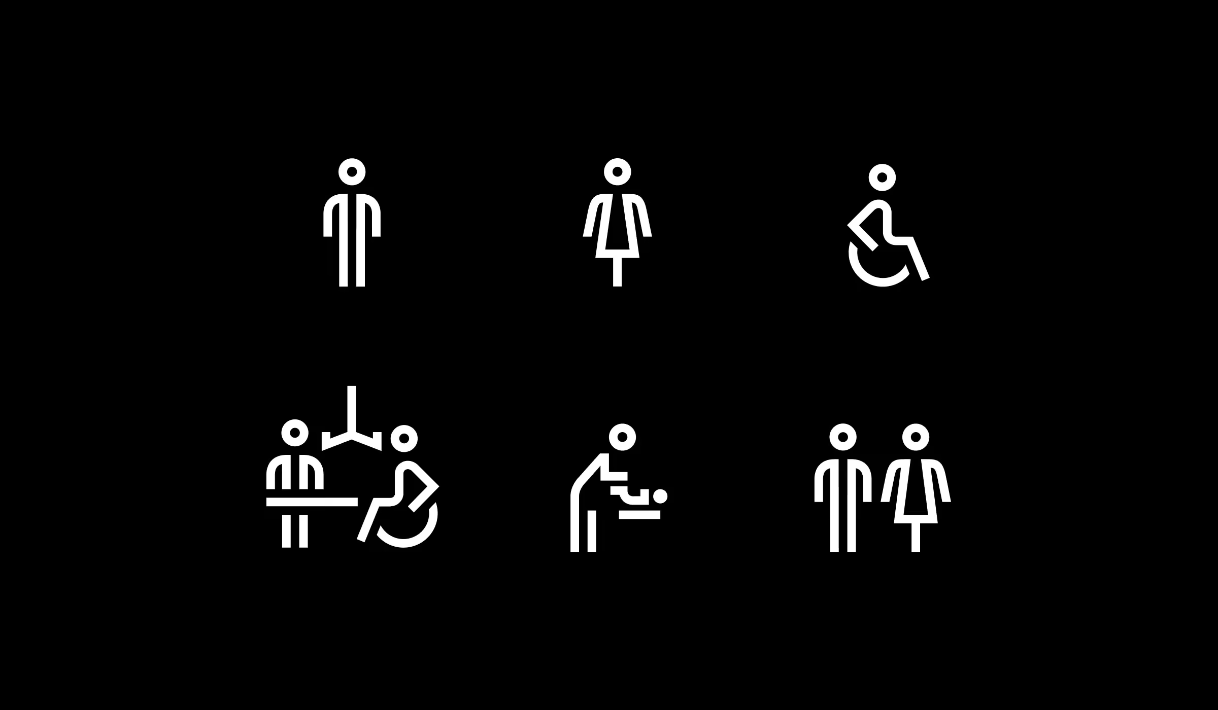
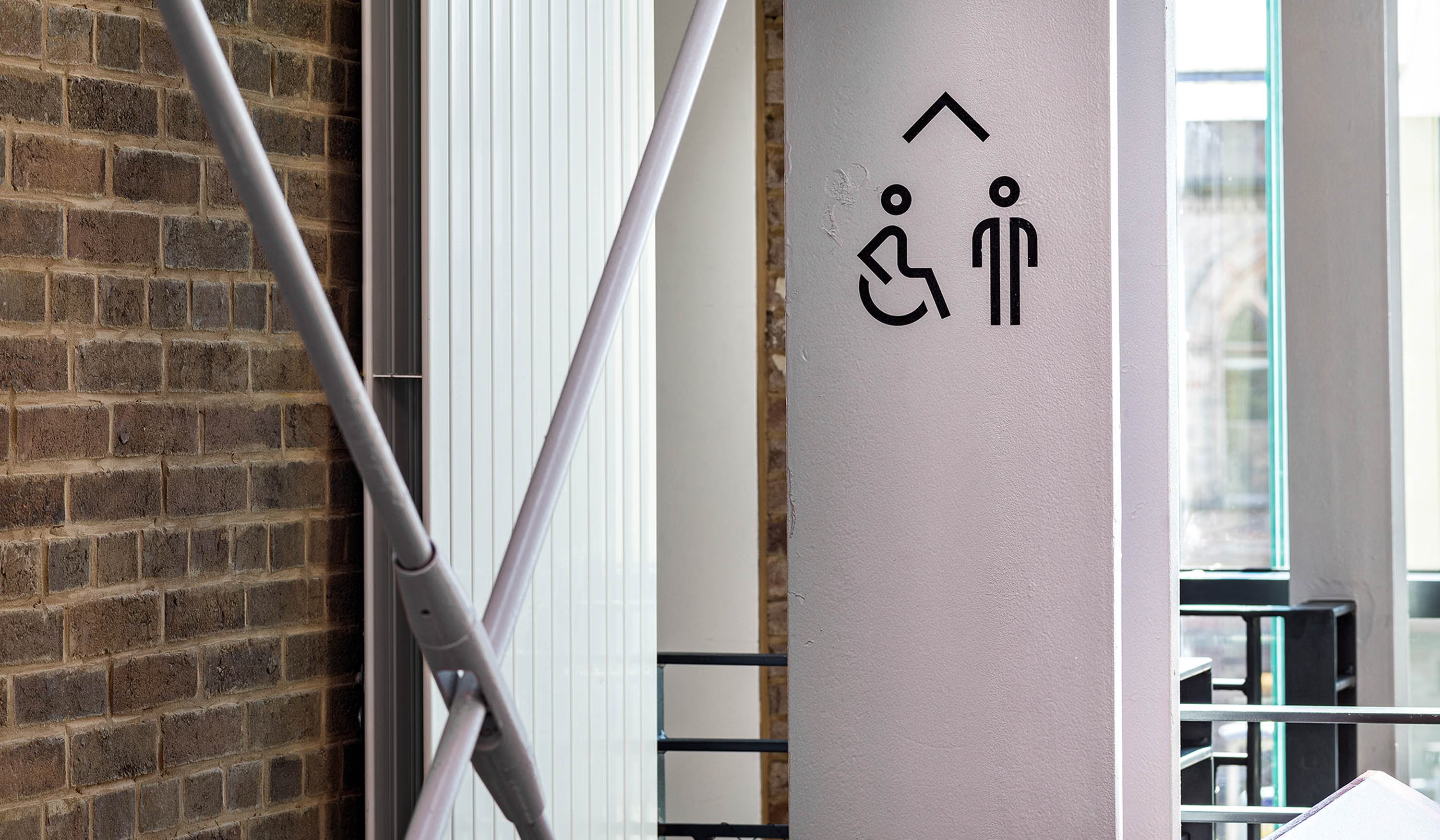
We also designed a bespoke set of icons for key facilities and destinations, taking visual cues from Storyhouse’s stencil-style logo so they felt like a natural extension of the identity rather than a generic signage set.
Just as importantly, we worked through the building itself to decide where information was really needed. The result feels deliberately understated. Instead of looking like a layer added afterwards, the signage sits nicely within the architecture and lets the building remain the star.
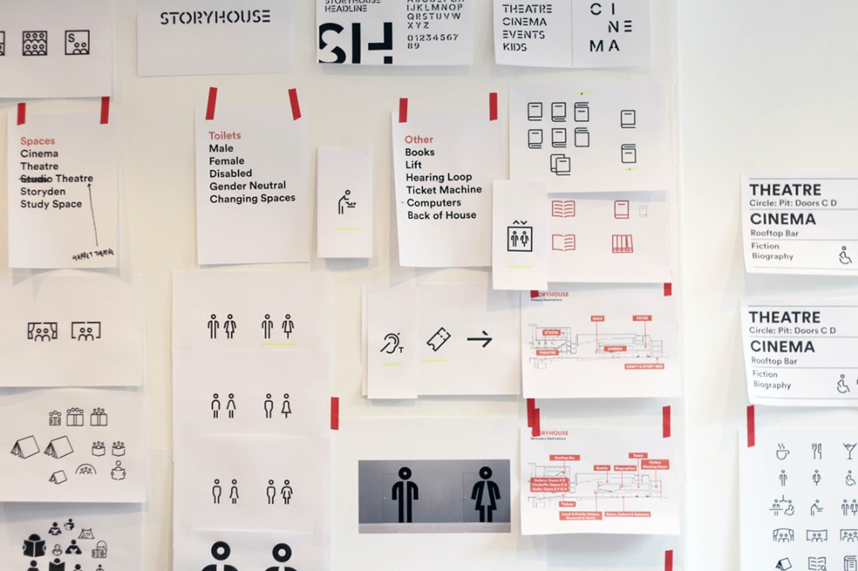
!["Slide reading 'There are only three types of destination: Primary: Theatre, Secondary: Rooftop Bar, Pictograms: [restroom icons]' on black background.](https://cdn.prod.website-files.com/6a1034094767c7aa26f40e94/6a16ff5feee56f95d9d1ed73_stride-storyhouse-vector-1%201.avif)
Helping visitors get their bearings
Not every bit of wayfinding needed to live on a wall. We also designed a fold-out map of the venue, giving visitors a simple overview of the different floors and spaces they could carry with them as they explored.
That mattered in a building designed to be discovered as much as navigated. The aim wasn’t to plaster every route with instructions, but to give people enough information to feel confident finding their own way around.

A relationship beyond signage
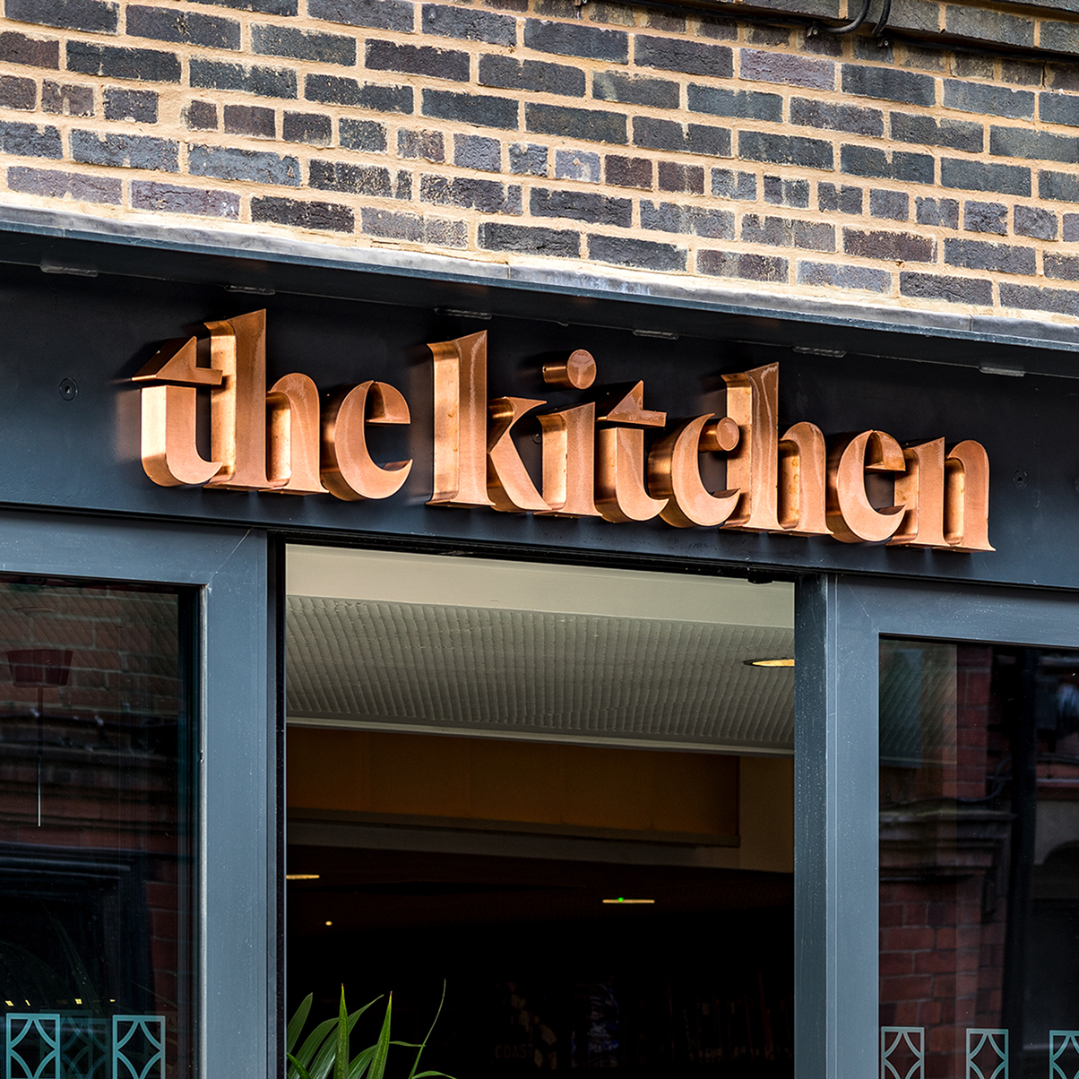
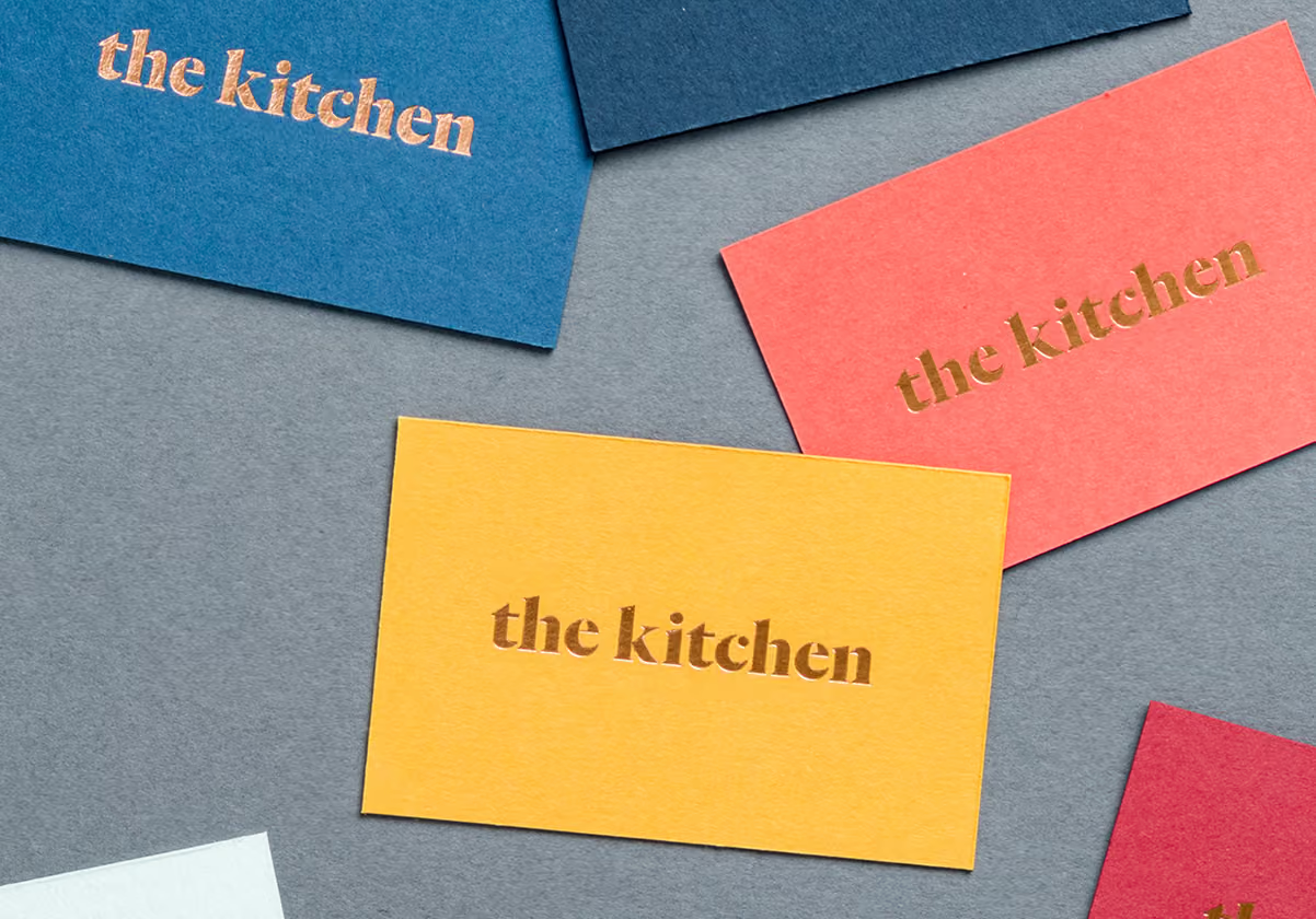
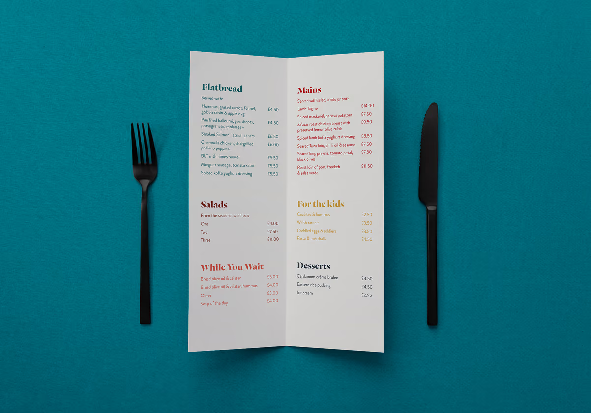
Our work with Storyhouse went well beyond the original wayfinding project. We branded its in-house restaurant, The Kitchen, creating an identity inspired by its Mediterranean and African-influenced menu, and went on to support the team with creative work throughout the venue. This included projects that ranged from applying seasonal poetry to the walls, to designing invitations for Storyhouse’s royal opening.
Different briefs, but the same principle each time: creating something useful and distinctive that feels completely at home in Storyhouse.

As we were getting ready to open Storyhouse, we asked Stride to work with us to produce practical but creative wayfinding signage throughout the building. We found the team brilliant to work with throughout the whole process, and two and a half years on we are pleased that their work is still here to help customers find their way around.
We have gone on to work with Stride for various other projects including our (very important!) invitations for a visit by Her Majesty the Queen and The Duchess of Sussex, and branding for our very first digital art commission. Each time, Stride have proven themselves to be a reliable, efficient and very talented bunch.

Jen Chapman, Head of Sales and Marketing

Book in a chat to see if we're a good fit.
