

Reviving a historic Liverpool pub with a bold, layered identity
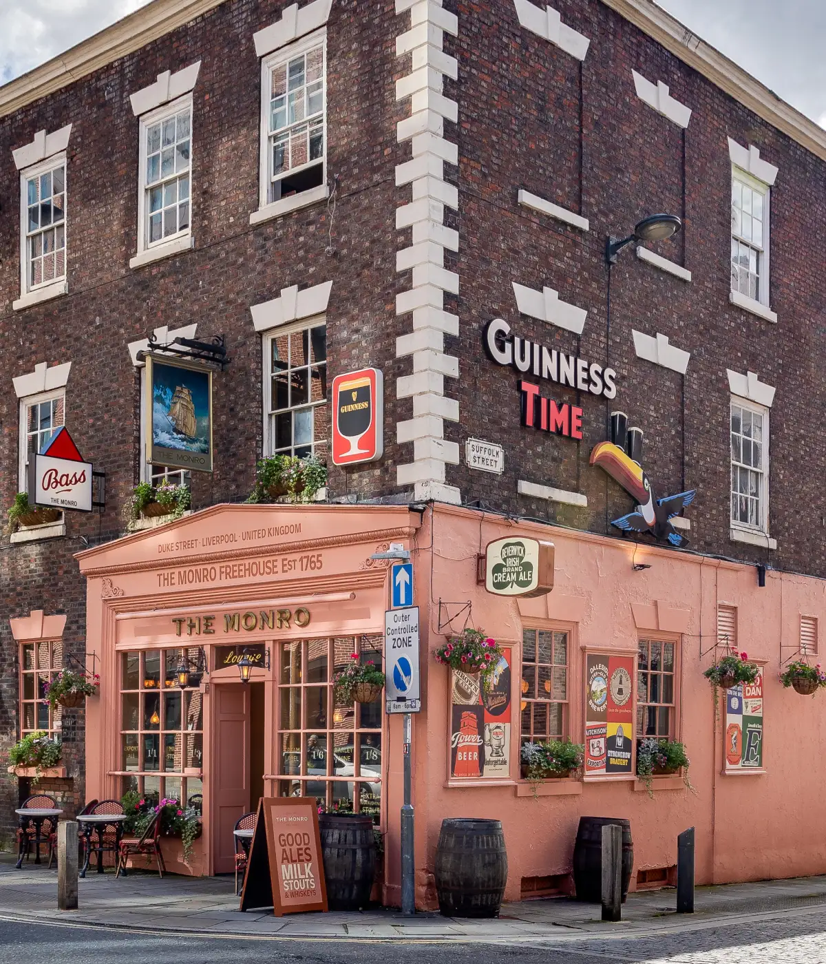
The Monro already had the kind of character you can’t manufacture: a Georgian townhouse on Duke Street, dating back to 1765, with years of pub history behind it.
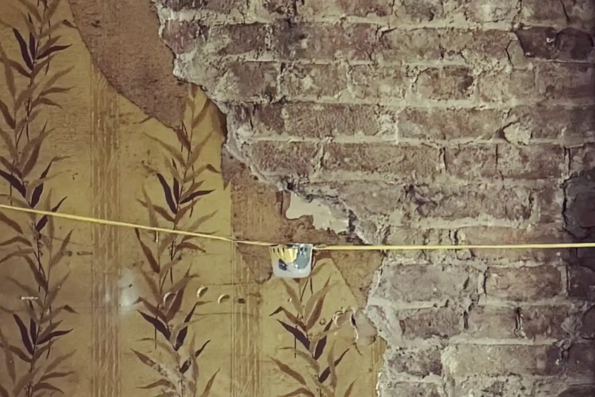
By 2024, though, it needed a new lease of life. Rather than making it feel overly polished, we leaned into the building’s history and added new layers of colour, signage and graphics.
The result is deliberately eclectic. Some things feel beautifully crafted; others are a little more DIY. That mix is exactly what gives the place its personality.
Hard to miss, even harder after dark
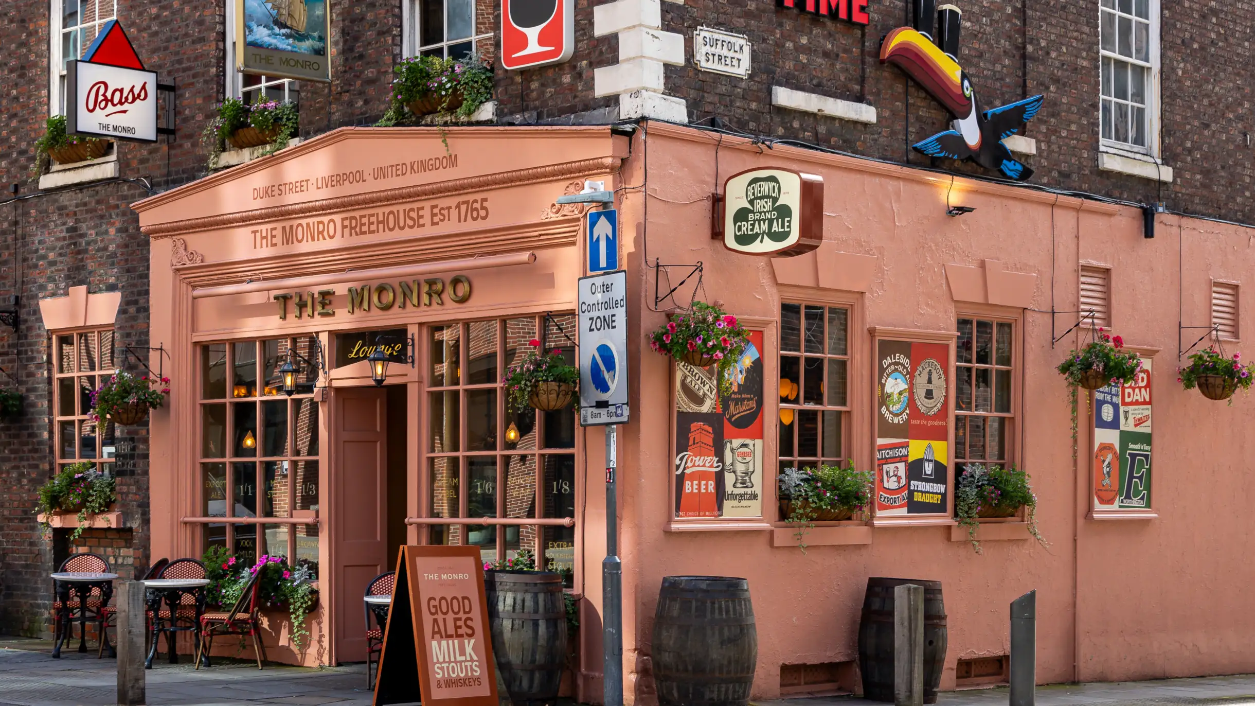
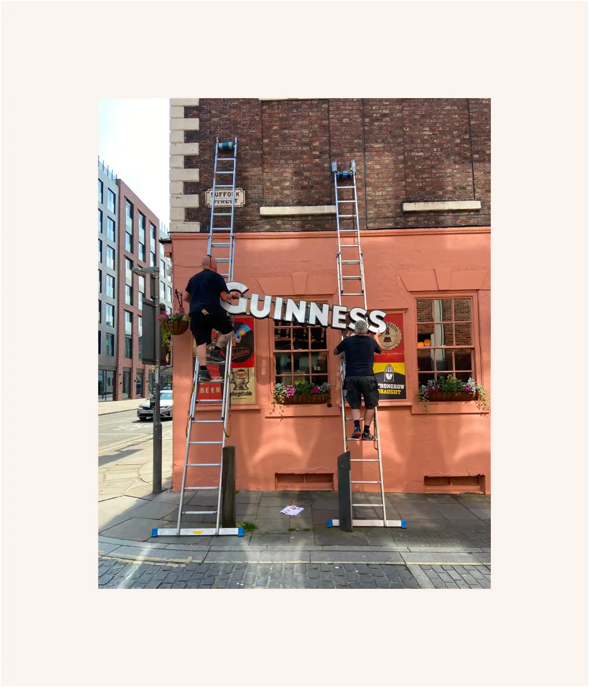
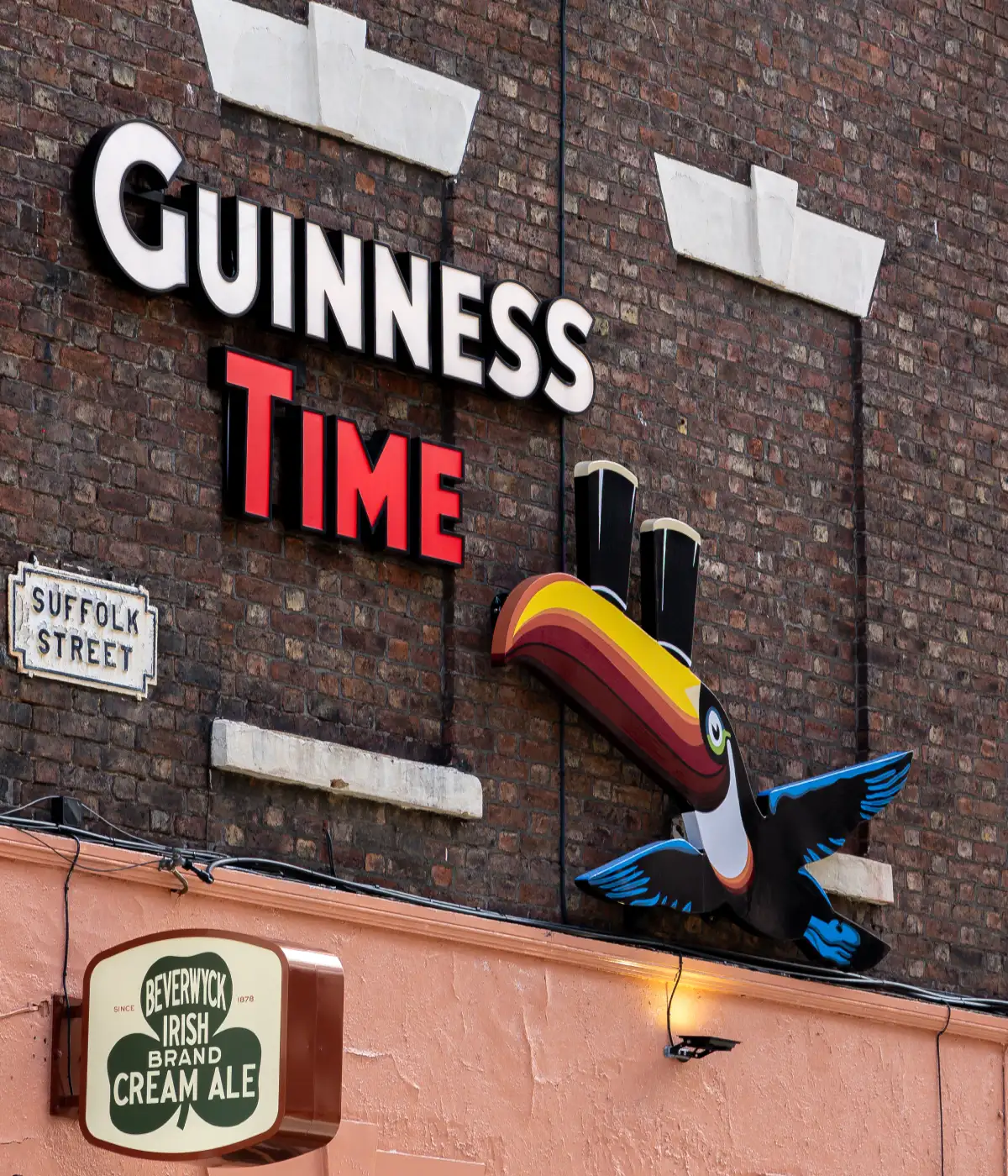
One side of the building gave us a big blank canvas, so subtle wasn’t really the answer. We dug through old Guinness advertising and recreated the GUINNESS TIME lettering as oversized 3D illuminated letters, mounted high on the brickwork so they could be seen from further down the street.
It gives the building more presence in the daytime, then really earns its keep once the lights come on at night.
Enter the toucan
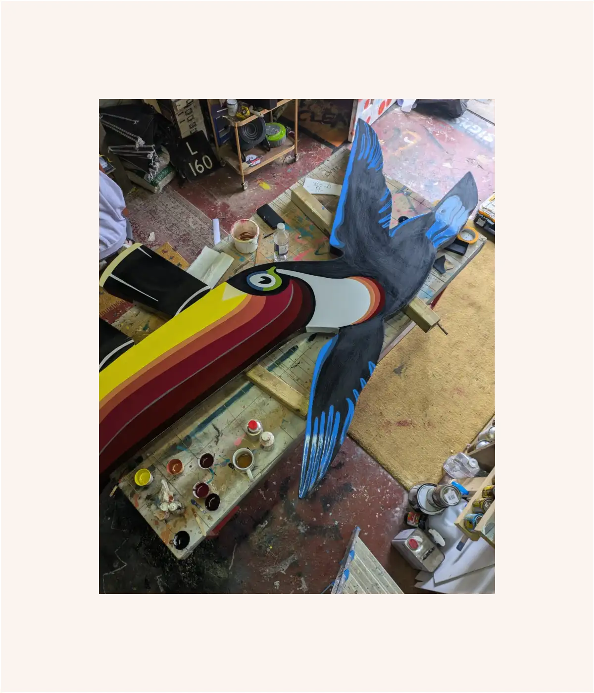
The lettering needed a companion. We created a hand-painted Guinness toucan inspired by the work of John Gilroy, whose illustrations helped define the brand’s advertising in the 1930s.
Our aim was to make the toucan and lettering feel as though they’d been part of the building for decades, creating the look of a vintage Guinness advert that had simply always been there.
Inspiration from a tobacco-stained ceiling
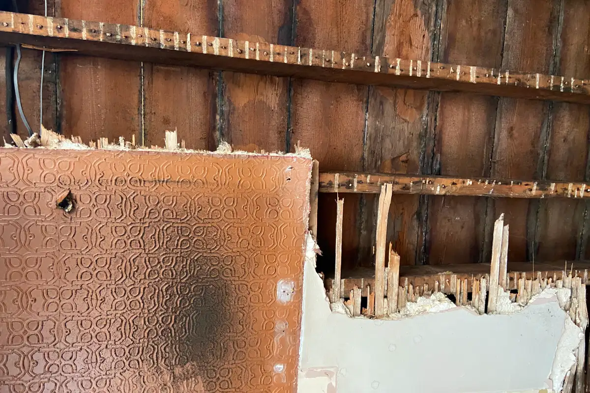
Some of the colour palette came straight from the building itself, including the warm browns and pinks of an old tobacco-stained ceiling.
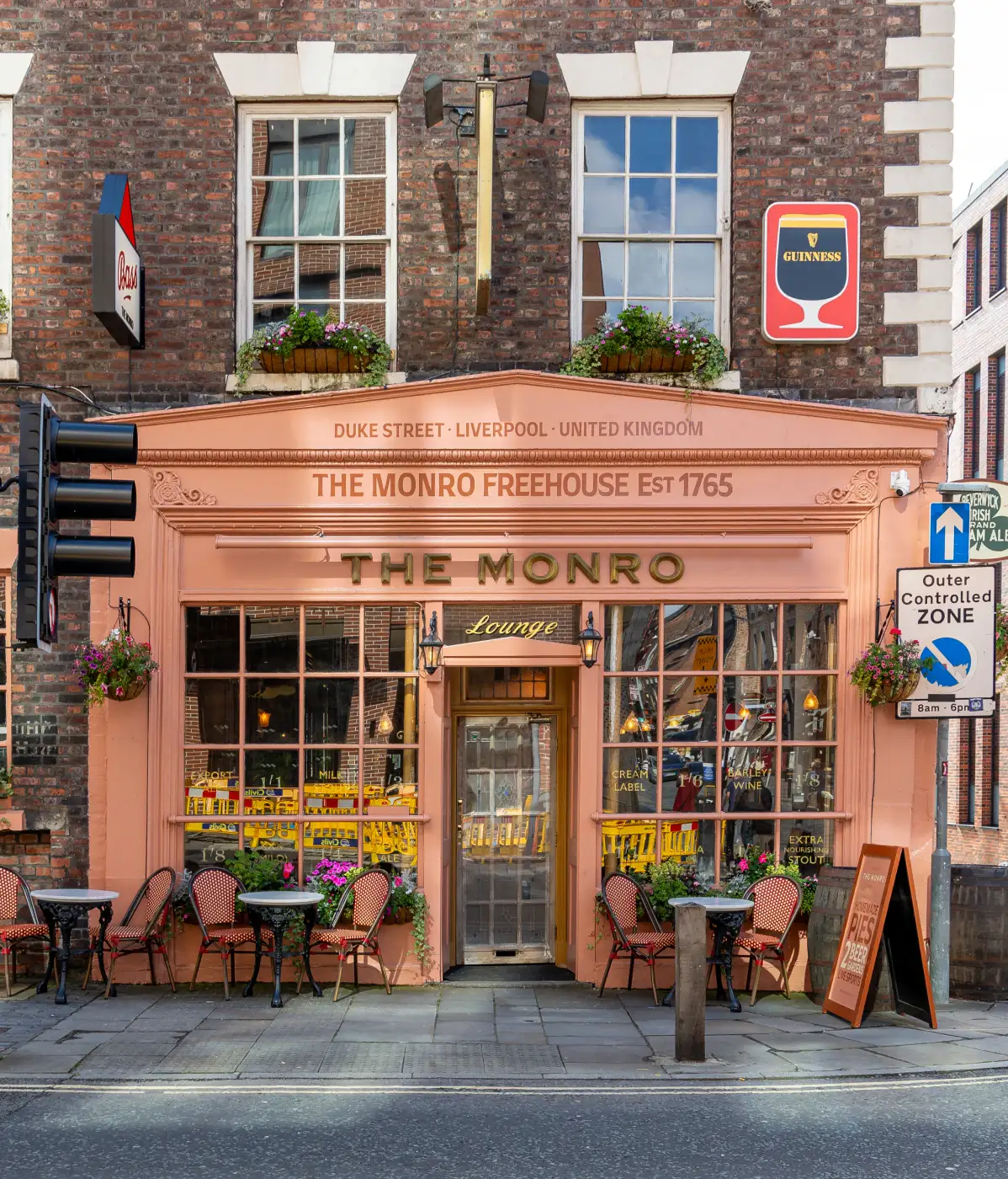
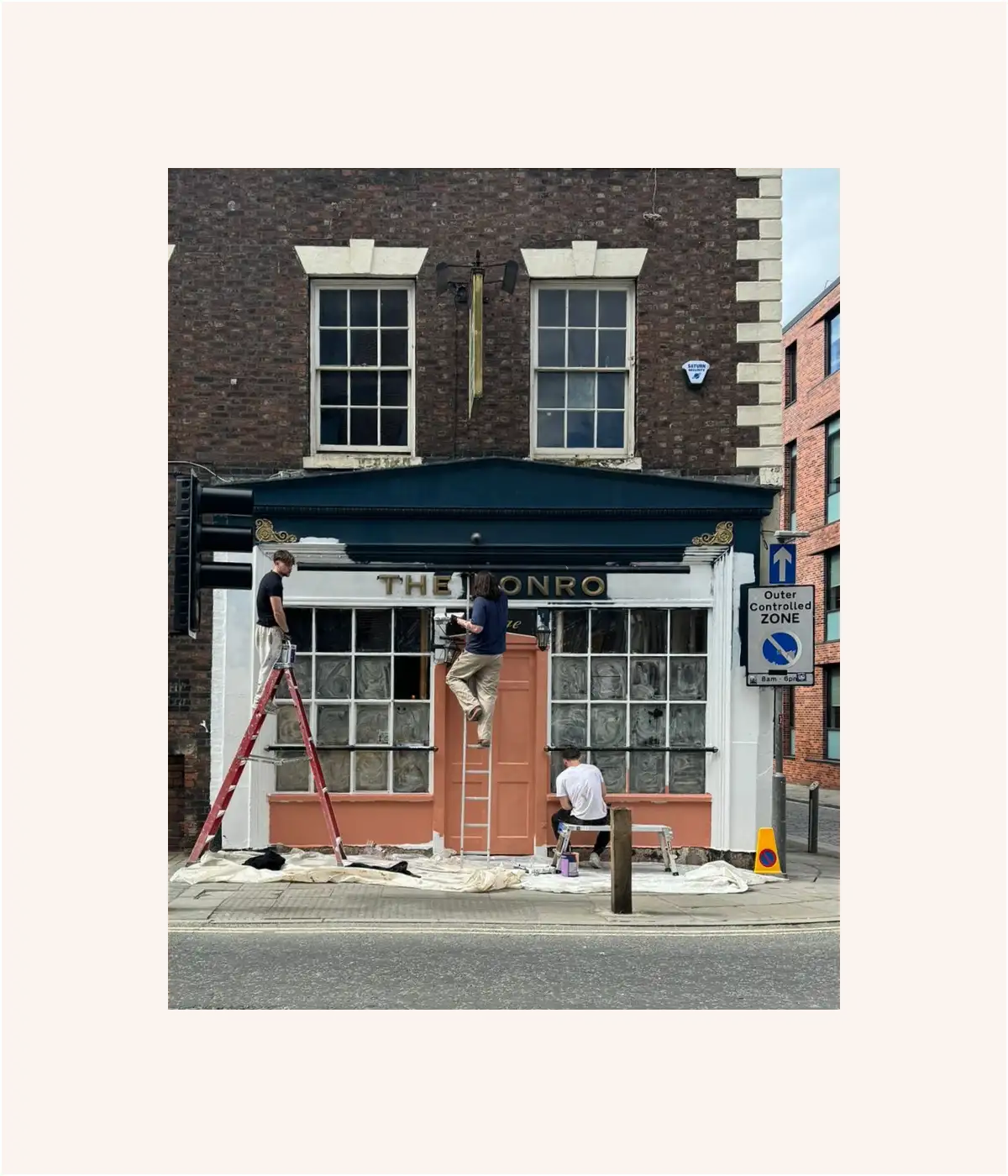
Those tones fed into the identity and the decision to change the exterior from dark navy to a much bolder terracotta pink. It nods to the building’s age without making the whole thing disappear into a sea of heritage colours.
A little clash never hurt anyone
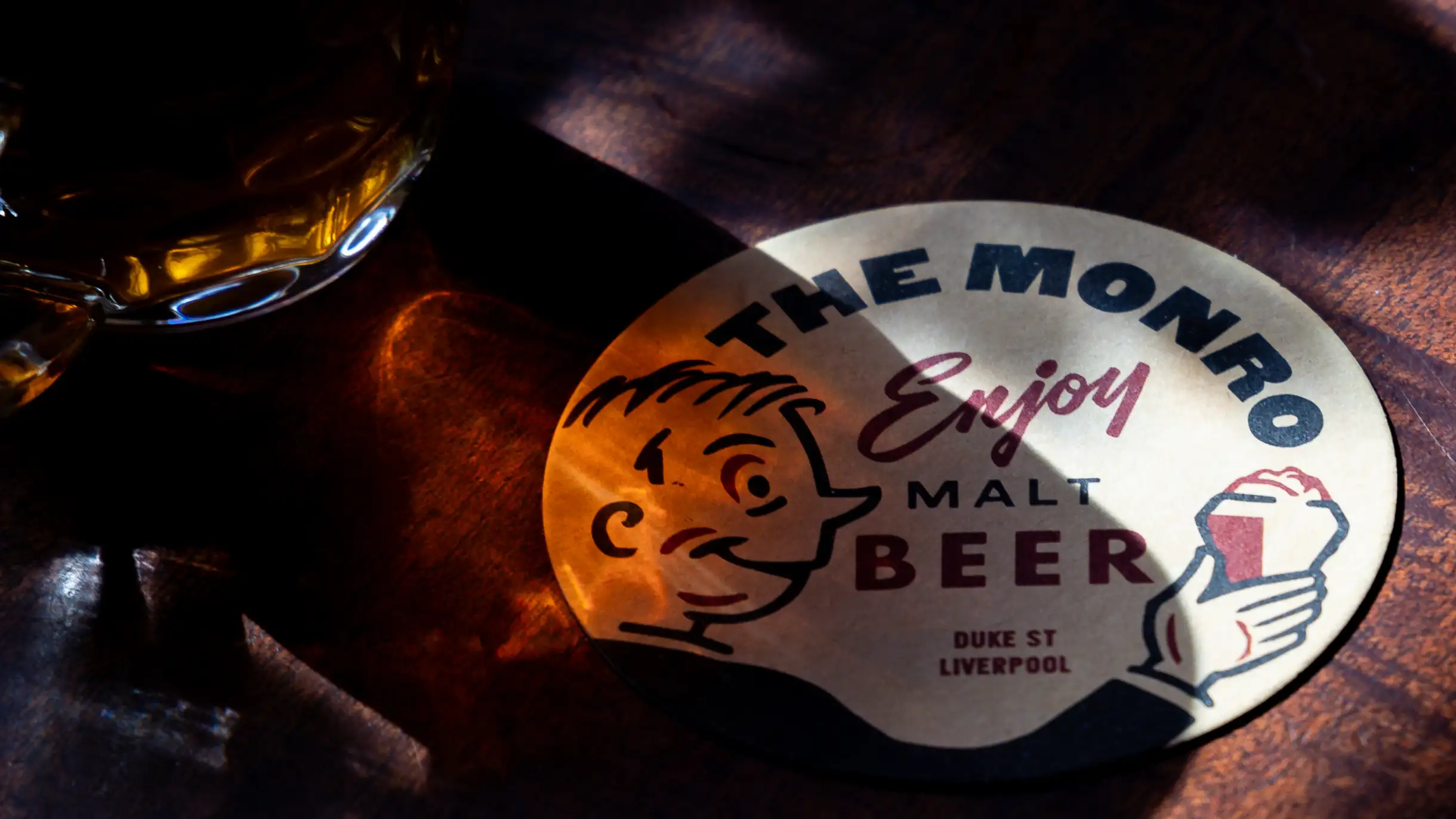
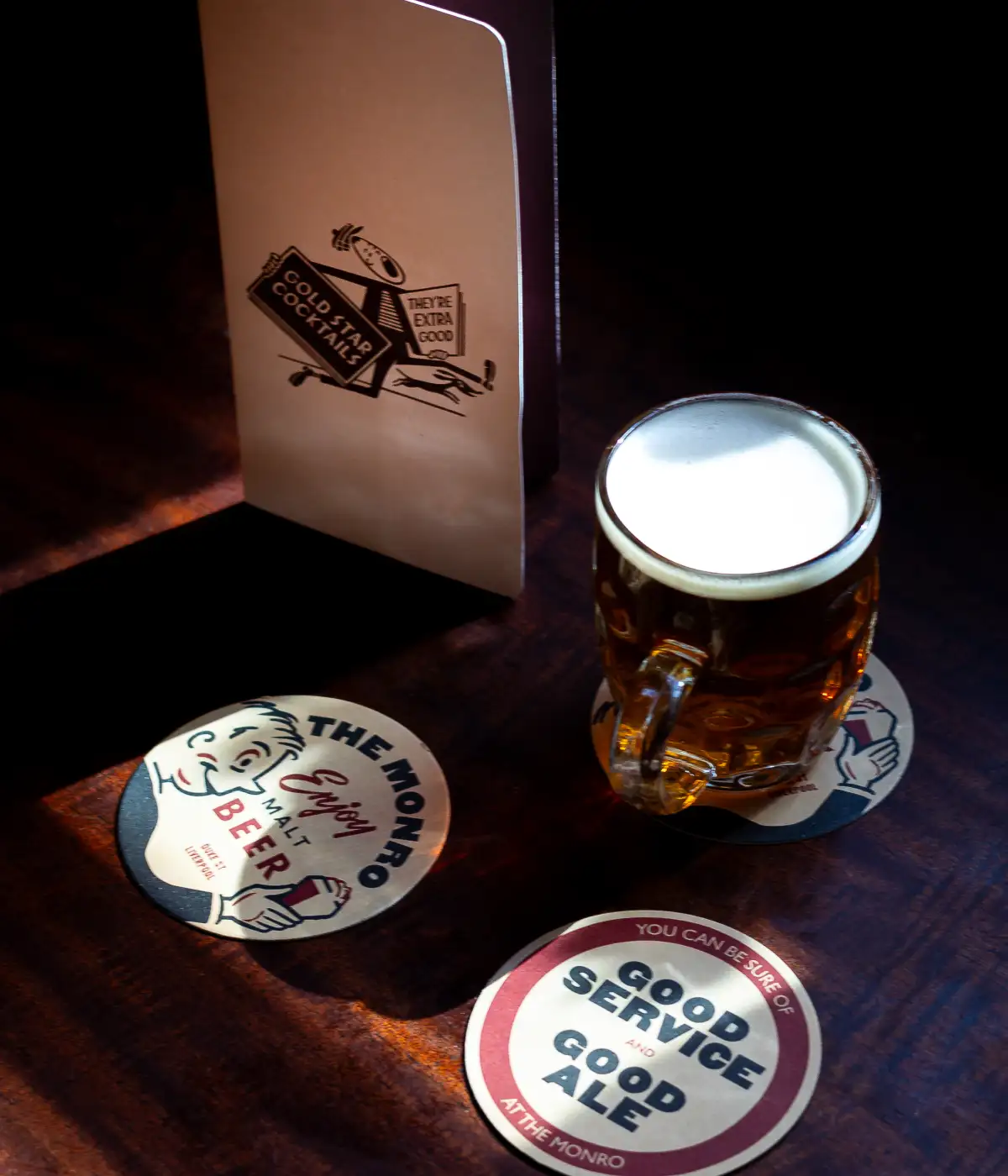
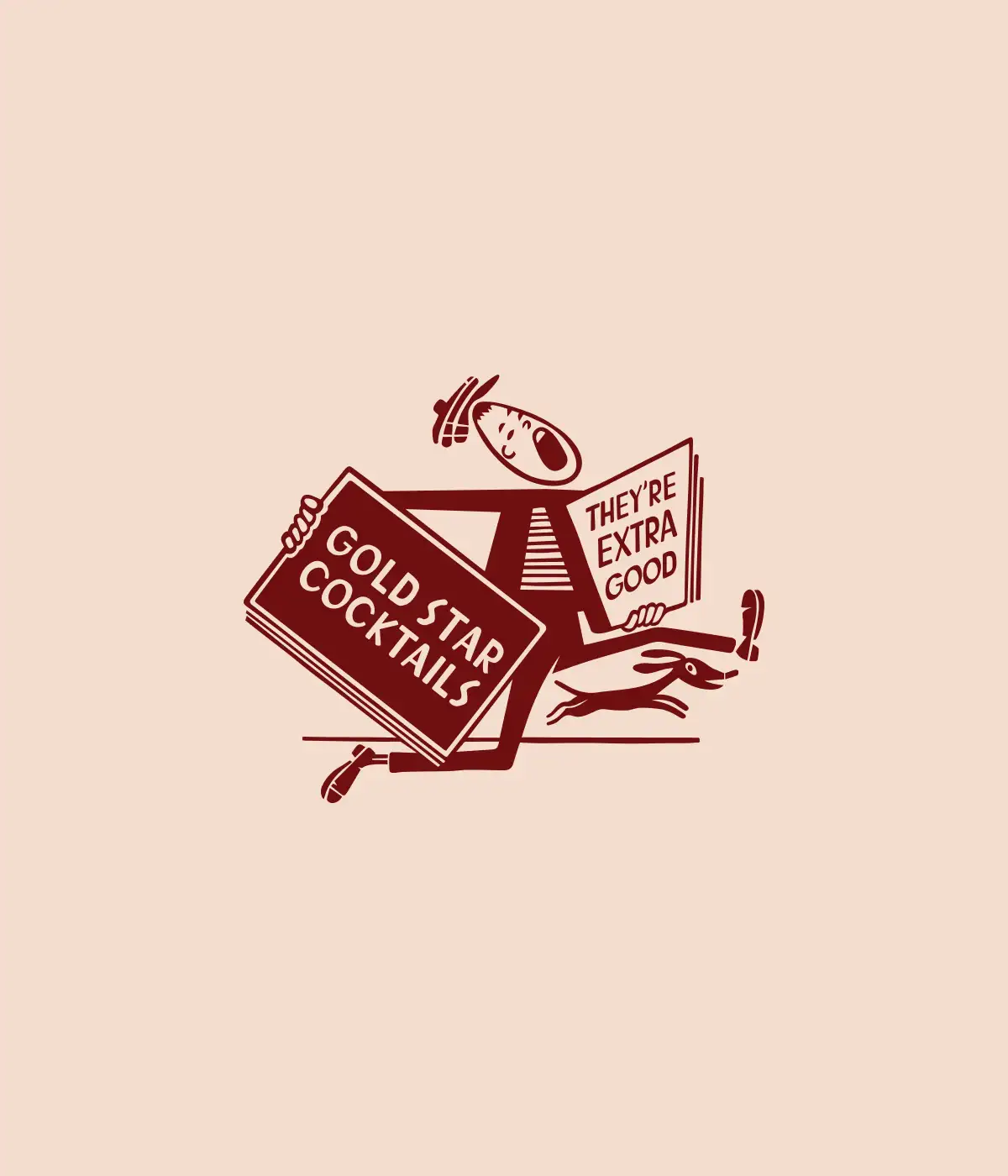
The beer mats and cocktail menus deliberately move away from the Georgian/Victorian pub feel.
We borrowed from mid-century graphics to introduce something younger and more playful. That contrast stops the pub becoming too historically perfect, and helps make it feel like somewhere people actually want to spend an evening.
Keeping it a bit rough around the edges
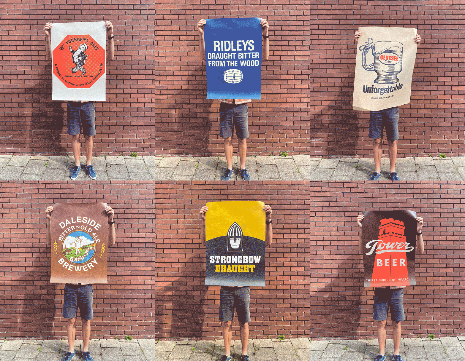
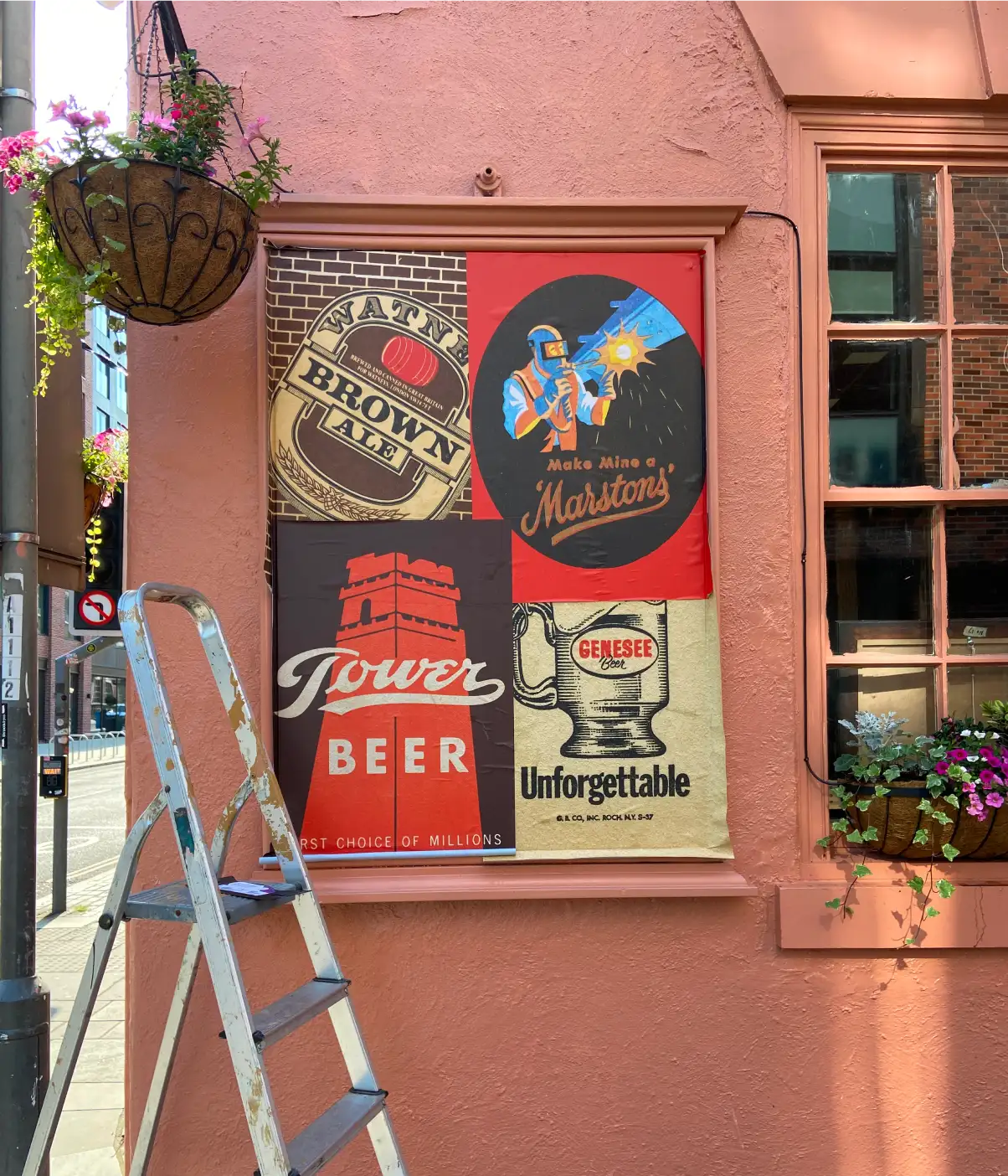
Existing poster frames on the exterior gave us another opportunity to add some character. We pasted them with vintage-style flyposters inspired by old brewery advertising, including brands that have long since disappeared. It’s a small detail that keeps The Monro away from anything that feels chain-like or overproduced.
Made for the night-time economy
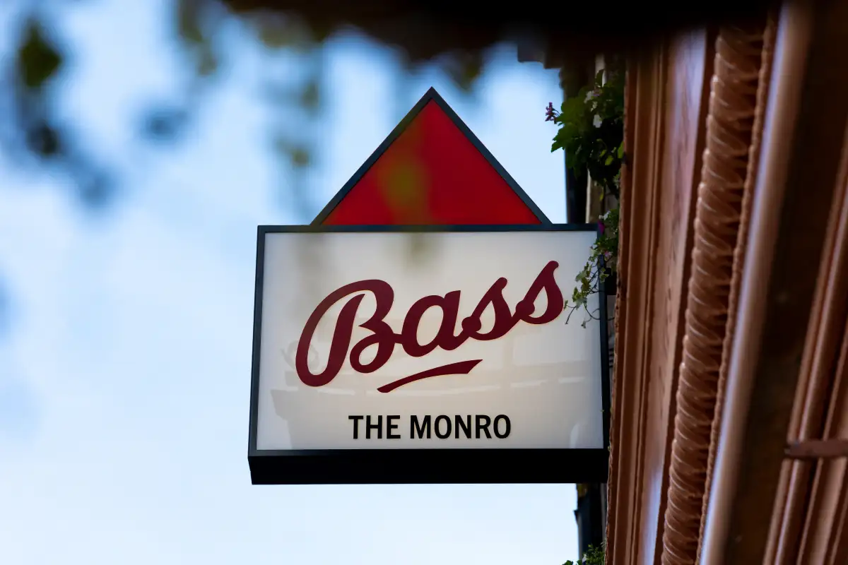
Alongside the Guinness installation, we introduced illuminated lightboxes across the exterior so the building still has plenty of presence after dark.
Different styles, shapes and periods sit side by side rather than following one rigid system, adding to the sense that the signage has built up over time.
The details you notice up close
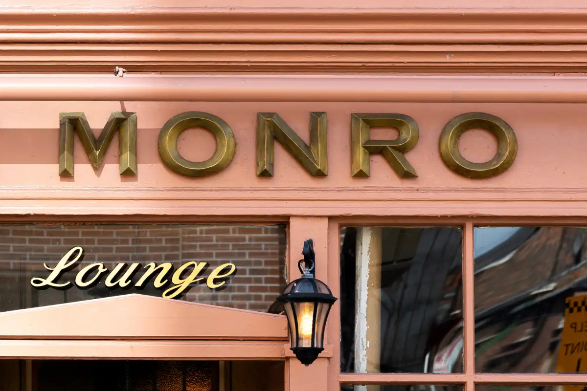
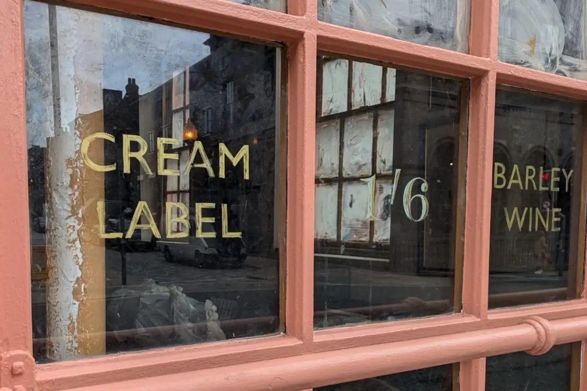
Even the window lettering has a backstory. A salvaged train-carriage door provided the reference for the lettering style, which we carried into hand-painted graphics featuring old-fashioned drinks such as ‘cream label’ and ‘barley wine’.
They’re details you might only spot once you’re standing outside with a pint – but that’s sort of the point. The closer you look at The Monro, the more there is to find.
Want to talk it through?
Book in a chat to see if we’re a good fit