


Eccentric branding for an imaginary pub landlord
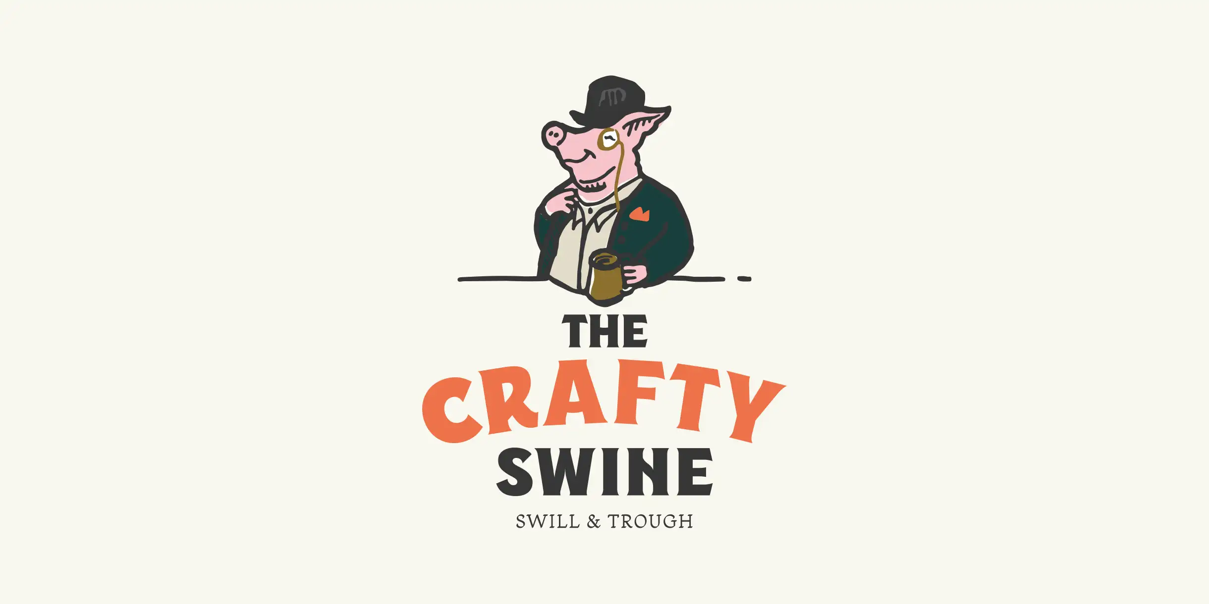
The Crafty Swine is built around an imaginary landlord: a whimsical, slightly eccentric character who sits at the heart of the whole identity. As far as he’s concerned, this is his pub, and he wants everyone to know it.
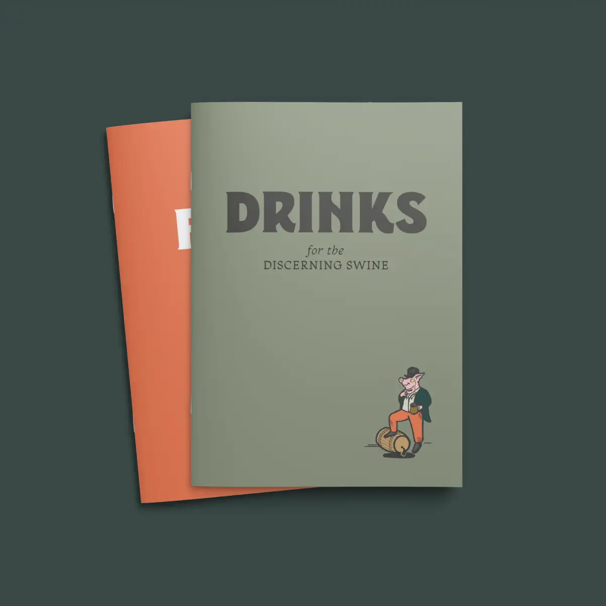
We created the name, identity and personality around him, using traditional pub cues as a familiar base before adding bold typography, illustration and the odd questionable pun.
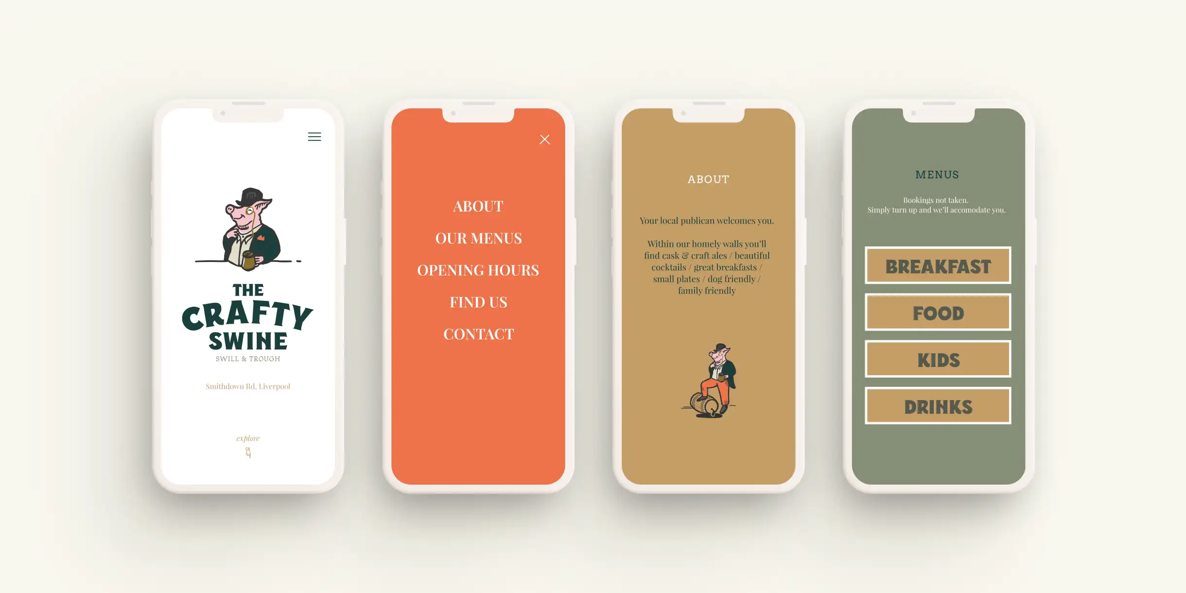
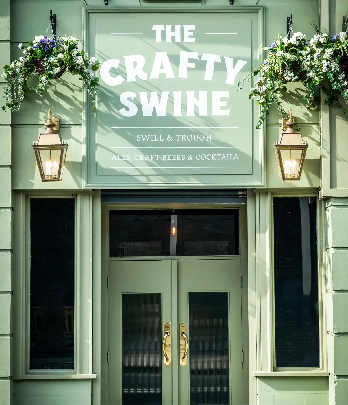
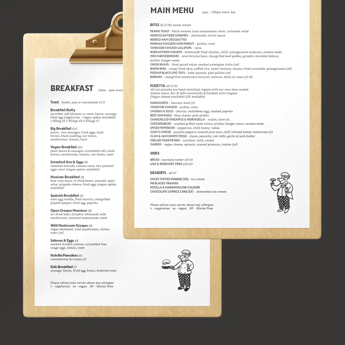
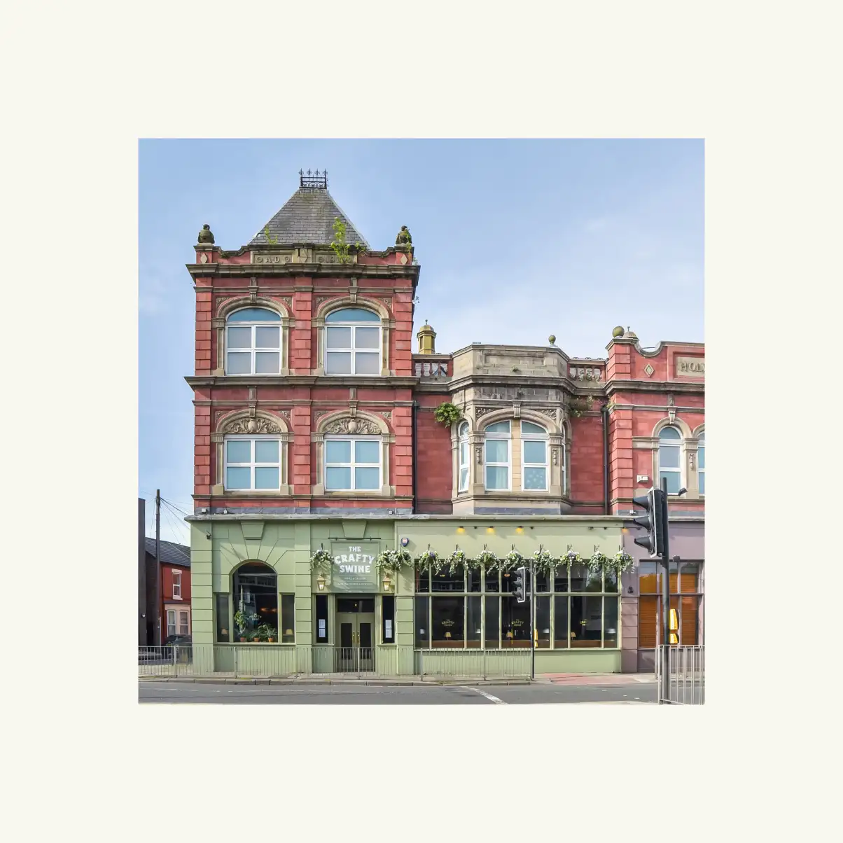
From concept through to opening, we carried that character across the branding, menus, signage, website and interior details so the whole place felt like it belonged to the same playful world.


Plenty of swill, very little corporate speak
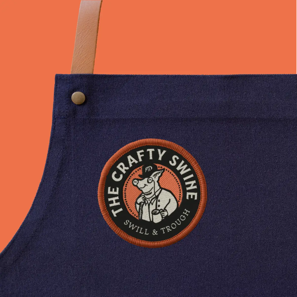
The tone of voice gave us permission to have some fun. In The Crafty Swine’s world, it isn’t just a pub, it’s a “Swill & Trough” – and the language carries that same quirky logic throughout.
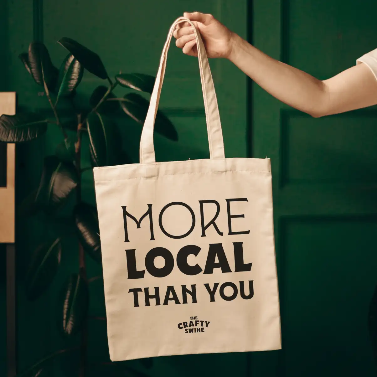
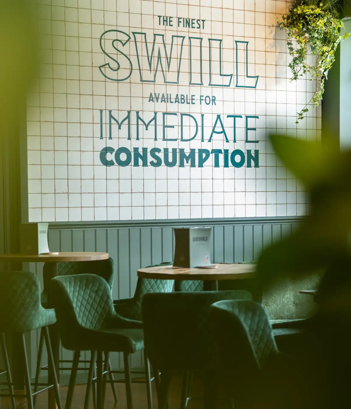
Lines like “More local than you” and the wall graphic “The finest swill available for immediate consumption” helped make the personality feel built into the space, rather than added on afterwards.
The copy is playful, knowing and a little bit daft, giving the brand a voice that feels just as distinctive as the landlord himself.

One swine, many questionable hobbies
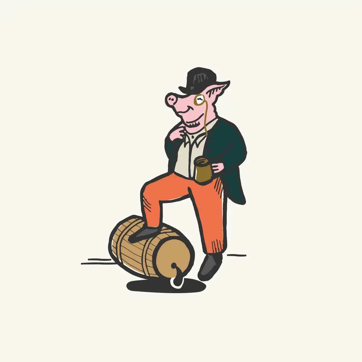
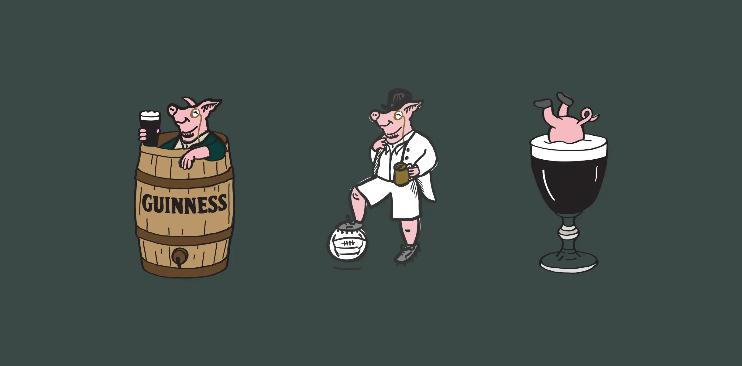
The landlord became much more than a logo. We developed a series of illustrations showing him in different guises across menus, signage, uniforms and other touchpoints – from bathing in a Guinness barrel to appearing in a dapper sporting kit or, naturally, upside down in an Irish coffee.
That gave us a flexible character we could keep returning to, adding humour and personality without having to reinvent the brand every time something new was needed.
Traditional pub, less traditional landlord
The finished identity balances old-school pub character with something much more playful.
Warm colours, chunky typography and familiar hospitality references make it feel approachable, while the illustration and copy stop it becoming another generic pub brand. It’s friendly, memorable… and just the right amount of daft.

Want to talk it through?
Book in a chat to see if we’re a good fit