


A café bar identity design celebrating Liverpool's transatlantic ties
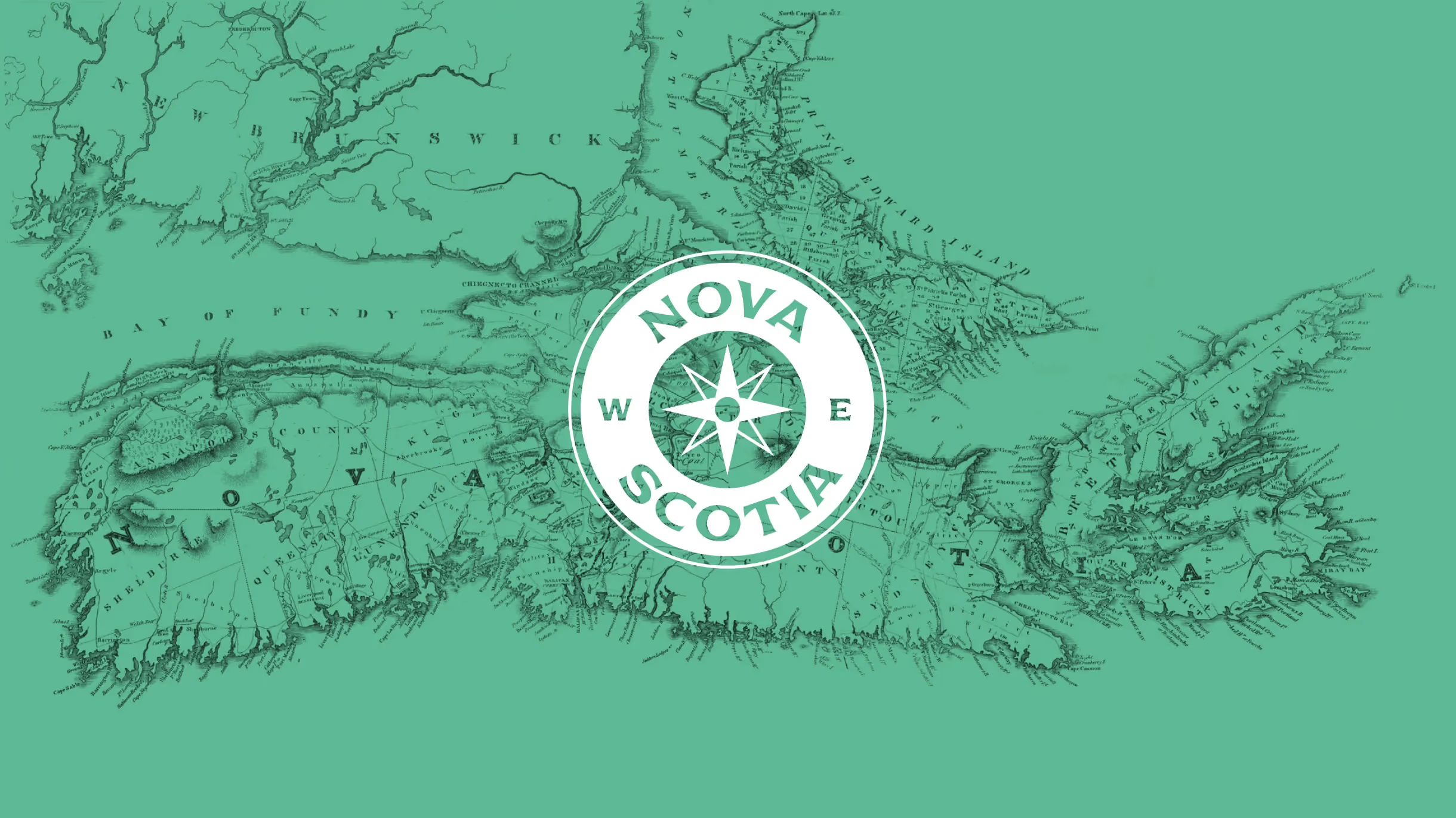
The name Nova Scotia was chosen for this independent café bar due to its connection with the Canadian district. This café bar pays homage to Liverpool's forgotten Nova Scotia district, which played a significant role in the city's maritime history. This history encompassed the timber trade between Canada and Liverpool, supporting the extensive shipbuilding activities that occurred at the docks.
When creating a brand identity for Nova Scotia, we aimed to capture the spirit of the area's maritime heritage and portray a welcoming impression on the many tourists that pass through the area due to its situation on Liverpool's waterfront.

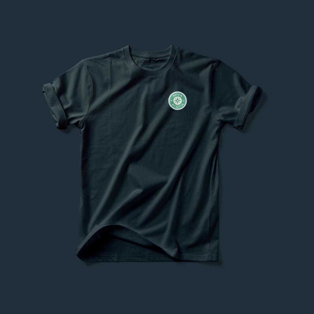
Logo concept
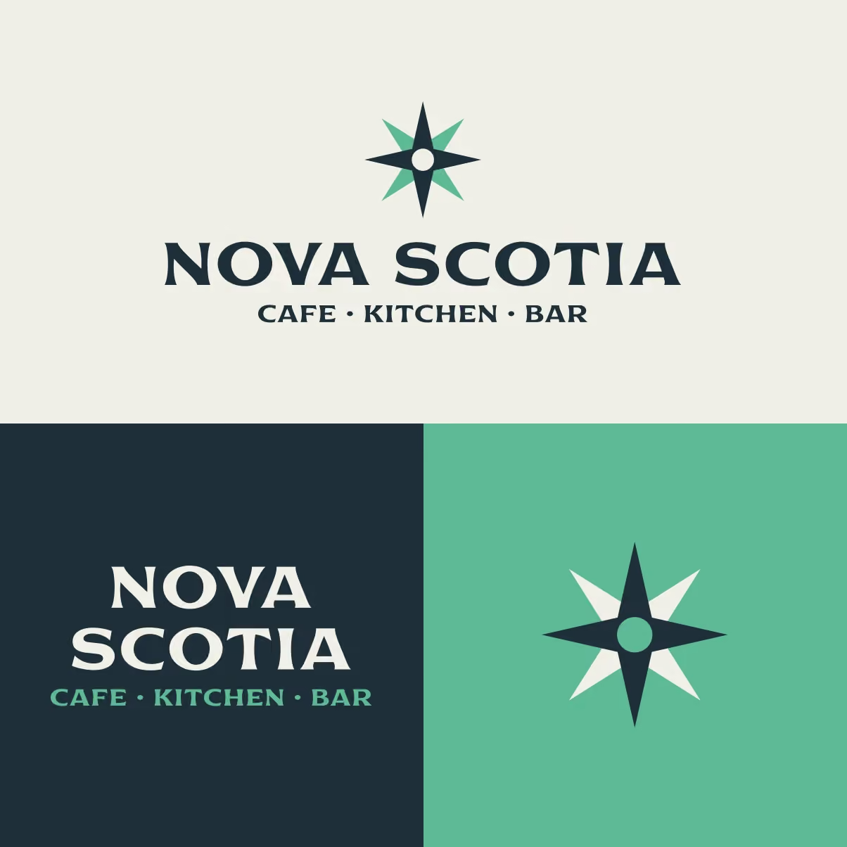
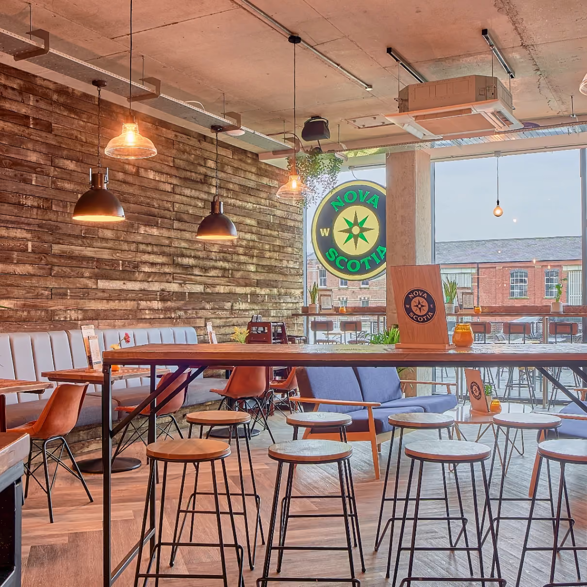
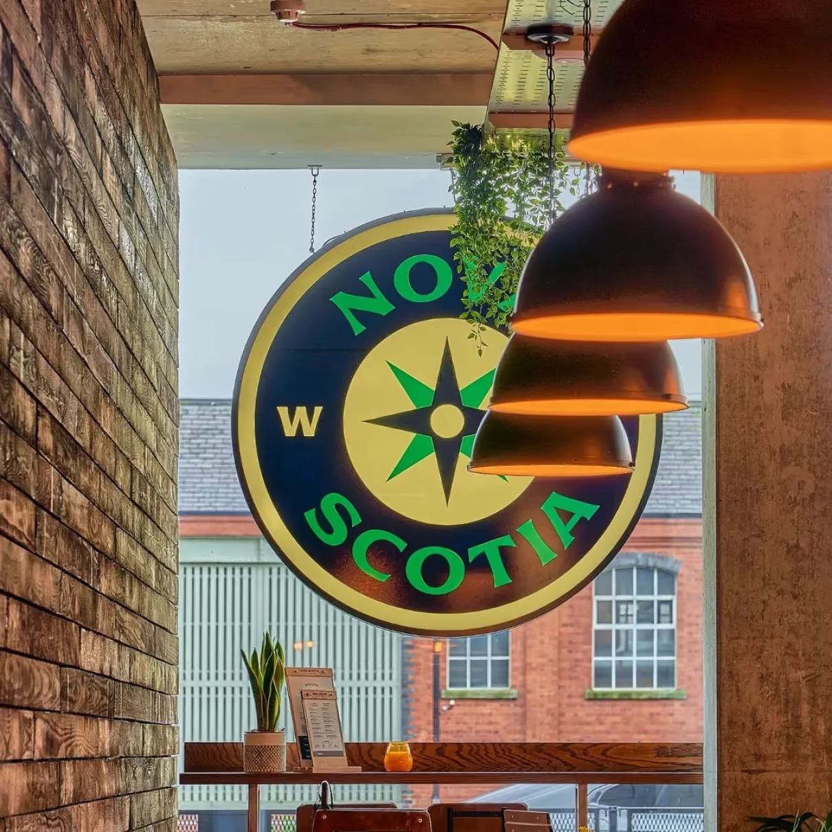
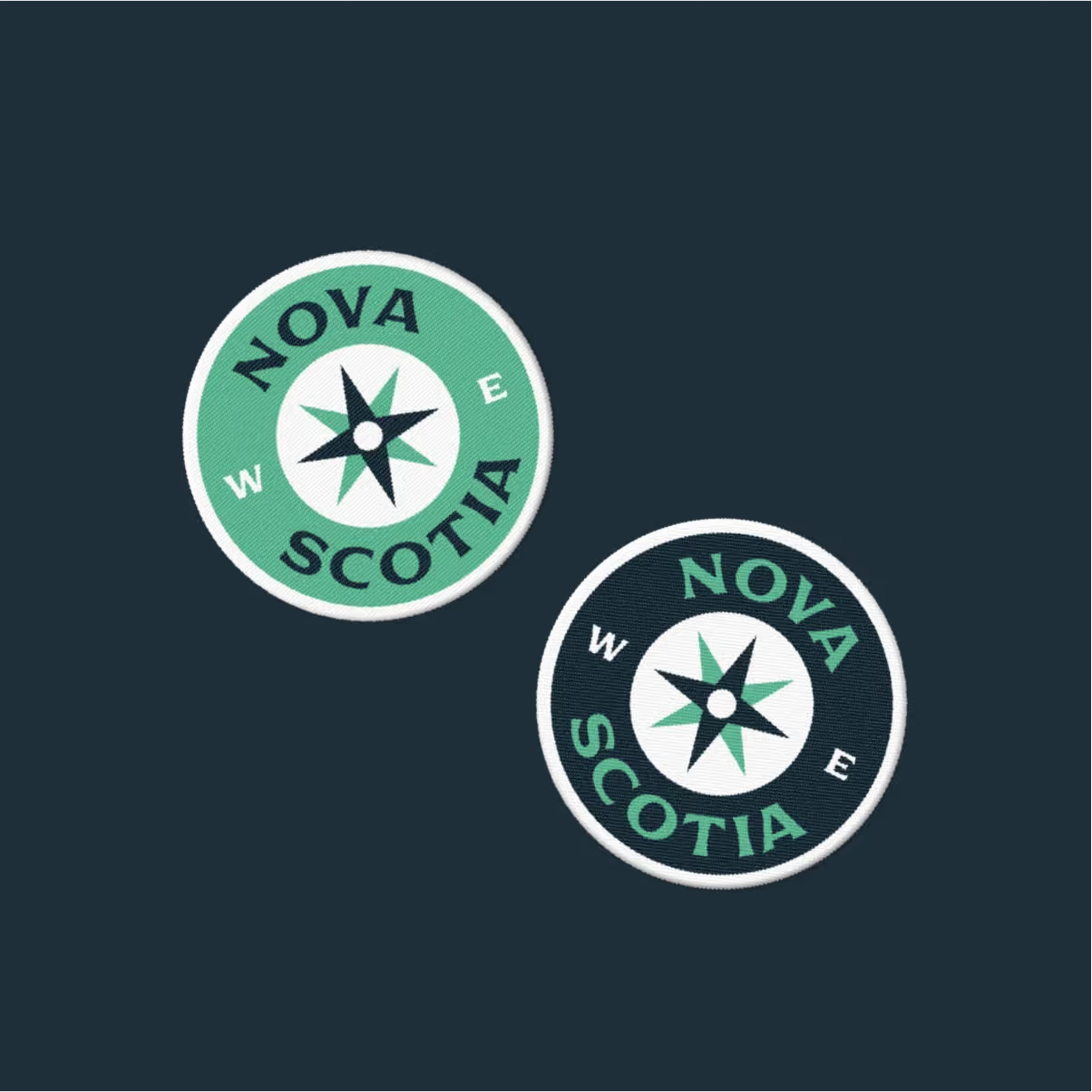
The logo references the maritime heritage of the area with a compass graphic, incorporating the initials for North and South to represent Nova Scotia.
The circular form of the logo is mainly employed for its adaptability across various applications, including crucial social media avatars. In addition, the compass rose can be used alongside the logotype or independently as a supporting visual element.
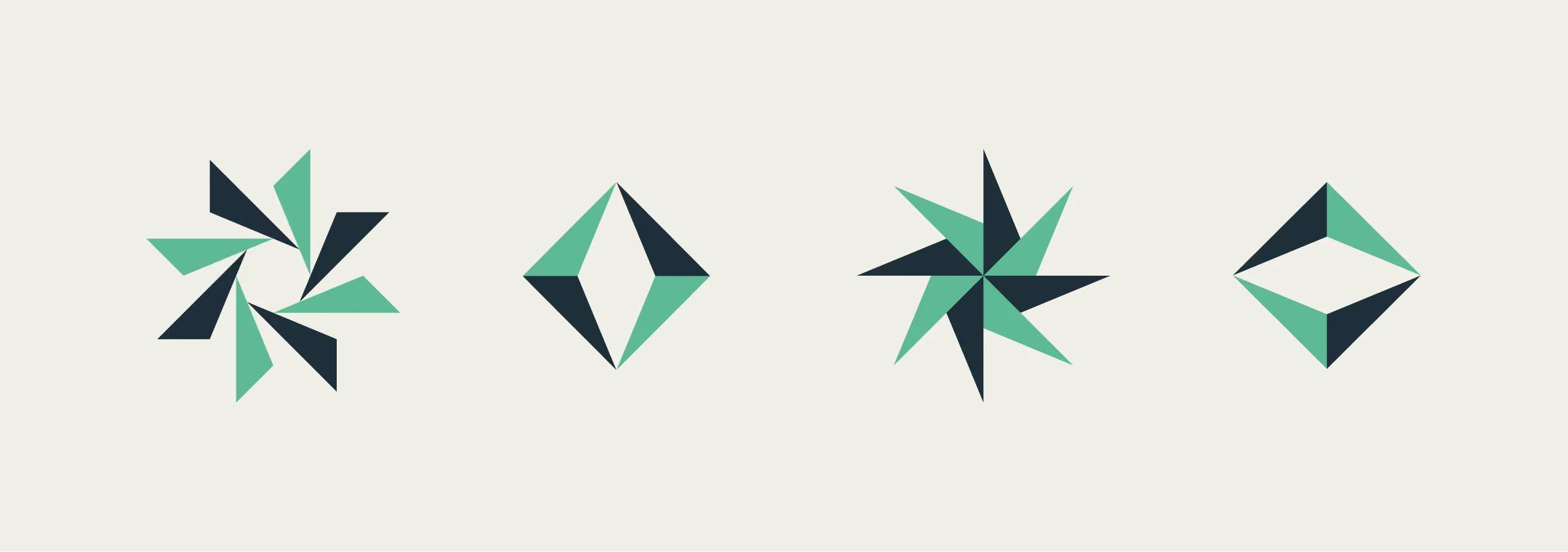
Graphic exploration
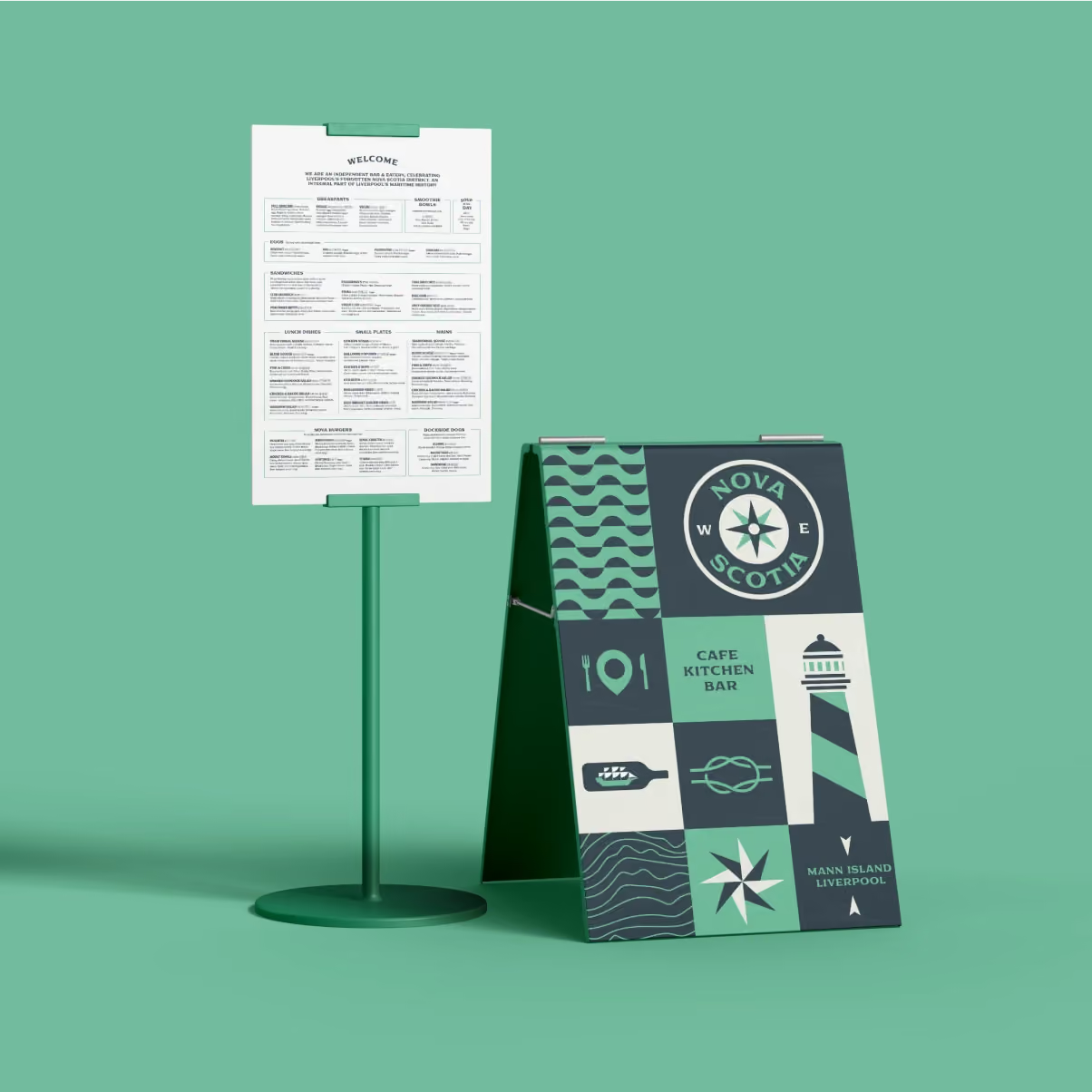
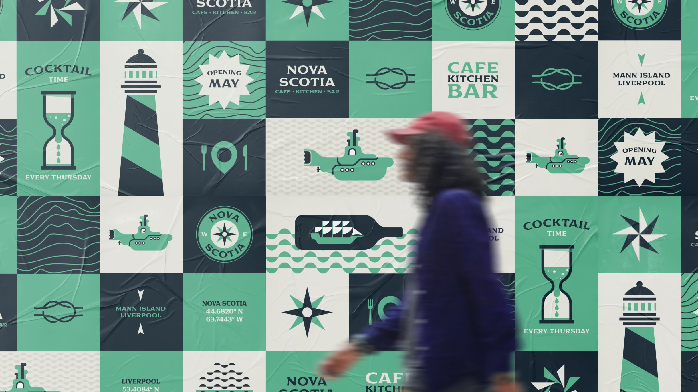
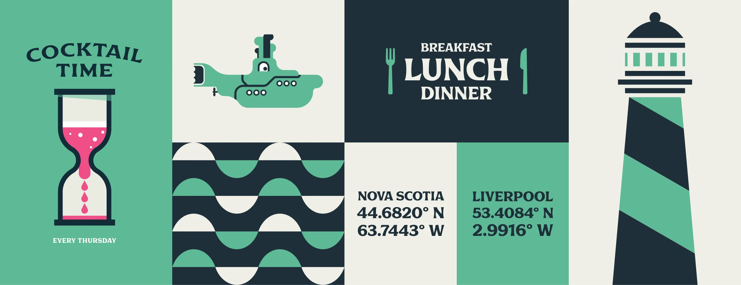
For the wider brand identity we incorporated elements such as maritime symbols, landmarks, and nautical themes to evoke a sense of adventure and exploration.
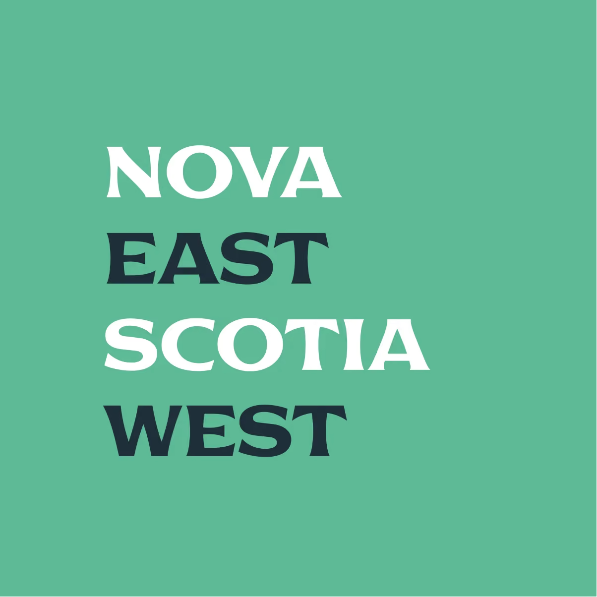
Colours are inspired by the ocean, with the vivid turquoise used as a bright colour to catch the eye of passersby. The typography reflects the past by utilising a woodcut font from the 1900’s. By blending these elements, the brand identity seeks to convey the spirit of Nova Scotia, inviting visitors to explore and appreciate Liverpool’s rich maritime heritage.
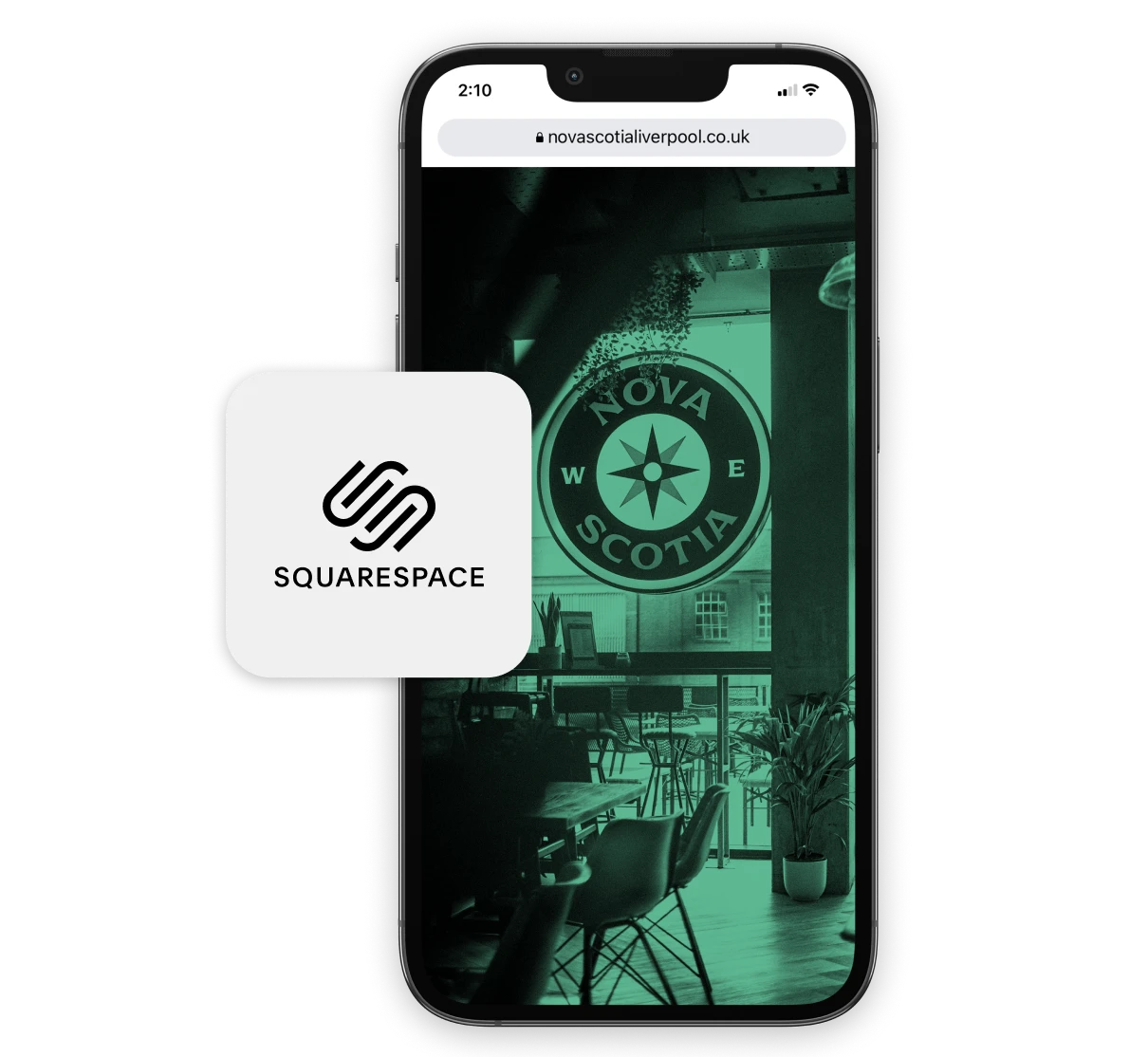
A website powered by Squarespace
We selected Squarespace as our platform for several reasons. Firstly, it allows for seamless integration of menus, reservations, and contact information.
Secondly, the intuitive drag-and-drop interface allows for easy customisation, making it simple to showcase image galleries, highlight events, and allow multiple user accounts so content can be regularly updated by various members of the team.
Lastly, its responsive design ensures a seamless browsing experience across various devices.
Want to talk it through?
Book in a chat to see if we’re a good fit