


A full-service partnership for a commercial cleaner
Why just a website wasn't the answer
For 20 years, PureMaison served both domestic and commercial clients under one name. But the commercial side had grown into a serious operation of its own, winning high-volume contracts like JF Hunt Regeneration at Shotton Mill, the largest paper mill in Europe, while still trading under a name built for home cleaning.
PureMaison came to us only for a website refresh. Looking at how far the commercial work had come, we made a different call: it didn't need a tidier website, it needed a brand of its own. A name, an identity and a home that matched the scale of what the team was already delivering, with room to keep growing, and without pulling PureMaison's focus away from domestic homes.
So we named it, gave it an identity and built it a website. Elara.
A name with meaning
The name had to feel established and dependable from day one, because the business already was. We landed on Elara, drawn from two places: a figure in Greek myth associated with protection and care, and one of Jupiter's moons, constant and stabilising. Together they give the brand clarity and warmth, and a sense of something steady you can rely on. Exactly the role Elara plays in its clients' day to day.
Building the brand
At the heart of the identity is a distinctive E, paired with a "group" lockup. That curve became a system in its own right, shaping the frames, fine lines and flowing lines used across social, so everything feels consistent and recognisable wherever it turns up.
Confident colour
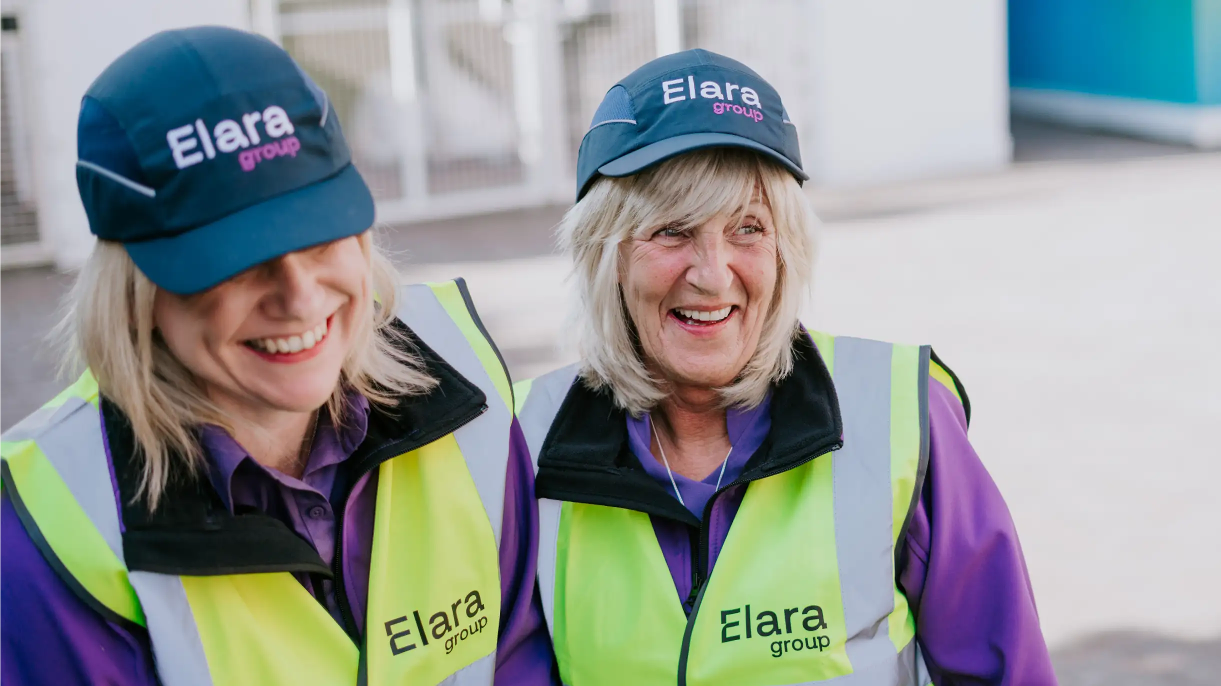
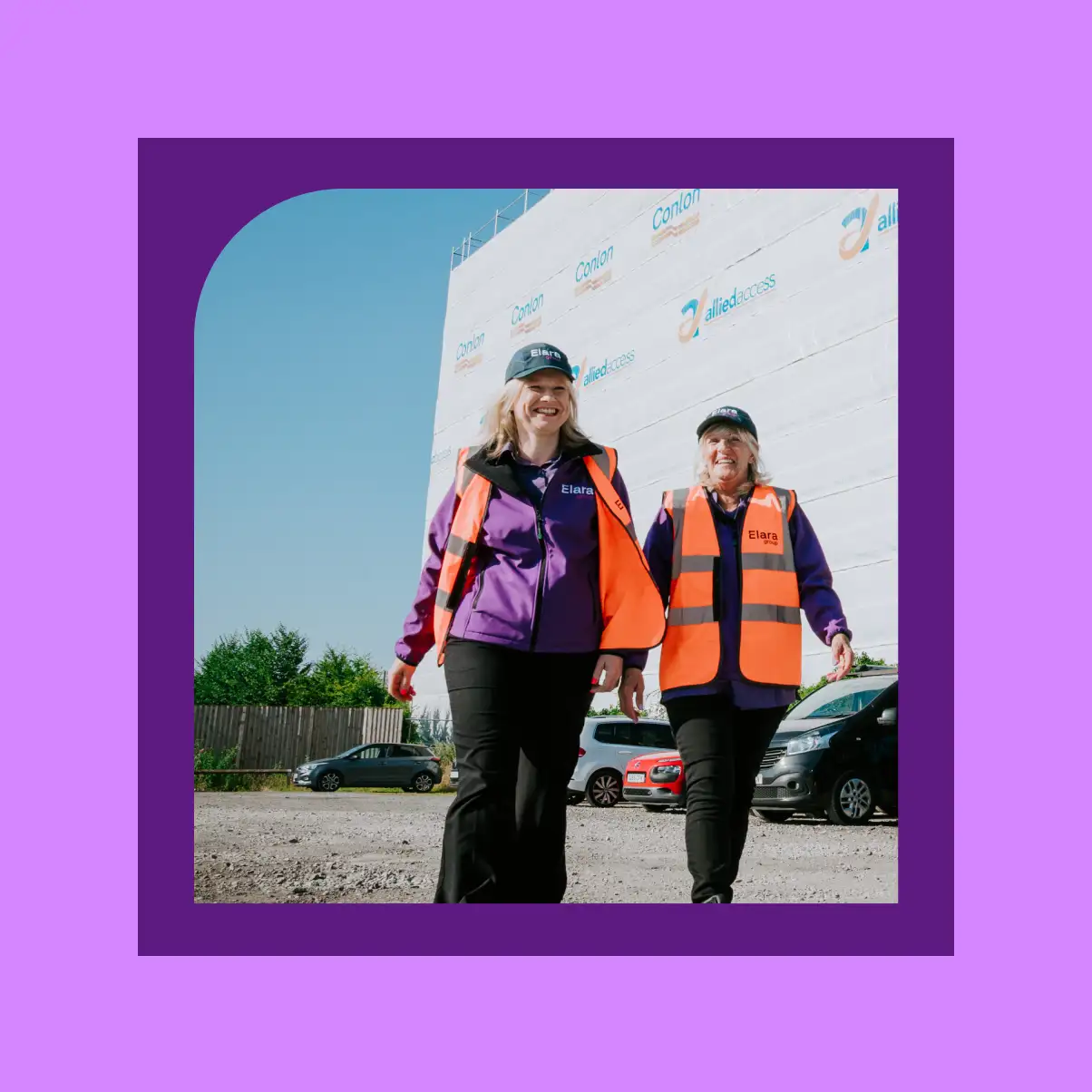
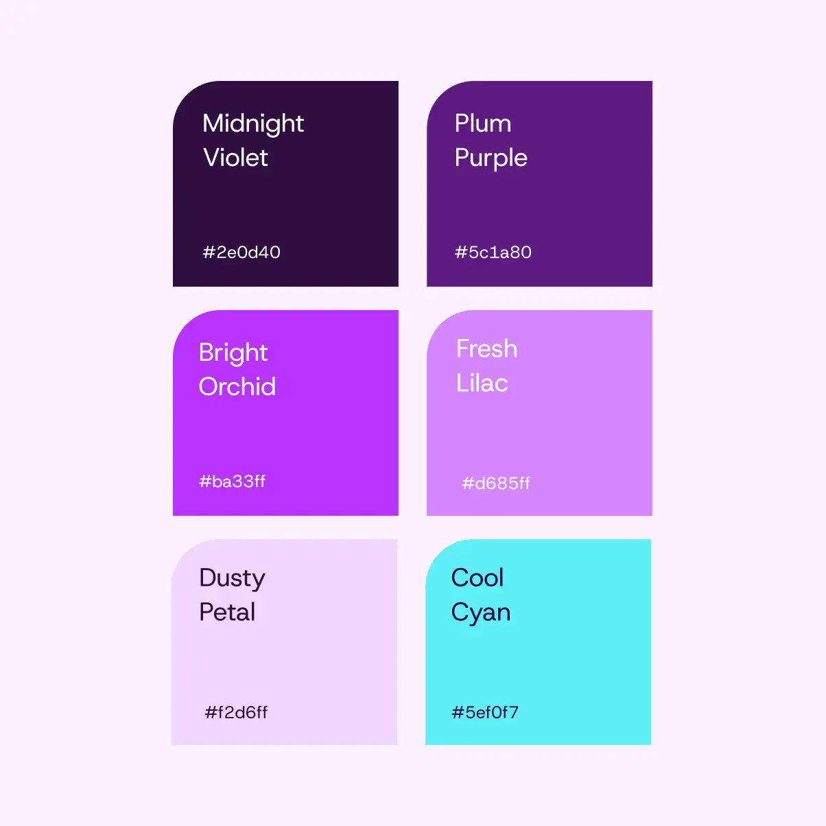
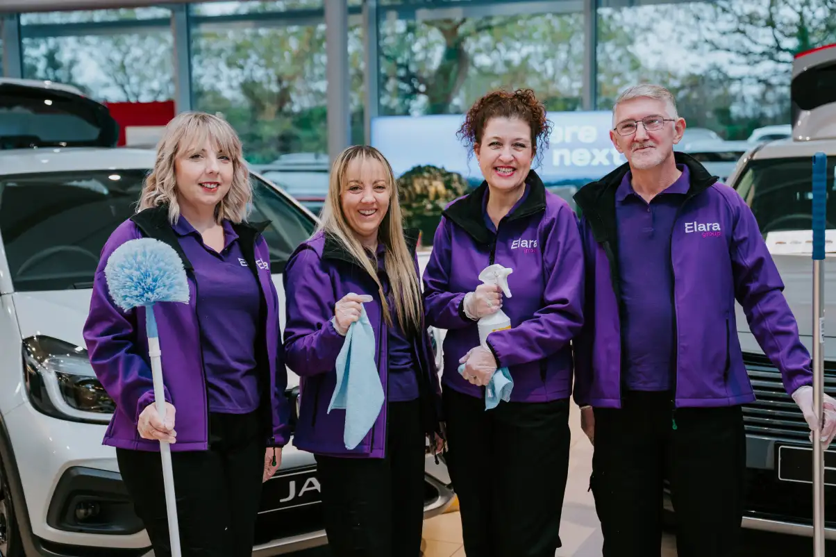
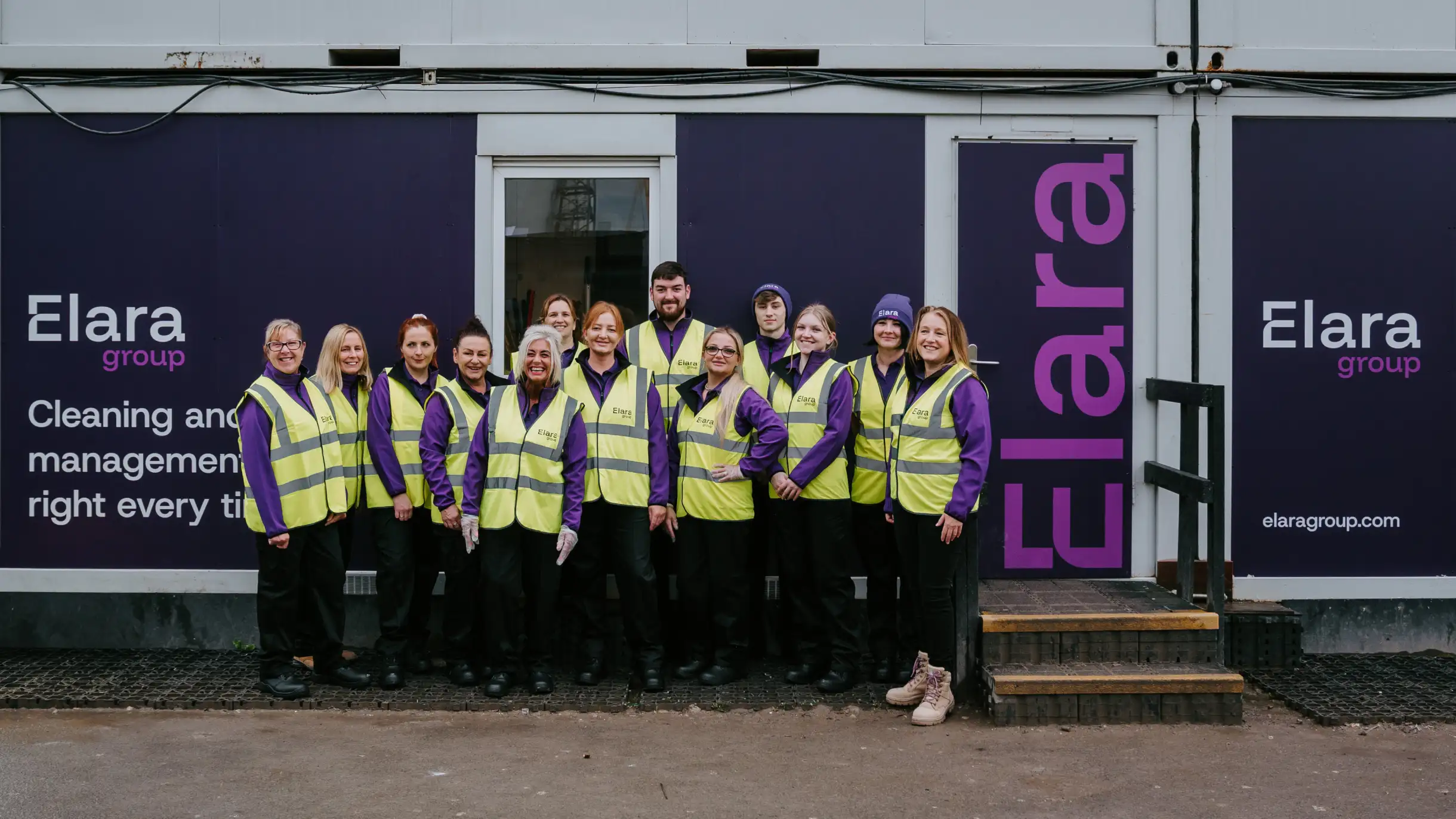
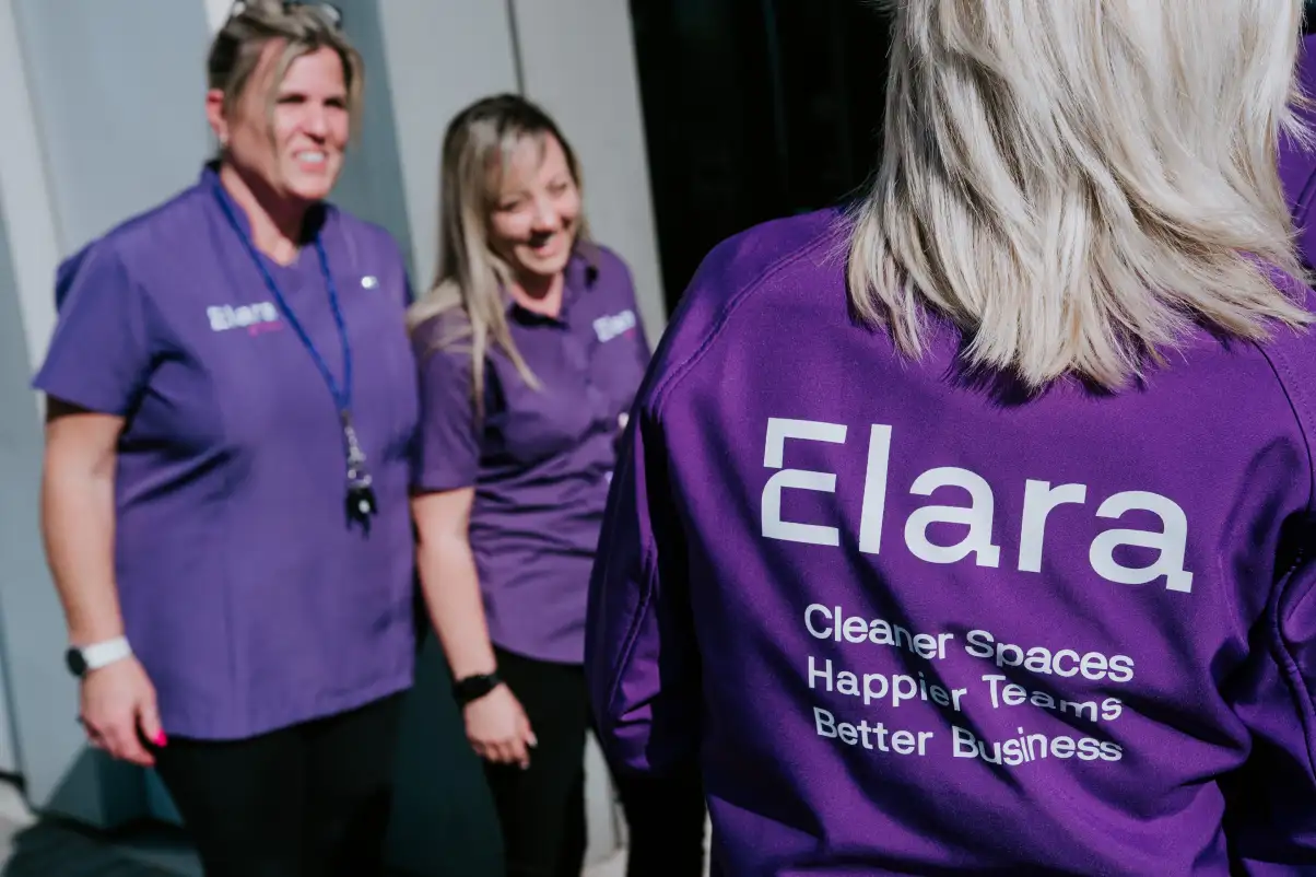
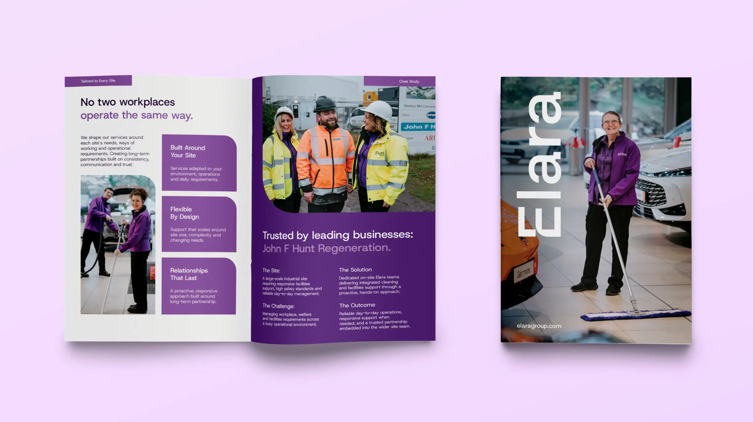
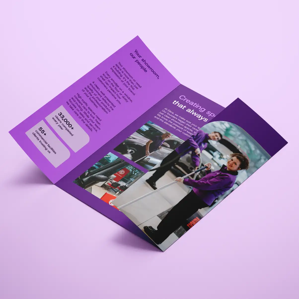
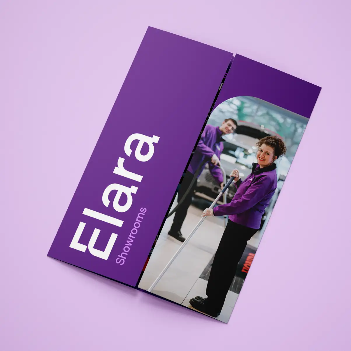
Cleaning and facilities is a sector of safe blues. Elara goes the other way. We built the identity around violet and orchid, a confident palette that stands out on a van, a uniform or a social feed and makes the brand impossible to mistake for anyone else. On the team's workwear especially, it turns everyday visibility into a real brand asset.
More than just imagery
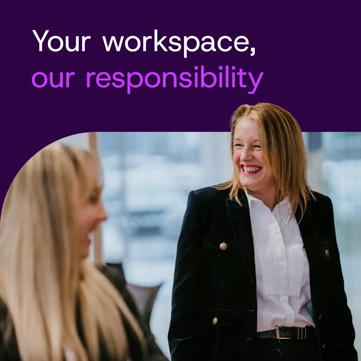
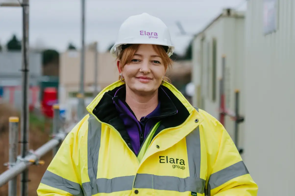
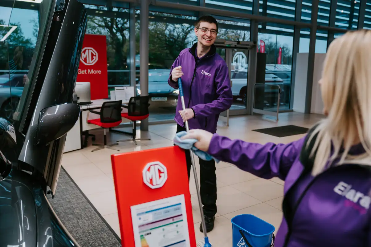
Photography is a huge part of how a brand feels. For Elara, each photoshoot was carefully planned and art directed to reflect the personality and ethos behind the business, not just to fill space on a website. Showing the team in a real working environment makes the brand feel more human, more credible and therefore easier to connect with. The right photography helps people understand who Elara are before they have even picked up the phone.
A website that leads with outcomes
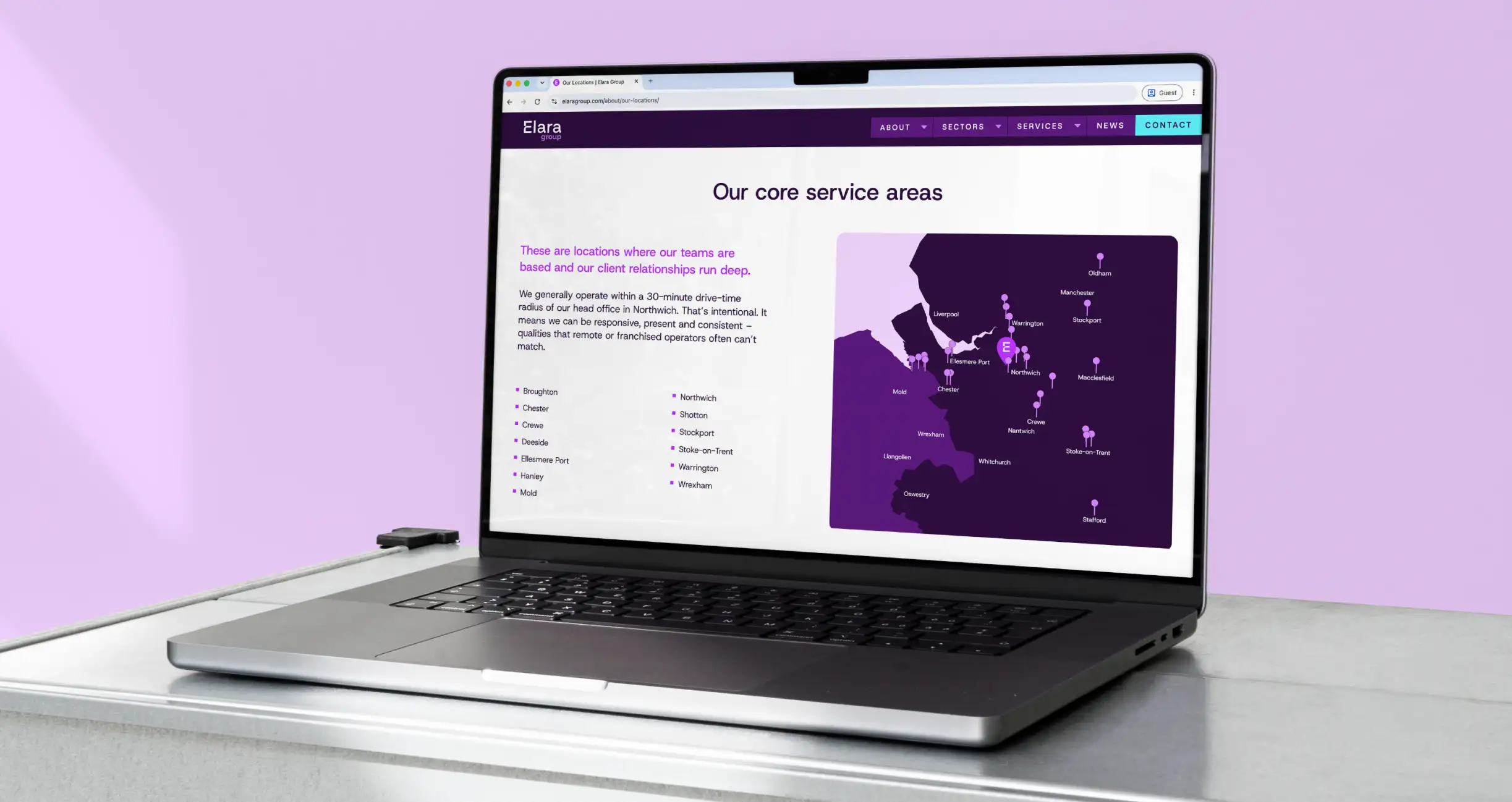
The website needed to do more than look the part. It had to make Elara’s wide range of services and sectors easy to understand, while making it simple for potential clients to take the next step. At Elara’s request, the enquiry form sits right at the top of the site, making conversion a clear part of the experience from the outset.
The biggest shift was in the copy. Rather than focusing on a list of cleaning tasks, we changed the narrative to lead with what those services mean for the client. The tone is punchy and direct, with more space for detail where it adds value. It keeps the site people-led and easy to navigate, while still giving enough depth to communicate the scale of what Elara does.
A clear shift in engagement
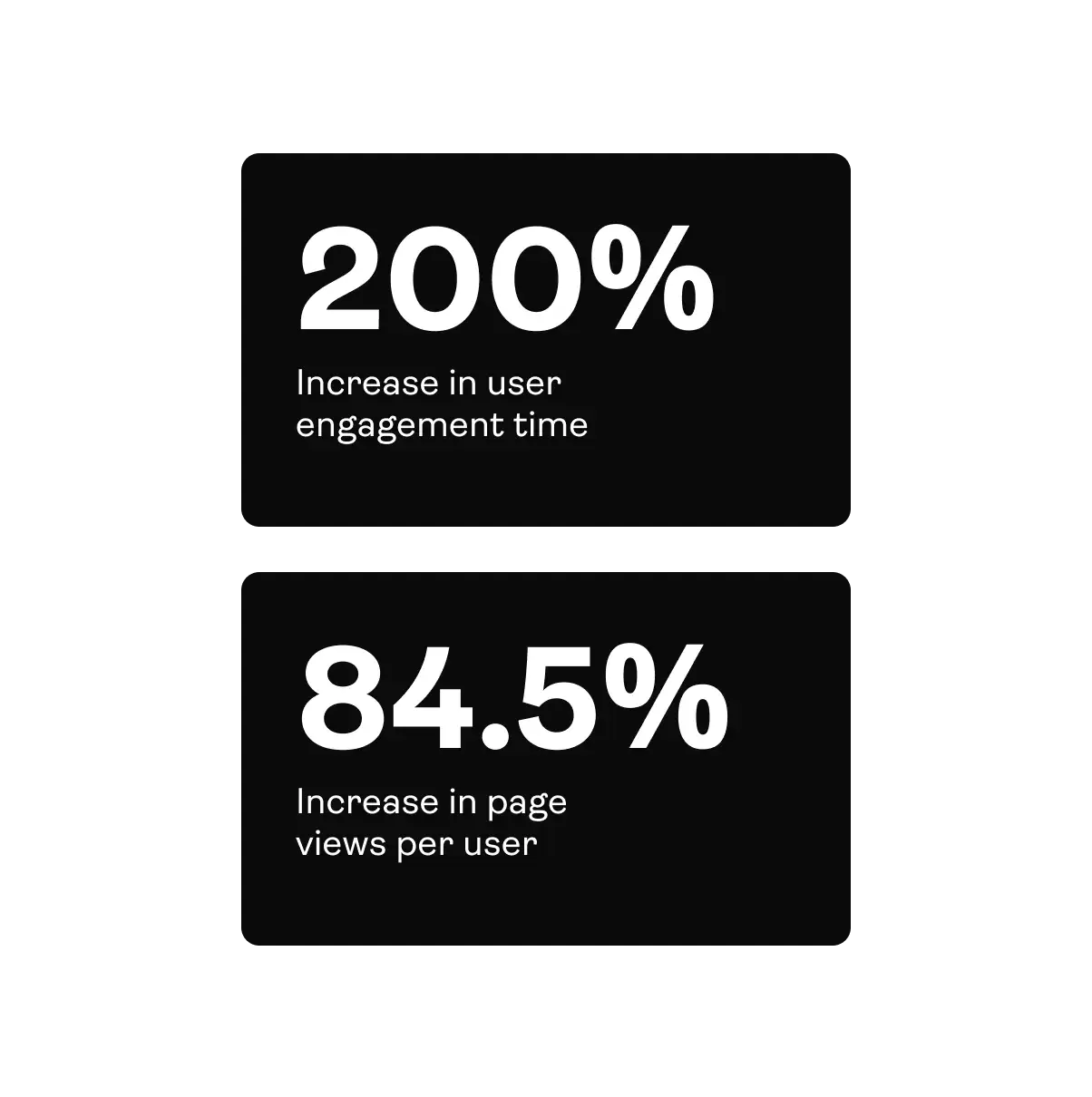
The new Elara website has made a noticeable difference to how people engage with the brand online. Comparing February to August, user engagement time increased by 200%, while page views per user rose by 84.5%. People are spending longer on the site, exploring more content and engaging more deeply with Elara’s services, giving the commercial brand a much stronger digital presence.
A partnership that keeps building
The relationship didn't end at launch. We work with Elara on a retainer, developing the website, producing marketing and building out case studies as the business grows.
That includes a growing suite of sales and sector collateral: a brochure that opens on "No two workplaces operate the same way", sector one-pagers for offices, warehousing, higher education and more, and folded leaflets and folders for showroom and site visits. Every piece carries the violet identity and the same outcome-led message, so the Elara team always has something confident to leave behind.
As a new brand carrying an established business, Elara has real momentum to build on, and a partner to help them do it.

We had looked at so many marketing companies and Stride was the perfect option for us. Clear proposals, pragmatic, measured working relationships with a real warmth and depth. They have really listened and understood us and our business...and we are thrilled with all the work they have done so far!
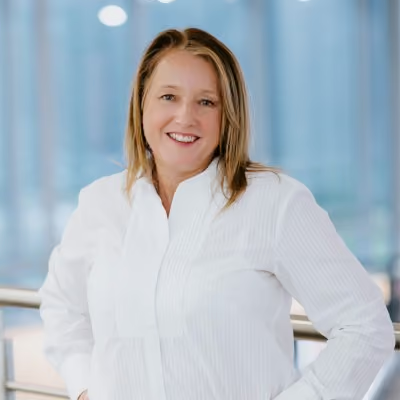
Rebecca Tilling Managing Director
Book in a chat to see if we're a good fit.
