
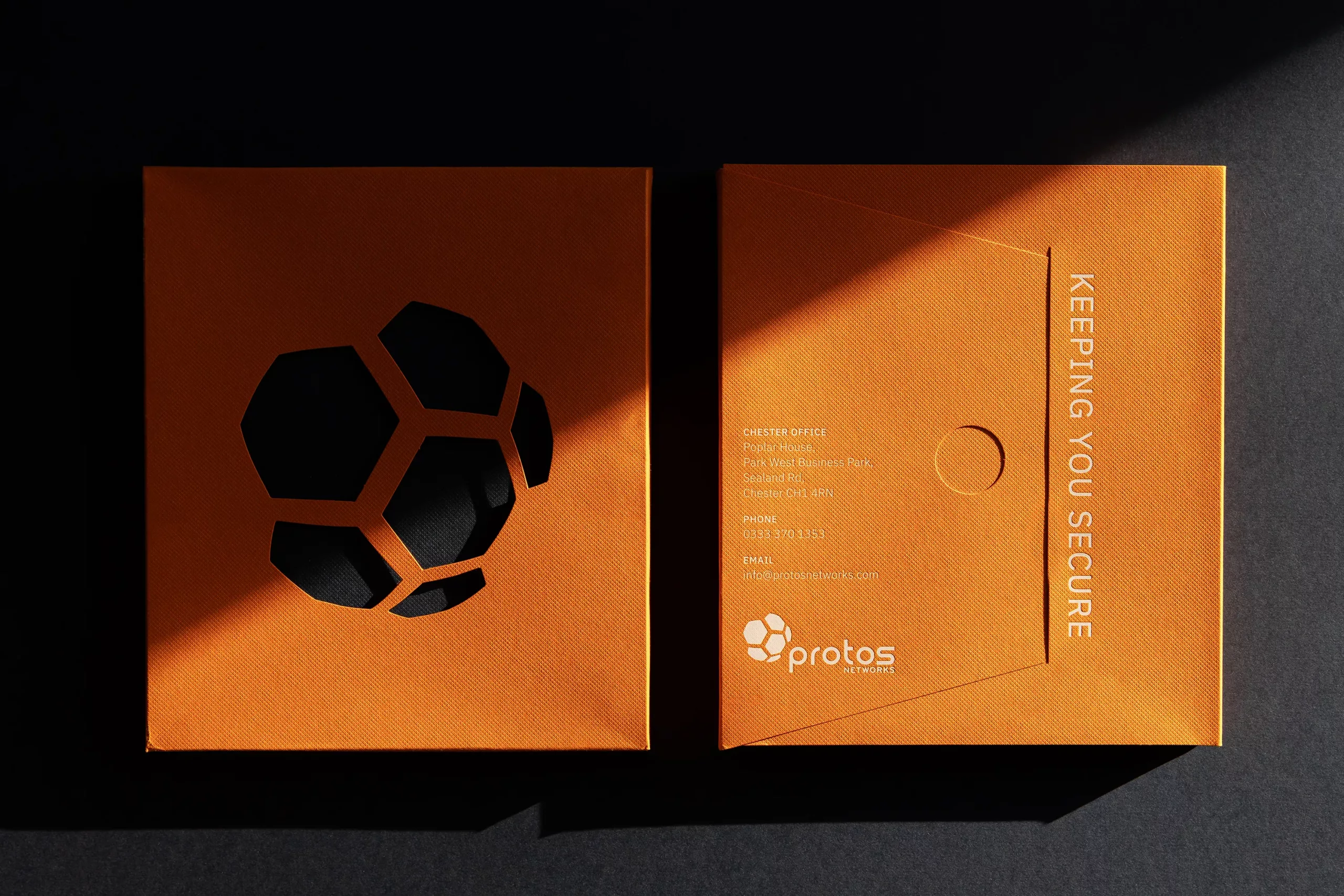
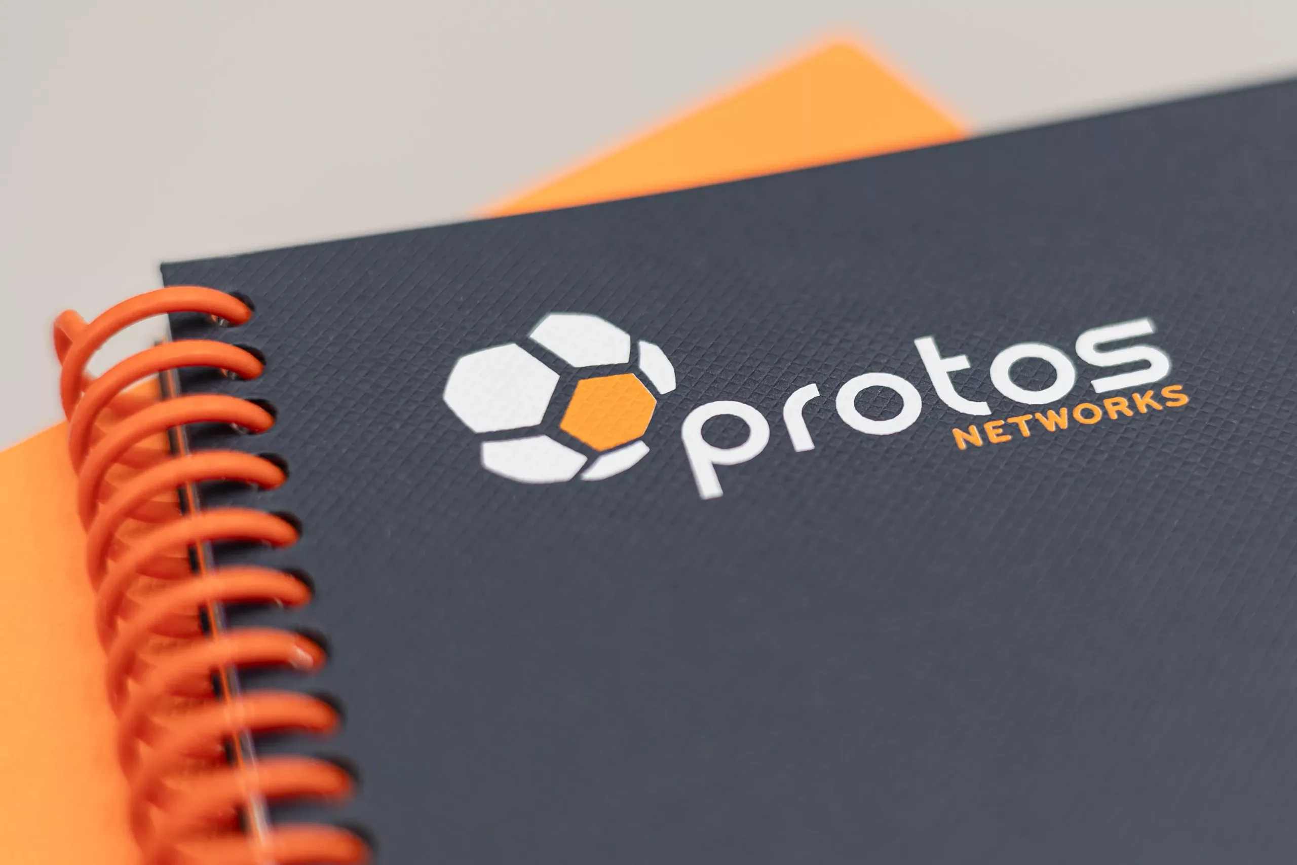
Branding evolution and new website for network and security specialists.
Following a thorough comprehension of their website objectives, we also needed to enhance their brand identity, evolving it from an existing logo into a fully fledged brand. We did this by providing them with a new colour palette, typography, styling and brand rollout.
Throughout the process, our primary focus remained on optimising the user journey to efficiently fulfil their requirements, ensuring a pleasing browsing experience.
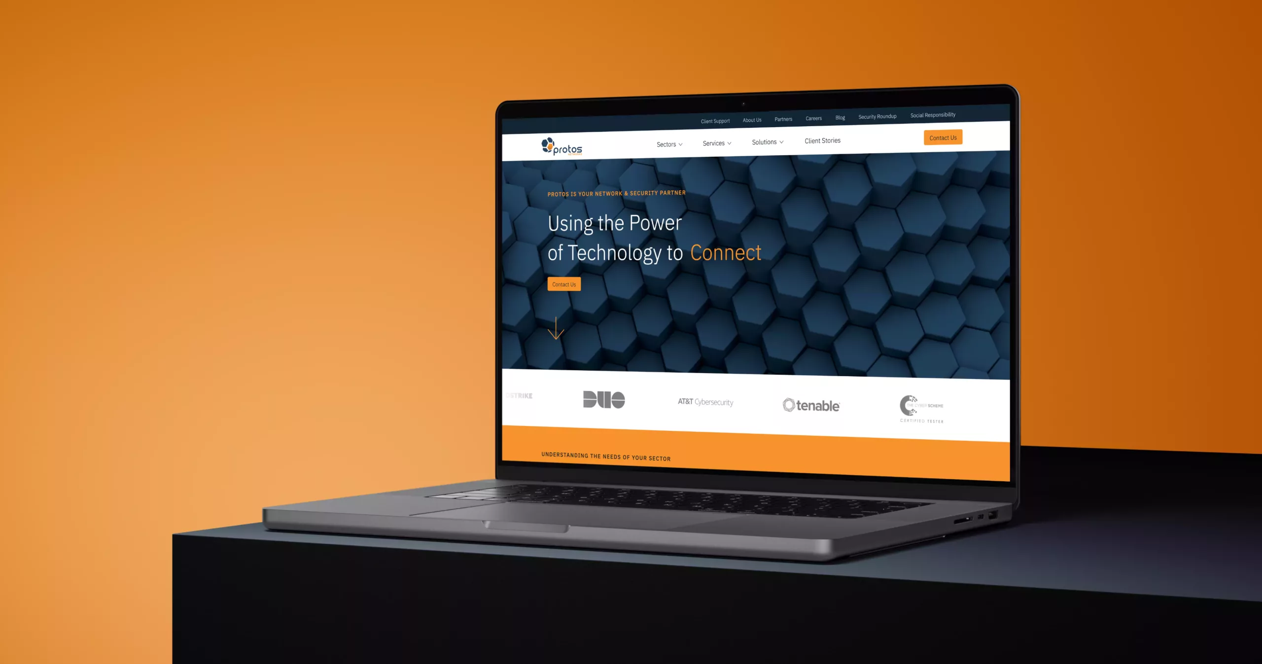
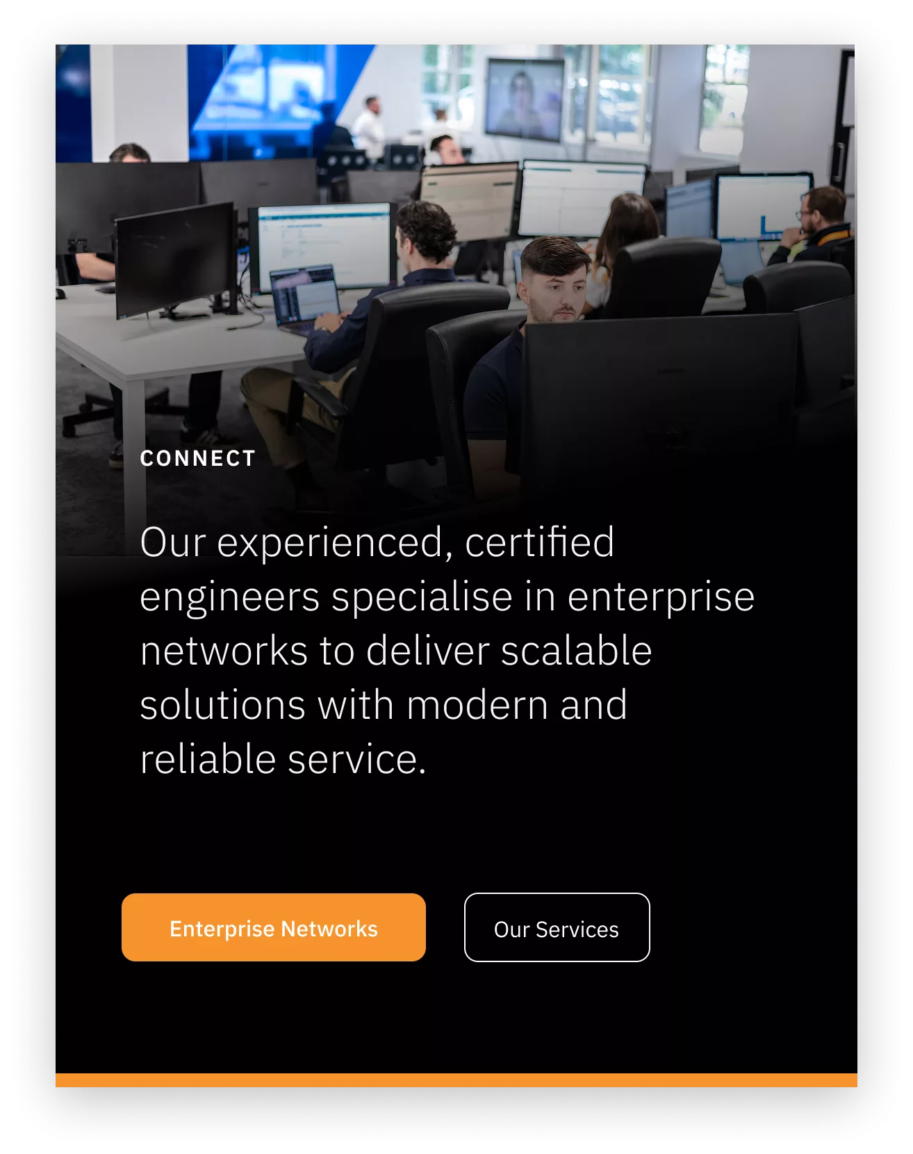

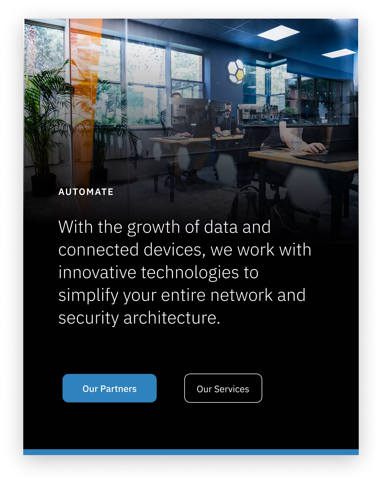
A crucial aspect of the website redesign was to present extensive technical information in a manner that is easy to understand. We sought to strike a delicate balance, catering both to those familiar with the subject and those who are not.
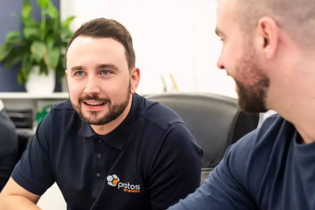
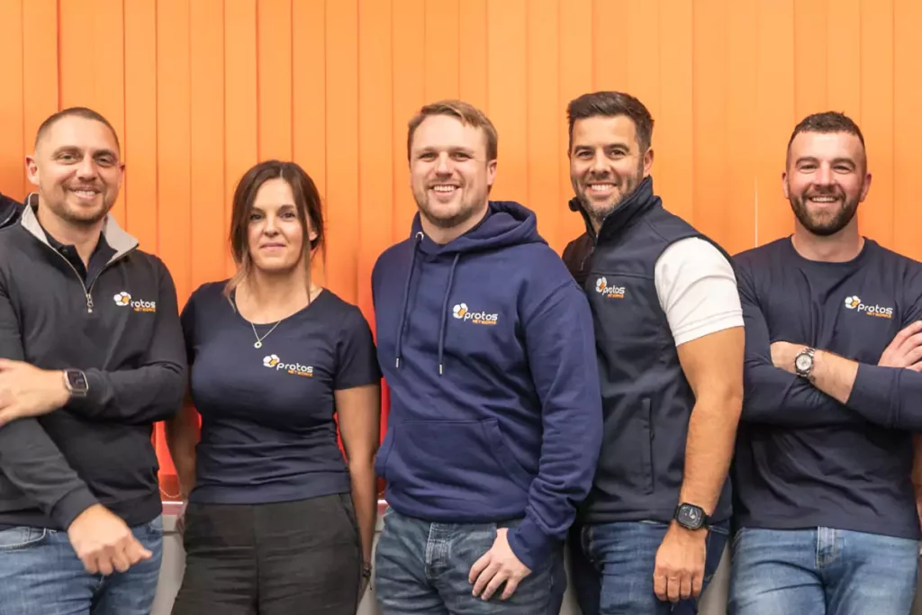
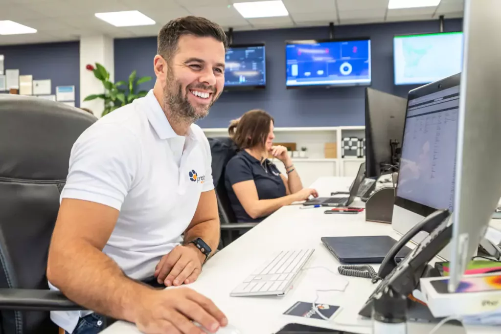
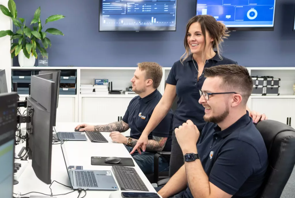
The Protos team, in particular, values the way we made the website dynamic and engaging even though the content is not always inherently visual.
We achieved this by introducing a revamped colour palette, new typeface, homepage video, new photoshoot and carefully selected stock imagery.

Engineering Clarity
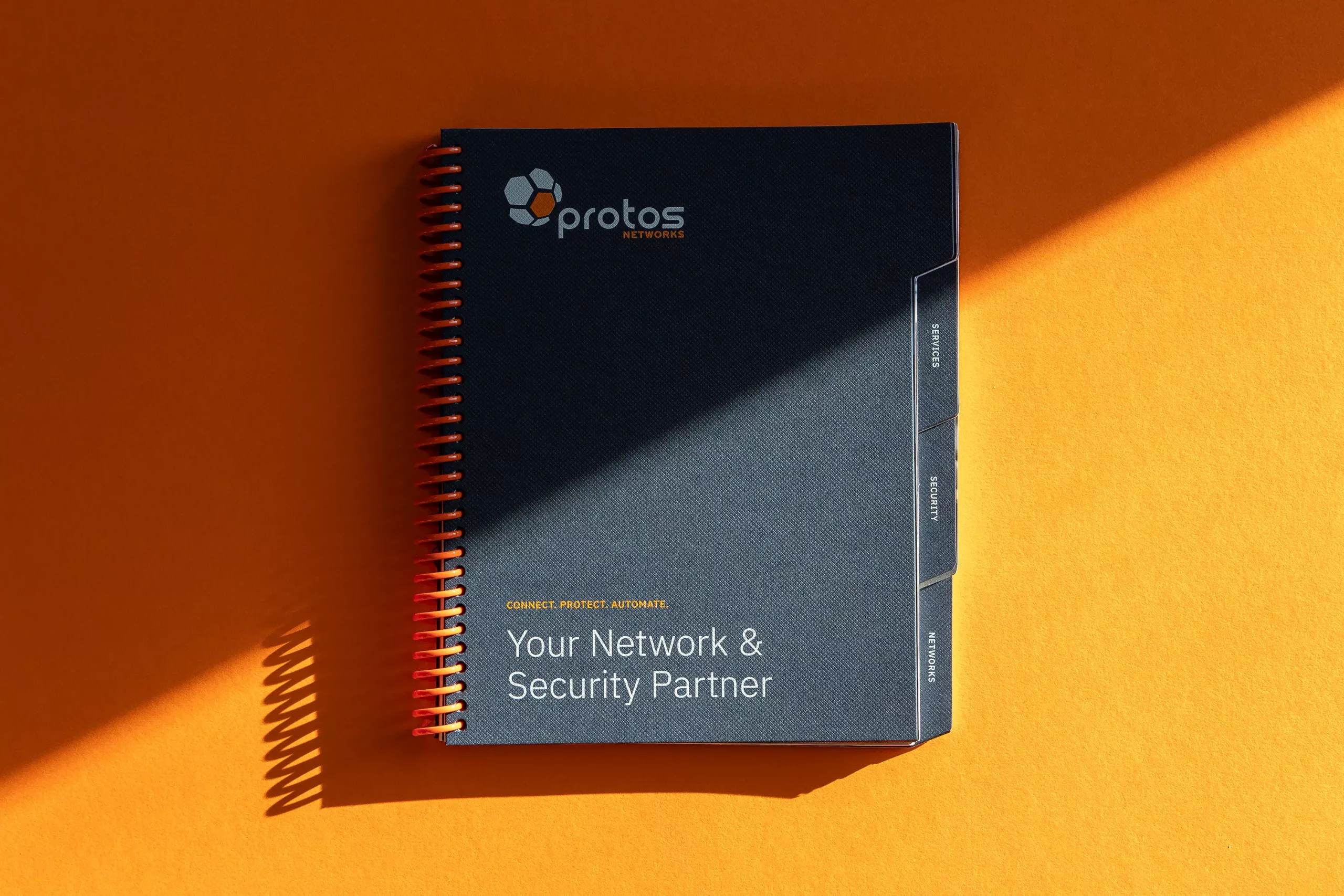
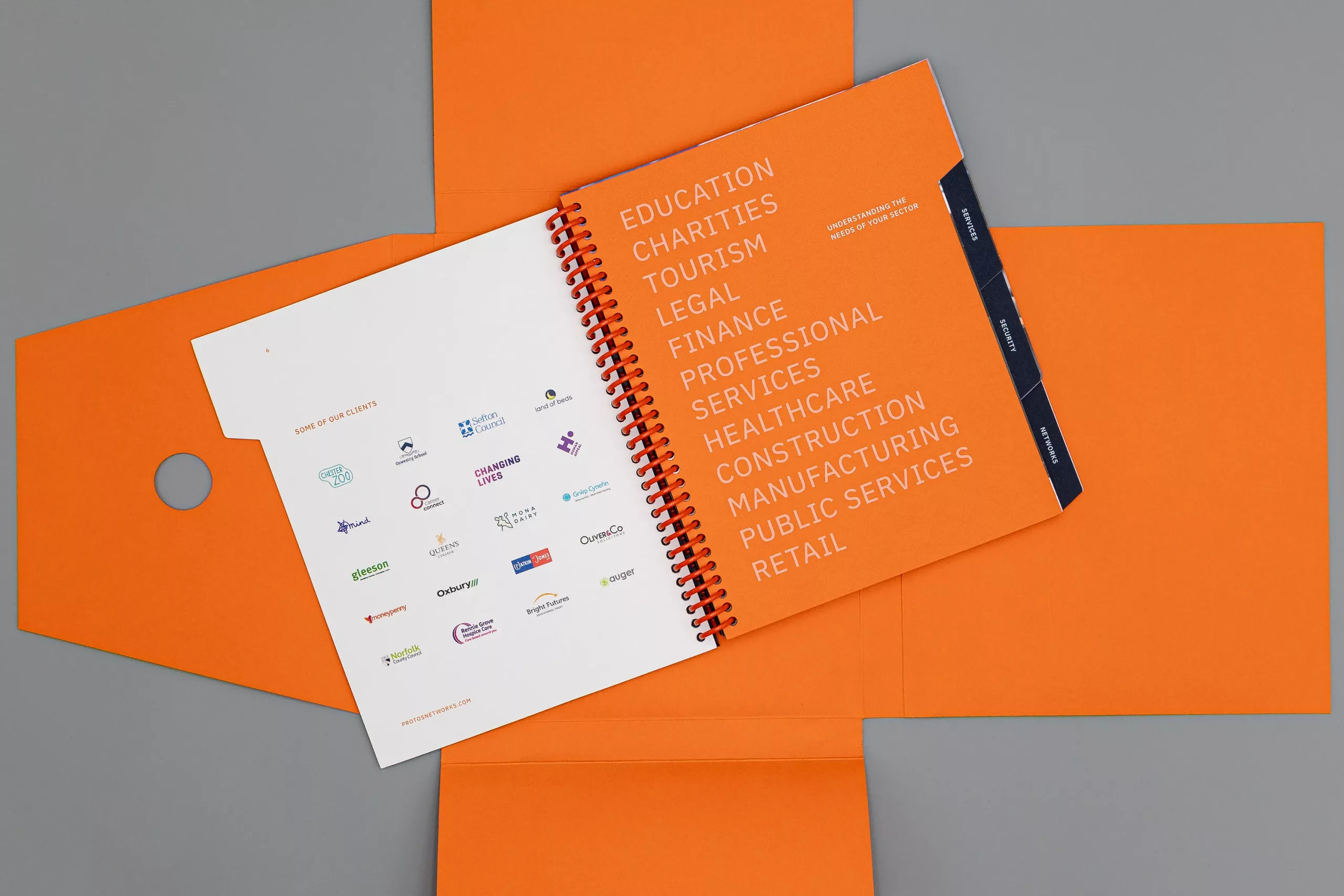
The company overview publication for Protos Networks was created as a tool to introduce their services to IT managers within large organisations.
The content was highly technical, covering complex infrastructure and security concepts, but needed to remain clear and approachable. The emphasis was on breaking information into manageable sections so readers could quickly understand key points without being overwhelmed. A strong visual hierarchy was used throughout, with large statistics, iconography and generous white space helping to structure dense content. Imagery was used selectively to support the narrative and guide readers through the publication at a steady, readable pace
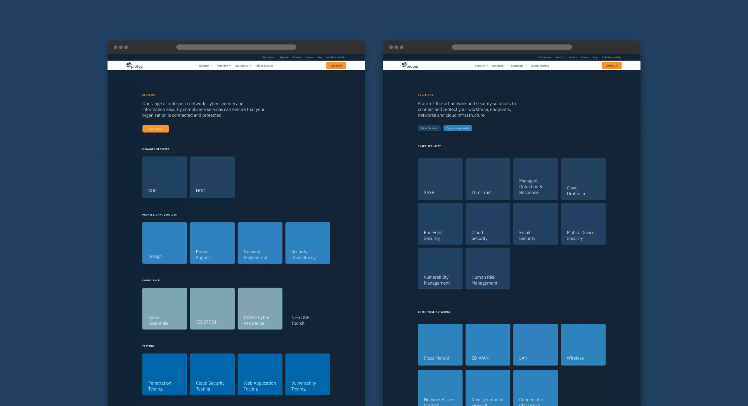
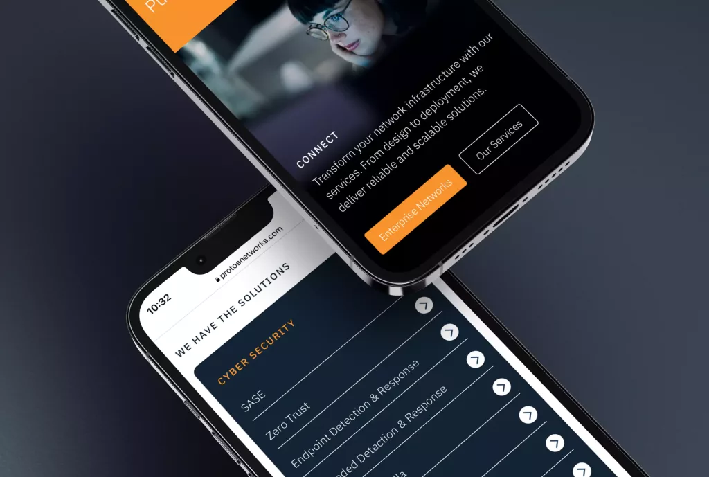
Navigation
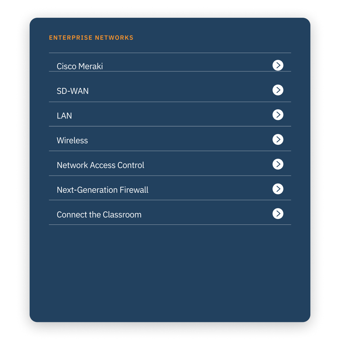
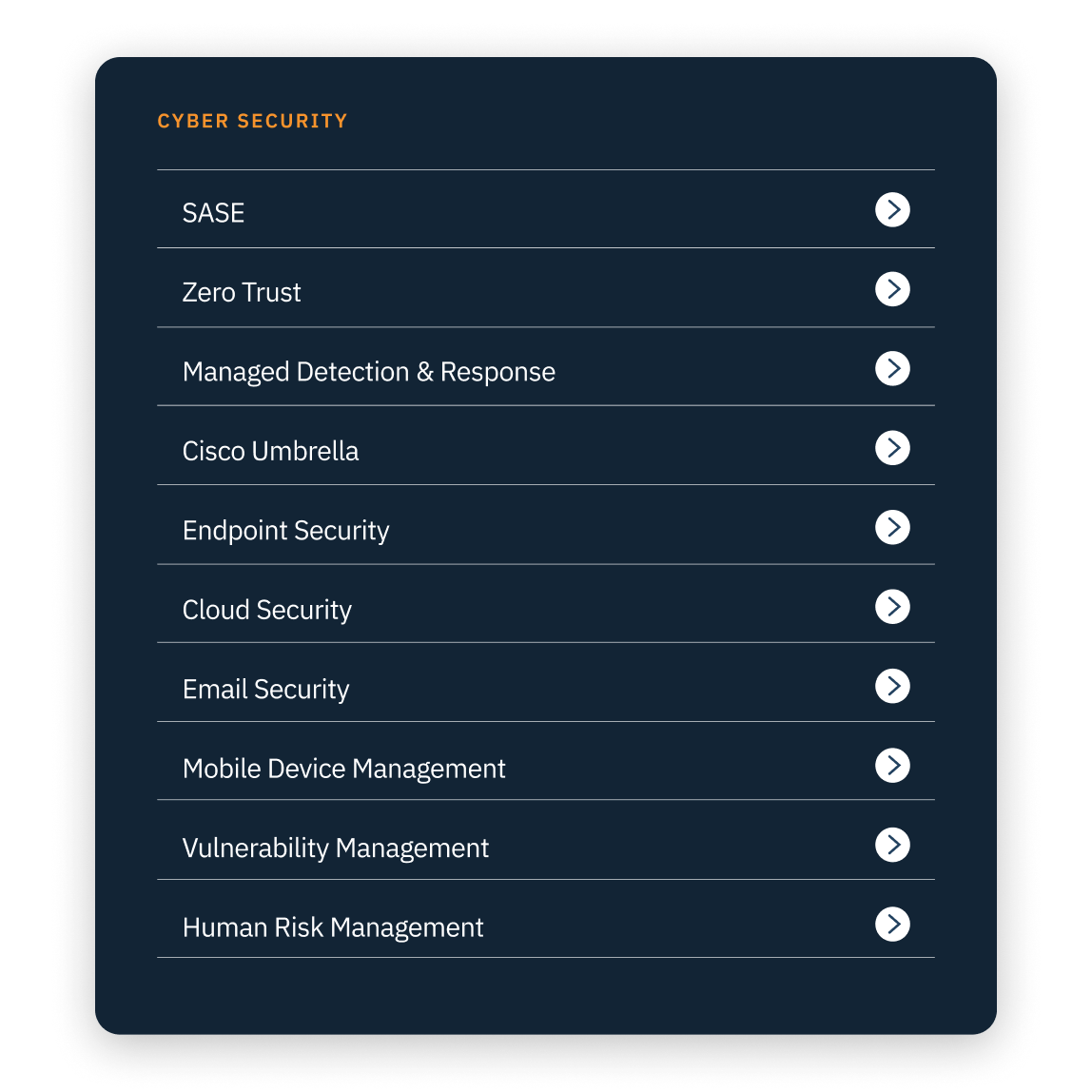
With an extensive array of services, products, and solutions, it was imperative to establish different customer entry points.
As each customer may have unique requirements, ranging from specific products they seek to researching solutions to their problems, we segmented the information into distinct categories allowing us to cater to different customer profiles effectively.
At all times, we looked to streamline the user journey to maximise the likelihood of satisfying their needs promptly.
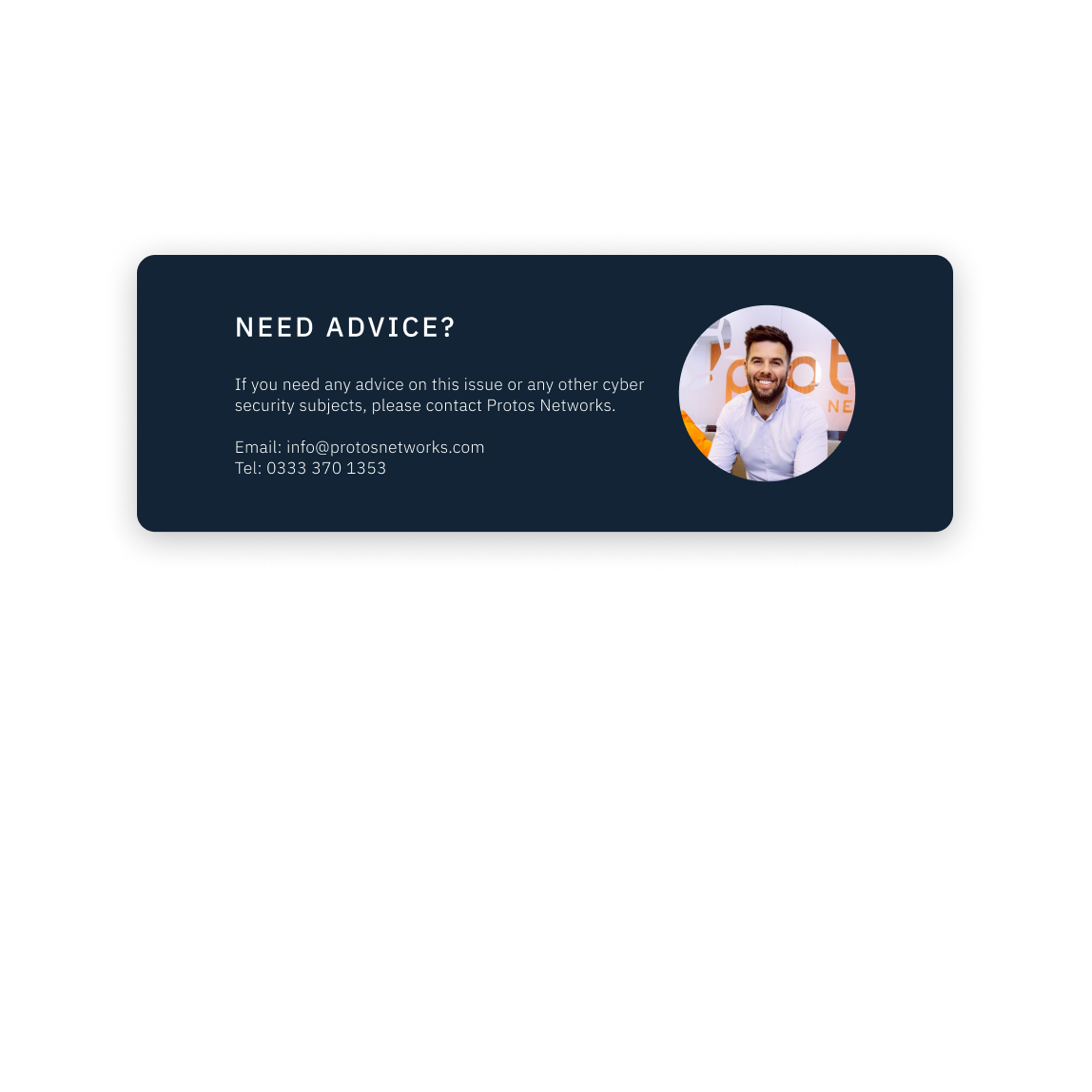
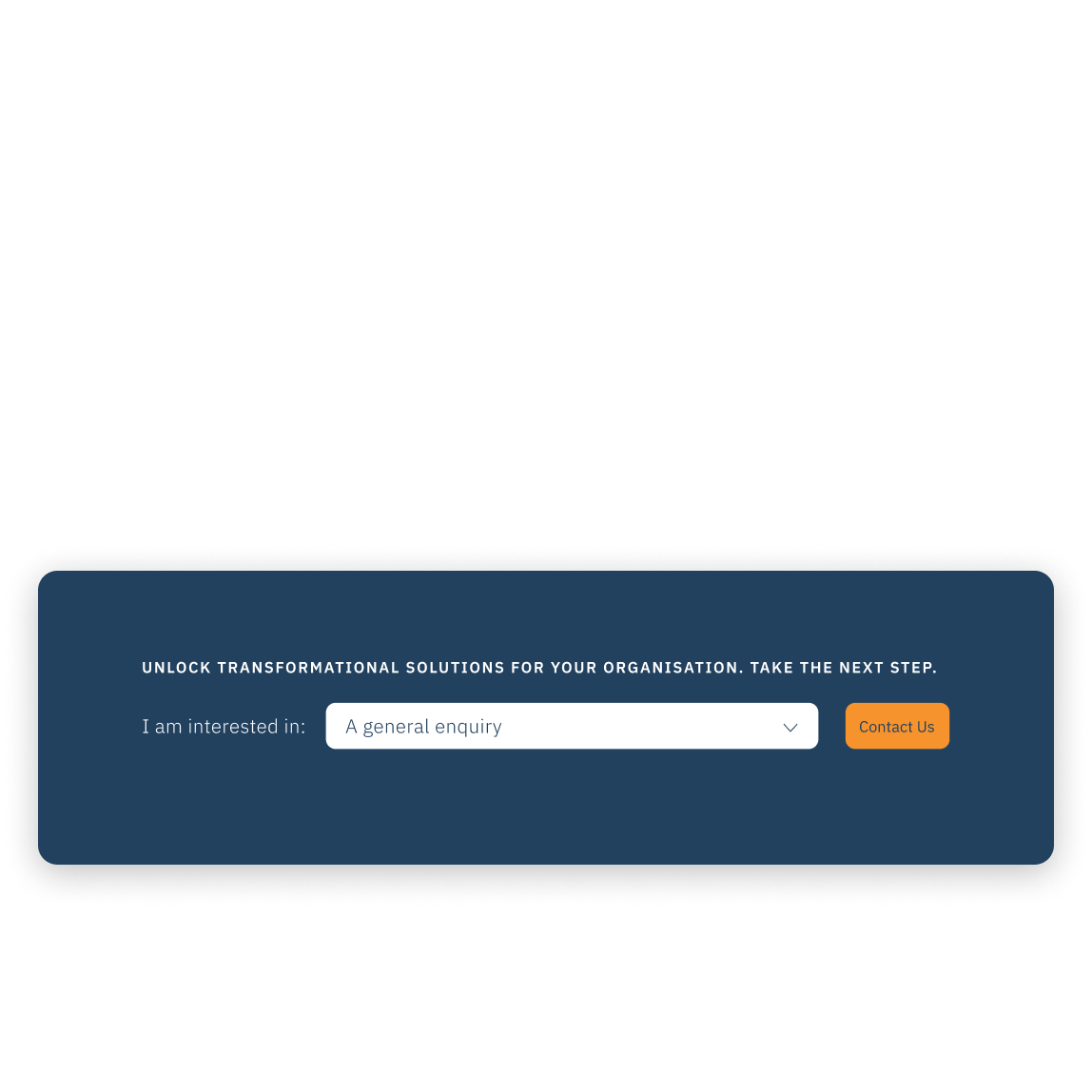
Call to Action
Where attention spans are limited, concise and compelling CTAs (call-to-actions) serve as signposts, directing users on the next steps to take.
We used CTAs to aid understanding of the services and encourage dialogue with new customers. We strategically placing these prompts throughout the website to ensure they stand out visually.
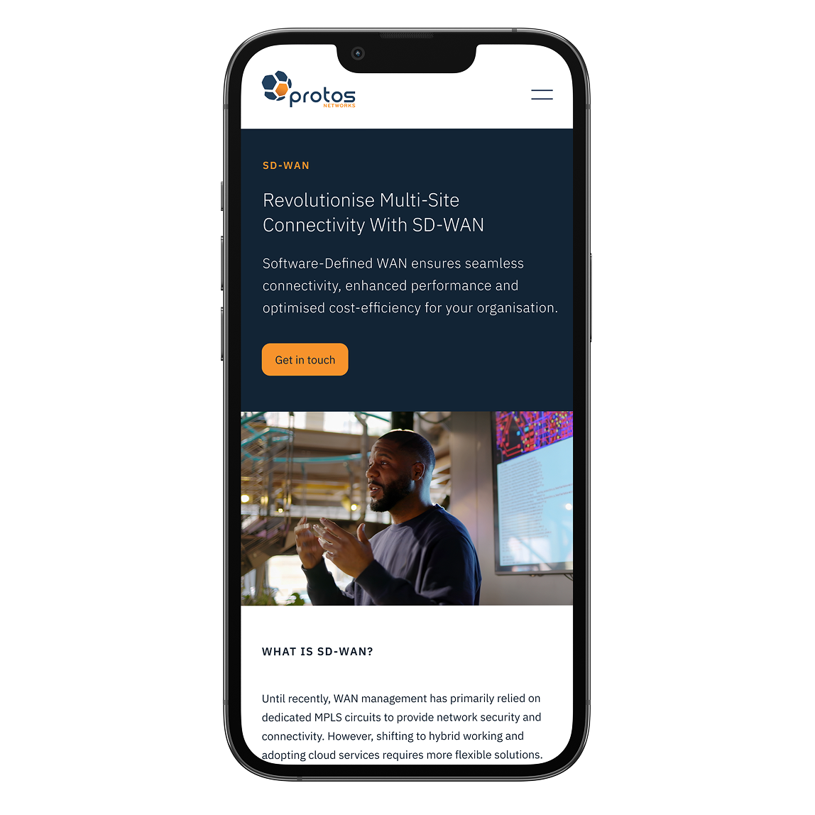
Optimised for mobile
We develop all our websites with modern browsers and mobile devices as standard to make browsing easy and fast. We use the latest HTML, CSS and PHP technologies to guarantee optimal performance, visual appeal and readability across all platforms.

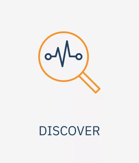
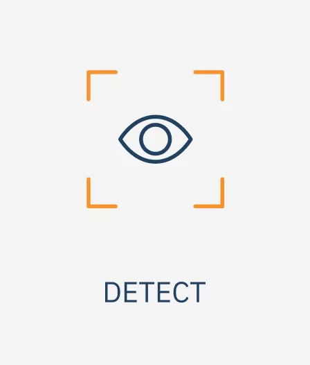
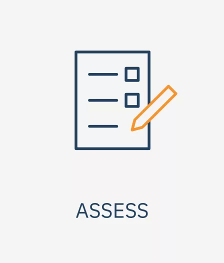
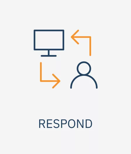
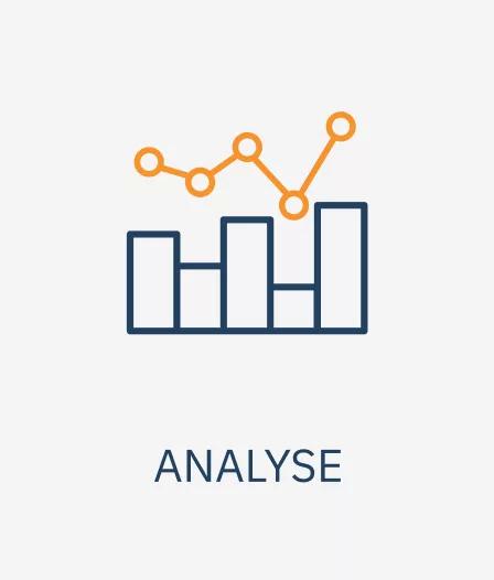
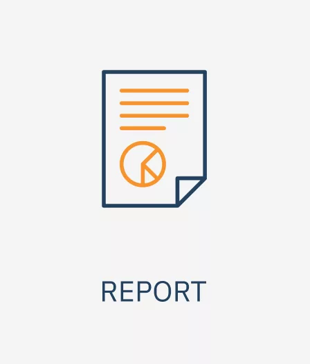
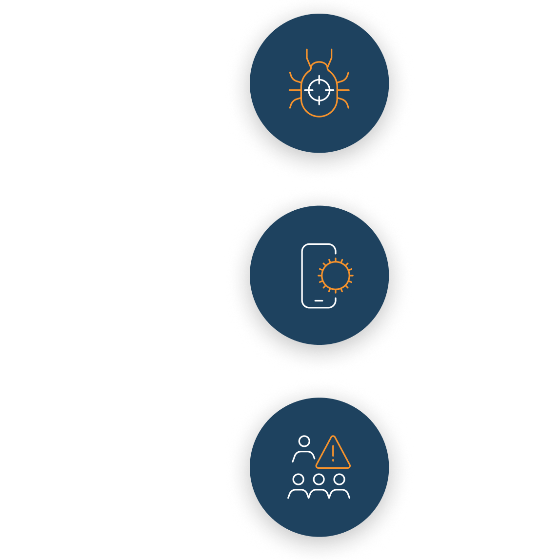
Bespoke icons
We developed a suite of over 30 custom-designed icons, integrated throughout the websites services pages, proposal documents, and printed brochures.
These icons serve to enhance visual engagement, providing respite from the often heavy informational content that needs to be outlined.

The whole process was simple, with Stride managing every detail, resulting in a fresh look for the website and bringing new life to our branding.
Stride are not just experts in the field but are incredibly epic people who have taken the time to understand not just our marketing needs, but us. We couldn’t have wished for a better partner.