From Heart to Hub: Reimagining Chester BID's Brand Identity
The refreshed brand is strategically designed to engage local businesses under Chester BID's remit while attracting consumers to visit the city. At the heart of our design approach was creating an adaptable logo system. We developed multiple logo iterations, with primary and secondary marks that could transition across different applications.
This wasn't just about aesthetics, it was about creating a brand language that could speak clearly whether on a website, social media, printed materials, or within the city's infrastructure.


Evolve to solve
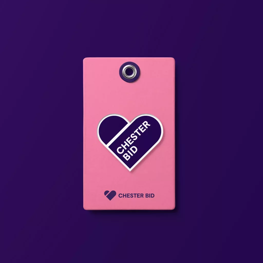
The previous Chester BID logo was built around a heart symbol, a metaphor for community support. By reinterpreting the heart, we were able to modernise the logo while preserving the emotional core of the previous identity.
We discovered an opportunity to create visual continuity within the brand by reflecting the organic, curved lines of the heart in the brand’s new capsule design element. The rounded edges of the original heart logo became a blueprint for the curved capsules used throughout the brand’s visual language.
These capsule shapes now function as a dynamic design device across brand applications, from social media to the website. This approach ensures the brand feels refreshed without losing its roots.
Built to explore
With a significant volume of existing content and complex functionality requirements, we focused on designing a website experience that serves both Chester BID’s team and its diverse audience.
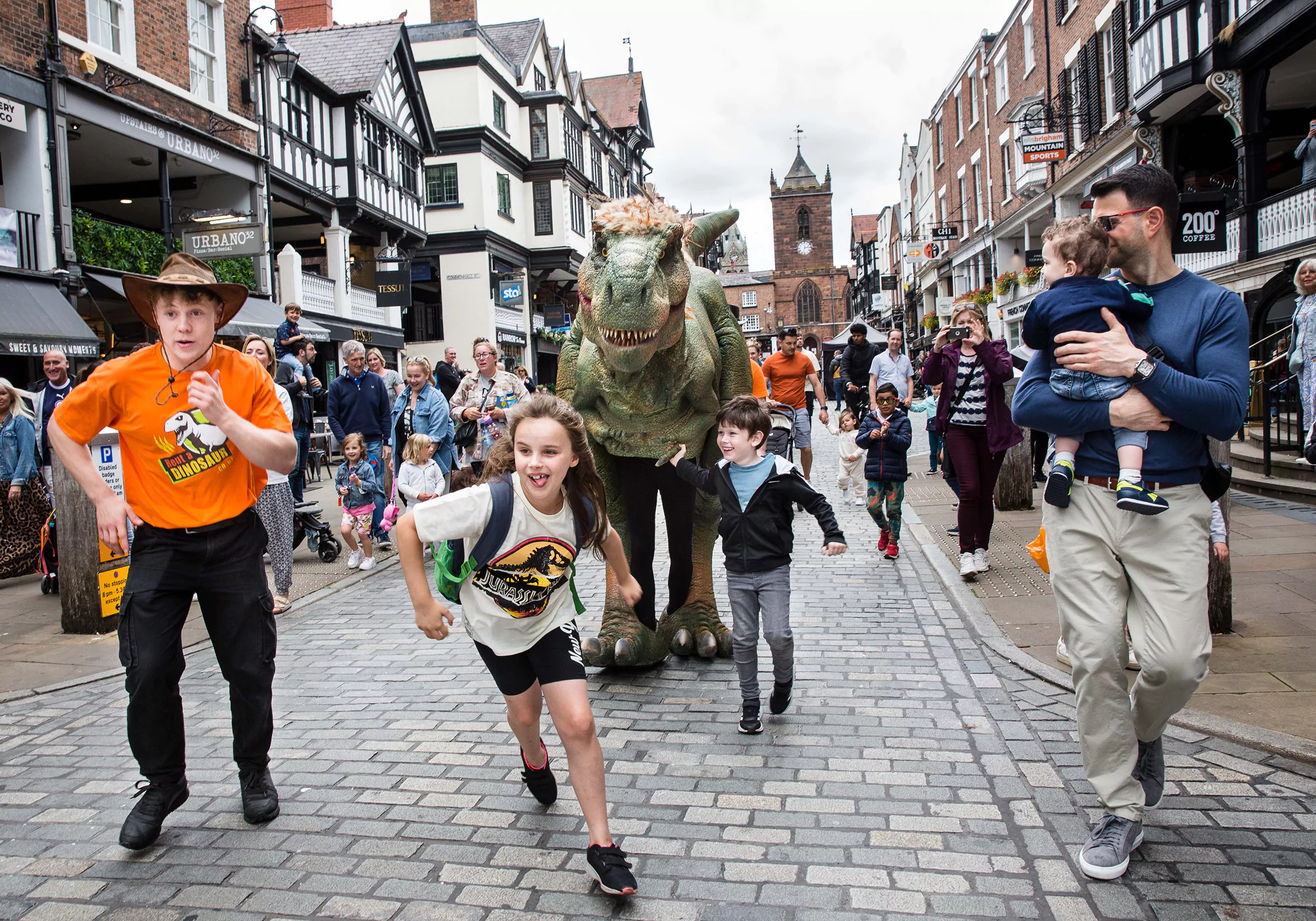
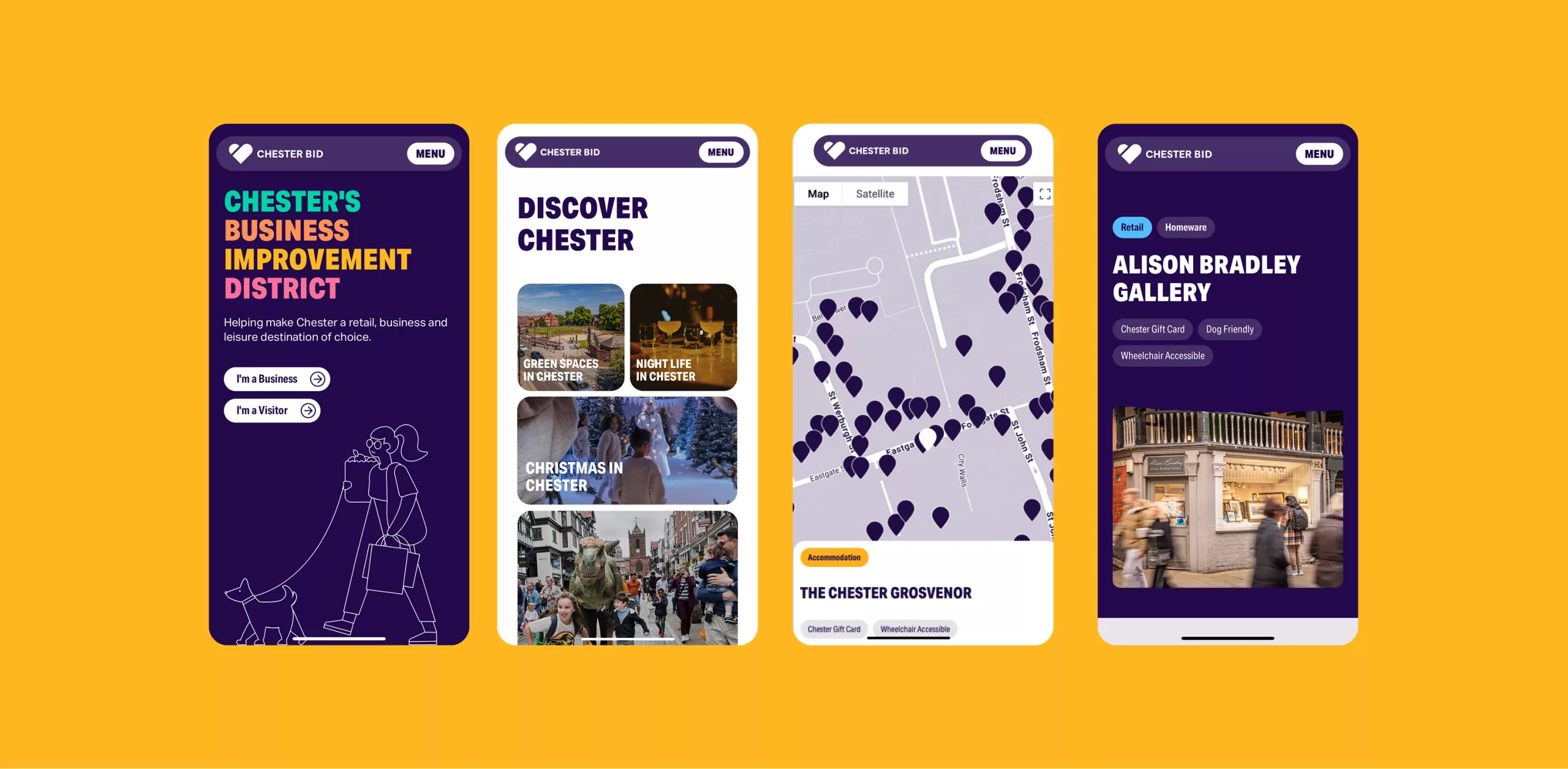
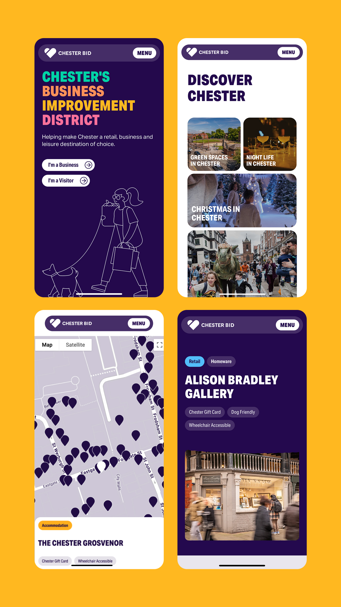
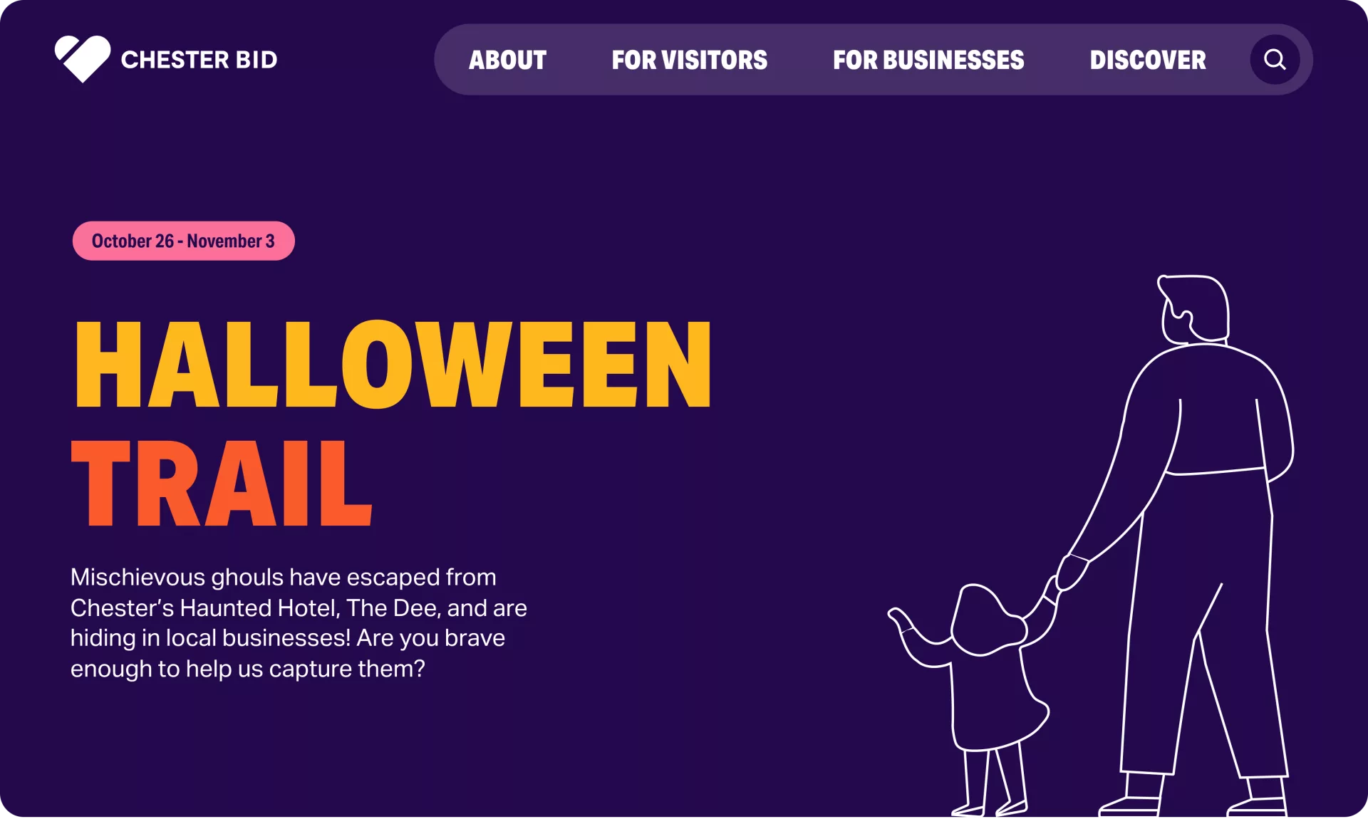
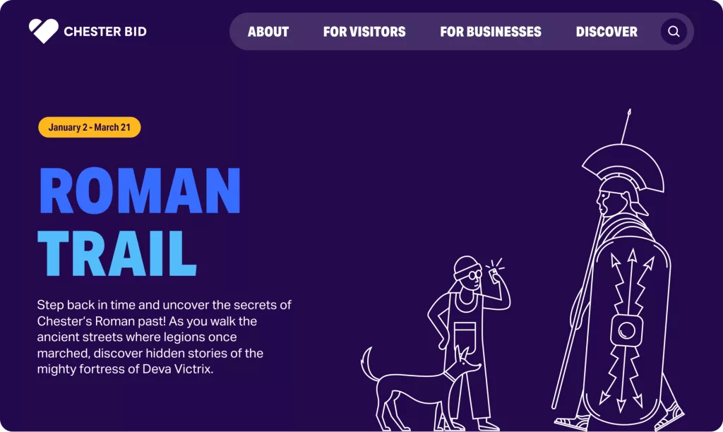
Key features include an interactive map system that powers business directories, car park listings, and seasonal trails such as Halloween and Christmas routes. Visitors can easily filter listings to find businesses relevant to their needs, while the visual design brings the new brand to life through colour, illustration, and subtle animation, enhancing engagement without distracting from key information.
Unified by design
Chester BID previously operated two separate websites, one for businesses and one for visitors, each tailored to different audiences. We brought these together into a single, user-friendly platform shaped by collaborative workshops that clarified priorities and informed intuitive user journeys. Visually, the site strikes a balance between a professional and vibrant brand expression.
The engine room
Behind the scenes, a fragmented system was replaced with a custom CMS that centralises business data and automates key features such as maps, events, and offers, all connected directly to member profiles. This reduces manual input and increases flexibility. With development continuing on a retainer basis, the platform is reviewed regularly to ensure it evolves in line with Chester BID’s goals.
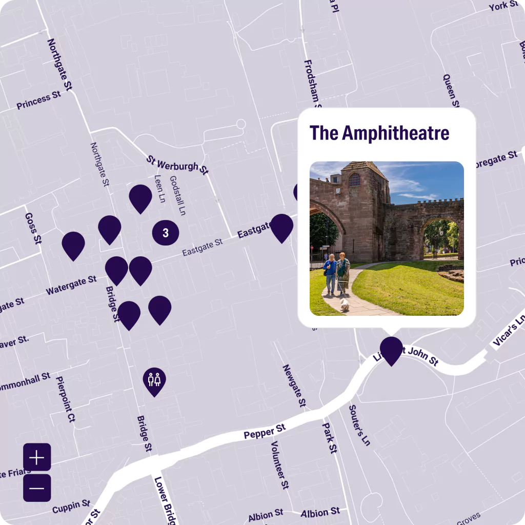
Maps galore
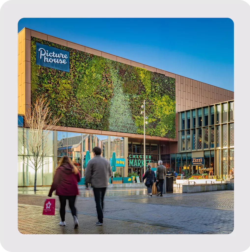
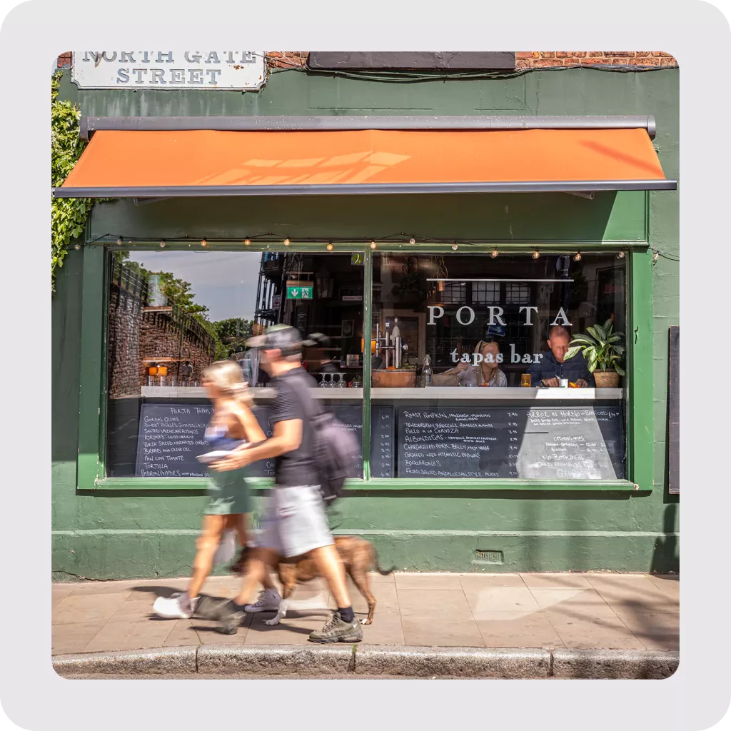
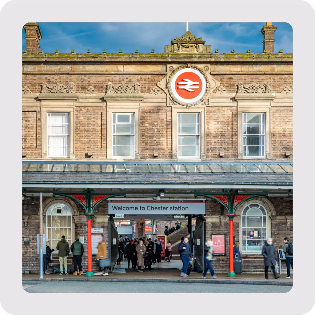
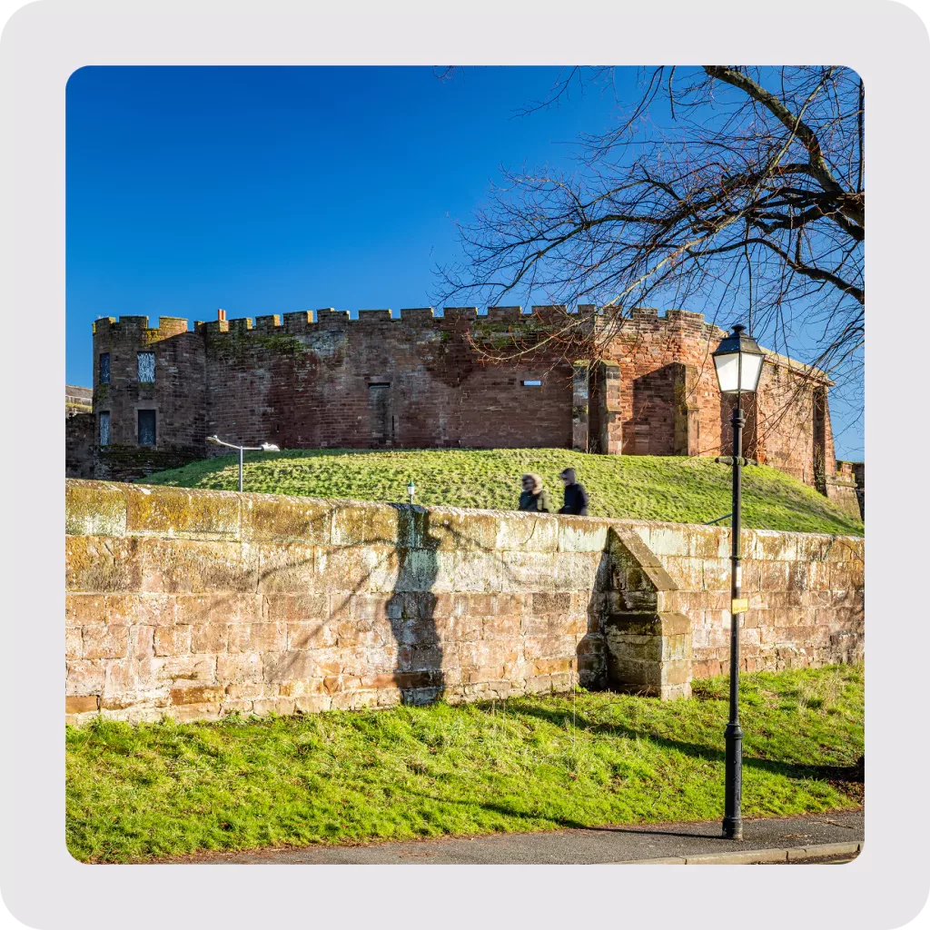
Understanding the importance of navigation and discovery, we developed a set of practical maps that make it easy for visitors to explore the city and find what matters to them. These maps highlight local businesses, uncover hidden gems, and encourage people to engage more deeply with the area.
From themed trails to seasonal highlights, the maps are designed to support real-world exploration and help visitors connect with Chester’s character and community. Whether someone is new to the city or returning, they offer a clear and helpful way to navigate, while showcasing what makes Chester unique.
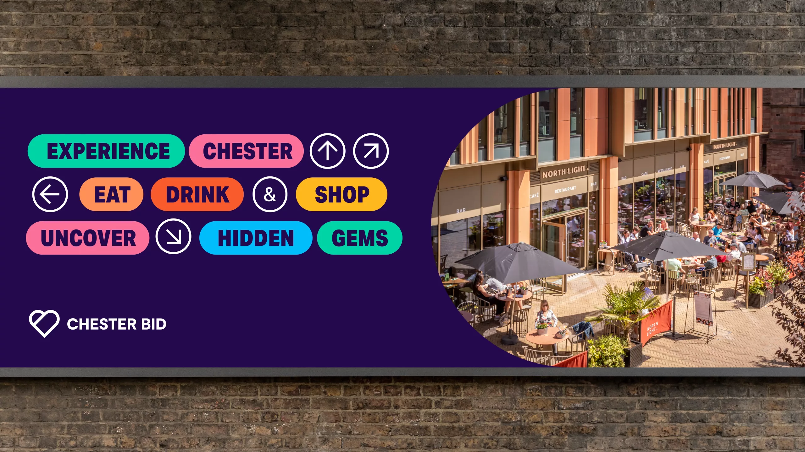
Built to be sociable
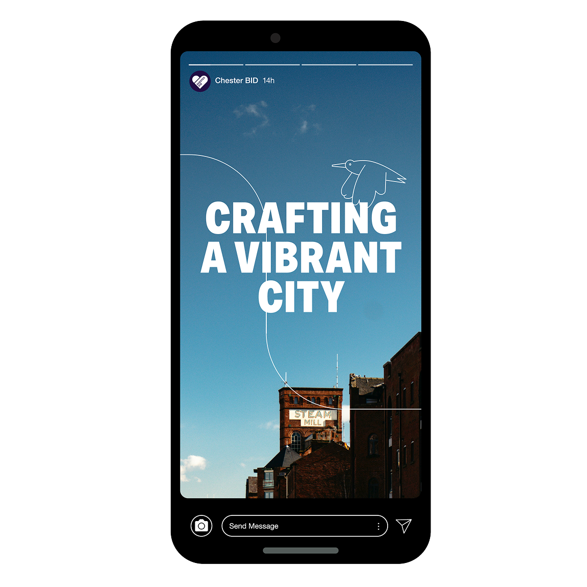
Within the brand rollout, social media became our canvas for expressing personality and purpose. We created mockups to demonstrate how the brand can flex, dialling up energy for bold campaigns or scaling back for more practical messaging.
Using dynamic typography, vibrant colour, and confident headlines, we brought key messages to life. Posts like “UNVEILING LOCAL CHARM” and “CRAFTING A VIBRANT CITY” show how digital platforms can become storytelling spaces, while also delivering clear calls to action.


We had the absolute pleasure of working with Stride, a talented design and web agency based in Chester City Centre, to develop our rebrand and create a vibrant new website.
From the outset, the team at Stride demonstrated an exceptional ability to delve deep into who we are, what we do, and how we achieve our goals. Their insight and knowledge were invaluable in shaping a brand and online presence that truly reflects the vibrancy of Chester and everything it has to offer.