


Rebranding of a traditional family owned bakehouse
Client
Satterthwaites
Location
Liverpool
Discipline
Brand
Print
Signage
Packaging
Sectors
Food & Drink
Retail & Leisure
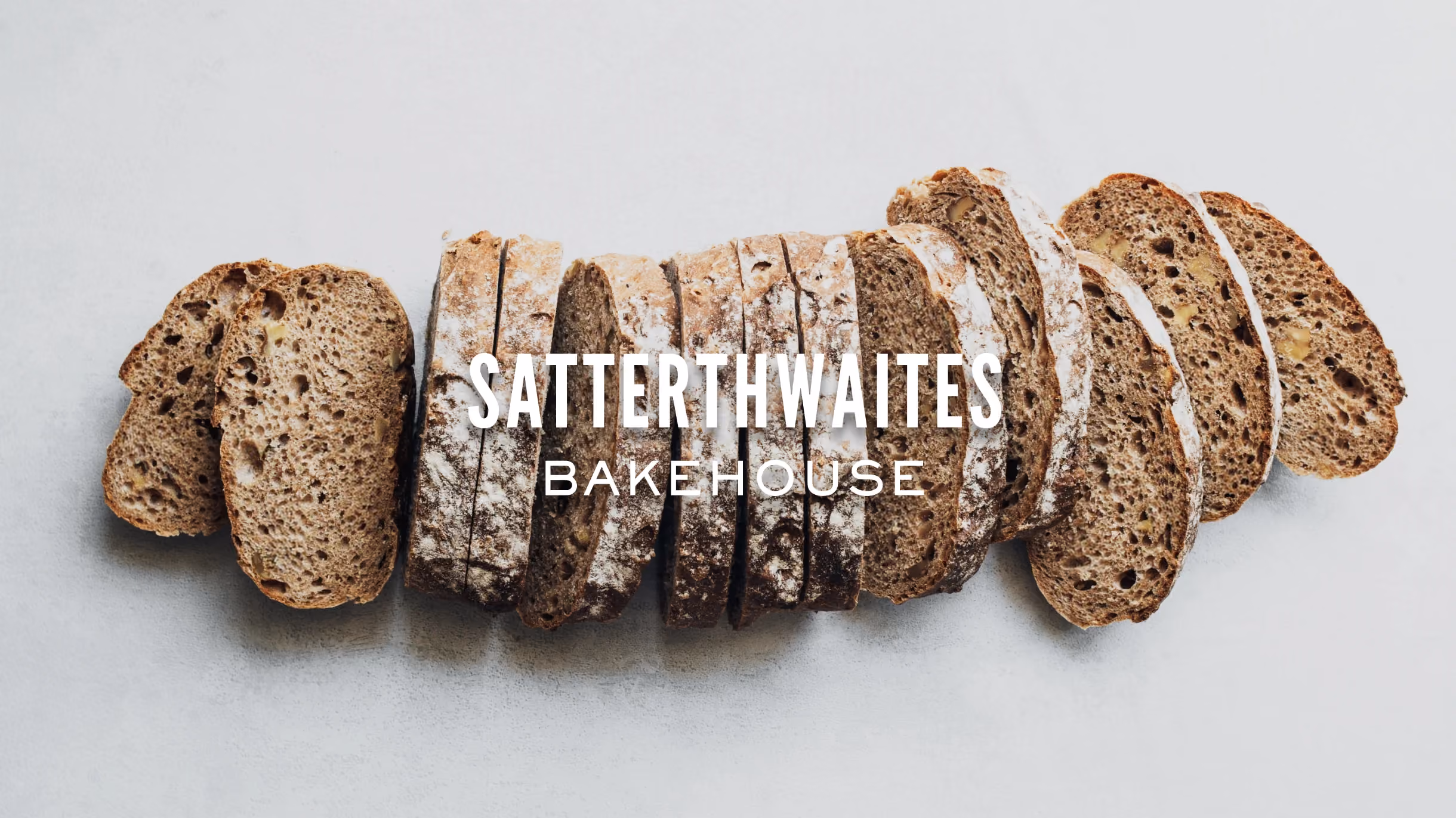
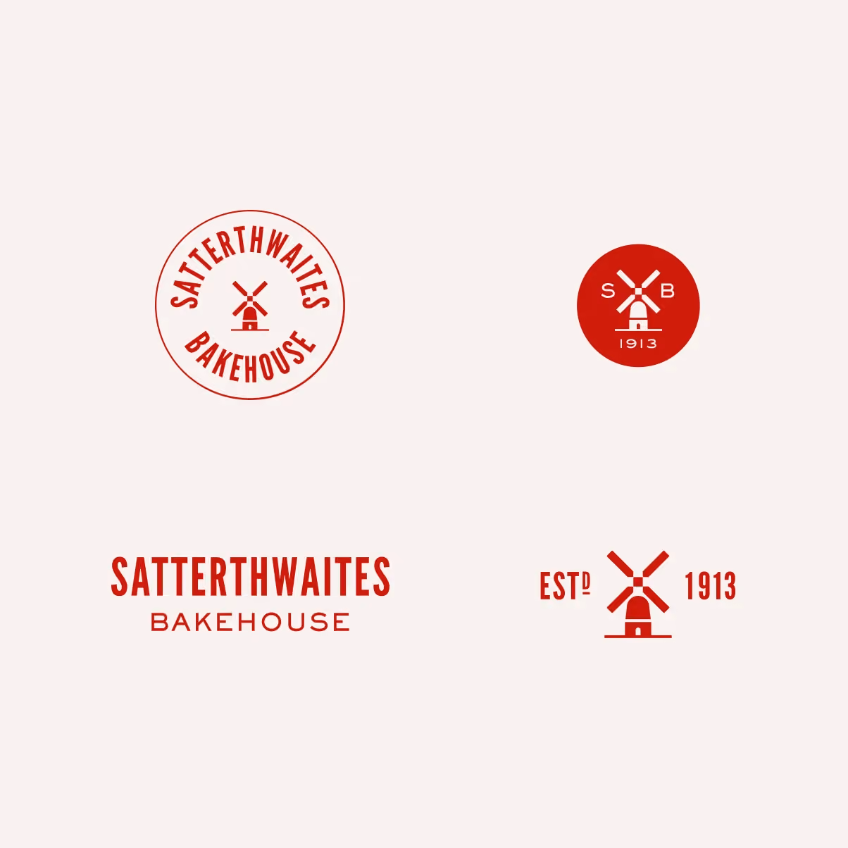
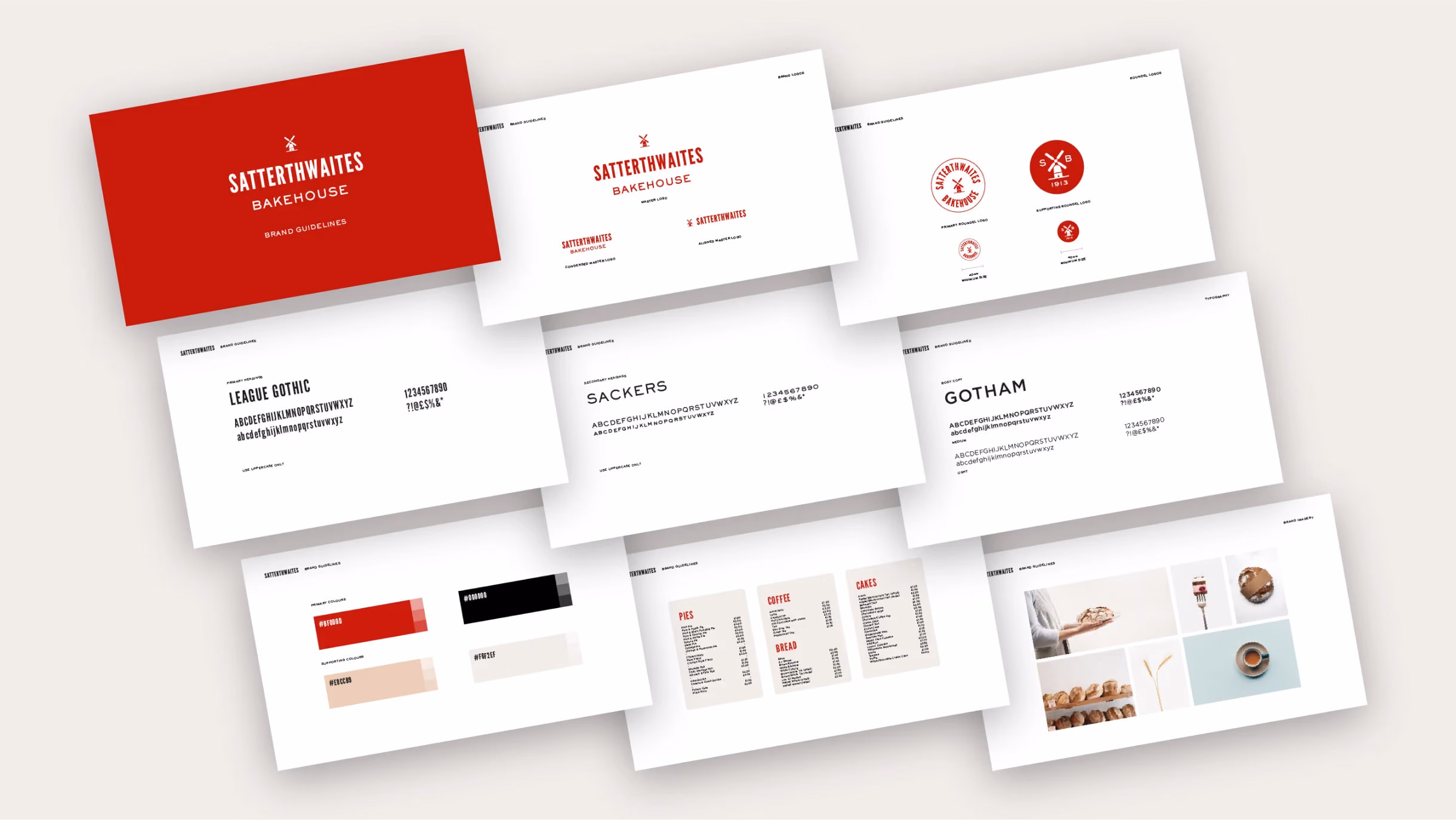
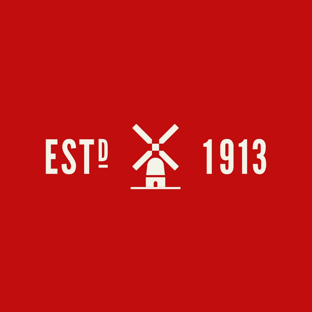
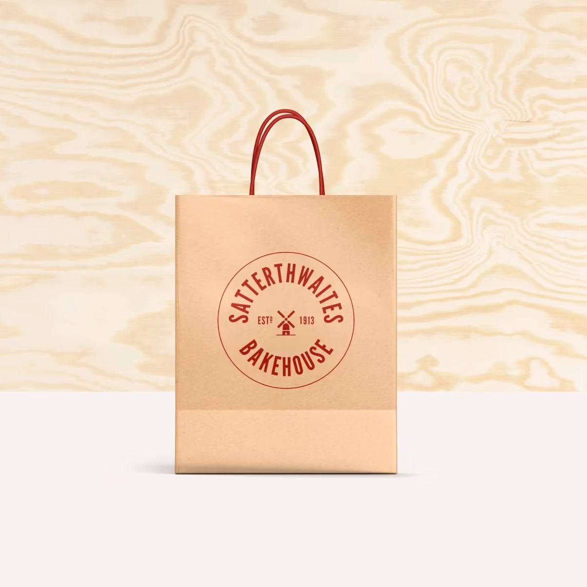
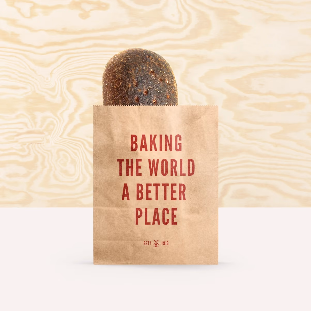
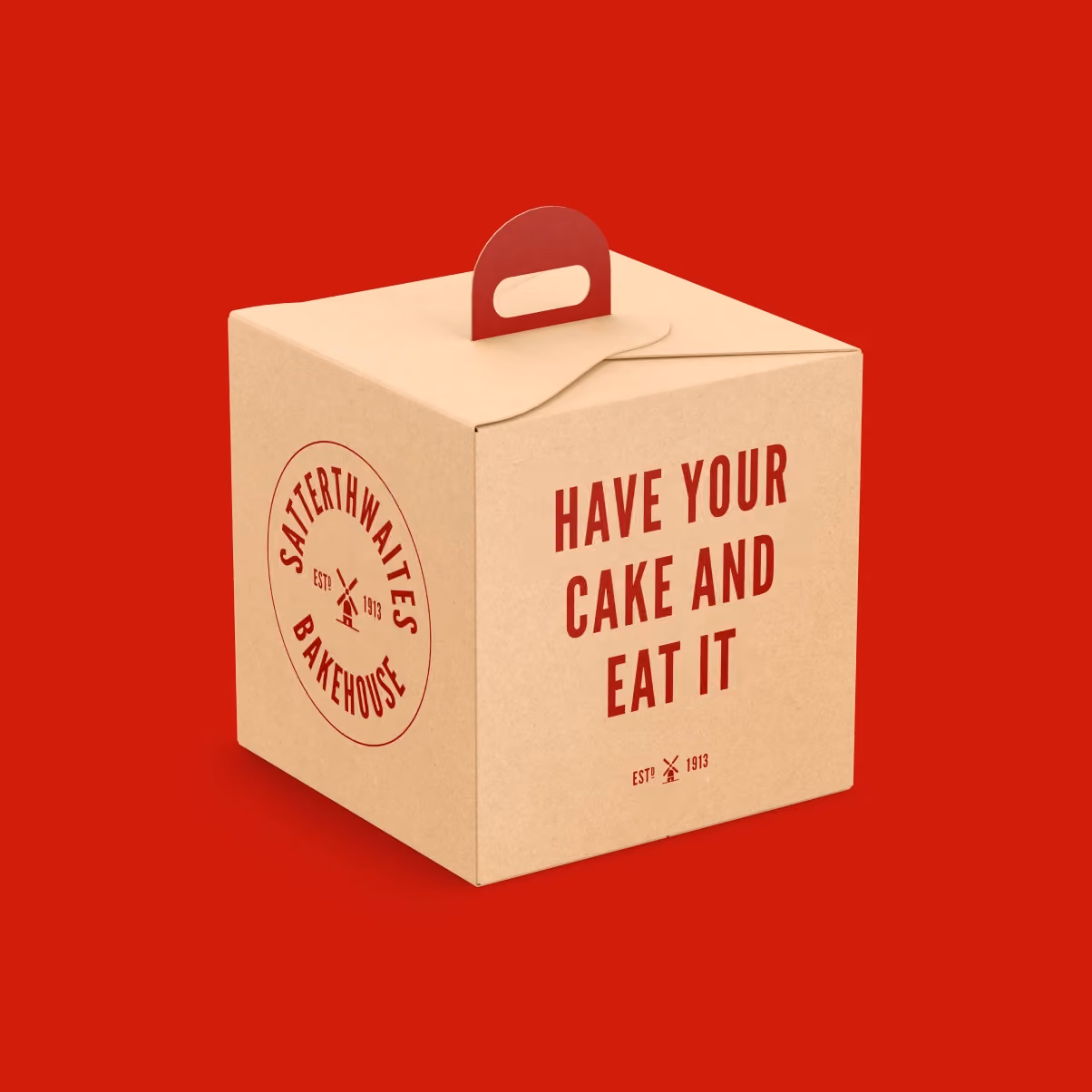
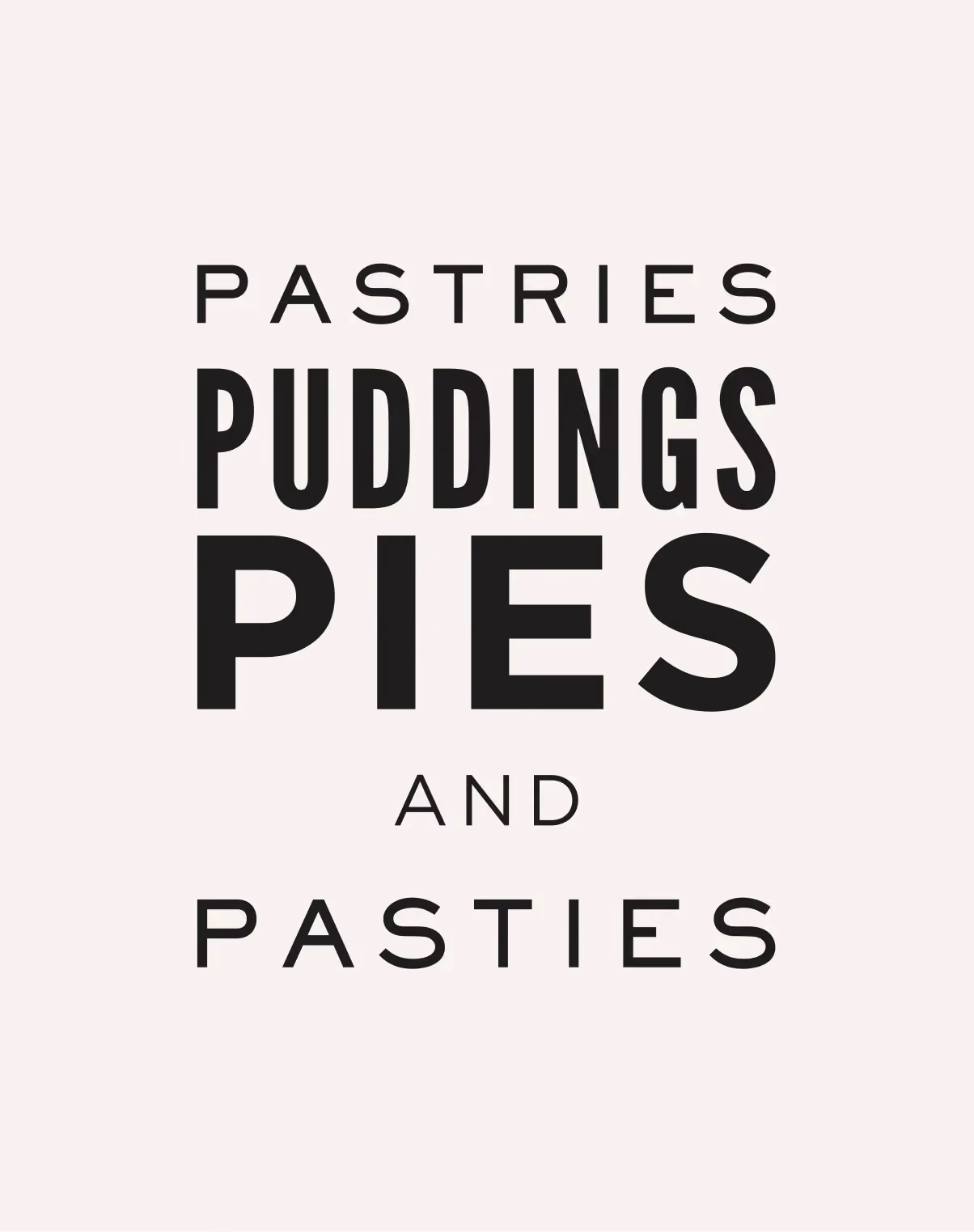
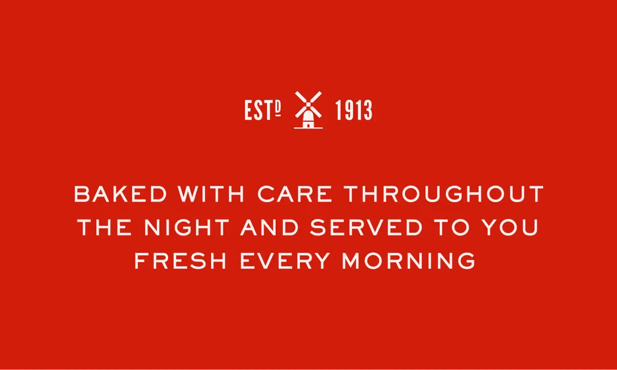
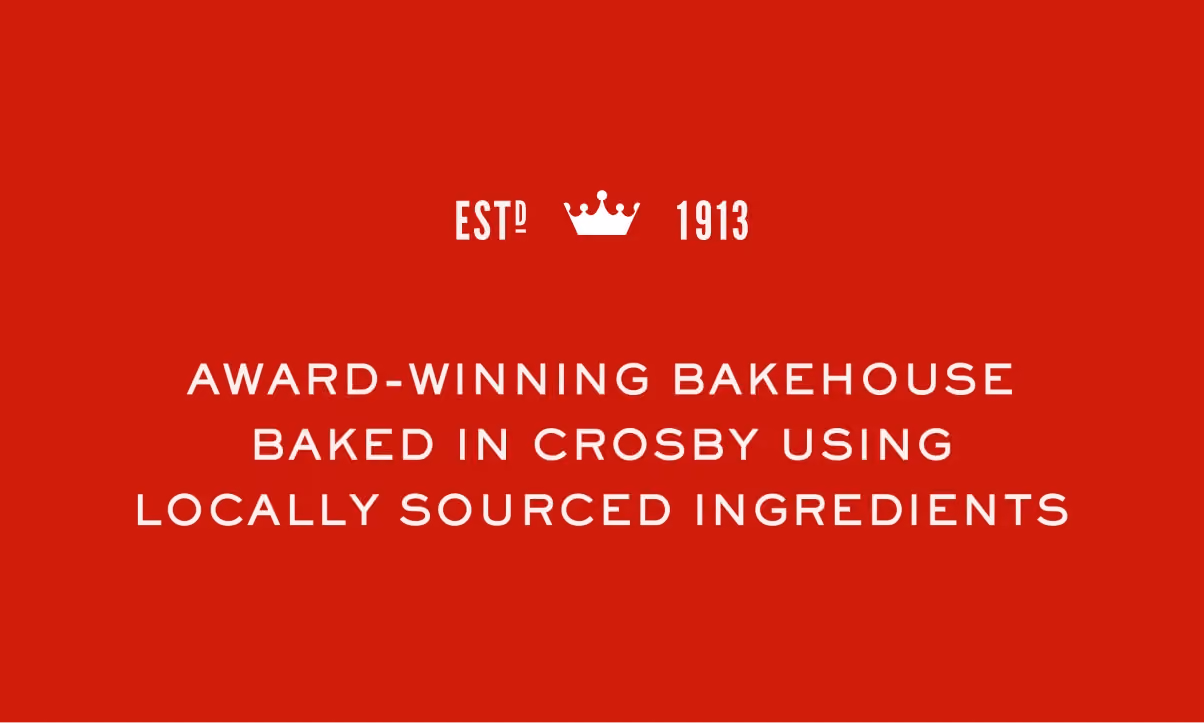
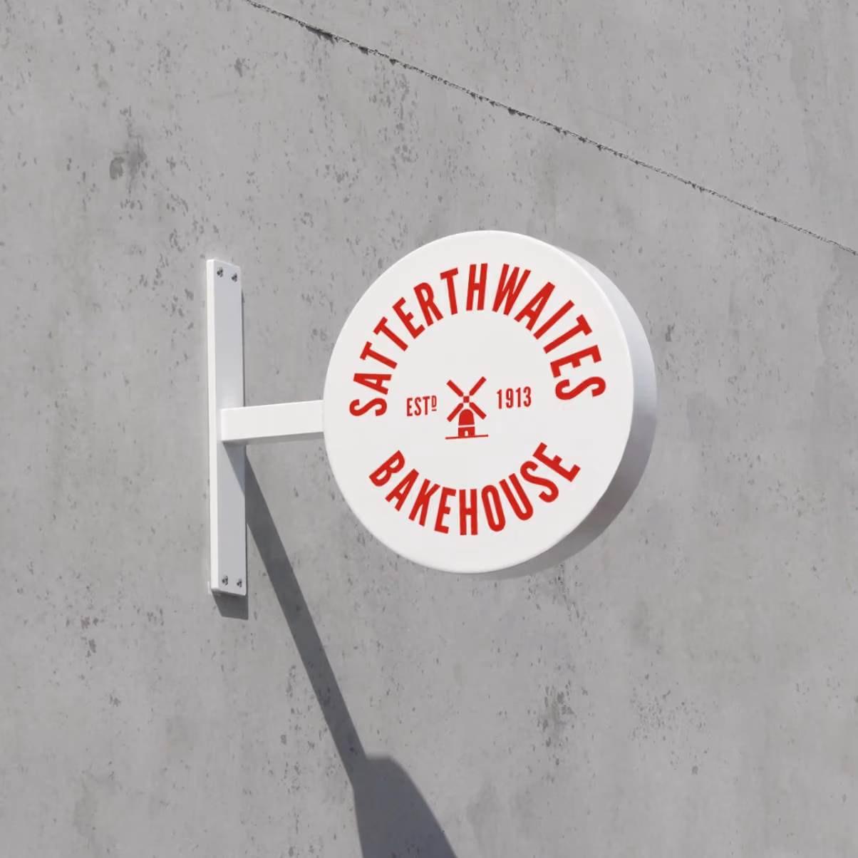
Our rebranding of the Satterthwaites Bakehouse fuses a bright and contemporary aesthetic with traditional British typefaces and layout. After thorough research, a windmill was selected as the brandmark.
The traditional purpose of grinding grain into flour made the windmill the perfect symbol for the bakery, as it conveys a rich history and legacy. This is complemented by the primary red, which was chosen as bold and ownable colour for all of the brands touchpoints. Lastly, an evocative and playful tone of voice enhances the personality of the brand.


© Stride Studio Ltd 2026