


Crafting a brand that follows the cycles of nature
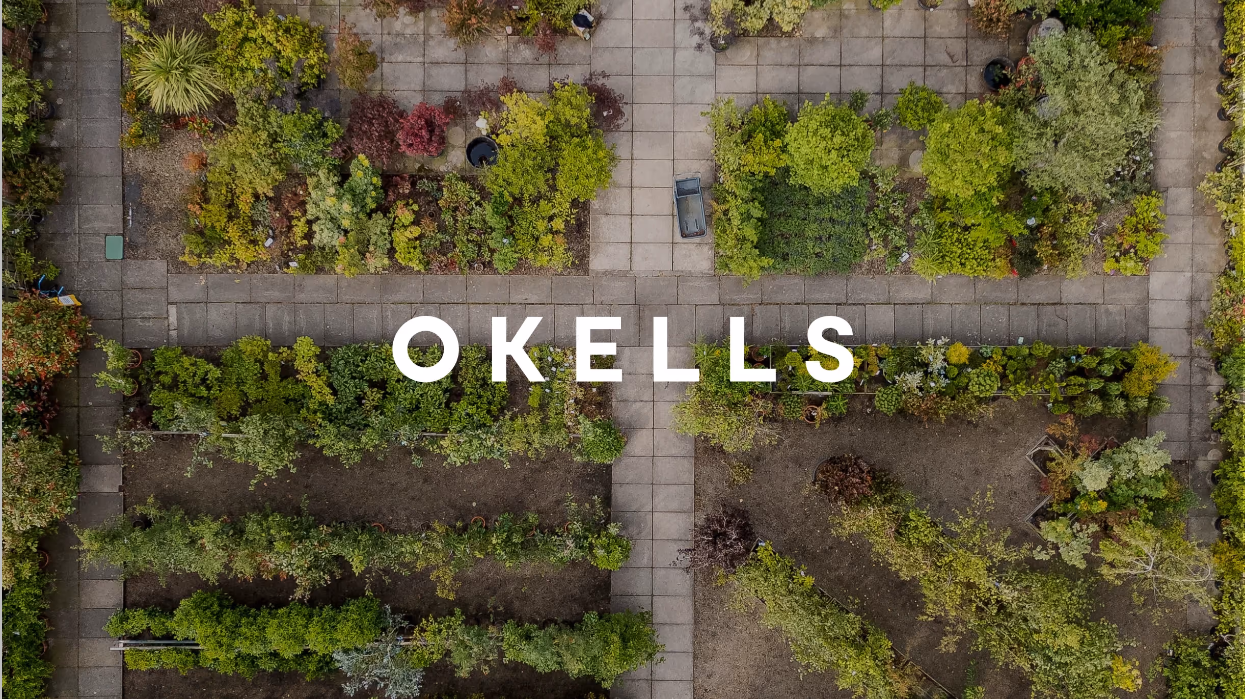
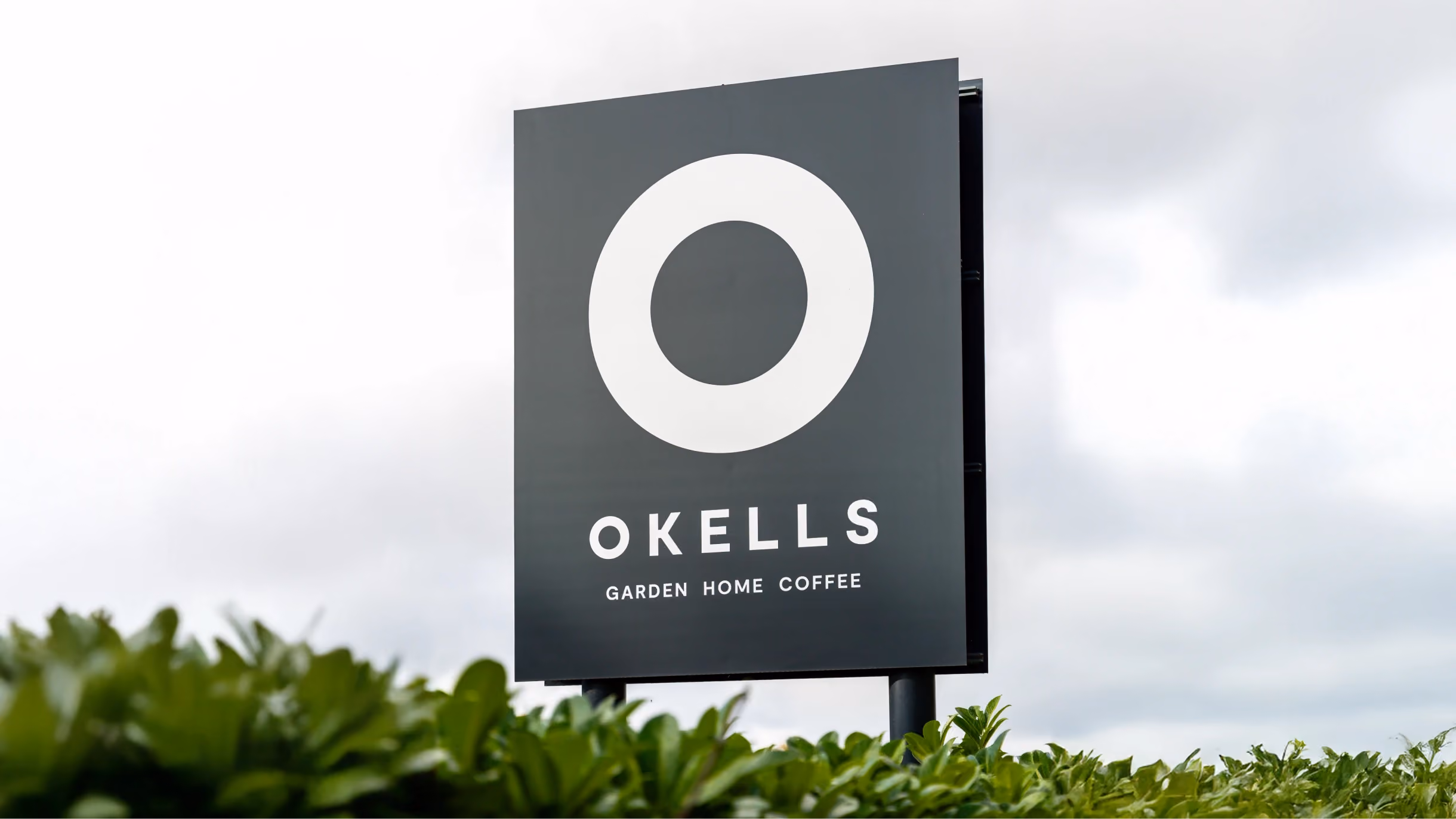
For Okells, everything returns to nature’s quiet cycles. We worked closely with their team to create a brand identity that captures this ethos, centred on a bold circular mark.
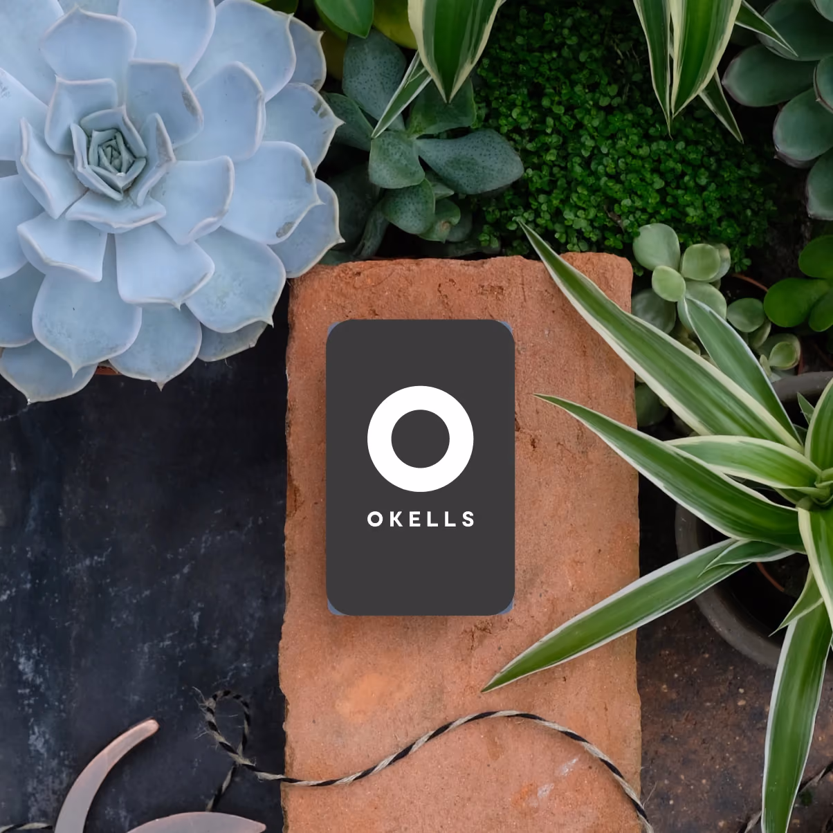
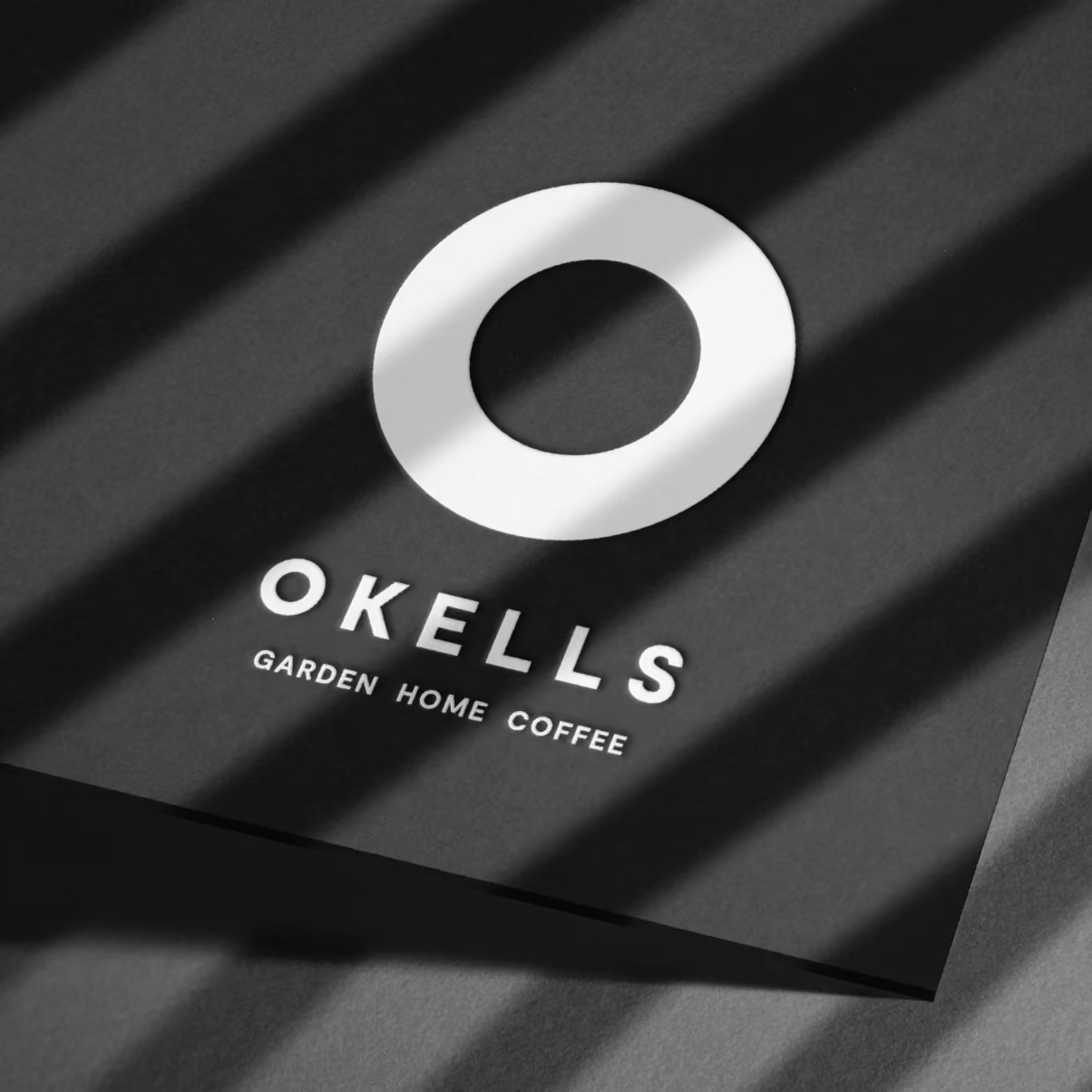
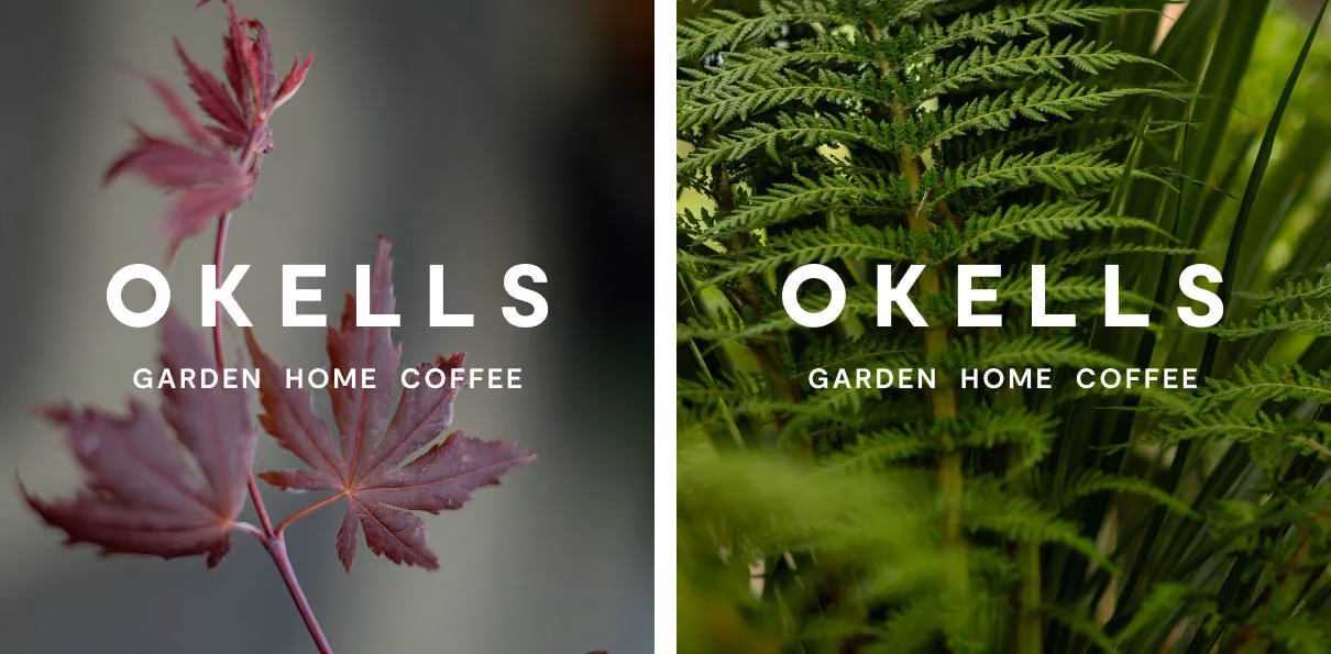
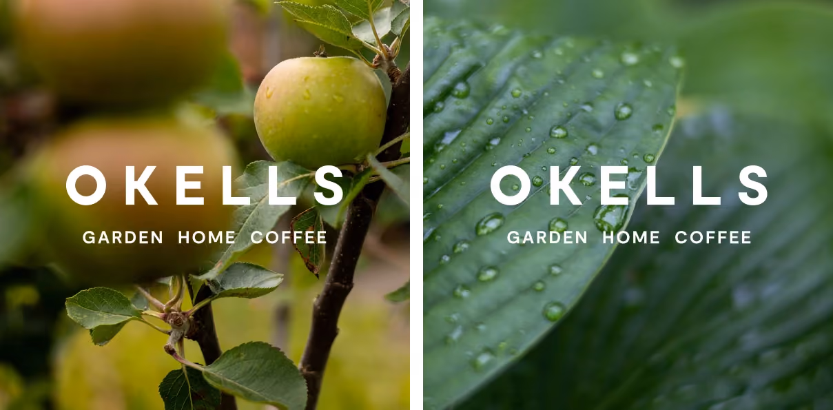
This mark reflects the ‘O’ of Okells, the cycles in seasons, plants, water, and nature, and the roundness found in seeds and blooms. A deliberately minimal and neutral colour palette is designed to showcase the vibrant colours of plants, products, and produce.
The result is an identity that feels effortless and human. Thats is designed to sit gently within its surroundings.

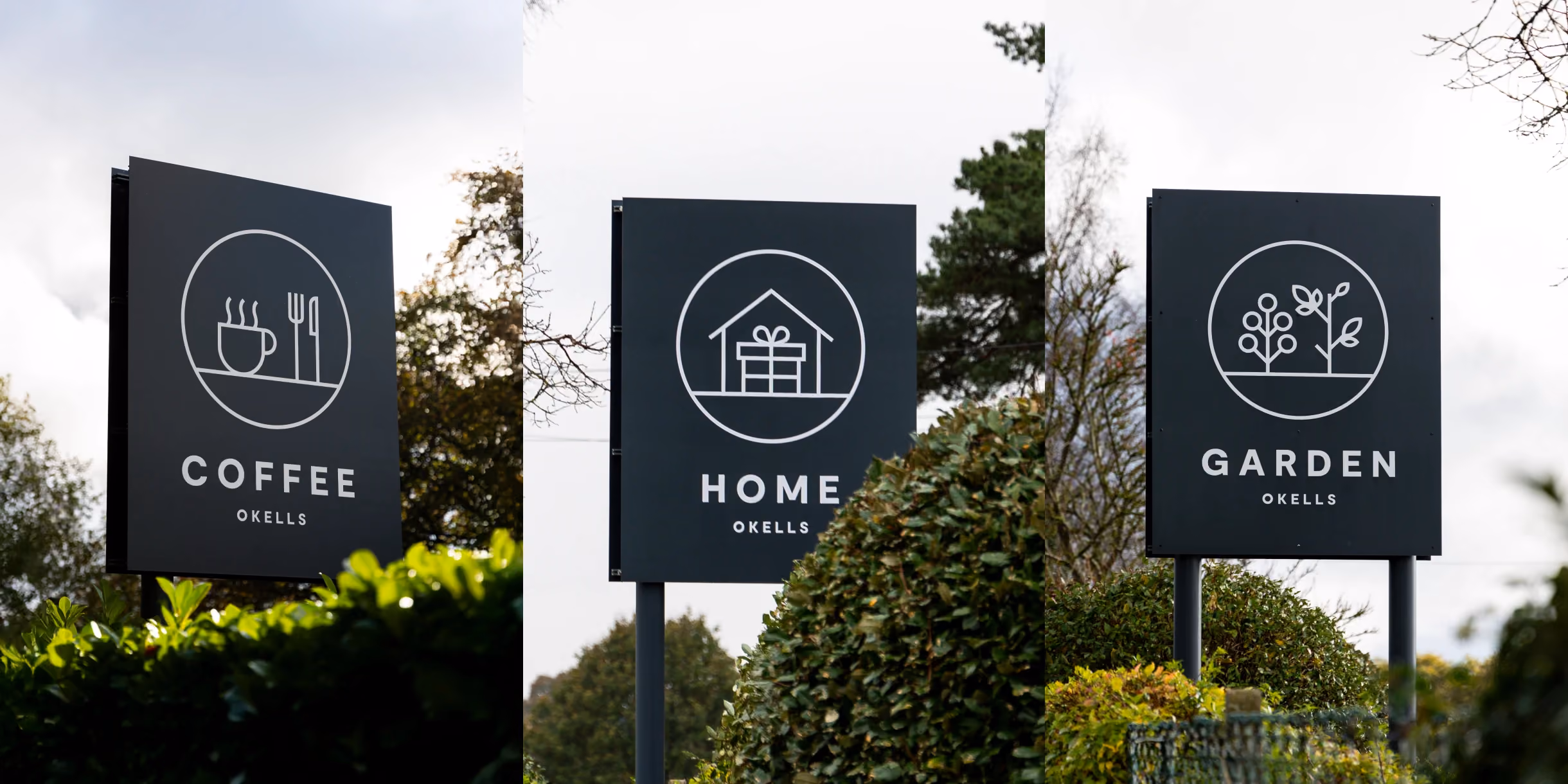
Icons that catch the eye
Clear and considered, the roadside signs feature simple icons shaped with the same rounded forms and clean lines as the Okells logo. They communicate the three core offerings: plants and garden, gifts and home, coffee and kitchen. The charcoal palette and minimal design ensure they’re easy to spot for passing drivers.
Design in the details
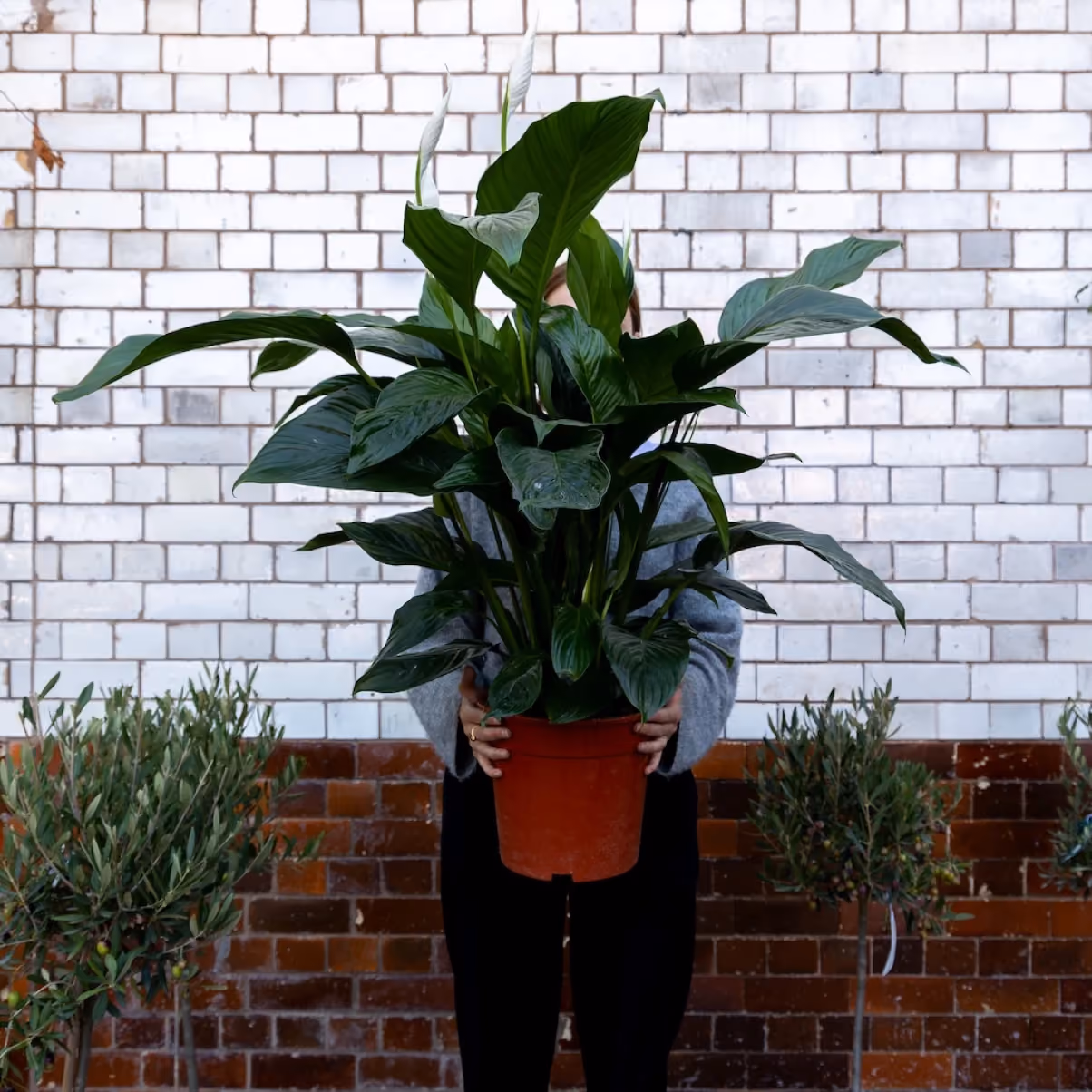
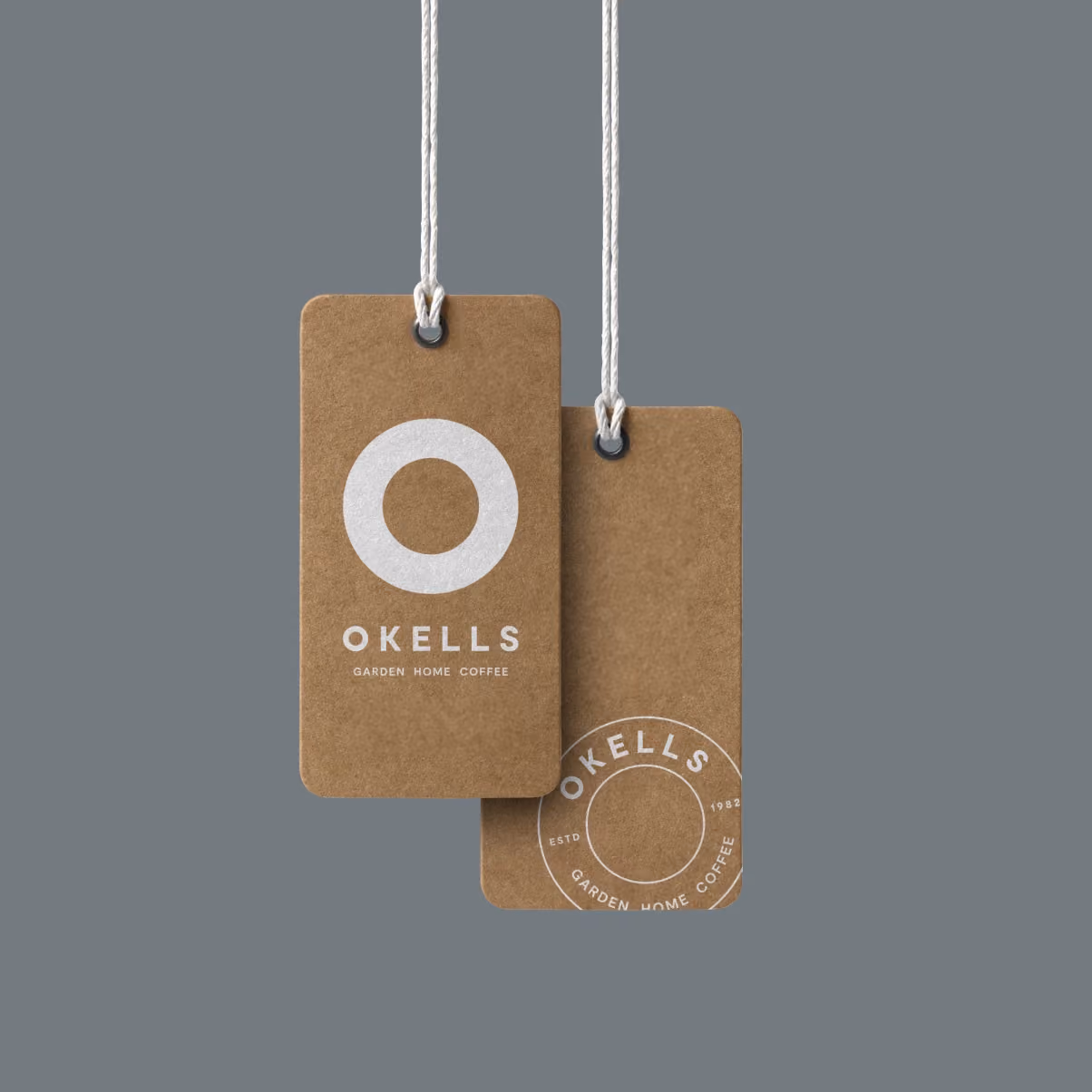
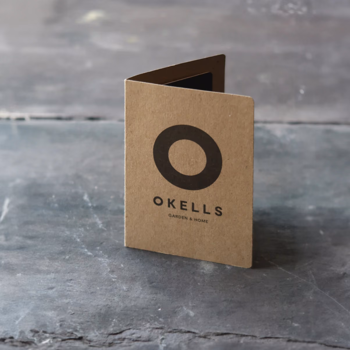
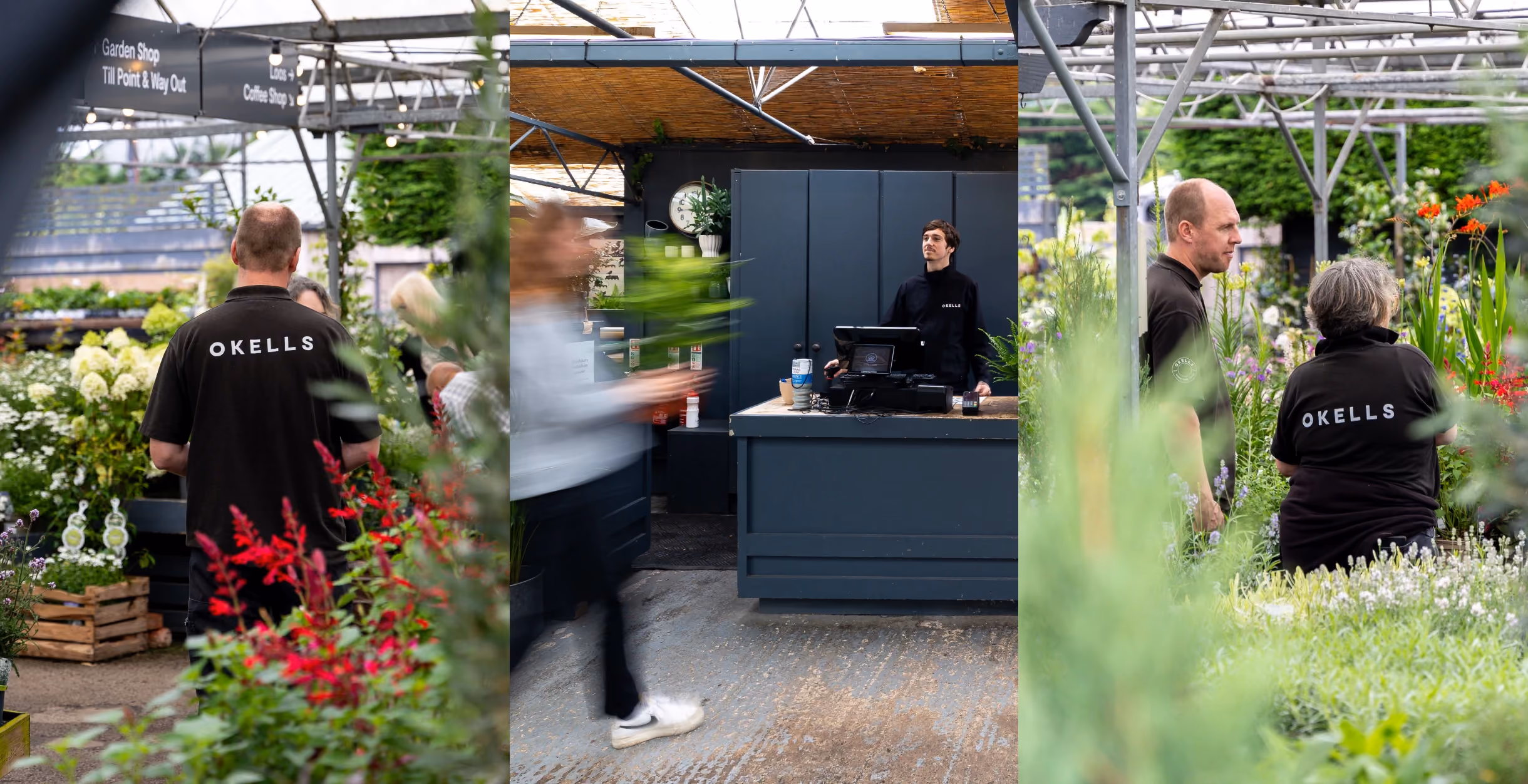
We extended the identity across a range of touchpoints, from product tags and gift cards to staff uniforms and tote bags. Using uncoated, recycled papers and clean typography, these pieces were designed to sit naturally within the different spaces, complementing rather than competing with the vibrant greenery around them.

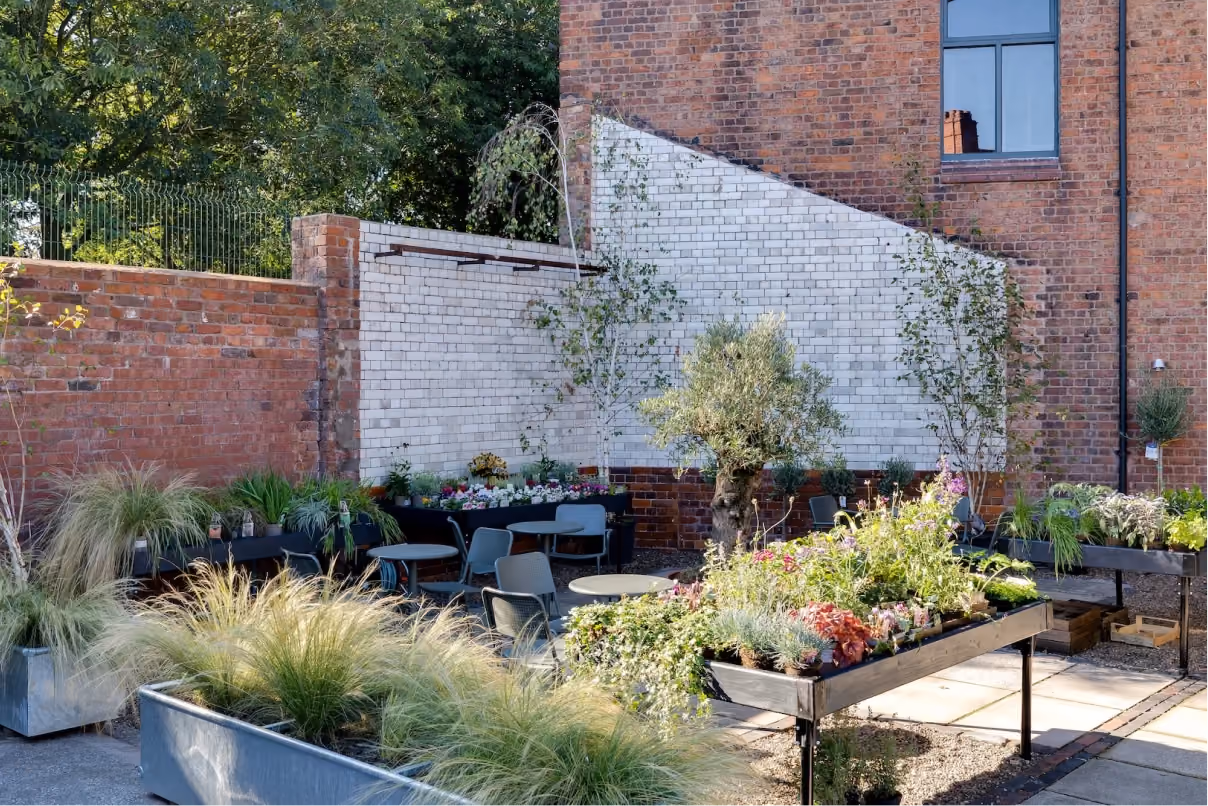
Breathing life into Hoole
When Okells opened their second site in Hoole, they took over a former Co-op building in need of restoration. The renovation has brought this 100-year-old space back to life, giving it a new chapter as a neighbourhood garden centre. The result is a welcoming space that feels part of the community and full of character.
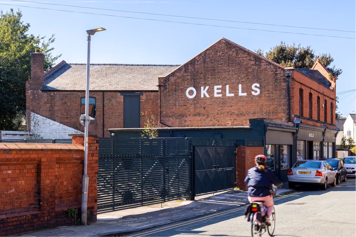
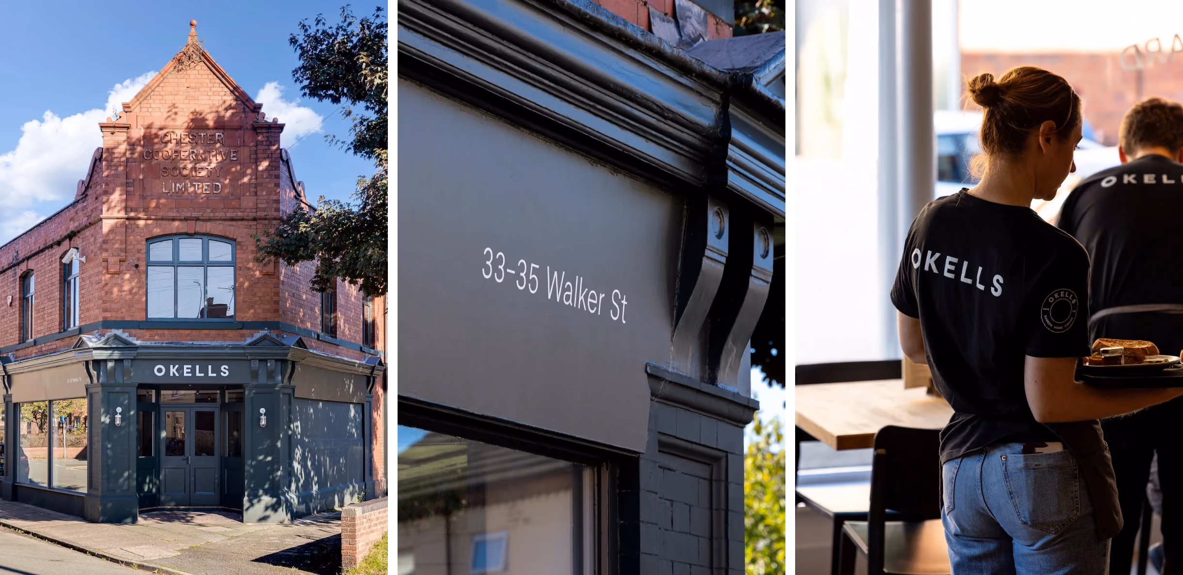
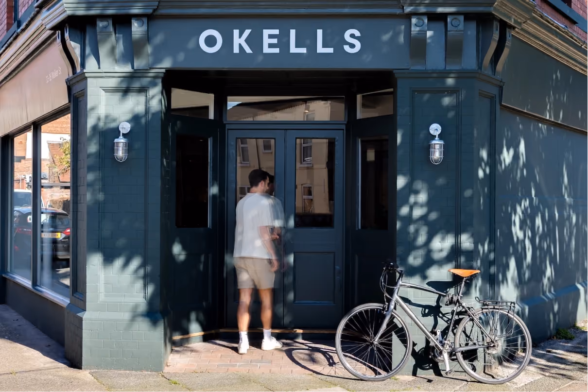
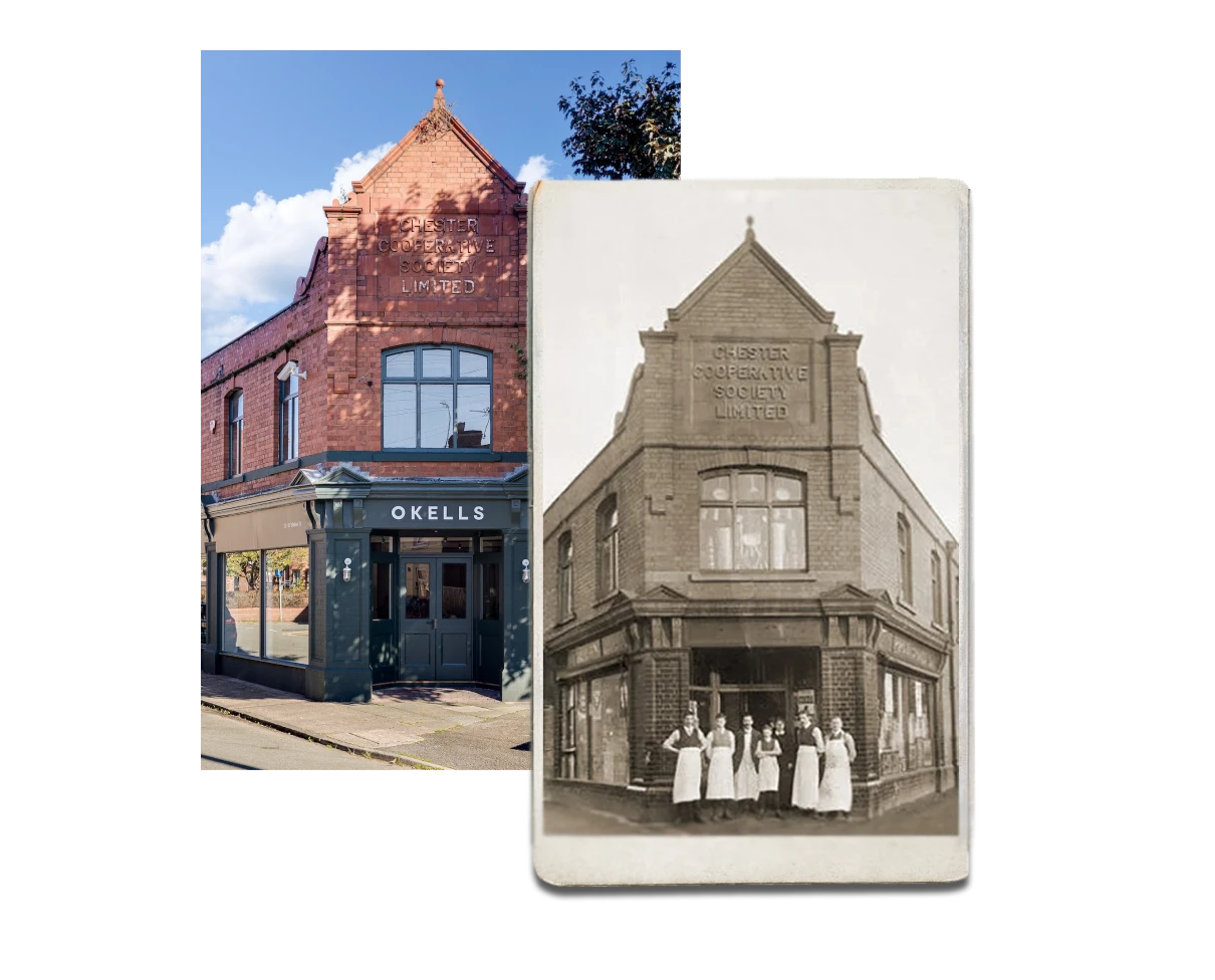
Heritage
Okells Hoole is housed in the old Co-operative shop, built in 1906. A beautiful building with many original features and great scale. There’s a pleasing poetry in transforming a space that sold groceries, meat, and household goods a century ago into one that now offers plants, coffee, and gifts.
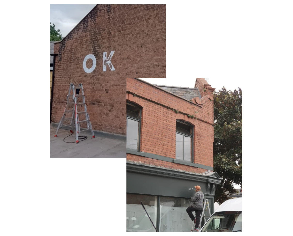
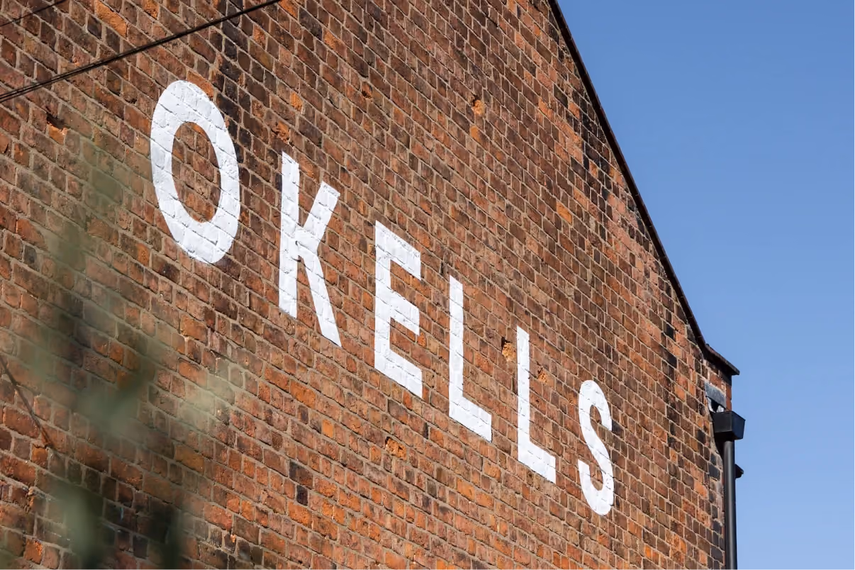
Signwriting with soul
For the Hoole site, we worked with signwriter Harry to hand-paint the exterior fascia and gable wall. This traditional approach was chosen to suit the age of the building and to avoid any overly modern interventions. The result feels sensitive to the building’s history and adds a quiet craft detail to the streetscape.
