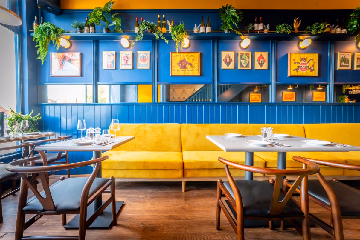
A contemporary restaurant celebrating the land and sea through fire cooking
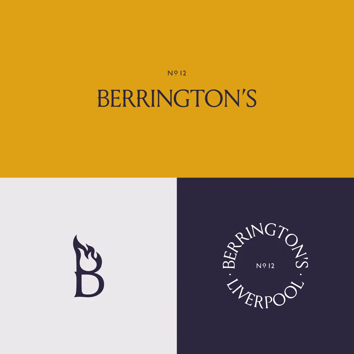
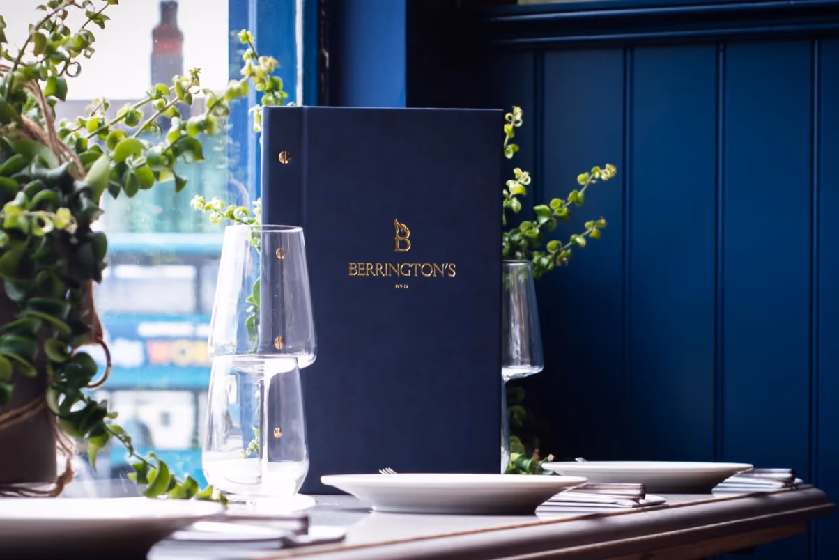
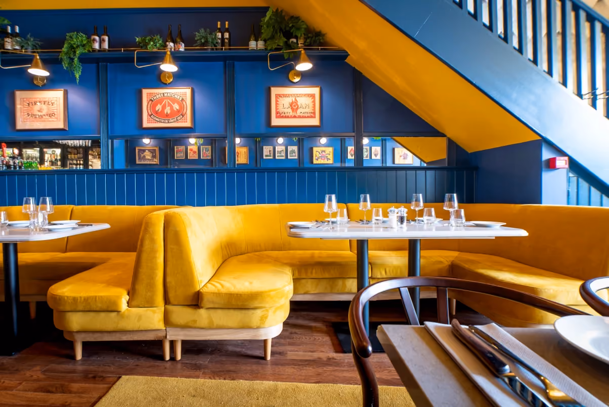
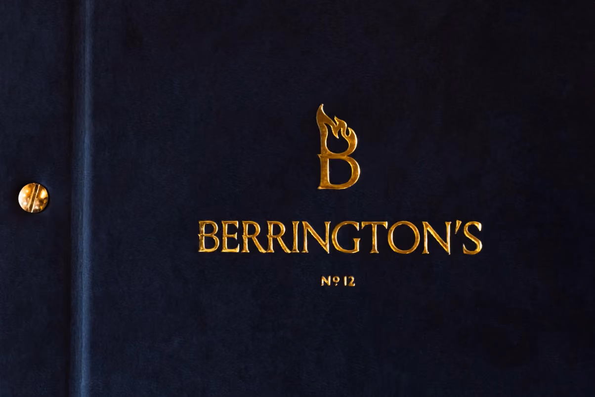
We were approached to create a full creative branding concept for a restaurant specialising in fire cooking. This included designing their logo, typeface, font and colour palette, interior elements, signage and launch collateral.
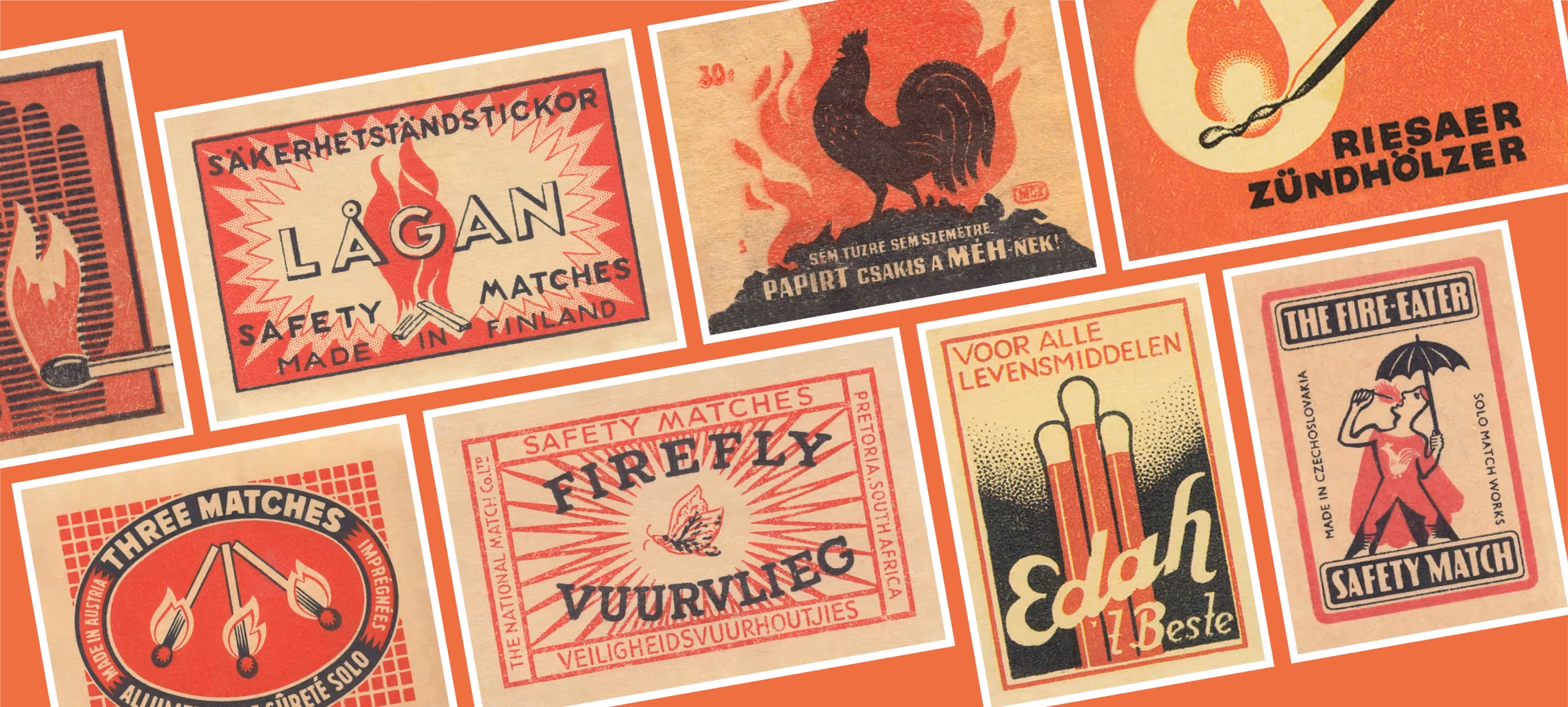
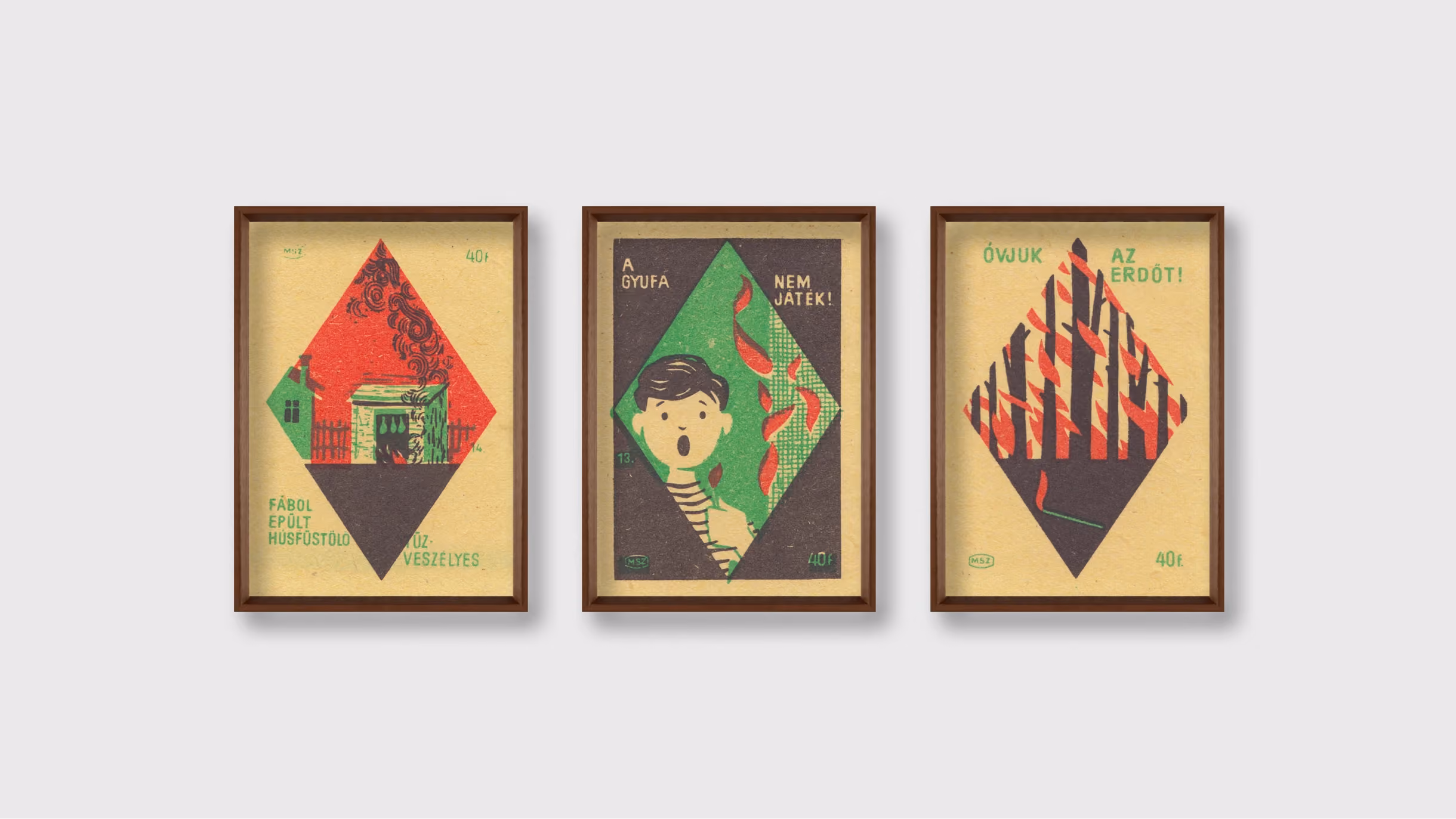
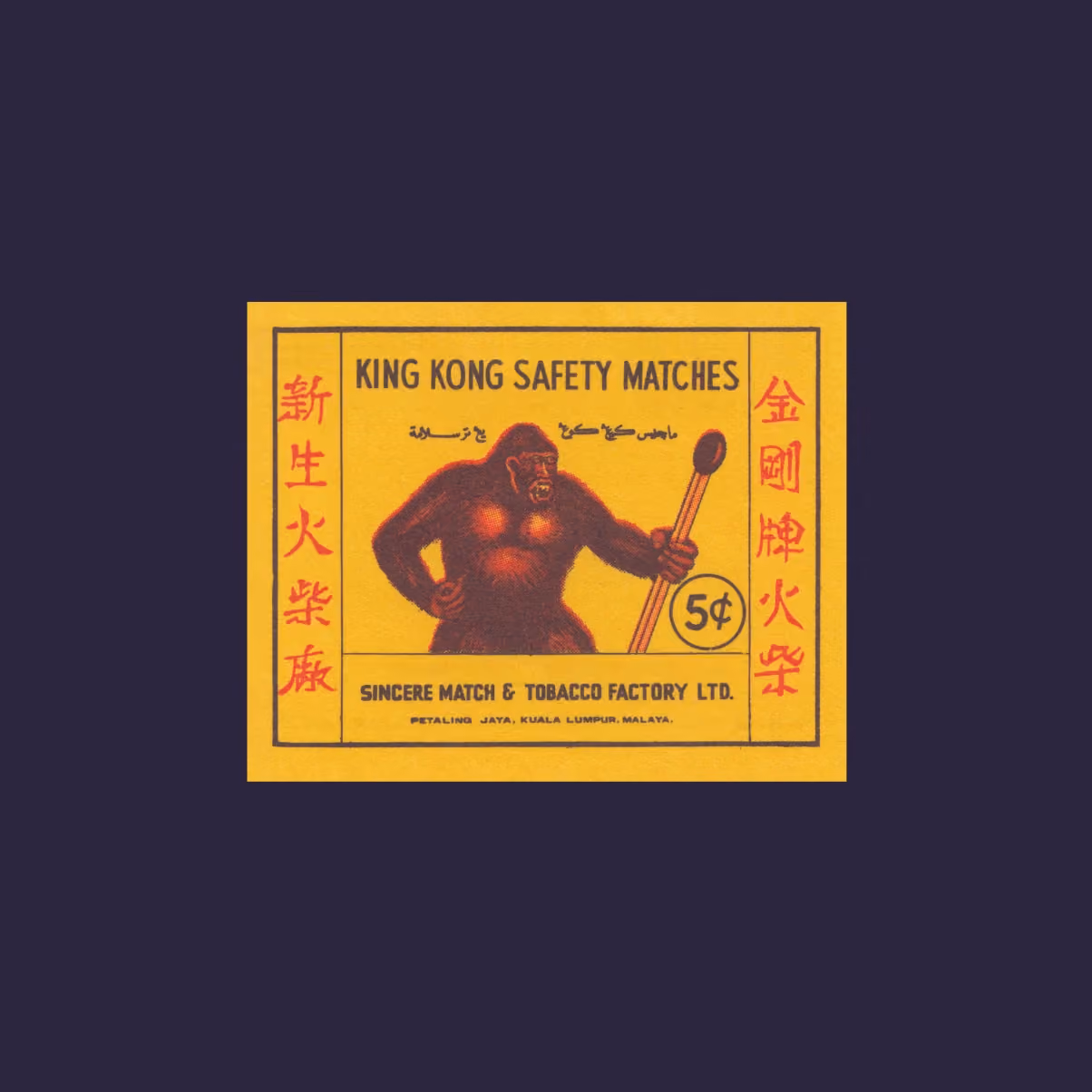
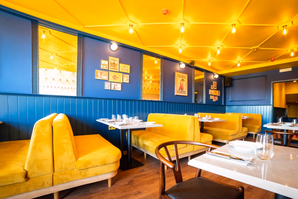
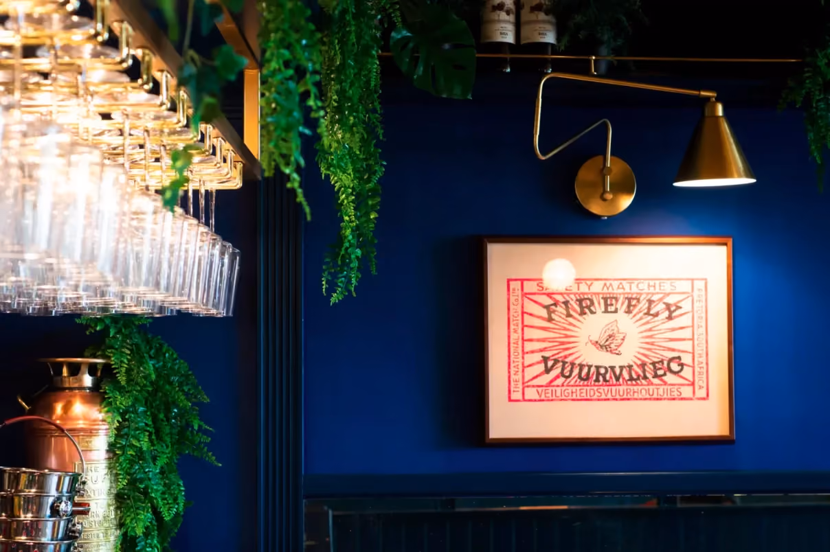
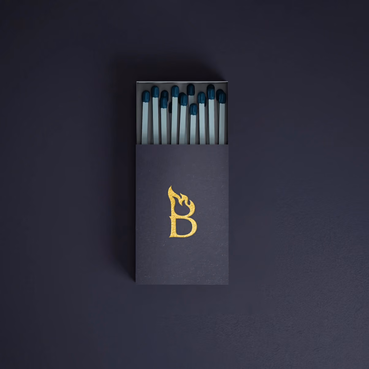
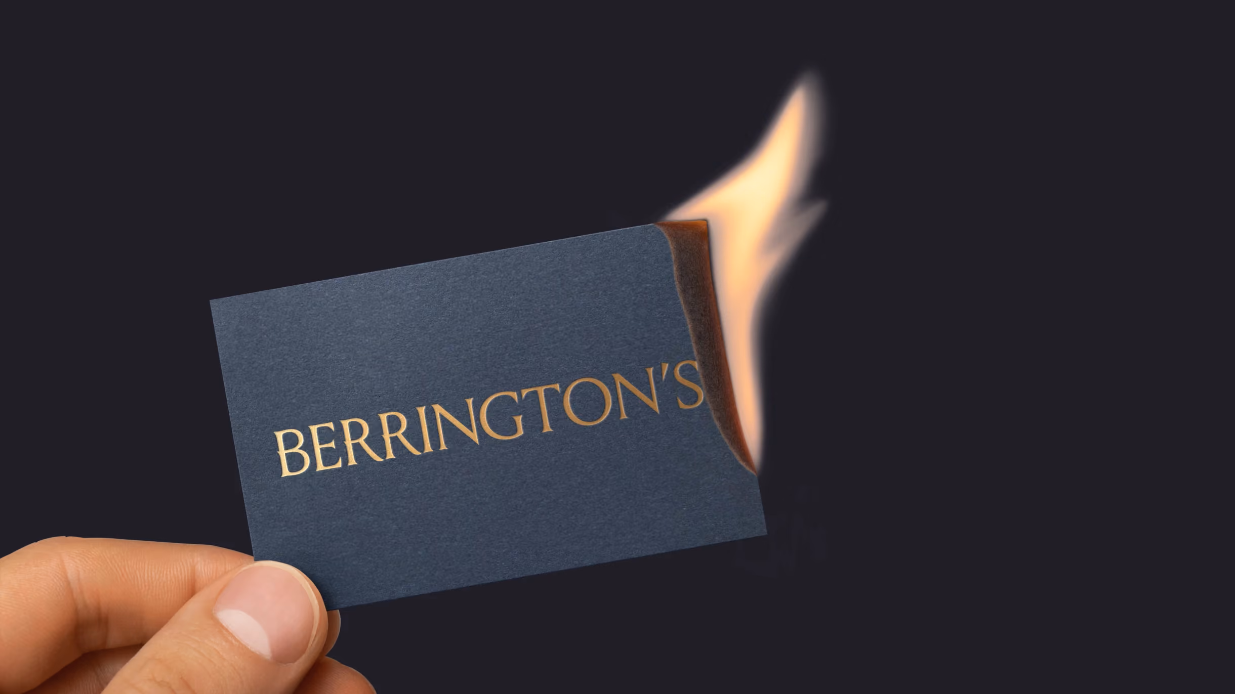
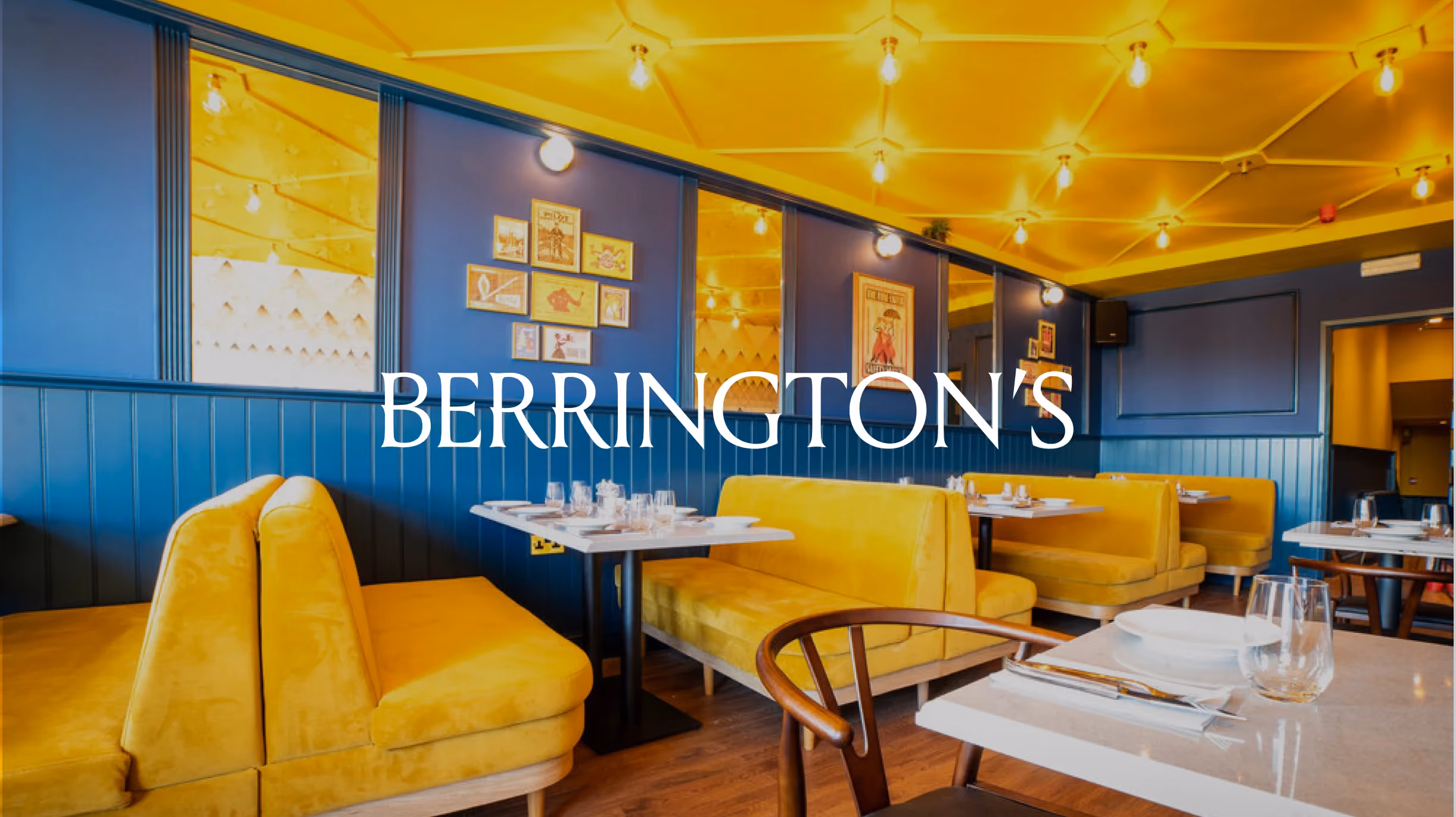
We formed a flaming B in reference to the fire cooking menu. This ‘B’ logotype is a flexible device that can be used on varied items. We also created a series of picture frames images, sourcing and repurposing vintage matchbox labels. This incredible imagery was deployed as clusters of frames set against the deep navy or vivid yellow paintwork.
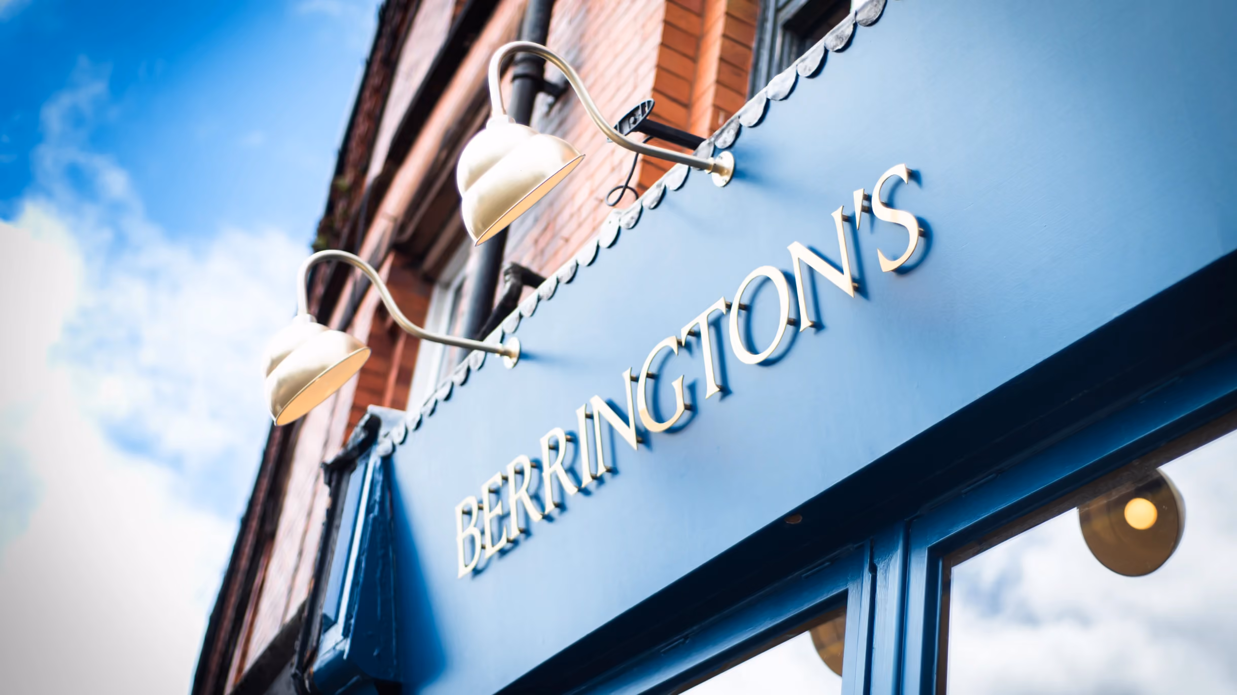
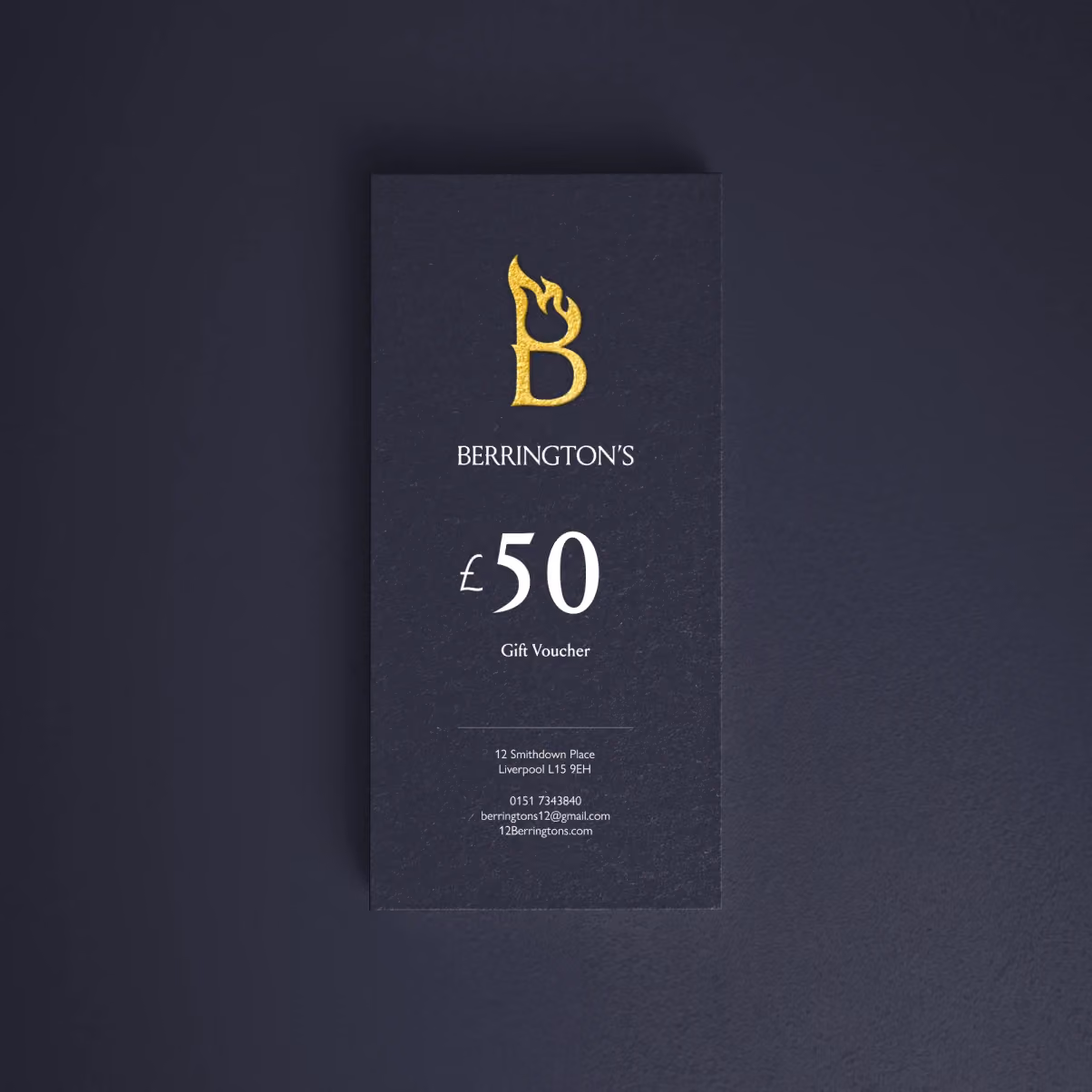
Finally a solid copper sign was manufactured featuring our bespoke logo. Copper was chosen for its ability to naturally change colours – transforming from a shiny brown to darker browns, and finally greens after a number of years.