Creating a Welcoming Brand for Every Body
| Sector: | Retail & Leisure |
|---|---|
| Discipline: | Brand, Strategy |
| Location: | Chester |


At the heart of Brio
Brio came in for three in-depth sessions, where we worked closely to unpack every aspect of the brand, from its purpose and values to its audiences and ambitions. We began by defining Brio’s vision: “better health and wellness for everyone”, and its mission: “to offer a wide range of fitness and wellbeing services at a value that makes them accessible to as many people as possible.”
This process surfaced three core values: Health & Happiness, Community over Profit, and Welcoming & Inclusive. These foundations shaped a brand that blends professionalism with warmth and connects meaningfully across every touchpoint.


Letters that move
The centerpiece of the brand is the distinctive Brio wordmark, featuring custom letterforms with a playful yet confident character. The rounded elements in the ‘b’ inspired a visual system where curves became a defining feature across applications. This custom typography extends to centre logos, where the unique letterforms are carefully integrated into the centre location names.
Tone that lifts, not lectures
We established a clear, human tone of voice for all Brio communications. The language avoids fitness jargon and overly technical terms, instead using everyday language that feels relatable and accessible. The tone is informative yet playful, with an emphasis on being encouraging rather than prescriptive. Importantly, the tone avoids any language around weight, fitness targets, or prescriptive messaging that might alienate those new to exercise.
Clear space, full focus
The photography style focuses on individuals rather than groups, showcasing a diversity of people against clean backgrounds. This approach allows for impactful compositions where people can be highlighted against Brio’s brand colours, reinforcing inclusivity and the “for every body” positioning. It also allows room to drop in typography and messaging across various assets, such as posters or website backgrounds.


Shaping up the brand
Inspired by the logo’s distinctive curves, we developed a cohesive pattern system and shape language that enhances visual interest while strengthening brand identity. Serving as a dynamic backdrop, the pattern and large-scale shapes reinforce brand presence and add a sense of playfulness.
Drawn directly from the Brio logo, the shapes introduce a sense of movement that captures the active, energetic spirit of Brio’s offerings.


Tangible, wearable, sharable
We extended the brand across various physical touchpoints including staff uniforms, membership cards, and promotional merchandise. Staff t-shirts feature clever tone of voice and promotional merchandise such as coffee cups can incorporate the pattern system and colour palette, turning everyday items into brand ambassadors. These tangible brand expressions help create a cohesive experience while building recognition and loyalty.


Faces over symbols
We developed a photographic approach that replaces traditional icons with authentic, diverse imagery. Each section (fitness, cafe, junior, wellbeing, classes etc) is represented by carefully selected photographs that reflect Brio’s inclusive ethos.
These images follow the brand’s photography style of showcasing individual people in simple, solid-coloured clothing against clean backgrounds. This approach creates a more engaging visual narrative, ensuring each section feels welcoming.


Finding your way
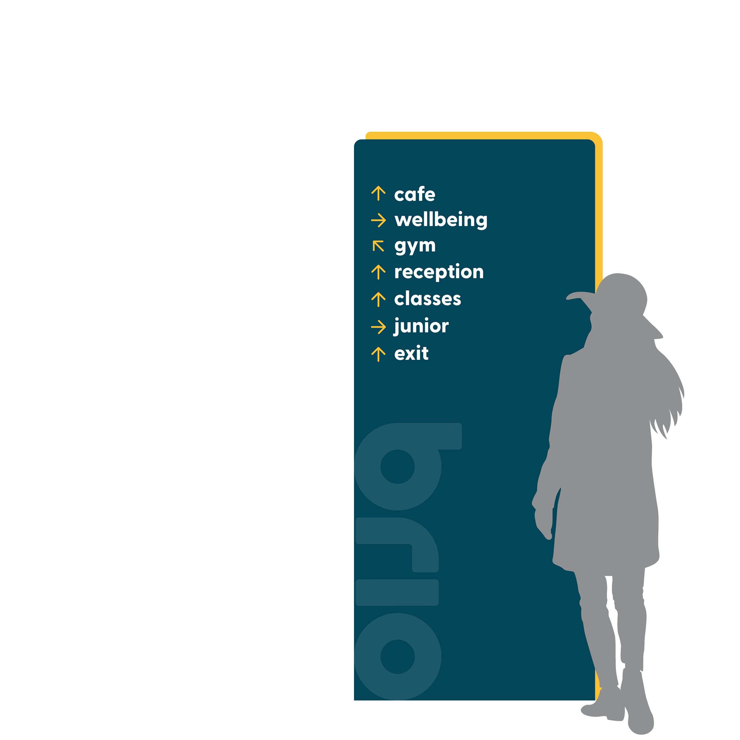
This proposed wayfinding system applies the brand’s aesthetic to create intuitive navigation throughout Brio’s facilities. Using the core colour palette to distinguish different areas and services, the system features the rounded corner treatment inspired by the logo. Clear typographic hierarchy ensures information is easily scannable from various distances.


